What is a Prototype? A Guide to Functional UX

Prototyping is one of the most critical steps in the design process, yet prototypes still confuse some designers and project teams.
A common misconception is that some designers refer to mockups as prototypes—which can confuse those who know otherwise! Prototypes are also not a series of sketches or a functional replica of the end-product.
Key takeaways:
- A prototype is a representation of the end-product that is used in order to see if the product teams are building the right solution for their desired users.
- There are several types of prototypes: a paper prototype that’s basically a sketch of a product, digital wireframe, functional prototype, and more.
- Prototypes differ in terms of their fidelity to the final product. Low fidelity means prototype doesn’t include many details while high-fidelity prototype can be fully functional and behave like a real product.
- There are a couple of ways of creating a prototype depending on the level of fidelity you want to achieve. You can start with a paper or build a prototype in code. Let’s discuss what that means.
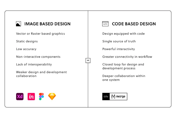
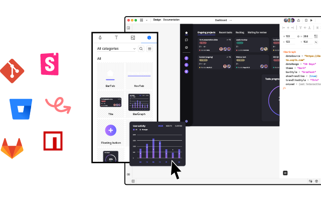
Build a living example of your product with components that come from your design library stored in Git, Storybook or as an npm package. Simplify design handoff and make sure that teams are sharing a single source of truth between design and code. Discover UXPin Merge.
What is a Prototype?
A prototype is a simulation of a final product which product teams use for testing before committing resources to building the actual thing.
The goal of a prototype is to test and validate ideas before sharing them with stakeholders and eventually passing the final designs to engineering teams for the development process.
Prototypes are essential for identifying and solving user pain points with participants during usability testing. Testing prototypes with end-users enables UX teams to visualize and optimize the user experience during the design process.
Engineering is expensive, and making changes to a final product is often not as straightforward as teams anticipate. So, finding and fixing errors during the design process is critical.
Prototypes have four main qualities:
- Representation — The prototype itself, i.e., paper and mobile, or HTML and desktop.
- Precision — The fidelity of the prototype, meaning its level of detail—low-fidelity or high-fidelity.
- Interactivity — The functionality available to the user during the testing phase, e.g., fully functional, partially functional, or view-only.
- Evolution — The lifecycle of the prototype. Some are built quickly, tested, thrown away, and then replaced with an improved version (known as “rapid prototyping”). Others may be created and improved upon, ultimately evolving into the final product.
Another common misconception about prototyping is that it only needs to be done once or twice at the end of the design process—not true.
One of our mottos that we believe at UXPin is “test early and test often.”
According to Elementor’s Director of UX, the website building platform’s designers’ – average four to five prototyping sessions, depending on the complexity of a given design.
You should prototype every possible iteration of your design—even your early basic ideas for solving a user need. Prototyping shouldn’t be reserved only for beta tests of the final version; you should test any and every version of your product!
If testing a prototype produces new insights about how end-users will interact with your product, then it’s worth taking the time to gather user feedback and iterate—whether that’s paper, low-fidelity or high-fidelity.
Types of Prototypes
We’re going to explore prototypes in three types of prototypes: paper, digital, and HTML.
Paper Prototypes
A paper prototype is a prototype that is drawn on a paper or a digital whitebaord. Such a prototype is used during the early design stages, like a design thinking workshop while designers still brainstorm ideas.
Paper prototyping works best during early design stages where design teams collaborate to explore many concepts fast. Team members sketch ideas by hand using simple lines, shapes, and text. The emphasis is on lots of ideas and speed, not aesthetics.
UX Teams lay paper screens on the floor, table, or pinned to a board to simulate user flows. A common practice for testing these prototypes is to have one person play “the product,” switching the sketches according to how the real user behaves.
A low visual/low functional paper prototype.
Advantages of Paper Prototypes
- Fast — You can sketch a prototype in minutes, which is why paper works so well for testing lots of ideas. You can draw a prototype quickly (even during a brainstorming meeting), so you haven’t wasted more than a few minutes if an idea falls flat.
- Inexpensive — You only need a maker pen and paper to create prototypes, making the process cheap and accessible.
- Team-building — Paper prototyping is a collaborative effort, and often teams have fun coming up with fresh ideas. It’s a fantastic team-building exercise, and these free-thinking sessions often inspire creativity.
- Documentation — Team members can keep physical copies of paper prototypes, notes, and todos for quick reference during future iterations.
Disadvantages
- Unrealistic — No matter how skilled the art or craftsmanship, paper prototypes will never be more than hand-drawn representations of a digital product. So, while they’re quick to draw, paper prototypes produce little or no results when doing user testing.
- False positives — Sometimes, paper prototypes don’t validate ideas properly. What seems like a good idea on paper might not work effectively in a digital wireframe.
- No gut reactions — Paper prototypes rely on the user’s imagination, adding a break between seeing the stimulus and responding to it. That “gut” reaction is crucial for a successful UX.
Considering these advantages and disadvantages, we recommend paper prototyping only during early-stage design. Once you move from paper to digital, there shouldn’t be any reason to revisit hand-sketched prototypes for the same designs or user flows.
For more information on paper prototyping, check out these helpful resources:
- Paper Prototyping as a Usability Testing Technique by Justin Mifsud
- Better Use of Paper in UX Design by Marcin Treder
- iPhone User Interface Design, Paper Prototype Design (video)
- Printable Paper Prototyping Templates courtesy of Tripwire Magazine
Digital Prototyping
Digital prototyping is an exciting part of the design process. Prototypes start to resemble the final product allowing teams to test and validate ideas.
There are two types of digital prototypes:
- Low-fidelity prototypes: a user flow using wireframes
- High-fidelity prototypes: a user flow using mockups
Low-fidelity prototypes allow research teams to outline basic user flows and information architecture. High-fidelity prototypes go into more detail, testing user interfaces, interactions, and how usability participants interact with a product.
Designers build prototypes using design tools like Figma, Adobe XD, and others. Sometimes non-designers, from product teams use Powerpoint or Google Slides to simulate user flows.
UXPin is unique because it allows designers to create prototypes that look and function exactly like the final product—something you cannot achieve with other popular design tools!
Advantages of Digital Prototyping
- Realistic interactions — Testing with high-fidelity digital prototypes lets UX teams see how users interact with the final product, thus effectively iron out any usability issues.
- Flexibility — Test early and test often! You can start with lo-fi prototypes that become progressively more advanced as the product design process moves forward.
- Speed — While paper prototypes might be the fastest way to test ideas, digital prototypes are the quickest way to test usability issues. Once a product gets to the engineering stage, changes cost significantly more time and money.
Disadvantages
- Learning curve — Before you can build a prototype, you’ll need to learn and understand the software—which is why product teams often use Powerpoint instead of a specialized design tool. The good news is that most design software incorporates the same tools, so it’s relatively easy to switch between them.
- Cost — As you move from low-fidelity to high-fidelity prototyping, time and labor costs increase.
A prototype’s success depends on teams outlining clear objectives and KPIs for each usability study. Without a proper plan, designers can get side-tracked, adding unnecessary features and interactions!
Here are some helpful resources for creating digital prototypes:
- A 10-Minute Rapid Prototyping Lesson by Marek Bowers
HTML & JavaScript Prototyping
On rare occasions, teams might build HTML & JavaScript prototypes to get more accurate results. The downside to this approach is that coding comes with considerable time and technical costs.
But with UXPin Merge, that isn’t the case!
Product designers (and non-designers) can create code-based high-fidelity prototypes that look and function like the final product.
For example, with UXPin’s Merge technology, teams can use React components pulled from a Git repository or Storybook components to create fully functional high-fidelity prototypes. With UXPin Merge, participants never have to “imagine” what a button or dropdown will do because the prototype functions like the final product!
Low Visual/High Functional Prototype built-in HTML. (Image credit: Mike Hill)
Advantages
- Final product functionality — HTML prototypes provide participants with an accurate model of the final product.
- The technical foundation for the final product — Building an HTML prototype provides researchers with a valuable research tool and provides developers with the foundations for building the final product.
- Platform agnostic — You can test your prototype on virtually any operating system or device, and the user won’t need to run outside software.
Disadvantages
- Dependent on designer skill level — Your HTML prototype is only as good as your ability to code. Poorly coded prototypes could introduce usability issues that don’t have anything to do with UX design!
- Inhibits creativity — Coding takes time and focus to build a usable prototype. Designers might not achieve the same level of innovation or creativity as using a familiar design tool.
Here are some helpful resources on HTML prototyping:
- Designing with Code by Andy Fitzgerald
- The Advantage of Rapid Prototyping by ZURB
- UXPin Merge for interactive prototyping by Robert Kirkman
The Prototyping Process
There’s no single best process for prototyping; it all depends on the product and application. Below are the three most effective prototyping processes, each intended for different scenarios.
(Note: We advise that you ALWAYS test the prototype when going from lo-fi to hi-fi.)
Paper => Lo-fi Digital => Hi-fi Digital => Code
Most designers follow the paper => lo-fi digital => hi-fi digital => code process for prototyping—it’s how we designed UXPin :).
Teams collaborate to develop lots of ideas, sketching wireframes on paper and creating user flows before committing to digital. Here, UX teams will use common brainstorming methods like crazy eights or asking “how might we” questions to get into an end-user mindset.
A lo-fi digital prototype (wireframe) tests crucial elements like navigation and information architecture early in the design process. Teams can use feedback to make quick adjustments to wireframes before committing to mockups.
Once teams complete navigation and information architecture, designers build mockups resembling the final product—adding color, content, interactions, and animations.
When researchers have exhausted testing, UX teams hand over designs to engineers to develop the final product.
Paper => Lo-fi Digital => Code
Going from Lo-fi prototyping to code is an old approach that few teams ever use these days. While lo-fi prototyping is cheap, it doesn’t catch many of the usability issues high-fidelity prototypes expose.
Product developers without design skills might use the paper => lo-fi digital => code method because it’s quicker for them to code than learn how to use a design tool.
The process is exactly like the example above, except that teams will skip the hi-fi digital step.
Low fidelity prototype created during a Yelp redesign exercise.
High fidelity prototype created during a Yelp redesign exercise.
HTML Prototyping => Code
Solo developers might skip any early prototyping methods and go straight to code. With no one to bounce ideas with, it can make sense for a developer to jump straight in.
Essentially, the prototype creates a foundation and evolves into the final product. This prototyping method is only effective for skilled product developers with efficient workflows.
Even designers with excellent design skills might want to avoid this method of prototyping. Low-fidelity and high-fidelity prototyping are significantly faster than building and editing code.
Paper =>UXPin Merge – Hi-fi Prototyping => Code
With UXPin Merge, you can accelerate the UX process through rapid prototyping. Create fully-functioning high-fidelity prototypes using UI code components to provide participants with a life-like model of the final product.

UX teams follow the standard paper prototyping processes as outlined above. Next, designers build high-fidelity prototypes using UXPin Merge just by dragging and dropping ready interactive UI blocks on the canvas.
The outcome: no more “imagining!” Your prototype will work just as the final product. Prototyping in a code-based design tool like UXPin Merge means engineers can build the final product significantly quicker than working with vector-based designs. Discover UXPin Merge.


