Creating Perfect User Flows for Smooth UX

User flows are integral to the UX design process. These valuable UX artifacts help product teams visualize flows and processes from users’ perspectives to reduce errors and enhance the user experience.
This article takes a deep dive into user flows, their importance, the principles that guide them, the visual representations, and the various types of flows.
Create user flows and design advanced prototypes with UXPin, an all-in-one design tool that covers every part of your design process, from ideation to design handoff. Build your first prototype today. Sign up for a free trial.
What is User Flow in UX?
A user flow is a graphic visualization representing the sequence of steps, decisions, and actions users perform while navigating a digital product, app, or website.
Product teams typically focus on one task or goal at a time, such as an onboarding sequence or eCommerce checkout. Designers build prototypes of these user flows to test the user experience with usability participants and stakeholders, iterating on feedback until they have a product ready for development.
Importance of User Flows in UX Design
User flows help product teams visualize the paths users take through an application or website to complete a specific task or achieve a goal. This visualization enables teams to identify friction points and opportunities within user flows and design solutions to fix them.
Additionally, designers can look at optimizing flows to create more efficient and satisfying user experiences.

Benefits of a well-designed UX flows
A well-designed user flow offers many important benefits for users and the organization:
- Improves usability: optimized user flows feel intuitive, simplifying decision-making while reducing cognitive load, resulting in a user-friendly experience where users don’t get lost or frustrated.
- Better retention: when a digital product meets user needs, allowing them to complete tasks and achieve goals, they’re more likely to keep using it and share their positive experience.
- Higher conversions: streamlining user flows removes roadblocks and obstacles for tasks that generate revenue for the business, like signups, purchases, subscriptions, etc.
- Reduce costs: optimized user flows remove redundant screens and features, resulting in many cost-savings, including design, development, maintenance, server requests, API usage, etc.
- Improved accessibility: design teams can visualize and optimize user flows to meet accessibility requirements, making user interfaces more inclusive while increasing the product’s user base.
- Data-driven design decisions: analyzing user flows provides valuable insights into user behavior and preferences, allowing designers to make informed decisions based on actual data rather than assumptions. Data-driven design decisions deliver products and experiences that meet user needs, making them more intuitive, enjoyable, and user-friendly.
UX Principles of Effective User Flows

Successful user flows incorporate UX principles that guide design concepts and decision-making. Here are some fundamental UX principles to consider when designing user flows:
Clarity and simplicity
Your user flows must be easy to understand and navigate. Avoid complex designs or features that people must learn before using them. Navigation and interaction elements must be consistent, predictable, and straightforward. When you force people to overthink a process or interaction, they’ll abandon it for an easier option, even at a higher cost.
Consistency
Maintain a consistent design language, layout, patterns, and interaction design throughout your product and user flows. Design consistency increases familiarity resulting in a more intuitive, user-friendly experience.
Flexibility
Design flows that cater to different needs, preferences, and abilities by offering multiple ways to complete tasks–for example, providing alternate paths, shortcuts, or input methods.
Feedback and communication
UI feedback guides users and manages expectations as they navigate user flows–for example, progress indicators, visual cues, status information, messages (success, error, etc.), and alerts. This communication informs users of the system status, whether their action was successful, and what to do next.
Anticipate user needs
Designers can utilize user research to predict and address user needs to prevent obstacles and roadblocks. Adding helpful tips and error prevention features enables users to solve problems faster for more efficient and streamlined flows.
Minimize steps
Designers can streamline user flows by eliminating unnecessary steps, actions, and decision points. Minimizing these points of friction increases efficiency while reducing errors and drop-offs.
Focus on user goals
Would you rather use a product that helps you achieve your objectives efficiently or one inundating you with business value proposals and other irrelevant content? Design user flows that prioritize the user’s goals and desired outcomes with features that enhance efficiency and success.
Accessibility and inclusivity
Ensure that users with diverse abilities, preferences, and devices can use your products, navigate flows, and complete tasks. Designers must consider how factors like font size, color contrasts, keyboard navigation, language, and screen-reader compatibility impact user experiences. Read more about accessibility here: Web Design Accessibility Checklist.
Types of User Flow Visualizations
Before we explore the user flow types, it’s important to explain the visualizations design teams use to map these journeys.
Flowcharts
User flowcharts (user flow diagrams) are a diagramming technique used across many industries to represent the information flow, decision points, and user actions. These visualizations use symbols, arrows, and other shapes to depict elements, processes, decisions, and data input/output.
Wireflows
Wireflows combine wireframes and flowcharts to provide a detailed view of a user’s journey through an interface. These visualizations describe each screen’s layout as well as how users and information flow between them.
Wireflows help visualize user interactions with specific elements and understand the context of these interactions. Designers and engineers can use these wireflows to visualize information architecture and navigation in greater detail.
Screen-flows
Screen-flows are annotated screenshots or mockups illustrating a user’s path through a product. These high-fidelity versions of wire-flows allow designers and stakeholders to visualize user flows in greater detail with screens that accurately represent the final product.
Storyboarding
Designers use storyboarding similarly to the film industry, using a series of illustrations, images, or screens to show a user’s journey. Storyboarding is helpful as it allows design teams to zoom out from the user flow and visualize a user’s environment and circumstances.
For example, if you’re designing an app for food delivery drivers, you’ll need to visualize the user flow from multiple perspectives:
- Walking
- Cycling
- Scooter/motorbike
- Car
- Van
Storyboard combined with user flows helps design teams empathize with users better to deliver more relevant solutions.
Types of User Flows
Here are seven common user flow categories. Design teams can use the techniques and mediums above to visualize these user flows.
Task flows
Task flows represent the steps users must follow to complete a specific task. These flows focus on sequential user actions and decision points, often visualized using a flowchart. Task flows are particularly helpful for identifying pain points and optimizing user journeys.
Onboarding flows
Onboarding flows allow product teams to visualize and design the product’s initial setup and introduction. These flows incorporate account creation, tutorials, feature highlights, and personalization options to familiarize users and get them started quickly.
Conversion flows
Conversion flows are crucial for generating revenue and growth. These flows represent the steps toward a desired action or outcome–for example, newsletter signups, purchases, plan upgrades, etc. Designers typically aim to minimize friction and distractions for these flows to maximize conversion rates, upsells, and other revenue-generating activities.
Navigation flows
Navigation flows outline the structure and architecture of a digital product. These visualizations help design teams understand how users move between screens, sections, and features. They can use these insights to prioritize features and content so users can find things faster and complete tasks more efficiently.
Account management flows
Users often need to update account information like addresses, passwords, billing details, app preferences, subscriptions, etc. Account management flows allow designers to simplify these administrative experiences so users can return to more important tasks.
Error flows
Error flows allow design teams to simulate issues and design solutions to fix them. They can use these insights to improve the user flow and eliminate errors from occurring or create appropriate feedback for users to correct problems.
Offboarding flows
Offboarding flows guide users through discontinuing a product or service, like canceling a subscription or deleting their account. These flows must be as efficient as onboarding to minimize frustration, increasing the chances of winning back customers.
How to Create a User Flow in 8 Steps
Here is a step-by-step framework for creating user flows.
Define the goal and entry points
Identify the task or goal you want to analyze–this could be one of the above user flows or something specific to your product. This goal will help determine the scope and focus of your user flow and which visualization is most appropriate.
If you are designing a website user experience, another good practice before creating your flows is to determine and map out where your users are coming from. Based on Morgan Brown’s advice in Stop Designing Pages and Start Designing Flows, we’d recommend you consider the following sources for your web or mobile prototype:
- Direct traffic
- Organic search
- Paid advertising
- Social media
- Referral sites
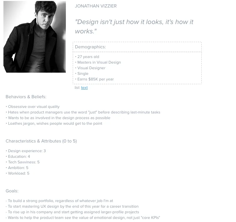
Identify personas
Your product may have many user personas. Determine which of these is most relevant to the user flow. You may assess the user flow for multiple personas to ensure it meets everyone’s needs and expectations.

For templates and helpful tips on creating personas, check out the chapter “Analyzing Users Before Diving Into Design” in the free ebook The Guide to UX Design Process & Documentation.
List user actions and decision points
Break down the user journey into a list of individual actions and decision points. Consider each step a user must take to achieve goals and their choices. For example, a signup screen might have several options, including email signup and multiple social logins. Each option will have a different path to completing the signup process.
Map the flow
Start by sketching your flows on paper or in a digital tool to iterate on many ideas fast. This should be a collaborative effort where team members share ideas and suggestions.
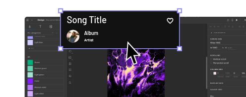
Once you have a basic outline, you can create your user flow in a design tool. UXPin offers five built-in design libraries, one of which is aptly named User Flows. UXPin’s User Flows library includes everything teams need to create and share user journeys, including:
- Flow lines for every conceivable direction
- Action blocks
- Icon blocks
- Labels
- Devices (mobile, tablet, desktop)
- Gestures
Here are a couple techniques for outlining your flow.
Writing-first Approach to Outlining a Flow
You can use the writing-first approach, which Jessica Downey writes about in her article Jumpstarting Your App Conception Without Sketching UI. This outlining method helps flesh out ideas and build a “common understanding” of each page of your app or site.
Let’s create one for, say, a banking app. The scenario: someone wants to turn on auto deposit. Note in the outline below, content in [brackets] represents action buttons/links.
Step 1: Would you like to set up auto deposit?
[Set auto-deposit]
Step 2: Select Deposit Frequency
[Once per month][Twice per month]
[Every other week][Every week]
Step 3: Deposit Once per Month
[Select calendar day]
Step 4: Set Amount
Display amount field
[Set auto-deposit]
Shorthand Approach to Outlining a Flow
You can also try a shorthand approach used by Ryan Singer at Basecamp. Ryan’s approach treats flows as ongoing conversations.
For our banking app example above, we can create a shorthand for Steps 2 and 3 that looks something like this:

To see how Singer demonstrates shorthand for Basecamp and how he can illustrates complex flows with this outlining process, check out A Shorthand for Designing UI Flows.
Add screens
If you’re designing a wireflow or screen-flow, you can add relevant wireframes, mockups, and screenshots depending on the level of fidelity you need for your user flow.
Include system feedback
Add system feedback and responses such as error messages, success notifications, or loading indicators. This detail will help designers and engineers create the appropriate UI components and content to guide users.
Review and iterate
Analyze the user flow for potential improvements, pain points, or friction. Share the visualizations with team members and stakeholders for feedback and iterate until you have a flow ready for prototyping.
Prototype and test
Create a prototype of your user flow in a design tool. UXPin’s built-in design libraries (iOS, Material Design, Bootstrap, and Foundation) provide designers with UI components and patterns for web and native applications. Drag and drop UI elements from the Design Libraries panel to create high-fidelity mockups you can test in the browser or use UXPin Mirror for mobile app testing.
Create fully interactive prototypes using advanced UXPin features to achieve results that accurately replicate the final product:
- States: allow designers to create multiple states for a single UI element and design complex interactive components like accordions, carousels, steppers, and more.
- Variables: capture data from user inputs and create personalized, dynamic user experiences–like a welcome message using data from the name field in a signup form.
- Expressions: Javascript-like functions to create complex components and advanced functionality–no code required!
- Conditional Interactions: create if-then and if-else conditions based on user interactions to create dynamic prototypes with multiple outcomes to accurately replicate the final product experience.
Enhance your user flows with high-quality prototyping and testing from UXPin. Start designing the user experiences your customers deserve with the world’s most advanced design tool. Sign up for a free trial.


