Website Design for Higher Conversions – A Quick How-To Guide

It takes 50 milliseconds for visitors to form an opinion about your business from your website’s design. A poor user experience creates a negative sentiment resulting in high bounce rates and conversion loss.
Understanding UX design’s impact on a website’s conversion rate is key to removing potential roadblocks, creating business value, and delivering a higher ROI for design projects. This article explores how website design impacts conversions and how design teams can improve marketing campaigns.
Design better user experiences using meaningful insights from prototyping and testing your conversion rate optimization ideas in UXPin. Discover how code-based design can enhance UX workflows, increase website conversions, and create better experiences for your customers. Sign up for a free trial.
What is Website Conversion Optimization?

Website conversions include successful sales, leads, form completions, and other tasks you want visitors to complete. Website conversion optimization is a practice of increasing opportunities for visitors to complete these tasks.
Much of this conversion optimization comes down to web design and user experience–a task for UX designers. Designing for optimization means UX teams must understand what users need and how the user interface can guide them to that goal quickest.
Why is Design Important for Conversion Rates?
Web design plays a crucial role in conversion rates. Here are some stats to support this case:
- 38% of the website visitors will stop engaging with a website if it has unattractive content or layout.
- 48% of visitors consider a website’s design the number one factor in determining a business’s credibility.
- 68% of companies with mobile-first web design reported increased sales.
- Most visitors leave a website after eight seconds, so designers must prioritize user interfaces and content to meet users’ needs.
Setting the First Impression
A website’s design is often the first customer touchpoint and how people perceive your brand. Impressing customers with an aesthetically-pleasing user interface, experience, and content is the first step toward converting website traffic to revenue-generating customers.
Enhances SEO
Search engine optimization (SEO) is vital for websites because it delivers free organic traffic. UX designers must understand how search engines crawl and index web pages to optimize content, layouts, and hierarchy.
Read more about UX and SEO on our blog.
Accessibility

Web accessibility is another SEO factor, but it’s also critical for creating inclusive website experiences. UX designers must factor in disabilities like low vision, color blindness, blindness, cognitive disabilities, deafness or hearing impairment, and mobility impairments to ensure websites meet Web Content Accessibility Guidelines (WCAG)–a legal requirement in many jurisdictions.
Promotes Trust
Trust is a significant factor in converting visitors. Customers want to know they can trust your company and website before handing over money or personal information. Good web design tells customers you care about your brand, value their business, and want to give them a good user experience–like welcoming people into a physical store.
Design ROI
Aside from user experience, designers must also recognize the importance of increasing conversions for design’s return on investment. Increasing opportunities and conversions establishes design’s value within the organization.
Design Tips and UI Patterns That Boost Conversions

1. Call to Action (CTA)
CTAs are crucial for conversion optimization. They grab users’ attention with an offer with a UI element to take the desired action–like call-to-action buttons or an email form. CTA buttons are usually colorful and larger than other content to signify their importance and encourage engagement.
2. Landing pages
According to HubSpot research, “more landing pages a business has on its website, the more leads it generates.” Designers and marketers can collaborate to design high-quality, lead-generating landing pages.
Unlike regular web pages, landing pages remove all navigation and links to eliminate distractions and focus users on a single product or CTA.
3. Testimonials
Testimonials or reviews are vital for displaying social proof, especially if they’re from prominent figures or brands. Testimonials tell website visitors that others are using your product and are happy with what they received.
According to marketing software giant HubSpot, “People consult reviews and testimonials to determine whether or not they trust a product, service, and even a seller.”
4. Value Proposition
Your value proposition tells customers what problem your product solves. For example, if you’re selling high-speed internet, your value proposition is that customers can “stream Netflix and YouTube videos with no buffering or interruptions.” Nowhere do you mention high speed or internet; you’re selling the solution.
Marketers generally put value propositions above the fold, next to the CTA. Customers see the solution (value proposition) to their problem and follow the link to sign up.
5. Contact Information
People often visit business websites to find contact information like email addresses and phone numbers. Many websites include these contact details in a header bar above the main navigation, so users don’t have to scroll or navigate to another page to find them.
Designers must instruct engineers include a “tel:” or “mailto:” HTML link attributes so users can click to email or call.
6. Pricing
Pricing is another reason people visit company websites, particularly SaaS and other service-based businesses. A pricing table UI pattern comparing your product’s plans is helpful for users, and the transparency builds trust. Designers must always include CTAs for users to sign up for their preferred option and begin the onboarding process.
7. Human Faces

Using relevant human faces for product images is crucial for creating a human connection while making the content relatable. Your about page must also include profile images of team members to give your brand a personal touch.
Onextrapixel has an interesting article, “On How To Use Human Face To Improve User Experience,” with examples from some of the biggest brands’ websites.
8. Negative Space
Negative space or whitespace is an excellent web design technique for drawing attention to specific content, like a CTA, important elements, or copy. Designers must also use appropriate negative space for text and UI elements to enhance readability and separate content.
9. Case Studies
Case studies are essential for B2B websites to demonstrate how your product solves problems and delivers results.
For example, our UXPin blog features a case study about “How PayPal scaled How PayPal Scaled Their Design Process with UXPin Merge.” Adoption from one of the biggest tech companies in the world gives Merge significant credibility and demonstrates that the product works.
10. Loading Speed
While loading speed optimization is typically the engineering team’s responsibility, designers can do a lot to reduce the page load time, including:
- Use responsive design best practices and optimize layouts and content for desktop, tablet, and mobile devices.
- Eliminate unnecessary “nice-to-have” features and functionality that don’t get users to their goals faster.
- Find ways to reuse components and microinteractions to minimize CSS and Javascript file sizes.
- Use JPG rather than PNG and scale and optimize images according to placement and web layout.
- Use SVG for logos, icons, and other graphics.
Conversion Rate Optimization
Here are some tips design teams can use to analyze and optimize a website’s conversion rate. Designers can use these tests for existing websites or test new ideas.
A/B testing
A/B testing (split testing) is a technique for comparing two designs to determine which performs better. It’s an iterative process where UX designers make small changes to optimize websites and landing pages.
The secret to successful A/B testing is to compare minor changes, like color, copy phrasing, fonts, images, etc. Comparing two completely different designs makes it difficult to tell what specifically increased conversions.
Multivariate Testing
Multivariate testing is similar to A/B testing, but design teams test multiple designs instead of only two variations. Designers can test multiple layouts simultaneously to arrive at the best option faster.
These tests only work for high-traffic websites where designers can split visitors into multiple groups and still have a large enough sample size to achieve accurate results.
Heatmaps

Heatmaps provide insights into how website visitors engage with a webpage and content, notably hover, scroll, and click/tap interactions. Design teams use this data to determine:
- Are CTAs and user journeys obvious?
- What navigational links are most important?
- How far do users scroll?
- Are there any UI elements distracting visitors from desired actions?
- Is there a link or content further down the page that users find more valuable than what’s above the fold? i.e., does the visual hierarchy match user behavior?
Google Analytics for Designers
Google Analytics (GA) can tell designers a lot about demographics, user flows, traffic sources (organic, social media, referrals, etc.), and behavior. It’s a fantastic tool for identifying the best and worst-performing pages and where users often exit funnels. Designers can use GA data to identify issues and run tests and interviews with end-users to pinpoint the problem.
We recommend reading Alice Walker’s “The ultimate guide to Google Analytics for UX designers“ to understand the tool and its capabilities better.
Improve Prototyping and Testing to Enhance Website Conversions in UXPin

One of the challenges UX teams have when prototyping and testing website designs are that image-based design tools lack fidelity and functionality.
Without replicating a user flow or code’s fidelity and functionality, UX designers cannot get accurate feedback and insights. They must rely on front-end developers to program code-based prototypes.
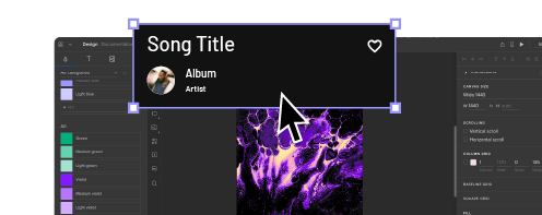
With UXPin’s code-based design tool, designers can achieve the same fidelity and functionality without writing a single line of code. UXPin prototypes deliver accurate, actionable results during testing, allowing designers to solve more usability issues before the design handoff.
Designers can build exact replicas of website user flows, landing pages, eCommerce checkouts, and more to test, iterate, and optimize prototypes with real end-users.
Get a clearer picture of your website’s user experience with accurate prototyping and testing in UXPin. Sign up for a free trial to discover how code-based design can optimize your website design for higher conversion rates.


