How PayPal Scaled Their Design Process with UXPin Merge
We’re always excited when we get feedback about how UXPin has improved our customer’s design experience. It’s even more special when that customer is one of the world’s largest digital payment platforms.
We had the joy of sitting down with Erica Rider, Senior Manager for UX – Developer tools and platform experience at PayPal, and Anthony Hand – Sr. UX Designer at Erica’s team.
In her own words, Erica explains the design challenge she had to solve at PayPal—bridging the gap between design, product, and development.
In most companies, the designer-developer ratio is one designer for every ten developers. At PayPal, there are five designers to over a thousand developers!
PayPal needed the tools and strategies to overcome this challenge. So, they turned to UXPin Merge and improved their DesignOps process.
Here’s how Erica and one of PayPal’s design teams revolutionized their design and development process using UXPin Merge. Scale design with UXPin Merge. See how to request access.
Challenges
Challenge of scaling design:
I have a small design team of five designers, including myself. We’re responsible for somewhere between 60 and a hundred products and well over a thousand developers.
As a small design team supporting such a large organization, we had to develop an innovative problem-solving approach. We were never going to get the budget to hire more designers, so we had to figure out how to scale design itself!
Challenge of consistency:
None of PayPal’s product teams had experienced UX people or UI developers. The result was a range of usability and design consistency issues—no two products looked the same!
So, I was assigned the challenging task of creating a cohesive and consistent user experience. With three designers and an infinite number of product teams, I knew that we couldn’t follow a traditional model to scale. And adding more designers wouldn’t solve the problem.
We had to scale design to empower product teams to be successful.
Before
The tools PayPal tried to use
To start, we knew that product teams were going to have to design products on their own. So, we looked at several different tools, starting with a traditional model, where we had design systems and standards.
Our initial idea was to adapt a traditional design approach while educating product teams about design. But, we quickly realized that with three designers trying to create documentation, providing support, and with the learning curve for design tools, the traditional model wasn’t going to work.
If product teams were going to design products successfully, we had to minimize the tools and skills they needed to learn.
The traditional way
In a traditional UX process, you have designers creating vector-based mockups, which they hand off to developers. Unfortunately, this process creates a gap between how components are supposed to work and what components are supposed to be there.
The result, lots of back and forth between designers and engineers to get design clarity and what the prototypes are supposed to do. Many times developers ask designers questions they hadn’t thought of because they were thinking purely about how the product is supposed to look and work.
Introducing UXPin Merge
For product teams to design products, we had to minimize this designer-developer gap while increasing collaboration.
Several years before I joined PayPal, I had a theory that to scale design effectively we had to include developers and product managers in the design process. I just didn’t know how we were going to do that. I knew the what, but I didn’t know the how.
Discovering Merge and UXPin opened the door to understanding how I could bridge the gap between design and development—and formed the catalyst to PayPal’s improved design process.
A traditional DesignOps process is about scaling. The usual ratio is one designer for every ten developers. First by adding designers and then building the supporting infrastructure to accommodate a large design team.
As an internal organization, we knew we would never get the resources to scale to the traditional one to ten designer-developer ratio. We had to find an innovative solution to solve our design challenges without adding designers.
So how does UXPin Merge work?
PayPal’s consumer-facing apps, services, Venmo, and other external services all use different technologies. We settled on Microsoft’s Fluent design system with UI controls for our internal tools development because they’re more enterprise-focused and better suited to internal user interfaces.
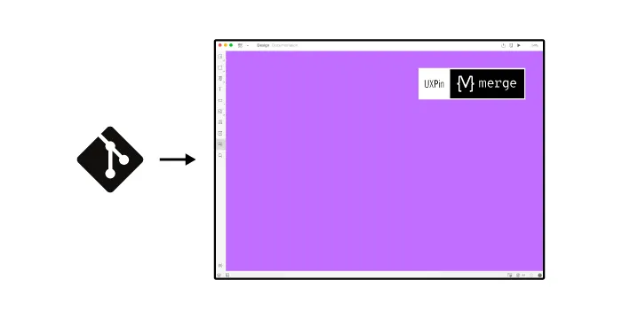
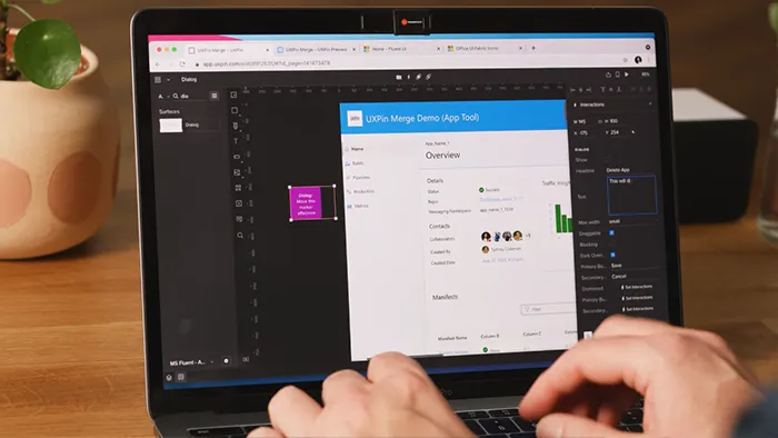
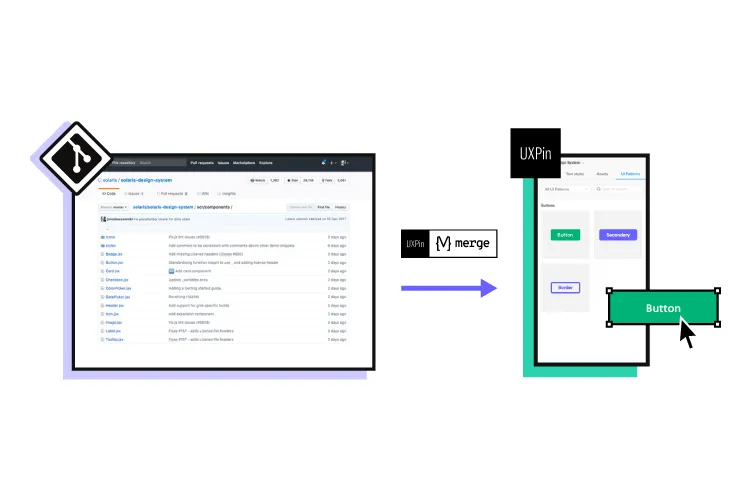
With UXPin Merge, we’re able to put our Microsoft Fluent Design System into a Github repo and import the components into UXPin’s design editor. Using this UXPin Merge setup, our product teams can design prototypes that leverage the exact components and UI controls our engineers use to develop these DevOps tools.
For example, a button on the canvas in UXPin’s editor renders exactly the same as it does in our developer tools, including hover/click effects, font styles, and other metrics. Designing with UXPin Merge brings significantly higher fidelity to our prototypes than we’ve ever had at PayPal.
With Merge
We knew we were going to save significant time designing with UXPin Merge during the initial rollout.
Some of PayPal’s senior management asked us to do a time-saving comparison between using UXPin Merge and a traditional design model.
So, I had one of my designers pick a one-page design comparison test. We did a one-page vector-based design with another design tool we use at PayPal. And then the exact same prototype in UXPin using our Merge component library. How would these two tools compare against the clock?
The results: Using Merge our designer took around eight minutes while using the other design tool the same prototype took over an hour! It’s important to note that this was from an experienced designer familiar and competent with the tool we chose as a comparison.
We didn’t feel comfortable providing product teams with this vector-based design tool. They would have to maintain documentation and educate themselves about how to use the tool before they could even start designing! Even with that training (which would take a lot of time), they wouldn’t reach the competency of an experienced designer or design the same prototype in an hour.
With UXPin Merge, some of our product managers can build similar one-page prototypes in eight to ten minutes—the same time it takes our experienced designers in UXPin!
Before, with our limited resources and designers, a one-page product would take two or three months just to design mockups. Now product teams can design and deliver a product within the same time frame.
Impact of using UXPin Merge
One of the significant impacts of UXPin Merge is our ability to create higher fidelity prototypes. There’s a lot more confidence from everyone (including designers, C-suite, directors, and developers) about what the final product will look like, the user experience, and interactivity—giving us higher quality feedback from stakeholders.
The C-suite people and the directors are able to give us stronger feedback about the ultimate direction because they experience the features and goals of these prototypes rather than just commenting about how, how these boxes don’t look like a text field, for example.
Now that we’re using UXPin with Merge my design philosophy and productivity have gone way up! I’m confident that I can implement a prototype in 30 minutes or less. Whereas with the tools I was using previously, it would take me half a day.
Feedback: Our stakeholders are able to provide feedback pretty quickly using UXPin. We can send them a link to play with the prototype in their own time and UXPin allows them to provide comments directly on the prototypes. UXPin’s comments functionality is great because we can follow along and mark comments as resolved once we address them.
Quality of the product: With this new UXPin approach we’re seeing a more collaborative, integrative design process. Rather than separating design, prototyping, and development, UXPin allows us to create an integrated flow where we engage engineering and product teams throughout the process. As a result, the product’s final quality has improved dramatically.
User testing: It’s been so helpful for us to have these high-fidelity prototypes built with UXPin. We build high-fidelity prototypes much quicker, and we get immediate feedback after the session. If there’s something we can fix immediately, we make that change before the next participant and get feedback much faster than before.
UXPin gives you the tools to go from concept to high-fidelity prototyping right away! Explore UXPin Merge and discover how advanced prototyping and testing will change your design process.

PayPal’s redefined design process
PayPal’s DesignOps is an end-to-end process.
- Product teams must fully understand their users
- Design products based on the users’ needs
- Enable domain experts to complete designs based on their knowledge and testing
- Validate the design’s success
A common internal issue is that product teams often see UX design as a bottleneck. So, our strategy was to start with removing that bottleneck and enabling the product teams to do the design on their own.
We achieved this with UXPin Merge which enabled us to perform this “snap-together” type design. We provide product teams with components they can drag and drop to build user interfaces.
Product teams were able to create layouts with fixed margins and components so everything looked and worked the way it was supposed to. Designers didn’t have to police anything or step in to design products.
Designers still help product teams when they’re not following standard design principles or when they’re stuck on challenging problems. But product teams are able to complete 90% of the work on their own, freeing designers to focus on bigger picture design problems.
Outcomes
Customer-focused
In my opinion, being customer-focused or design-driven doesn’t mean that designers are always leading. Everyone in the organization understands what it means to be design-driven.
When we do design at PayPal, it’s not focused on one little problem here or edge case there. We’re focused on solving problems at a global level, across the entire organization, and across the entire product line.
We must provide a cohesive and consistent experience to our users across all PayPal’s products, not just little corner cases.
While PayPal’s product teams and domain experts are doing design, our UX team acts as a mentor or coach. Where a UX designer used to work with a single product or maybe a single domain, with Design Ops 2.0 our product designers now work across 10 to 15 different products at a time.
Education in an enterprise
When our UX designers mentor our product teams, they’re not only giving them guidance on how to design better layouts or products, they’re also teaching design thinking.
Design thinking is not just about the UI design, but rather thinking about the complete user experience. How do API response times impact the user experience? How does latency impact the user experience?
We want design thinking from top-level UI all the way down. We want everybody to understand their impact on the user experience so that our product teams can make good decisions for their end-user.
Focus on what matters
My design team spends 50% of their time supporting various product teams and the other 50% is spent on larger UX initiatives that impact the organization globally.
Some of these UX initiatives include:
- Do we focus on things like how do we build trust between users on a platform?
- How do we build an intrinsic attachment between users on a platform?
- How do we build user research into all of our products, so we’re not running studies, but rather understanding how users use our products, where the gaps are, how we fix them, and how do we provide that data back to our product teams?
Future investment
Scaling your design process is an investment that pays off in the long run. It takes a savvy team to look at the overall design and development life cycle, what that looks like today, and try to figure out how we are going to shorten it, rather than stating, “this step is too long.”
While the initial process of building all of the technology seems like a long time, it’ll actually save you significant time in the long run—for your entire development, design, and development process.
UXPin Merge and your design process
If UXPin Merge managed to solve a complex design issue for one of the world’s biggest digital financial platforms, imagine what it could do for your business!
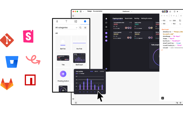
PayPal used Merge to sync React components from a Git repository with UXPin but Merge also integrates with Storybook, giving you access to many more frameworks—like Vue, Angular, and many more.
Ready to increase the velocity in your design process?
