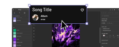
Powerful Microinteractions to Improve Your Prototypes

Well-designed microinteractions enhance the user experience by providing reinforcement and feedback. Without microinteractions, user interfaces would be dull and lifeless.
Like it or not, digital products play on human psychology. When you see the flashing “typing…” in chat or social media apps, you want to stick around to see what the person’s going to say.
These microinteractions keep users engaged, so they’re more likely to continue using the product, make a purchase, or share a positive brand experience.
Microinteractions can also distract or impede the user from completing user flows, resulting in a negative experience.
Finding the right balance comes down to UX teams testing high-fidelity prototypes with end-users through usability studies and feedback from stakeholders.
If you want to speed up the process of adding interactions, use UXPin Merge to have UX designers create high-fidelity prototypes using fully interactive components from a Git repository or Storybook. By using code-based prototypes, UX teams can test the exact microinteractions used in the final product. Get started with a free trial to experience advanced prototyping with UXPin today!
What Are Microinteractions?
Microinteractions provide feedback based on triggers from the system (system-initiated triggers) or end-user (user-initiated triggers). This feedback helps users know when a task is completed or alerts them when action is required.
Microinteractions work in trigger-feedback pairs. First the trigger, then the feedback in acknowledgment:
- Trigger: user action or system state change
- Feedback: visual, audio, haptic changes to the user interface
An excellent example of a microinteraction we mindlessly use every day is swiping away preview notifications. If you receive a notification while using your mobile, you often swipe it, and the notification popup slides off the screen.
In the above example, we can define the microinteraction trigger-feedback as:
- Trigger: user swipes the notification popup
- Feedback: notification slides off the screen
The notification appearing in a popup is also a microinteraction.
- Trigger: system receives a notification
- Feedback: notification popup animation
The notification popup is a fantastic example of a microinteraction serving more than one purpose:
- Helpful: notifies the user of a new message
- Marketing: encourages the user to use the product that sent the notification
The Four Stages of Microinteractions
To the user, microinteractions happen as trigger-feedback. But as product design teams and engineers know, there’s more happening behind the scenes.
There are four stages or parts of a microinteraction:
- Trigger: user action or system state change
- Conditions: system rules that define what microinteraction is triggered
- Feedback: visual, audio, haptic changes to the user interface
- Loops & Modes: those are the meta-rules of the microinteraction and determine what happens once the microinteraction is complete—state or UI changes (modes) and how long it will last (loops)
UXPin provides UX designers with various user-initiated triggers, including click/tap, mouse actions, and gestures. You can also set “if-then” conditions for the prototype’s next actions (including microinteractions)—similar to running a Javascript function.
Try it for yourself. Sign up for a free UXPin trial to play with the world’s most advanced prototyping tool.
Why Are Microinteractions Important?
Microinteractions allow a brand to communicate with the user—providing clarity, validation, brand engagement, and more.
Provide Clarity & System Feedback
For example, when you pull down on your Instagram feed (or most apps), a loading animation appears at the top to indicate that the system is working to refresh the feed.
Without that microinteraction, the user wouldn’t know if the system had A, complied with their action, or B, completed the task.
Take Action
Microinteractions also help guide users to take action. The most common of which is a call to action, such as the “add to cart” microinteraction that we see in eCommerce.
When a shopper adds a product to their cart, the cart icon jiggles or changes color in the header. In some cases, the cart might slide in from the side of the screen—prompting the user to checkout.
Branding
Microinteractions also enhance the brand experience. Those small moments provide the user with positive reinforcement or they are a fun animation.
A great use case for this is DuckDuckGo’s app experience. If you’ve ever used DuckDuckGo’s app, when you click Clear All Tabs And Data, a flame appears to indicate that the browser has erased your browsing history.
This microinteraction affirms DuckDuckGo’s commitment to providing users with browsing privacy and blocking tracking cookies.
More Examples of the Importance of Microinteractions
- Improve navigation and user flows
- Provide prompts and direction—especially during the onboarding stage
- Indicate or prevent user errors—a red highlight around a required incomplete form field
- Encourage engagement and sharing
Types of Microinteractions
The possibilities are endless when it comes to microinteractions. UX designers often have fun showcasing their creativity while designing microinteractions.
These are some of the most common examples of microinteractions and how they enhance the user experience.
Mouse Hover Effects
Mouse hover effects are some of the most common microinteractions for desktop users. These microinteractions can provide clarity through tooltips or change the cursor to indicate a clickable element.
Hover microinteractions can also initiate or stop image carousels or preview a video, so the user can “browse” across the screen before deciding where they want to click.
Click/Tap Effects
Most interactions occur when a user clicks or taps an element on the screen. There are endless microinteractions and possibilities for click/tap interactions, but most of the time, they provide a way to navigate through a product or website.
Click/tap actions might trigger a microinteraction on the element, like a button press effect, triggering a page slide transition to show the user they’ve navigated to another screen—typical microinteractions for an eCommerce checkout flow.
Tap/Click and Hold Effects
Tap and hold microinteractions are fantastic alternatives to dropdown menus, especially for mobile devices with limited screen space. Users can tap and hold an element to get more options—usually activating a popup with some sort of microinteraction.
A perfect example is Facebook’s like button. On desktop, you can hover over the like button for more post reactions. You don’t have a mouse cursor on mobile, so you must tap and hold the thumbs up button to get the same functionality.
Haptic Feedback
Apart from visual feedback that we discussed, mobile apps and gaming controllers feature haptic feedback—vibrations that correspond to a user or system action.
Games often use haptic feedback for action sequences, like when you’re getting shot or punched. These vibrations create an immersive experience where the user hears, sees, and feels what’s happening on screen.
If you use thumbprint biometrics on your smartphone, you’ll feel a slight vibration under your thumb if the authentication fails. This haptic microinteraction lets you know that you must reposition your thumb and try again.
Data Input & Progress Microinteractions
Microinteractions are highly effective for data input and progress. Often when you create a new password, a progress bar will appear starting from “weak” and progressing to “strong” or “very strong” as you go.
The Signup or Confirm button might also remain shaded dark/unclickable and illuminate once you have created a strong enough password to proceed.
Progress bars at the top of a flow can tell users how far they still have to go to the confirmation page. The bar might animate or change a different shade as they progress to encourage completion.
Swipe/Slide Microinteractions
UX designers often use slide microinteractions, such as scroll bar, to indicate movement or navigation. These microinteractions are most effective on mobile but also work well on desktop screens for image carousels, sales funnels, and checkout flows.
On mobile devices, swiping can replace tapping for smoother, faster navigation. Slide microinteractions work well with swipes because they correspond to the action.
An excellent example of slide microinteractions is the swipe left or right on dating apps. As the user swipes, the potential match slides off-screen. If it’s a match, the app rewards the user with “It’s a Match” microinteraction and a button or link to start chatting.
System Feedback
Microinteractions play a crucial role in communicating system feedback to the user. Spinning loading icons are the most common system microinteractions. These microinteractions let the user know to wait while the app or website is loading.
Without the spinning icon, the user might think the app has crashed, or they might keep clicking or tapping, resulting in multiple server requests.
Message notifications are also great examples of system feedback. The app receives a new message (from another user) and alerts you to open the app.
Effective Microinteractions Enhance UX
We’ve demonstrated the importance of microinteractions and how to use them to enhance the user experience. Like anything, less is more. Don’t overuse microinteractions or create long, unnecessary animations that slow user progress or derail users’ attention.
UX designers must use feedback from usability studies to determine where users might need microinteractions to help with navigation or if they’re missing vital instructions—like creating a strong password.
Creating Microinteractions for Your UXPin Prototypes
UXPin provides UX designers with Triggers, Conditions, and Interactions to create immersive user experiences for their high-fidelity prototypes.
You can also create variables to personalize microinteractions. For example, capturing a user’s name from a signup form to personalize a welcome animation when the user signs in successfully.
You can also activate page transitions, show/hide elements, toggle, set state, create an API request, and much more. UXPin provides the tools and flexibility for UX teams to exercise their creativity by building fully functioning high-fidelity prototypes.
Get started designing your next prototype with UXPin. We offer a 14-day free trial to let you experience the power of prototyping with the world’s most advanced code-based design tool.


