A 10-Minute Rapid UX Prototyping Lesson
Regardless of what tool you use to create your prototype, you need to understand what to include and what to leave out.
In this post, we’ll explain the two main components of all lo-fi prototypes, then start practicing.
Interactions
What interactions will you be showcasing in your prototype?
Each interaction includes a trigger (i.e. “What triggers the action?”) and an action (i.e. “What actually happens?”). A trigger can be a tap, click, hover, swipe, key press, page-load, etc; whereas, actions can include show element, hide element, go to page/URL, scroll, disable/enable, check/uncheck, etc.
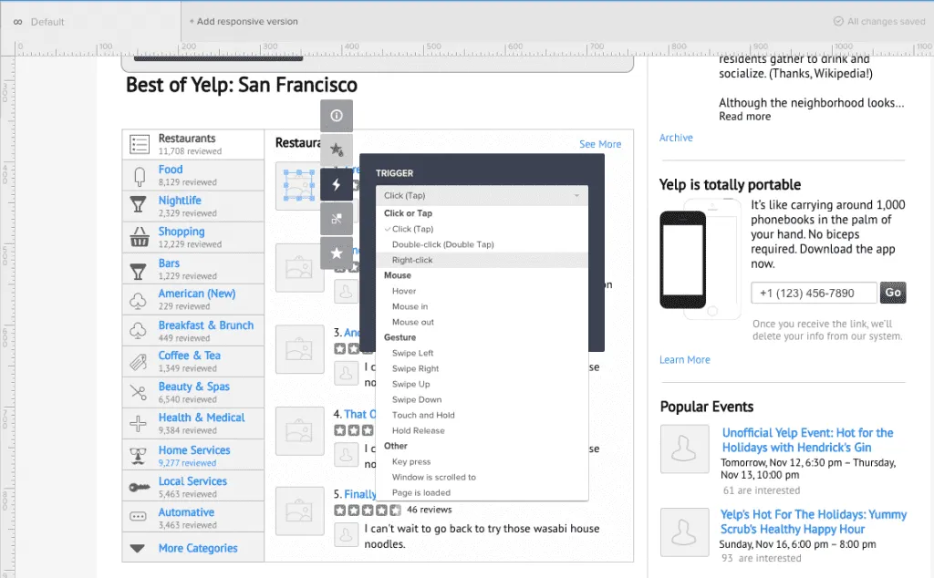
Photo credit: UXPin
Flow
What are your user flows?
If you have an idea of which personas will be testing the prototype, think about what happens before and after a user is on a particular page. As first described in Interaction Design Best Practices, you can link up your pages and create as many flows as you need to, especially if you have several personas.
For example, for an application that does reporting and analytics, you may have one flow for the Executive who will be reading the reports and an entirely separate flow for the Business Analyst who will be building the reports. The experience is vastly different for those personas, so think about how they will be interacting with your prototype.
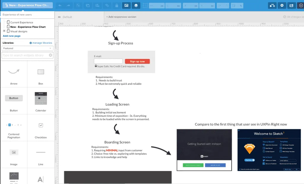
Photo credit: UXPin
Practicing the UX Trade
Now let’s dive into my tool of choice to get started.
UXPin offers some excellent tools for building low-fidelity prototypes, including responsive breakpoints that can help you simulate site behavior in different screen resolutions, setting up interactions between UI elements and pages, creating multiple element states, and more.
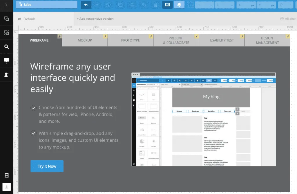
In this hands-on example, we’ll create a multi-state prototype to simulate the interactions a user has with a tabbed container. Each tab contains a different value proposition, which is a combination of feature benefits and imagery.
If you haven’t already, go ahead and create a free UXPin account so you can follow along. The live preview of the project is available here, so feel free to open the project for quick reference.
Step 1: Create low-fidelity wireframe in UXPin
Using UXPin’s wireframing tools, we created a low-fidelity wireframe with the following elements:
- Boxes
- Text Elements
- Icons
- Image Placeholder
- Button
Step 2: Create multiple states for the tab group
To create a prototype that allows us to interact with the tabs on-screen, we need to create multiple states for the tab group. Below, we selected all 6 tabs, right-clicked the selected elements and choose Grouping > Multistate.

Then, we selected the newly formed multistate tab group and clicked the States icon (![]() ). Here, you will see six states shown: each state represents one of the tabs being selected (and the others de-selected).
). Here, you will see six states shown: each state represents one of the tabs being selected (and the others de-selected).
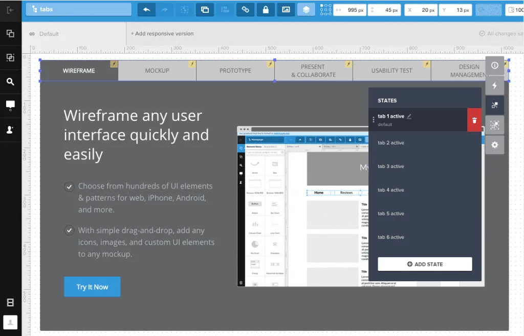
The state of the second tab when activated is shown below.

We proceeded to do this for all 6 tabs.
Step 3: Create multiple states for the content inside the container (content and image)
Following the same process as we did for the tab group, we selected all the content inside the container, right-clicked the selected elements, and choose Grouping > Multistate.
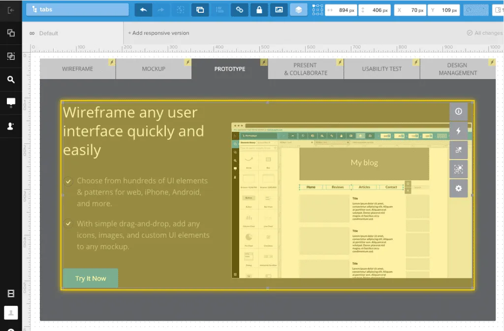
Then, we selected the newly formed multistate content group and clicked the States icon (). Again, you will see six states shown: each state represents the content changing when a different tab is selected.
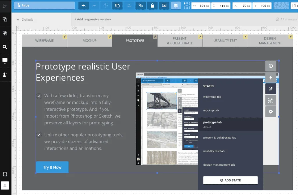
We proceeded to do this for all 6 tabs / content areas.
Step 4: Add the interactions of clicking tabs.
Lastly, we added the interactions of clicking the tabs by selecting a tab and clicking Interactions (). Each tab has two interactions:
- On Click action, set the state of the tab to the selected state.
- On Click action, set the state of the content container to the content matching the tab.
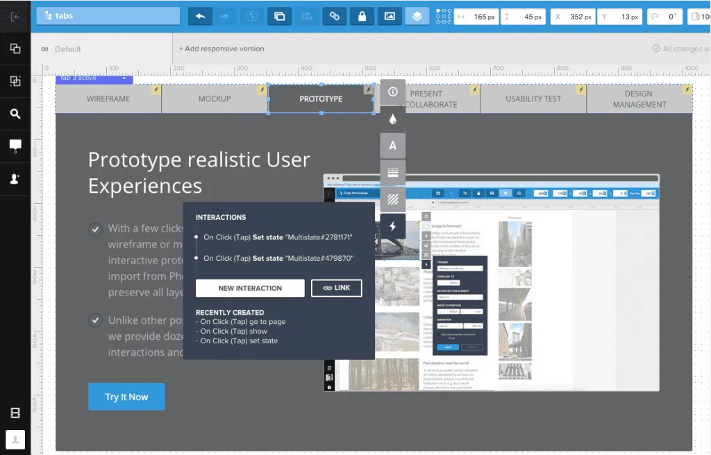
Not that we’re done with that, we can preview our clickable, low-fidelity prototype by selecting the Simulate Design button in the upper right-hand corner of the screen.
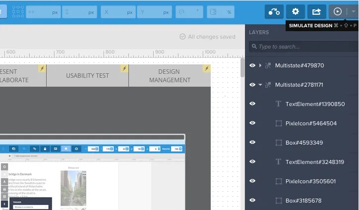
And voila! Our new prototype!
Now that we have our low-fi prototype (i.e. interactive wireframe), we can iterate, iterate, iterate on our prototype to put our best digital MVP out there.
Next Steps
To learn more prototyping techniques and other UX best practices, I recommend checking out the following guides:
You can also practice your prototyping techniques in UXPin with a free trial.


