How to Create a Wireframe? Step-by-Step Guide + Examples

Wireframing is a crucial part of the design process, where designers typically complete most of the work, including information architecture, layout, structure, identifying key navigational elements, and screen transitions.
The more work designers complete during wireframing, the less they do during the mockup and high-fidelity prototyping phases, thus streamlining the design process.
UXPin features built-in UI design elements, including forms, shapes, icons, and dummy content, for designers to create wireframes from scratch in minutes. Sign up for a free trial to design your first interactive wireframe with UXPin.
What is Wireframing in UX Design?
A wireframe is the structure of a digital product or website. Wireframes are composed of shapes (circles, squares, rectangles, triangles, etc.) to represent UI elements and lines for text–except for critical copy like call-to-actions (CTAs), headers, pricing, or instructions.
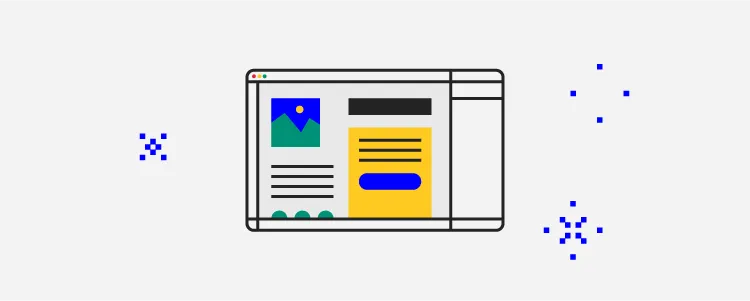
Wireframes must answer four critical UI design questions:
- What UI components and content do we need to achieve business goals and user needs?
- How will we arrange and prioritize content?
- What is the screen layout?
- What are the key navigational elements and CTAs?
Wireframing is the process of iterating over many design ideas using wireframe UIs. These rudimentary designs make it easy for designers to identify and fix fundamental user experience issues before they commit to mockups and high-fidelity prototyping–which require significantly more time and resources to change.
What is the difference between a wireframe and a mockup?
Wireframes generally contain no color, fonts, graphics, or other visual design elements and are therefore referred to as low-fidelity designs. Mockups are high-fidelity designs that provide an accurate graphical representation (or screenshot) of a final user interface.
Why do Designers Create a Wireframe?
Wireframing is integral to the design process because it forces designers to zoom in on what users need without being distracted by picking the right colors, typography, images, and other content.
The wireframing phase can significantly reduce product’s time-to-market and avoid costly design mistakes. Designers can use it to test their design idea and communicate it to stakeholders without committing to colors, fonts, or copy, thus making fewer design decisions at the start of the project.
Information architecture and navigation
Wireframing is also crucial for a digital product’s navigation and information architecture. Designers can solidify these decisions before creating high-fidelity mockups.
Imagine designing a high-fidelity, 10-step user flow only to discover you can do it with six. That’s four steps of wasted resources, which could mean missing a deadline or going over budget.
Sharing ideas
Designers use wireframes to share ideas and gather feedback from team members and stakeholders. They explore various layouts and move elements around to determine the best outcome for user experience and business goals. For example, designers might collaborate with the marketing team to find space above the fold for a specific CTA.
How to Create a Wireframe
What do you need to create a wireframe?
You’ll need several key UX artifacts when designing a wireframe, including:
- User persona: defines the user group you’re designing for
- User journey map: a high-level visualization of how your persona interacts with a digital product
- Sitemap or information architecture (for existing products): a visual representation of a product’s screens and how they connect
- Business goals: the elements or features required by the organization (banners, forms, CTAs, etc.)

Only start sketching once you have synthesized your research and defined user needs and business goals.
These documents will guide the design process and tell you what features, elements, assets, and content you’ll need in your designs. More importantly, it’ll tell you what you don’t need.
Define your user flow
A user flow is a high-level flow diagram (flow chart) with shapes and lines. Each shape represents a screen or decision, while the lines show the user’s progress and direction through a sequence–like completing a signup process for a mobile app.
Teams often use a whiteboard and sticky notes (digital or physical) to visualize a user flow and define each step. They move the sticky notes around, trying different possibilities while considering different scenarios–for example, there may be more than one entry point to a user flow.
This process aims to have a clearly defined map of how users will navigate your user flow, the screens needed, and the decisions users must make at each step.
Do paper sketches
Once you have a user flow, you can create wireframes. Designers typically start wireframing with a pen and paper. This method offers three benefits:
- It’s faster and cheaper than using a design tool
- Sketching is more collaborative
- Allows designers to focus on the problem without distractions
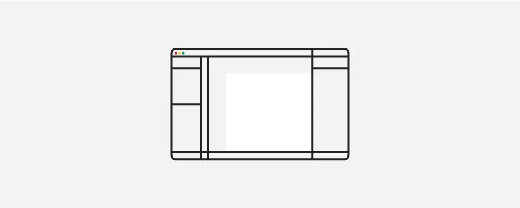
While there are some best practices for sketching wireframes, the aim is to test as many design ideas as possible. Sketching is probably the most creative part of the design process, where designers are encouraged to think out of the box–there’s even a UX ideation method called “worst possible idea.”
Crazy 8s is a popular paper wireframing method for exploring many ideas to achieve the same outcome–for example, eight ways to design a signup screen. Designers have eight minutes to sketch eight variations of a single screen and choose the best option to iterate.
By the end of the sketching process, you should have a layout with placeholders for content and features for each screen. If you’re designing a cross-platform product or responsive website, you’ll need a version for each screen size–i.e., mobile, tablet, desktop.
Try to complete as much as possible during the sketching process. The more you do during sketching, the faster the rest of the design process will go.
Create digital wireframes
Copy your paper wireframes to a design tool and recreate it in a digital design tool for product prototyping like UXPin.
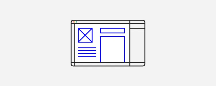
Designers look at spacing, sizing, and alignment to ensure wireframes are consistent and visually appealing. They may add copy like CTAs and headlines to provide more clarity and context.
Low-fidelity prototyping & testing
Low-fidelity prototyping allows designers to test user flows, ensure they have the correct navigational elements and solve foundational usability issues.
They present these prototypes to stakeholders for feedback and may do a few iterations until they’re satisfied the designs adequately solve user needs and meet business goals.
Once designers complete this wireframing process, they move on to UI mockups and high-fidelity prototyping.
UXPin – The Most Advanced Prototyping Tool
UXPin provides designers with everything they need to start prototyping immediately. Unlike other design tools which require plugins and extensions, UXPin comes with out-of-the-box features to build wireframes and mockups.
User Flows
User Flows is one of UXPin’s built-in design libraries allowing designers to design flow diagrams and map information architecture. The User Flows library includes all the elements required to create flow diagrams, including actions, decisions, arrows, gestures, message icons, etc.
Team members can collaborate on user flows, trying different variations while commentating and annotating using UXPin Comments–perfect for remote design teams.
Built-in Elements
UXPin’s Elements library includes shapes, forms, icons, and text to create wireframes fast. Unlike image-based design tools, UXPin’s form elements are fully functional, allowing designers to create interactive wireframes with minimal effort.
UXPin’s interactive form elements include:
- Text input
- Button
- Select
- Checkbox
- Radio button
UXPin also provides a Content and Data feature to populate elements with accurate dummy data like names, addresses, dates, eCommerce products, and more–no more lorem ipsum.
Simplified wireframing tool
UXPin provides designers with multiple canvas sizes for desktop, tablet, mobile, and wearables. Instead of drawing wireframe elements from scratch, designers select them from the Quick Tools menu to create layouts.
Designers can create a wireframe design system in UXPin, including components and wireframe templates, and share it with team members, saving valuable time and resources for future projects.
Interactive low-fidelity wireframe prototyping
Designers generally leave interactivity to the high-fidelity prototyping phase, but with UXPin’s interactive components, they can complete more advanced experiments during wireframing–for example, capturing a user’s name and email using UXPin’s text inputs or testing a checkbox for a consent form.
Leveraging built-in design libraries
With UXPin’s built-in design libraries (iOS, Material Design, Bootstrap, and Foundation), designers can go from wireframes to high-fidelity mockups and prototypes effortlessly.
These built-in libraries enable designers to test and iterate on ideas, including interactions, before committing to the time-consuming task of converting wireframes.
High-fidelity prototyping
UXPin is powered by code, enabling designers to add interactivity and functionality that other design tools can’t. These powerful features extend the prototyping scope so designers can solve more problems and identify more business opportunities during the design process.
- States: Create multiple state variants, each with different properties and interactions for a single component.
- Variables: Capture user input data and use it to create personalized, dynamic user experiences.
- Expressions: Javascript-like functions to create complex components and advanced functionality–no code required!
- Conditional Interactions: Set if-then and if-else conditions based on user interactions to create dynamic prototypes with multiple outcomes to replicate the final product experience accurately.
Enhance your wireframing and prototyping capabilities with the world’s most advanced product design tool. Sign up for a free trial to explore UXPin’s features and start designing better user experiences for your customers.


