16 Inspiring Examples of UX Design Portfolios That You Just Must See

Creating a portfolio is a crucial first step for any UX designer. It’s where you showcase your best work and let your skills, as well as your personality, shine through.
Recruiters and potential clients will all want to see your portfolio website before hiring you. This is true whether you’re new to the field, or a senior looking for your next step.
The work you present in your portfolio will ultimately determine how employers and clients view you, and whether they’ll consider you for the job. But when it comes to UX design, it’s not just about what you present, but how. Your website is, in fact, a part of your work.
Create prototypes that stakeholders, developers, or test subjects can click through. Use UXPin and create interactive prototypes with advanced features like variables, expressions, states or conditional logic. Try UXPin for free.
Alex Lakas
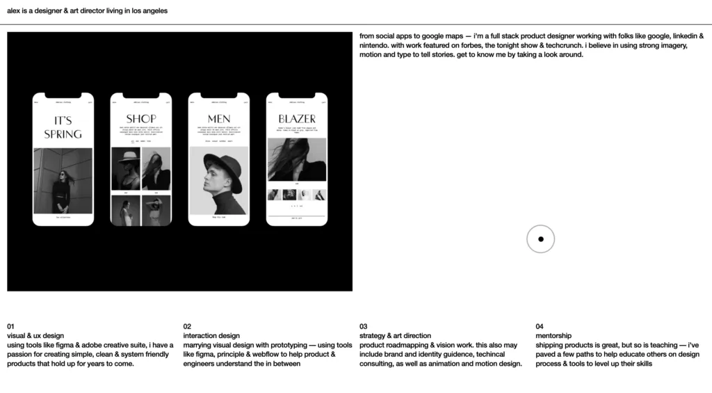
Alex Lakas is a UX designer with over a decade of experience working on products everyone uses. He took part in rejuvenating LinkedIn’s feed and gave Google Maps search pages the modern look they have today.
Lakas makes his caliber clear the moment you arrive, with a one-line bio that presents his experience.
A short scroll-down and you’ll find a short but precise list of clients, most of whom are major household names. This isn’t just name-dropping, it’s an important part of any experienced designer’s portfolio. Piquing your visitors’ interest right away with something familiar is the best way to motivate them to check out your work.
While boasting impressive credentials, the website doesn’t rely on that alone. After a few short lines, you’re met with the most important part of any UX portfolio – case studies. Lakas’ case studies present the thought process behind some of his most well-known work, in a clear-cut, easily digestible fashion.
Complete with a slick design that mirrors his UX work, Alex Lakas’ portfolio website is a great example of what any designer should strive for.
Olivia Truong
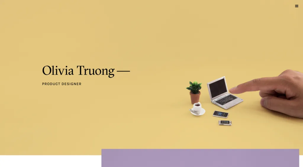
Olivia Truong is a product designer. She makes that clear the moment you enter her portfolio, in a simplistic fashion that runs through her website, as well as her work.
Truong’s UX portfolio doesn’t offer quotes or credentials. It simply displays four of her projects, in a beautifully designed, minimalistic presentation. The way she presents them, by raising questions such as “how do I manage my events onsite?”, is exactly the thought process a UX designer should have. She asks a question, referring to a common problem, and offers a solution in her case study. In this case, she presents Ticket Manager, an app developed to manage event ticket sales.
The case study is a perfect example of how UX case studies should be. She walks us through the problem she set out to solve, presents her research, and details her design process with a lot of imagery.
Olivia Truong’s portfolio pinpoints what a UX designer should present. It’s a great inspiration for designers just starting out, as it does nothing but highlight her process. If you have even one complete project, this is how to present it.
Ed Chao
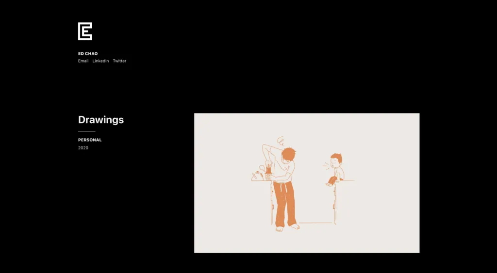
Ed Chao is most well-known for his work with Dropbox. He’s designed their web interface, followed by their mobile app, and finally their desktop app UI.
What works best about Chao’s portfolio is the minimalizm. There are very few images and even less text. The few case studies he offers are short and don’t go into too much detail. However, what they do present is the key features and ideas behind his Dropbox UX design. This shows that Chao understands what’s important, and what can be cut out, a great trait for a UX designer.
One small, but important aspect that Ed Chao nails is the contact information. The first thing you’ll see when you arrive at his portfolio is links to his email, LinkedIn and Twitter. This is arguably one of the most important functions of a portfolio website, ensuring potential customers and recruiters can get in touch as easily as possible.
Jung Hoe
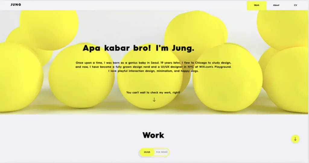
Jung Hoe is a UX/UI designer at Wix.com’s Playground. His portfolio website catches your attention immediately with a greeting that rapidly switches languages.
But what keeps visitors interested is the humor. With a backdrop of beautifully animated yellow blobs bouncing around, he presents himself as a “genius baby” transformed into a “fully grown design nerd”. The personality in these lines creates an immediate connection and willingness to discover more.
Scrolling down, it’s clear that this portfolio belongs to a talented and playful UX designer. As a visitor, you can flip a switch between UI/UX work and “Fun Work”. Both of which present a wide range of apps and products he’s designed. Clicking on any project will lead to a detailed case study that includes his research, thought process, and final, as well as scrapped designs.
Whether you choose to browse UX projects, or simply look at Hoe’s “Fun Work”, you’ll eventually reach an eye-catching call-to-action to “Make somethin’ fun together!” with a playful “Hit Me Up!” button leading to his email.
Jung Hoe’s portfolio is an example of how designers can showcase their personalities, as much as their work. But still, maintain a perfectly professional UX portfolio website.
Jamie Choi
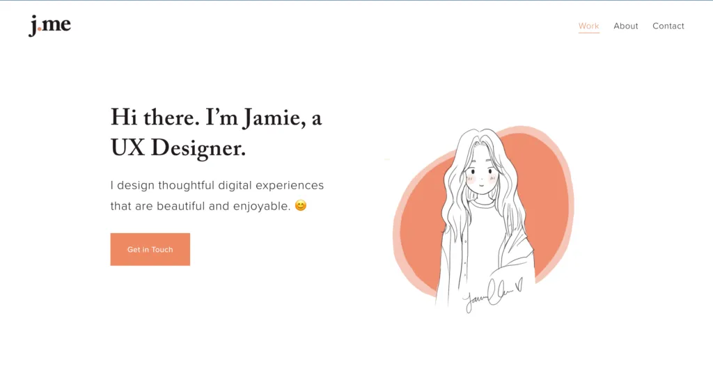
Jamie Choi’s website is another example of a great UX portfolio that does exactly what it sets out to achieve, and nothing more.
The simple illustration of Jamie herself, the autumn color palette, and the simplicity in which her projects are presented make scrolling down her website a soothing experience.
The case studies she offers, such as her work designing an online platform for a local bakery, are perfectly precise and detailed. She walks the reader through the challenge, research, analysis, work process, and ultimately design ideas. These case studies go into extreme detail, which is what any recruiter or client would want to see.
What completes Choi’s portfolio website is her about page. Like her case studies, this section includes all the detail it needs to keep you interested, while never being too overbearing.
Jamie Choi’s UX portfolio perfectly balances two of the most important things a portfolio website needs. It provides an in-depth look into her professional work process, while simultaneously creating a feeling of personal familiarity.
Liz Wells
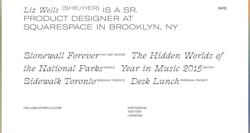
Liz Wells is a Brooklyn-based designer and senior product designer at Squarespace. Her UX portfolio site is stunningly trippy.
The homepage displays five case studies, with nothing but unique typography. You’re only met with an image when you hover over a project, an image which is then smeared across the page as you move your cursor.
What makes Wells’ portfolio truly impressive is her case studies. Her “Sidewalk Toronto” case study, for example, is summed up into a short video. If you wish to know more, you can scroll down to find a hand-drawn sketch of the site map, followed by a project description, as well as the UX challenges and solutions. The case study is accompanied by visuals that give life to her process.
Liz Wells’ UX portfolio leaves nothing to be desired, while perfectly presenting her personality as a designer.
Jeremy Stokes
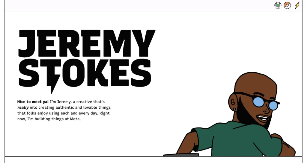
Jeremy Stokes is a product designer at Duolingo and a former UX design intern at Google. But what’s most special about his work is his passion project – Cultivate.
With Cultivate, Stokes sets out to design a new way of understanding mental health, specifically in the African American community. The project is laid out like any other case study, providing some background into the issue and detailing the process behind building and designing the platform’s concepts.
Another aspect that shines through Stokes’ portfolio is his ability to present himself. His About page is full of imagery and references to his favorite things – video games and cartoons. But he doesn’t settle for just a bio. His portfolio includes his stunning resume, which is as much a part of the portfolio as his case studies.
Jeremy Stokes’ UX portfolio walks a thin line between professional portfolio, and personal website, and does it excellently. Showing visitors your personality can make the difference between being considered for a job, or being forgotten among dozens of other UX designers.
Siriveena Nandam
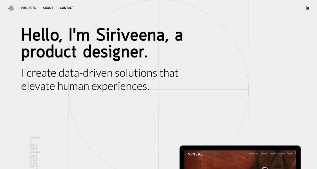
Siriveena Nandam is a UX designer with an analytical twist. With a background in psychology, Siriveena creates “data-driven solutions that elevate human experiences”, as her website states.
Her portfolio makes it clear that data is the key parameter that runs through her work. The design has a much more technical feel than many other UX portfolios.
As expected, scrolling down her site reveals several case studies. These are the highlights of Nandam’s portfolio, and they’re incredibly detailed.
“Our National Conversation”, a non-partisan news aggregator, is a perfect example of the type of issues Nandam tackles, and the case study includes everything a case study should. It provides a short summary, before diving into her research, analysis, wireframes, and UI designs, all with great detail, as expected from such a technical product designer.
Siriveena’s UX portfolio is an inspiring demonstration of how designers can take serious subjects and technical information and present them in an interesting way. The lack of playfulness doesn’t hinder the visitor’s experience at all and does a great job at differentiating her from the competition.
Eugenie Lee
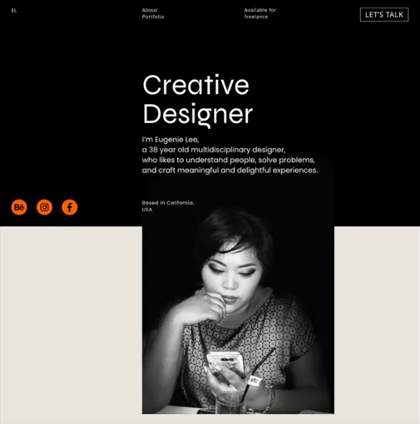
Eugenie Lee is a UX designer from California, USA. Her portfolio starts off with a short, to-the-point bio about herself. Notice how the above-the-fold section mentions that she is an inquisitive, problem-solving individual, i.e., has two essential UX designer skills. Right under her profile photo, she shares her philosophy. Namely, that there is a solution to every problem if you know how to ask the right questions.
In terms of the color palette, Eugenie chose bold colors like black and orange. These two, paired with various hues of grey, are used throughout the entire portfolio.
Right under the above-the-fold, Eugenie added tags for her skills. Among others, they feature popular prototyping and animation tools.
Scrolling down, there’s a lengthy section on the projects she has worked on. Each sheds light on the entire product design process. Eugenie mentions how she collected briefs, ran preliminary research, and engaged in prototyping. If you head over to her portfolio, you’ll see that she has worked on major projects like the Griffith Observatory and MSN News apps.
Without a doubt, Eugenie Lee’s UX design portfolio is a delight to go through both from an aesthetic and informational perspective. It’s a great example of how you can market yourself in front of prospective clients.
Zhenya Nagornaya
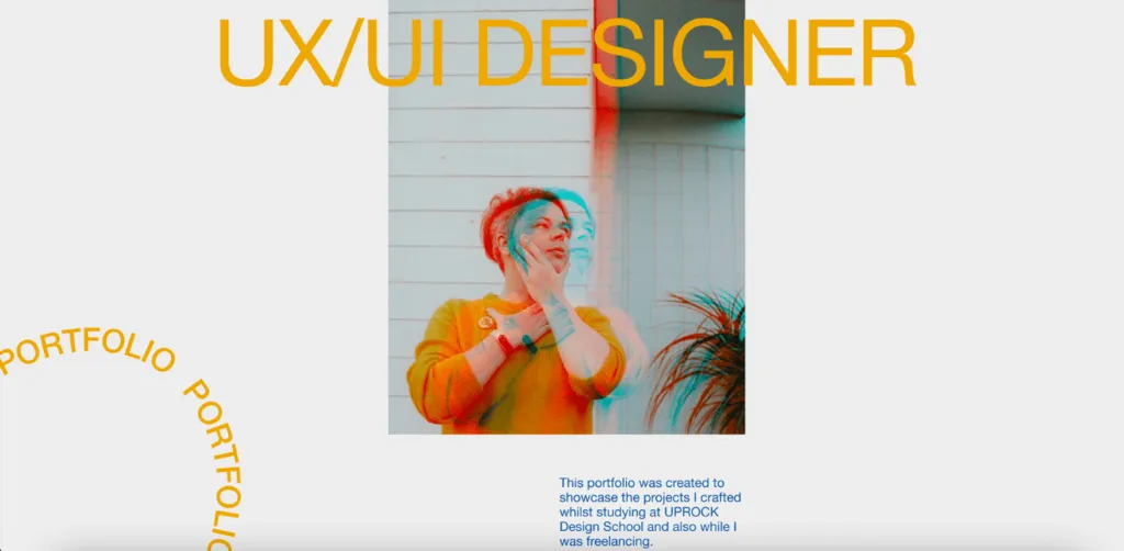
Zhenya Nagornaya is a junior UX/UI designer from Wellington, New Zealand. She recently completed her studies at Uprock Design School. Her portfolio showcases all of her freelance work taken up while studying.
Zhenya has worked on different types of projects, including online magazines, landing pages, and various corporate marketing collateral. These have been selected to show her versatility.
After sharing a few examples of her work, Zhenya moves on to a brief section about herself. Here, she mentions how she pivoted from being a front-end developer to a web designer. Her bio can be read as a cover letter to a potential employer – she’s aware that she doesn’t have much commercial experience, but is willing to learn.
Further down, there’s a section on skills that – on top of proficiency in UX design tools – include HTML, CSS, and Javascript.
If you’re fairly new to the UX design scene, then this portfolio will be a great source of inspiration.
Yael Levey
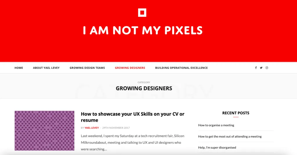
Yael Levey is a UX design leader based in London, UK. She has been in the design industry since 2009. Throughout the years, she’s climbed the UX career ladder from an intern role all the way through to becoming a Creative Director at BBC Weather and, currently, Product Design Manager at WhatsApp.
Yael Levey is a prime example of how UX designer portfolios evolve as you proceed to a leadership role. While her LinkedIn profile is filled with endorsements of her hands-on wireframing, user research, and information architecture skills, her online portfolio features leadership content. She synthesizes her past experiences and shares advice with those who want to progress in the UX design field.
That being said, unlike Yael’s website, her Dribble profile focuses on her work. So, you can see some of the projects she’s taken on throughout her career.
This profile is a perfect example of how you can become a thought leader in the industry. Not to mention, it goes to show that some UX design portfolios can also take on a written form.
Jared Bartman
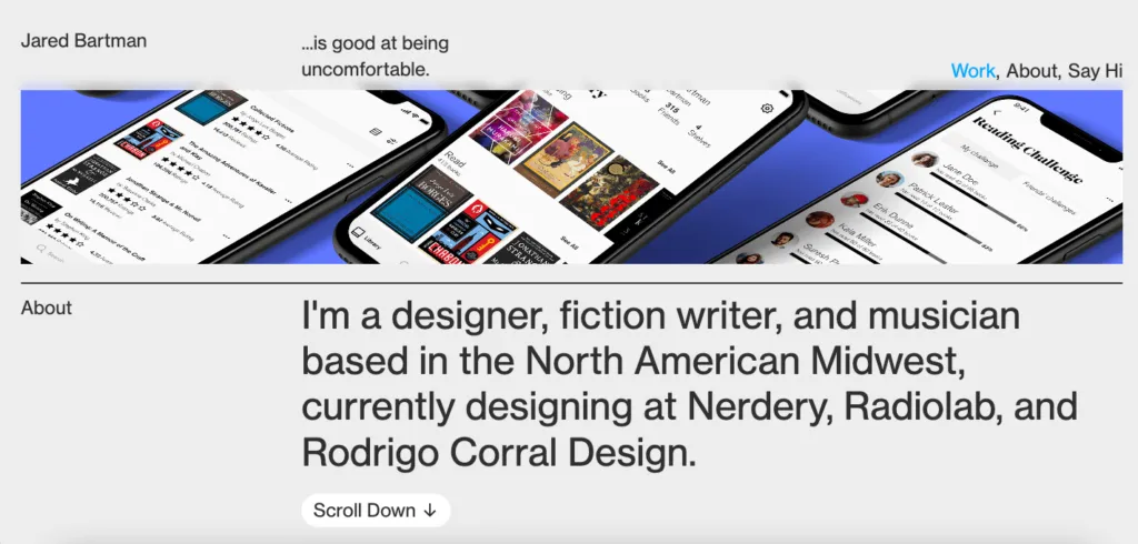
Jared Bartman is a designer, writer, and artist based in the USA. His website serves as a portfolio of the projects he’s worked on since 2021. These, among others, include designs for small businesses and globally-recognized enterprise companies like Nestle and the New York Times.
The website features an ‘About Me’ section where Jared talks about his hard skills and his approach to design. It also has a downloadable CV for those who prefer a formal, traditional work experience overview.
In each of the projects descriptions, Jared sheds light on:
- The project objectives, user challenges, and market opportunities
- The tools used throughout the project
- All the stages of the design process – from research to prototyping and user testing.
If you’re a multidisciplinary designer like Jared, then this portfolio is certainly worth inspiring yourself with.
Henry Dan
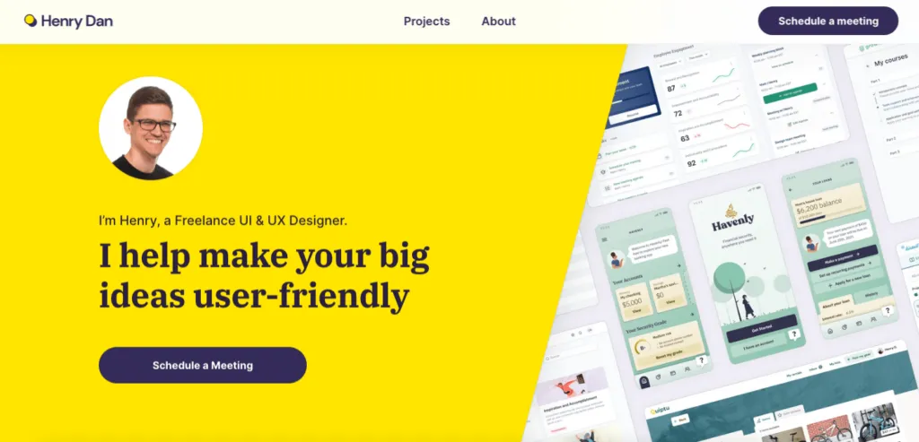
Henry Dan is a freelance UI/UX designer with more than seven years of experience in mobile, desktop, and web design.
Henry’s website is a well-rounded portfolio where he shares a short bio, a list of completed projects, and his design philosophy. What’s particularly noticeable is how bold and transparent Henry is about what it’s like working with him. On top of explaining the main stages of the design process (Understand, Explore, Prototype, and Deliver), he clearly mentions that UX design is a collaborative process. Meaning, that he requires the client’s honest input and ongoing communication to ensure successful delivery.
As you scroll down, right after an overview of completed projects, you’ll see a few testimonials from satisfied customers. This is a great way of telling potential clients that not only is he an experienced designer, but also a reliable, trustworthy partner.
Whether you’re a freelance UX designer like Henry or looking to find full-time work, this website portfolio is a perfect source of inspiration.
Stef Ivanov
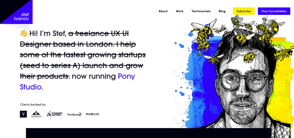
Stef Ivanov is a London-based UX and UI designer who has fifteen years of experience in design and branding. While he started off as a freelancer, he now works as the Founder of a design studio called Pony (a fact he makes blatantly clear on his personal site, as seen above).
His work has been nominated to Awwwards and featured on outlets like The Next Web and Tech Crunch.
Throughout his site, Stef uses a mix of blue and yellow, complemented with black font and white spacing. Right under the fold, he mentions his extensive UX leadership and design experience to legitimize himself in front of potential clients. He underlines that he’s as focused on design deliverables as he is on helping businesses reach their business goals.
What’s particularly great about this senior UX designer portfolio is that he helps potential clients quickly assess if he’s the right fit. How so? In the ‘Work’ section, on top of short project descriptions, he mentions that his “sweet spot” is taking on both UX and UI work for the same client. He’s also clear that he loves “tricky UX challenges” and enjoys every minute of helping businesses identify and fix what’s blocking their growth.
This is one of the most compelling work descriptions we’ve seen. If you’re clear on the types of projects and/or industries you’d like to work in, then this should be your number-one source of inspiration.
Kimberly Kim
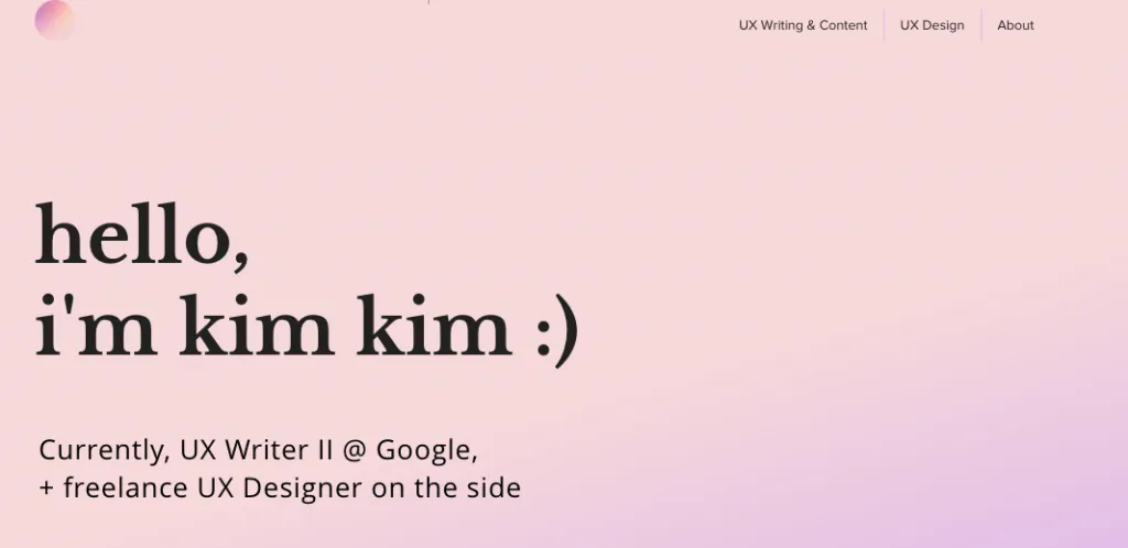
Kimberly Kim is a freelance UX designer and a full-time UX writer at Google. Her portfolio is a simple, yet highly-informative account of her work in both of these roles.
What made us choose it for this round-up is that it’s one of the best examples of a designer showing off their personality. Kimberly’s work colleagues say that she’s “somehow, both super chill & super passionate”. She explains that it’s because she takes work seriously, but not herself. This shines through each of the case studies and sections on her site.
Kimberly’s portfolio is divided into three sections – UX writing, UX design, and an ‘About Me’. When it comes to the first two, what’s great is that each project description starts with a bulleted list of problems she helped solve. This makes it easy for potential clients and employers to see if they’re facing a similar challenge.
The bio page, meanwhile, is the rare kind – equally entertaining, laid-back, and professional. Kimberly mentions the types of projects she can help with and that she prefers informal communication with clients. This helps pre-qualify any potential future customer and boosts the chances of fruitful cooperation.
Fabricio Teixeira
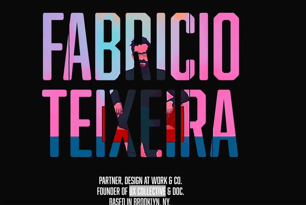
Fabricio Teixeira is a design partner at Work & Co. In the UX community, he’s known as the founder of the UX Collective, the largest design publication on Medium. Fabricio’s UX career spans more than two decades. During this time, he’s worked with multiple tech companies, including Google, Samsung, and Mailchimp.
For his website, Fabricio bet on a one-pager, which starts off with a short bio written by none else (or, rather, nothing else) but ChatGPT. What follows is a list of recent engagements, where he appeared as a lecturer, jury member, or speaker.
As you scroll further down, you’ll see an overview of the awards he received, companies he worked at full-time, and articles he wrote. What separates this UX design portfolio from most is that there aren’t any lengthy project descriptions or mission statements. Instead, Fabricio links to external sites and his social media accounts, treating his site as more of a content hub.
If you, just like Fabricio, would like to link to examples of your work spread across multiple outlets, then this portfolio might just be the perfect example.
Design Your UX Portfolio With UXPin
If you want to design your UX portfolio, why not sign up for a 14-day free trial? By the end, you’ll have another design tool to add to your portfolio!


