Tradeoff Between Time and Robust Prototypes? You Can Have Both!
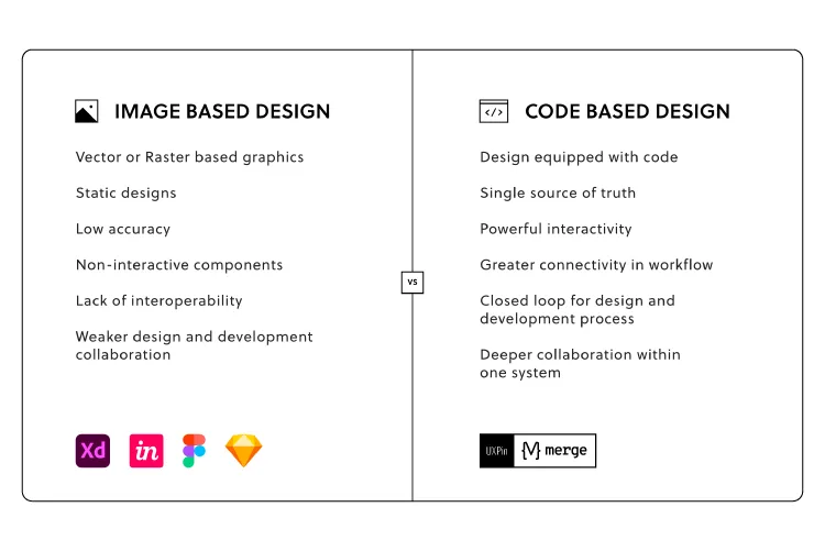
Prototyping is challenging for designers using image-based design tools. These static mockups and prototypes never achieve the fidelity and functionality required to get accurate feedback from testing and stakeholders.
Designers often have to use several tools throughout the design process; one for design, one for prototyping, and another for testing. This workflow is not only disruptive but expensive as companies pay subscription fees for multiple tools and paid plugins to integrate this complicated workflow.
We will demonstrate how code-based tools can simplify your team’s UX workflow, reduce your reliance on extra tools and plugins, significantly enhance prototyping and testing, improve collaboration, and streamline the design handoff process.
Enrich your end-to-end design process with UXPin’s code-based design tool. Sign up for a free trial and start designing better user experiences for your customers.
The Challenge of Prototyping With UI Kits
One of the challenges with image-based design tools is that designers often have to start from scratch every time they start a new project. Even with a comprehensive design system, there’s only so much fidelity and functionality you can save in a static UI kit.
“Imagine this”–an all too familiar scenario…
You have to present your designs for a new onboarding flow to stakeholders, but your team didn’t have the time or resources to build a fully functioning prototype.
So, you connect a series of static artboards with some basic transitions and a few GIFs to demonstrate complex interactions and animations. The problem is that the prototype isn’t intuitive, and stakeholders battle to understand how it’s supposed to work.
You find yourself repeating, “ok, now imagine this…” as you guide stakeholders through your prototype. Stakeholders have to jump from static artboard to GIF to preview animations of what your prototype is supposed to do. It’s difficult to follow without your step-by-step instructions, and there are lots of confused faces.
By the end of your meeting, you’ve spent so much time explaining what the prototype should do instead of pitching your team’s innovative design.
Poor Fidelity from Static Prototypes

Many teams are stuck in this scenario where prototypes lack clarity. There simply isn’t enough time and resources to build working prototypes for every idea or flow. Designers have to compromise, hoping they can explain their designs to stakeholders, usability participants, and engineers.
It’s a challenge with stakeholders but even more aggravating during the design handoff, where frustrations boil over between engineers and designers.
Getting accurate results from usability participants is near impossible with these low-fidelity prototypes. Designers are limited by what they can test, usually restricted to basic user flows. They must rely on UX engineers to build code-based prototypes for accurate testing and meaningful results.
Building fully functioning prototypes no longer means you have to rely on developers. UXPin Merge has revolutionized the standard UX workflow, so designers and engineers work with the same component library linked to a repository.
PayPal’s Faster Time-to-Market with UXPin Merge
PayPal uses Merge to scale design and ship products 8X faster than image-based design tools. Product teams also get better feedback from stakeholders because they don’t have to explain how everything works.
“Our stakeholders are able to provide feedback pretty quickly using UXPin. We can send them a link to play with the prototype in their own time, and UXPin allows them to provide comments directly on the prototypes. UXPin’s comments functionality is great because we can follow along and mark comments as resolved once we address them.” – Erica Rider, Senior Manager for UX – Developer tools and platform experience at PayPal
PayPal’s internal products use the React component library from Microsoft’s Fluent UI design system. They host the design system in a GitHub repository which syncs directly to UXPin’s design editor.
These components include interactivity, minimizing interaction design, and animations designers must do to build interactive prototypes. These interactions also help maintain consistency across projects and teams.
Any changes engineers make to the repo automatically sync to UXPin, so PayPal’s product teams, UX designers, and engineers always work with the same components–creating a single source of truth across the organization.
“With this new UXPin approach, we’re seeing a more collaborative, integrative design process. Rather than separating design, prototyping, and development, UXPin allows us to create an integrated flow where we engage engineering and product teams throughout the process. As a result, the product’s final quality has improved dramatically.” – Erica Rider, Senior Manager for UX – Developer tools and platform experience at PayPal
Iress’ Design System Maturity Using UXPin Merge
Every design system strives toward a fully integrated system where designers drag-and-drop components to build UIs and engineers copy/paste code to complete the development process.
The component-based end-to-end product development process means designers spend more time prototyping and testing than wireframing and designing. At the same time, engineers focus on optimization and innovation rather than writing code.
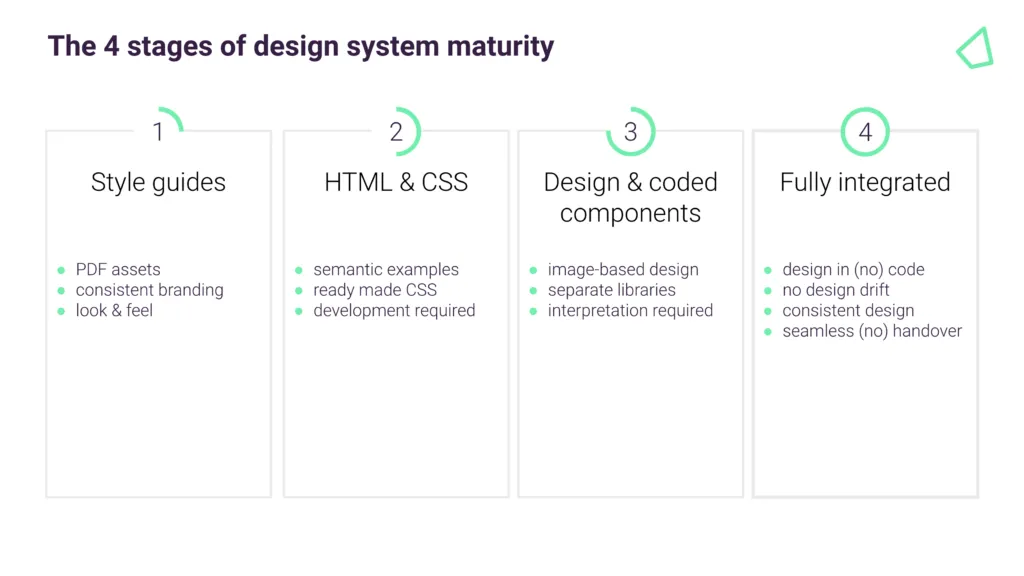
Iress’ Nick Elliott calls this stage four design system maturity, where designers and engineers use the exact same components for their workflows. Consistency and design drift are no longer issues with a seamless, almost non-existent handover process from design to development.

Nick spent 12 months reviewing design tools to bridge the gap between design and development to achieve level four maturity. UXPin Merge emerged as the clear winner, allowing Iress to develop a fully integrated design system where designers and engineers work with the same component library.
Increase Fidelity and Functionality in a Fraction of the Time
We learned from PayPal’s case study how much faster designers build high-fidelity code-based prototypes. PayPal tested this side-by-side with Merge vs. an image-based design tool.
An experience PayPal UX designer built the exact same one-page prototype using both tools. The image-based prototype took over an hour, while the Merge prototype (with higher fidelity and functionality) took eight minutes!
Due to Merge’s drag-and-drop workflow, even PayPal’s product managers (who have no experience with design tools) can build the same one-page prototype in under 10 minutes.
Getting the Most out of Merge
Merge works best for companies using an existing design system or open-source component library, like the MUI library. Engineers can give designers control to customize components via React props or Args if you’re using the Storybook integration (Angular, Ember, Vue, etc.)

The design system team can also set interactions and states for each component, like default, hover, active, and disabled for a button. Instead of designing interactions, designers simply select one from a dropdown in the properties panel.
Any changes designers make to a component UXPin renders in JSX, so engineers simply copy/paste for front-end development.
As we learned with PayPal, stakeholders can interact with prototypes with little or no explanation in their own time, leaving feedback via UXPin’s Comments feature. The design lead can assign these comments to team members to action and mark them as resolved when the task is complete.
Are you still using low-fidelity static prototypes with poor functionality, GIFs, and excessive annotations? Switch to the world’s most advanced design and prototyping tool to enhance collaboration with engineers and improve feedback from stakeholders.
Sign up for a 14-day trial to explore UXPin Merge via our free MUI integration.

