How to Work With the Development Team on a Design System?
Developing a design system is not about aesthetics and making things look pretty. It’s a powerful design tool that improves cohesion and consistency, reduces time-to-market, and enhances collaboration between teams.
In our free eBook, Design Systems: Step-by-Step Guide to Creating Your Own, we succinctly define a design system and its purpose as follows:
“The primary purpose of design systems is to increase efficiency in product development. With a consistent design language in place, it becomes easier to design products at scale that are consistent in aesthetics, user interface, and user experience. Design systems also promote collaboration, since handoffs across distributed teams become easier.”
Table of contents
Enhance team collaboration and streamline design handoffs with UXPin. Simplify design system use, sharing, and maintenance with UXPin Merge, a technology that allows you to bring interactive components from a component library and use them to create powerful prototypes that can be easily shared with development team. Request more information about UXPin Merge.
Design System vs. Style Guide vs. UI Kit
Design system, style guide, and UI kit are not the same. Let’s explore differences between them.
Design System
An entire system including pattern libraries, components, iconography, typography, style guides, design principles, guidelines (design/copy/code), governance, assets, and other documentation.
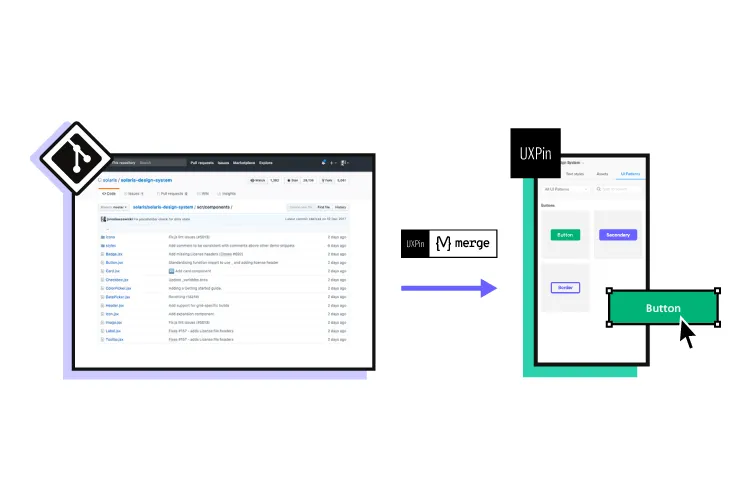
Design systems usually include a UI kit for designers and code snippets for developers. With UXPin Merge, designers and developers use a single code-based design system hosted in a repository creating a single source of truth across the organization.
Style Guide
A style guide comprises of written guidelines and visual references for a product, including typography, color, UI components, assets, and other elements. Simply put, a style guide tells you how to use a design system’s UI elements.
UI Kit
A UI kit is an image-based version of a design system or component library that designers use to build user interfaces. UI kits have no functionality, but designers can use its elements and components to build prototypes.
Why Engineers & Designers Must Collaborate to Develop a Design System
One of the most significant benefits of a design system is optimized workflows for designers and developers.
- Designers drag-and-drop components to build UIs
- Engineers copy/paste code snippets to develop the final product

Design handoffs go much smoother because engineers are familiar with components and require less explanation to understand the UIs.
A fully-integrated design system eliminates design drift, reduces friction, and streamlines QA processes, significantly reducing time-to-market. All of which benefit designers and developers.
Bridging the Gap
Designers and developers often use separate naming conventions or references–a button is a visual component to a designer and a few lines of code for a developer. Design systems provide designers and engineers with a single design language.
For example, design tokens define values for typography, color, spacing, and other UI elements, so designers and engineers speak the same language. Instead of using HEX or RGB codes for the brand’s color, team members reference a design token, e.g., brand-primary.
Aligning Constraints
When designers and engineers work together on a design system, they factor in one another’s constraints. So, when designers design a new product or interface, they don’t have to worry about drift or exceeding technical limitations.
Design System Governance
Implementing a system of governance is crucial for a design system to scale and evolve. Designers and engineers must work together to develop the processes and protocols teams must follow to update the design system.
These processes are especially important for products that must sync separate design systems for design and development–one image-based for designers and the other code components for engineers.
Design System Maturity
The ultimate goal is to have a single design system that automatically syncs design and development. Nick Elliott talks about the stages of design system maturity and its impact on design and development in his article, Re-Imagining Iress Design Tools.
Nick says the ultimate goal is to reach stage four: “a single source of truth where designers and engineers are using the same design system components.”
Tools like UXPin and Storybook can help bridge the gap between design and development, so the entire organization uses a single design system.
Building and Scaling a Design System With UXPin & Storybook
UXPin Merge and Storybook are the ultimate design system tools. With this combination, you can create an end-to-end, fully integrated design system:
- Design UI elements and components from scratch in UXPin
- Engineers convert designs to code and set up a Storybook (available for React, Vue, Web Components, Angular, and more)
- Use UXPin Merge’s Storybook integration to sync the design system to UXPin’s editor
- Designers build new products and features using the Storybook design system in UXPin
- At design handoff, engineers copy/paste components to begin development

Starting from Scratch
Designers design UI elements and save them as Components to a Design System in UXPin. Features like Auto-Layout allow designers to automatically resize, fit, and fill designs making editing and scaling designs much faster.
With UXPin’s Spec Mode, developers can inspect a component’s properties, measure distances between UI elements, and access a style guide with colors, typography, assets, and supporting documentation.
Set up a Storybook
Engineers can use this information to convert designs into code components. They can then set up a Storybook that allows teams to view and test components in isolation.
Engineers can even invite designers to Storybook to perform QA and collaborate to make necessary changes.
Sync to UXPin
Once designers and engineers have completed the initial QA, they can sync Storybook to UXPin. Once the initial sync is complete, all future updates are automatic. Any changes you make in Storybook automatically update in UXPin’s design editor, and team members get notified.
Giving Designers Control Through Args
Engineers can use Storybook Args to give teams control but also set constraints. For example, engineers can create four states for a button and define multiple properties so designers only select default, primary, secondary, or disabled.
These constraints make it easy for designers to create consistent designs that meet the design system’s specifications.
Streamline Design Handoffs
Design handoffs are effortless with UXPin and Storybook. Engineers can replicate any changes to the component’s Args in Storybook and invite designers to perform QA.
Next, engineers can update the repository, and the changes automatically sync to UXPin.
Iterate and Scale
If the design system team wants to make changes, designers can start from scratch in UXPin and repeat the process. It’s quick and easy to scale with UXPin and Storybook because the DS team only needs to manage one design system using two tools!
Scaling Design With UXPin Merge
In our January 2022 webinar, Defending Your Design System, keynote speaker Carola Cassaro (Product Manager at Work&Co and part of the team that developed IKEA’s design system) summarized the benefits of a design system beautifully…
“Design systems have evolved to be more than just components and tools. They democratized design processes and best practices to empower product teams and businesses to ship great work at scale.”
How PayPal Scaled Design With Merge
Even though PayPal used Microsoft’s Fluent design system, they battled with inconsistencies. Using image-based design tools meant designers and engineers had separate design systems, “The result was a range of usability and design consistency issues-no two products looked the same!”
PayPal also had a disproportional designer/developer ratio with five designers and over 1,000 engineers across 60-100 internal products. To put that into perspective, an NN Group survey found that most companies operate on a 1-to-10 designer/developer ratio.
And PayPal wasn’t prepared to scale its design team. Erica Rider, Senior Manager for UX – Developer tools and platform experience at PayPal, had to figure out how to scale design without adding to the payroll!
After trying several solutions, Erica decided to give UXPin Merge a try. PayPal used Fluent’s React front-end framework, which they connected to UXPin using Merge’s Git integration.

With everything set up, PayPal decided to test UXPin Merge with a side-by-side using an image-based design tool. One of PayPal’s experienced UX designers built an identical one-page prototype using each tool–the results far exceeded expectations:
- Image-based design tool: Over an hour with limited functionality and fidelity
- UXPin Merge: Eight minutes with fully functional code components
PayPal’s small team of UX designers taught product teams (who had no experience using design tools) how to use UXPin. They now design and update all of PayPal’s internal products, with UX designers only stepping in to fix challenging usability issues and provide mentoring.
PayPal’s product teams now complete and deliver a product in the same it used to take to design a mockup–significantly reducing time-to-market! Some of the other benefits include:
- From concept to prototyping immediately
- Better feedback from stakeholders
- Improved team/stakeholder collaboration using UXPin’s Comments
- Streamlined end-to-end workflow
- Dramatic improvement in quality
- Enhanced user testing with the ability to make quick changes on the fly and get immediate feedback
- UX designers have more time to focus on PayPal’s “larger UX initiatives that impact the organization globally.”
You can build, maintain, and scale your design system with UXPin Merge. Read more about it and request access to it. Discover Merge.


