Codifying Design System – Why & How to Do That?
Codification is an integral part of evangelizing a design system and getting adoption from teams. A design system’s documentation must educate teams about usage, company policies, best practices, governance, and branding with examples and tutorials.
Enhance collaboration between design and development while creating a single source of truth with UXPin Merge. Sign up for a free trial to explore UXPin’s revolutionary Merge technology through our MUI integration.
What is Codifying a Design System?
The Cambridge Dictionary defines codification as “the act or process of arranging something, such as laws or rules, into a system.”
Codifying a design system or design system codification is the process of organizing a design system’s components into a searchable archive or hub with guidelines, principles, documentation, tutorials, governance procedures, and more.
This centralized hub serves as a working document for team members to reference when building new products or searching for the correct component and how to use it–for example, proper color usage and header tag sizing.
The hub will also outline the design system’s governance procedures teams must follow to introduce new elements or promote patterns. Like GitHub’s Primer, some design systems display a release history so designers can learn what’s new and a design system roadmap for future releases.
Why Do You Codify a Design System?
Like any digital product, a design system needs documentation to learn and understand how to use it. Having a design system is one thing, but team members will invariably use its components based on opinion and interpretation without proper direction.
It Provides Clear Instructions
For example, if you purchase a 1,000 piece Lego set without instructions, there are endless possibilities. But, if you follow the instruction manual, you’ll use every piece as intended to build a single structure, consistently the same, every time.
Design system codification ensures every team member follows the same guidelines for designing new products. So, no matter who the designer is, they should always get the same result.
It Streamlines Onboarding
Another reason you want to codify your design system is to streamline onboarding. Instead of someone sitting with new team members to teach them about the organization’s design system, they can visit the documentation and learn everything they need to know without oversight.
11 Tips to Codify a Design System
There is no standard “how-to” guide for documenting a design system, but there are several things you must consider. Here are eleven tips for codifying a design system.
1. Overview with Design Principles
Every design system must include the organization’s core principles and values–preferably on the home page, so it’s the first thing team members see. These principles answer the why behind your design system and choices.
For example, Salesforce outlines four core principles in its Design Guidelines Overview:
- Clarity: Eliminate ambiguity. Enable people to see, understand, and act with confidence
- Efficiency: Streamline and optimize workflows. Intelligently anticipate needs to help people work better, smarter, and faster
- Consistency: Create familiarity and strengthen intuition by applying the same solution to the same problem
- Beauty: Demonstrate respect for people’s time and attention through thoughtful and elegant craftsmanship
We have a complete guide about design principles and how to establish them for your company here.
2. Brand Style Guide
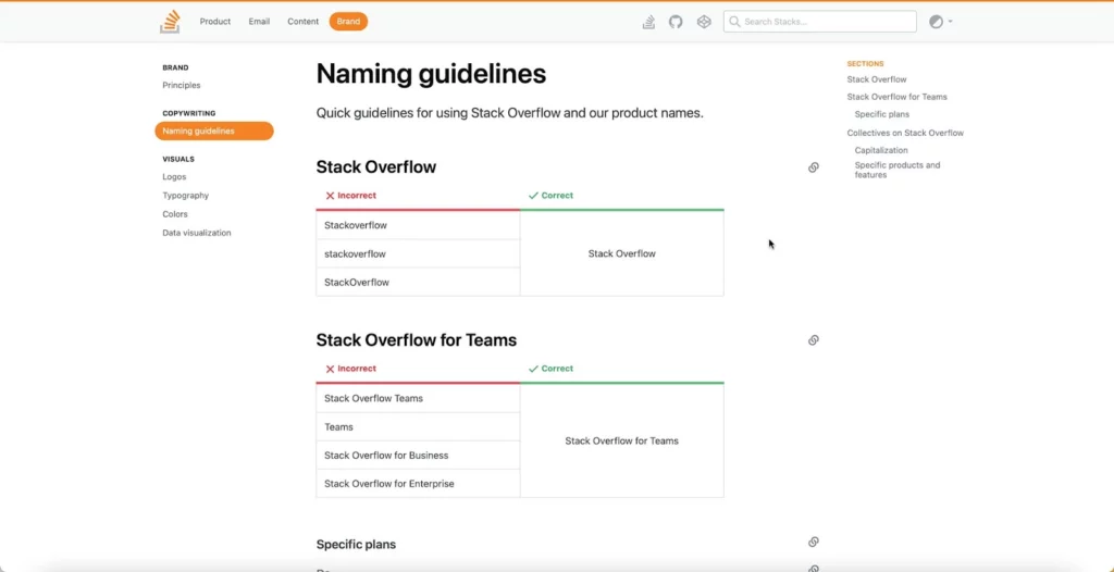
A brand style guide provides teams with direction on how to represent the brand through design and copywriting. Some companies, like Stack Overflow, also include the correct usage of its name.
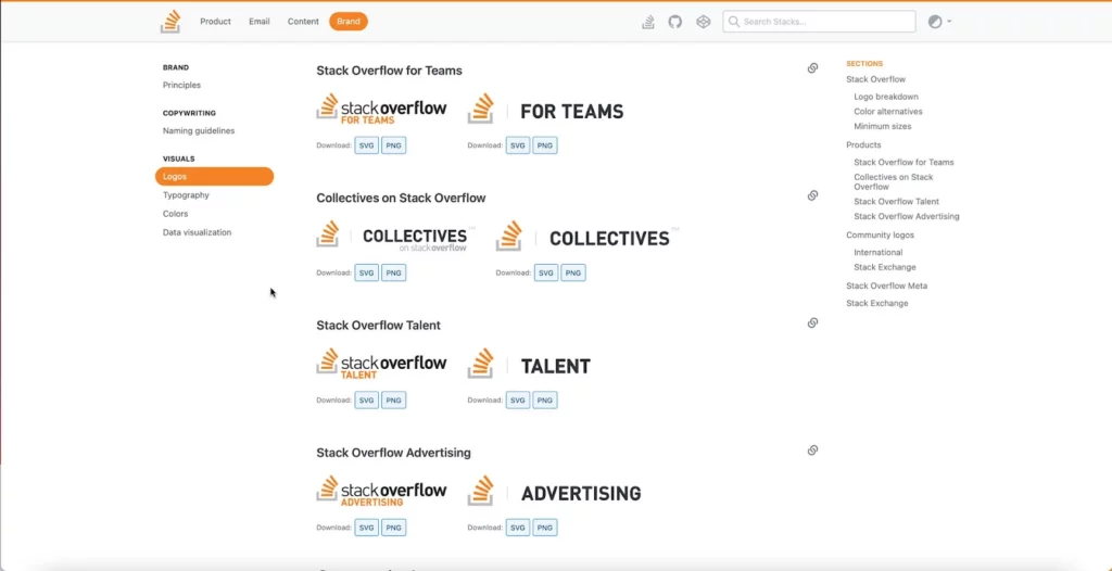
You should also include your logo in multiple sizes, contrasts, and formats so team members can download and use the same files throughout your product.
3. Writing Style Guide
Some design systems include the writing style guide as a subheading in the branding guidelines. But, if you have a lot of writing or branding instructions, it’s best to keep these separate.
The writing style guide should provide instructions for all copy, including content, marketing, ALT text, and UX writing. Some points you might want include:
- Voice and tone
- Principles (writing grade, slang/jargon/joke policies, language to avoid, etc.)
- Grammar
- Structure (for long-form content like articles and landing pages)
- UX messages (error, success, warning, etc.)
- Labels (including forms, checkboxes, radios, etc.)
4. Best Practices
Best practices include recommended (and mandatory) methods, tools, and processes for your organization’s design system. What image formats must teams use, how do they name them, and where do they store these assets to make them accessible to the whole organization?
You might separate your best practices by the department to avoid confusion–for example, design best practices vs. engineering best practices.
The goal of your best practices is to ensure cohesion and consistency in the way teams work so anyone can step in and take over someone’s work when they’re absent or if they leave the organization.
Stack Overflow includes a list of FAQs that explains some of the design system’s best practices (likely based on questions from team members), for example:
- Why do we have to write CSS inline?
- If CSS is inline, why do we need a style tag?
- What is preview text?
5. Easy, Searchable Navigation
Designers must approach a design system the same way you would any other product–with a user-centered design approach. Your design system should serve users by providing easy, searchable navigation.
Separating your design system into menus and submenus can help teams narrow down precisely what they need. Note how Shopify Polaris uses simple submenus to categorize its design system.
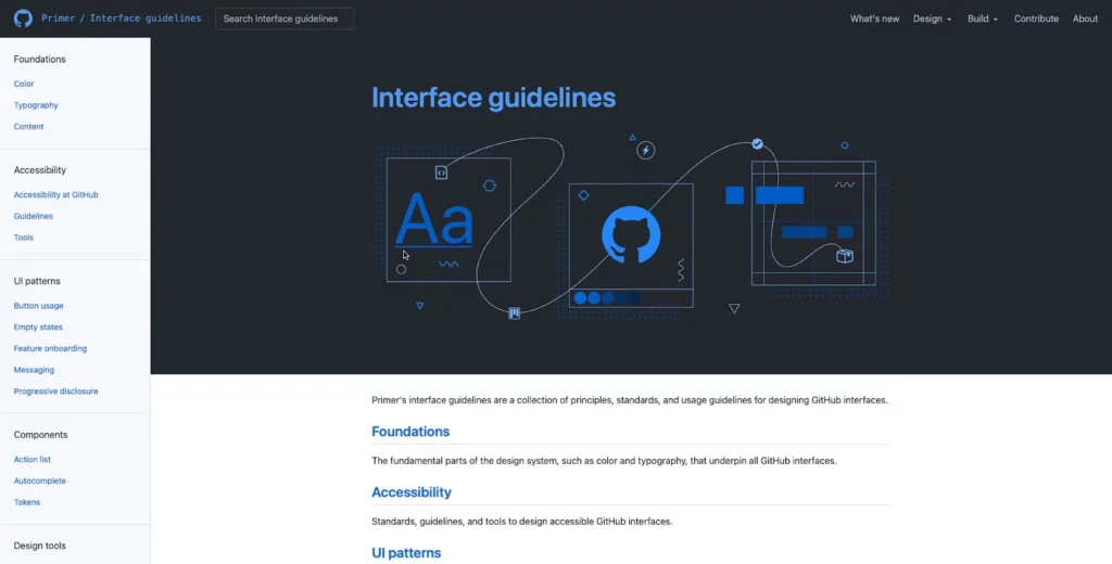
Many design systems use a standard dashboard layout with category links on the left with primary navigation and a search form in the header. GitHub Primer, Salesforce Lightning, Shopify Polaris, and others use this format for their design system documentation.
6. Contributing and Governance
Managing and scaling a design system must be a democratic process where team members can contribute and make suggestions. Most leading design systems allow feedback and outline the governance procedures for making contributions.
GitHub Primer outlines various scenarios for team members to voice their opinions and suggestions:
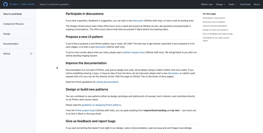
- Participate in discussions: Provide channels for teams to start and participate in dialogue through forums, Slack channels, Zoom calls, etc.
- Propose a new pattern: Setup a specific channel or ticket for proposing new patterns and outline the processes and protocols to manage employee expectations.
- Documentation improvements: As a working document, your documentation must be open to evolving with the product and technology. As GitHub Primer puts it, “we’re always trying to make it better and more useful.”
- Bug reporting: Bugs adversely impact usability, so you should have a line of communication for teams to report issues so the DS team can fix them fast.
- Contributing: Some designers and engineers love solving problems and want to be a part of the product’s evolution. Contributing gives team members ownership of the design system and recruits more evangelists to promote its benefits.
7. Component Library
Your component library forms the core of your design system documentation, and it’s where teams will likely spend most of their time. Here are some things you want to consider including in your component library:
- An example of each component
- Interactivity guidelines
- Code snippets
- Page and layout templates
- Dark/light variations
- Use cases
- Dos and don’ts
- Sizing
This list is by no means exhaustive; you may have to include more detail based on your product and team dynamic.
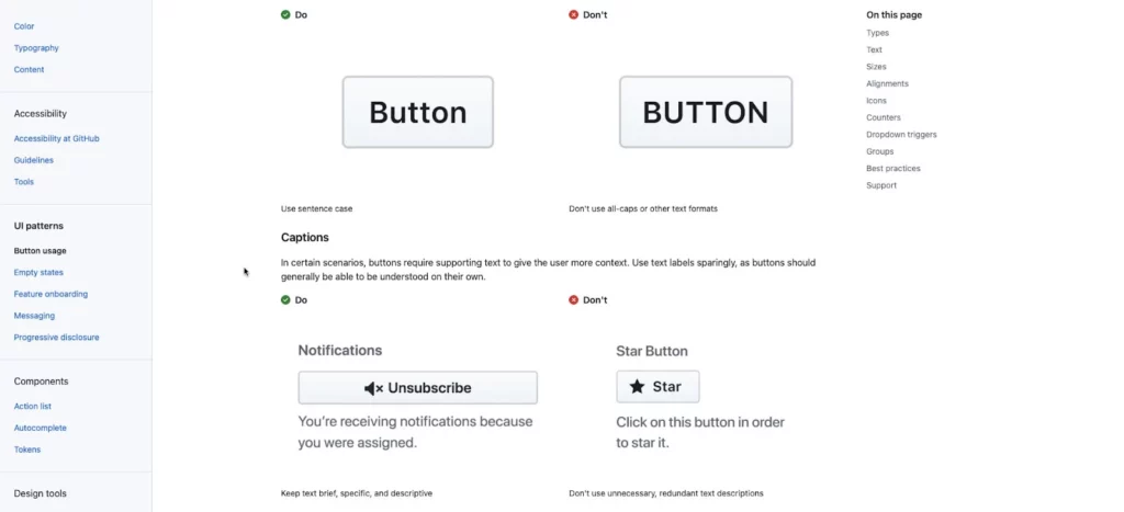
Also, use images to complement explanations, no matter how simple they may be. Look at this example from GitHub Primer, where the DS team uses images to explain dos and don’ts–even though you might assume capitalization would be obvious to interpret.
8. Colors
Color is one of the most common inconsistencies. When Slack set up its design system and documentation, the DS team discovered 136 colors across its products and UIs.
The problem is that team members use screenshots or color pickers to grab hex codes from other UIs, often a shade or two off. Over time this results in multiple shades of the primary color palette.
To avoid color inconsistencies, design system documentation must include color palettes in multiple formats, including:
- Visual swatch or example of the color
- HEX code
- RGB code
- Design token or CSS variable (if applicable)
9. Icons
Include a complete list of approved icons (whether you have a custom or stock set), their usage, and guidelines. Remember to include examples for multiple scenarios, for example, outline, circular, color, etc.
10. Typography
Your typography should include approved typefaces with examples for the various styles, like bold, semibold, regular, light, italic, etc. You should also stipulate when and how to use each font and style–for example, bold for headings and regular for body copy.
Other typography considerations include:
- Desktop vs. mobile sizes
- Scale, letterspacing, line height, weight
- Alignment
- Font stack or family (for CSS)
- CDN link
- File downloads for various applications – TFF, WOFF, OTF, etc.
- Hierarchy
- Color contrast
- Accessibility
- Locational rules – alerts, navigation, body, footer, etc.
11. Tools
You should include a list of approved tools and workflows with onboarding instructions for new team members. These tools include:
- Design tools
- Development tools
- Accessibility tools
- Cloud storage
Enhancing Design System Management & Collaboration With UXPin
UXPin has a design system solution no matter where your organization is in maturity. With UXPin’s Design Systems feature, teams can build, manage, and scale a design system from scratch.
Organize your design system into four categories:
- Colors
- Typography
- Components
- Assets
Include documentation using descriptions for each element, including links, examples, usage, and more. You can also set permissions to prevent team members from making unauthorized changes.
A Single Source of Truth Using Merge
With UXPin Merge, you can sync an existing design system hosted in a repository to UXPin’s editor so design teams can build mockups and prototypes using code components–creating a single source of truth across the organization.
Any updates to components in the repository automatically sync to the design editor, and UXPin notifies teams of the changes. You can sync React components directly to UXPin via Git or use our Storybook integration for other popular technologies like Angular, Vue, Ember, HTML, and more.
Sign up for a free trial to experience code-based design with UXPin.

