Agile UX for Product Teams (Part Two): Design and Development
In Part One, we discussed getting started with Agile UX. We dove deep into the early stages of research and development with practical tips for involving the entire team. We also examined the different ways you and your team can ideate on potential solutions to your users’ problems.
In this post, we’ll focus on design and development:
- How to plan for designer’s needs
- Why prototyping is important
- Collaboration between design and developers
The design and development phase of project kicks off after stakeholders align on the agreed solution and the backlog has been completed, . Once again, there will be a delicate balancing act here as the Product Manager works with designers, developers and internal stakeholders to ensure that requirements are met in keeping with the expected product launch date.
Now let’s look at five-steps for better Agile UX design and development.
1. Include the UX designers in the sprint planning
Each sprint planning session is an opportunity for all team members to dig into not just what should be done, but why. Getting everyone in the room at the same time is a huge time saver.
In the same way that the product manager is often required to provide more insight into functional requirements, so too should the UX designer provide insights into their design choices.

In my experience, good developers will challenge the PM and UXer on their choices not for the sake of being difficult but to ensure that they are building the right product with the correct UX.
2. Plan ahead for design needs
Iteration is at the heart of Agile and designers also need to work iteratively, ensuring that developers have designs ahead of each sprint.
However, you may run into situations where full iteration isn’t a pragmatic solution. and all screens must be designed prior to the start of the project.
I ran into this situation as a Product Manager at a company that was transitioning to Agile. Key stakeholders had doubts about the efficacy of Agile for development cycles.
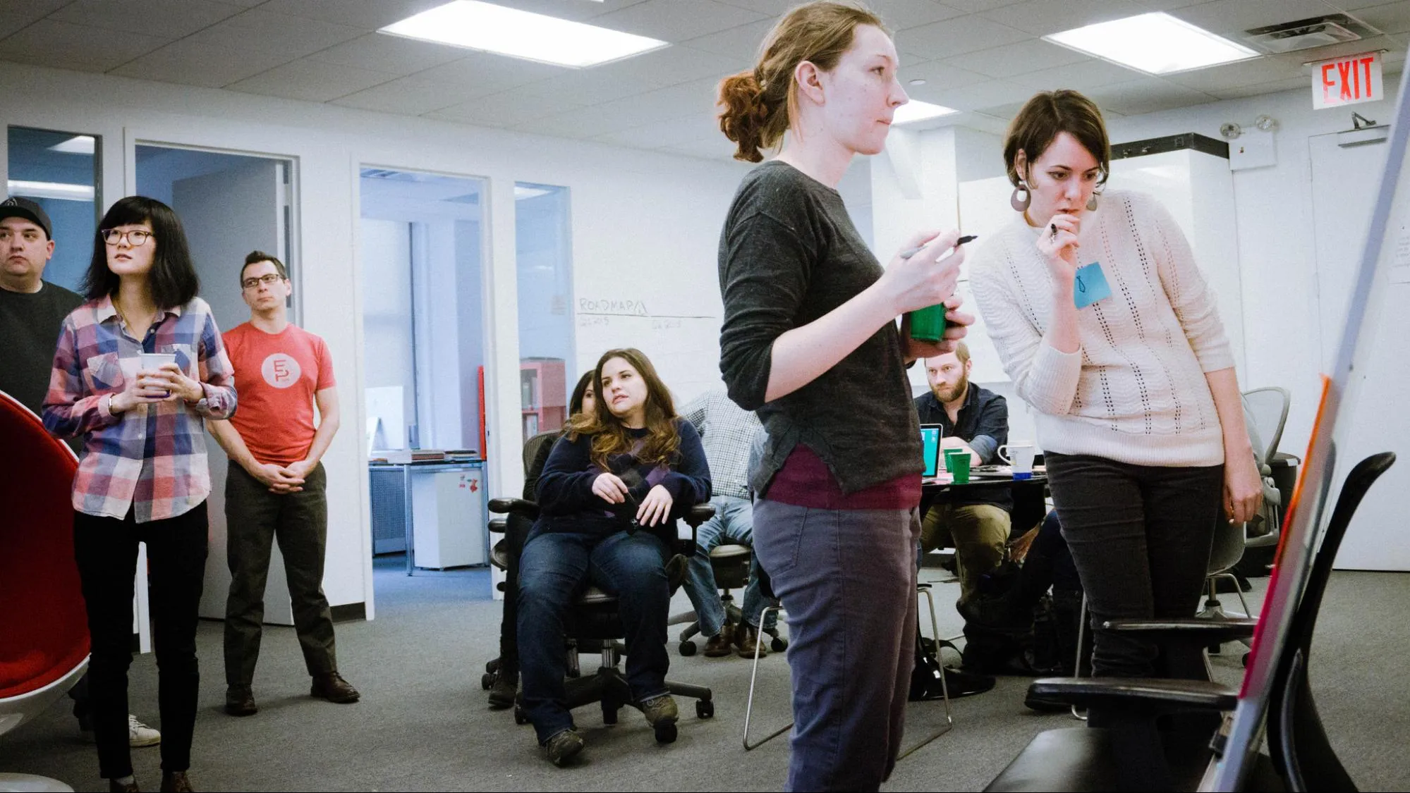
Photo Credit: “A List Apart big meeting, 30 January 2015.” Jeffrey Zeldman. Creative Commons.
In particular, they were concerned that they would end up with fewer releases per year which would ultimately impact the revenue generated by sales teams. They also expressed concern about doing iterative design, worrying that a lack of fully designed screens from the get-go would lead to a worse design and UX,. The development team, on the other hand, was very willing and eager to move forward with Agile methodology in every aspect.
To address the needs of both parties, the designer and I agreed it would be best to provide “enriched” wireframes of all screens to stakeholders prior to the official project kickoff.
Rather than doing simple black & white wireframes, we went a little further, inserting elements like colors and photos (derived from the brand identity) to various parts of the design, showing buttons and icons in various states (active vs inactive) and when necessary, making these mid-fidelity wireframes clickable at specific points to better demonstrate the user flows.
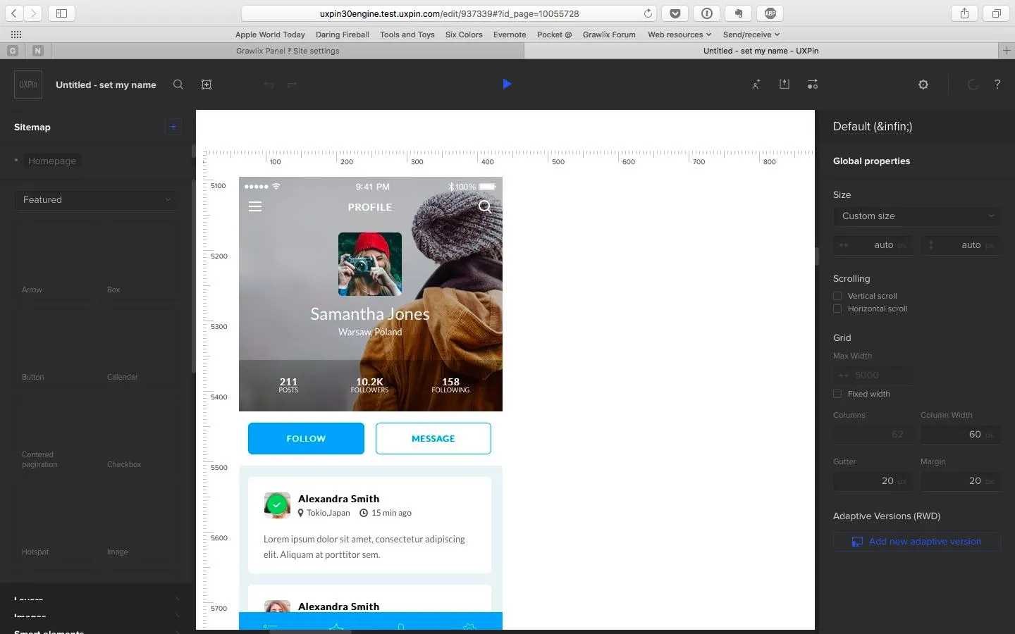
Photo Credit: UXPin
For some of you, wireframing may not sound groundbreaking. In fact, you may be thinking that wireframing all possible screens is very time-consuming. But for this particular context, the process proved to be far less work than creating full-scale mockups in Photoshop or Sketch.
Photoshop was a much more time-consuming process, which meant that stakeholders had to wait longer before seeing screens to evaluate the concepts. Our interactive wireframing, however, meant that stakeholders could actually use something tangible within a day or two.
The fast-paced approach also meant that the stakeholders, designer, and I could conduct our own “mini sprints” as we presented new wireframes and made adjustments as necessary on a daily basis.
Working in this manner presented several clear benefits:
- Developers received a more fleshed out view of the UI at the very start of the project.
- There was very little need to go back and do the designs in Photoshop. Since the wireframes were quite feature-complete, the designer mainly had to make notes for specific items that developers should pay attention to (such font size and font type).
- Sprint demo sessions (which stakeholders attended) were much shorter and much more pleasant for all because there were no surprises. Everyone left with a stronger feeling of accomplishment.
As previously mentioned, it is essential that the Product Manager take the pulse of the company, propose solutions, and mediate to get everyone going with Agile. In fact, as described in The Guide to Wireframing, it’s not a bad idea to learn some basic design skills – especially if you aren’t a designer.
Even the roughest wireframe can explain a concept to designers better than the most detailed specs document. More importantly, wifeframes and lo-fi prototypes serve as a collaborative rallying point for the whole team (regardless of who first created them).
3. Always prototype
Once you’re finished with the design studio exercise we discussed in the last section, the design team can flesh out the best ideas into a prototype for quick user validation.
If you’re using a tool like UXPin, you can create a flat wireframe, then add some interactions to quickly create a lo-fi prototype. Once you’ve gathered team feedback and tested the lo-fi prototype with at least 5 users, you can move to Photoshop or Sketch to improve the visual design. When you’re satisfied, import the file back into UXPin to add interactions to any layer. Test the hi-fi prototype you just created, iterate based on results, and repeat as much as needed.
Yelp Redesign Lo-Fi Prototype (internal exercise)
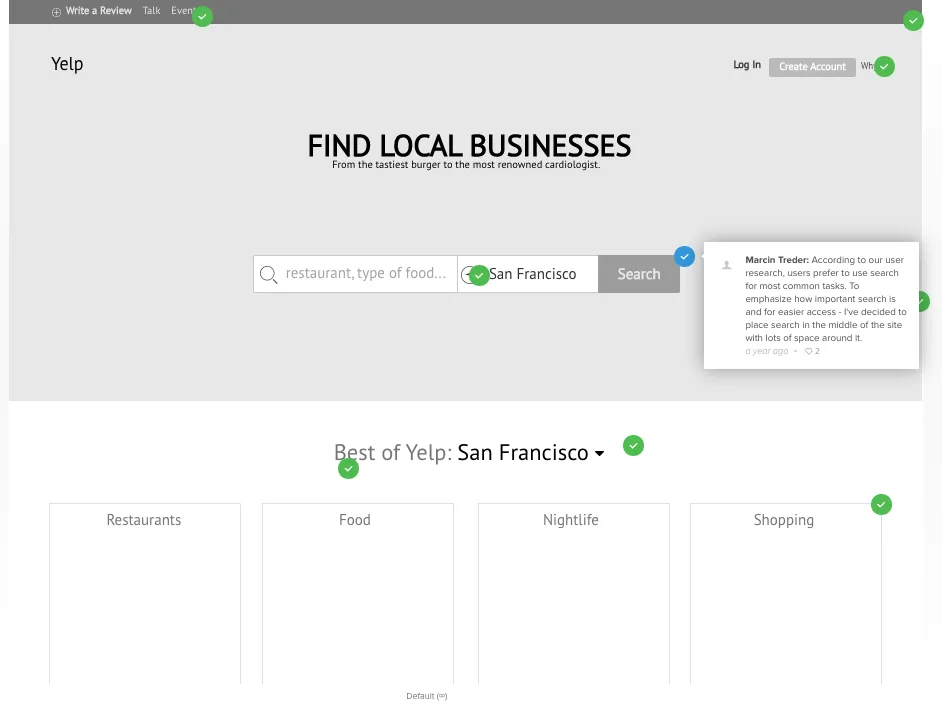
Yelp Redesign Hi-Fi Prototype (internal exercise)
During each step of the process from sketch to hi-fi prototype, make sure you get feedback from stakeholders and developers.
Developers are not code monkeys, so don’t hand them a prototype and expect it to be perfectly feasible. Developers speak the language of interaction (between elements, between systems, etc.), so start bouncing ideas around with them as early as possible.
4. If UX resources are overwhelmed, go for “bare bones” design
Several years ago, I worked on an Agile project that was scheduled to run for about six months. For the first two months of the project, I wasn’t able to secure any UX resources because the design team was already playing catchup on other projects.
Rather than delay the development of my project, we agreed that I would provide the development team with basic wireframes. Every two weeks we successfully completed and demo’d our work. The UI was something out of a kindergarten project: plain white, background, simple drop down menus, all text aligned to the left. But it did its job of communicating the content structure and overall concepts.
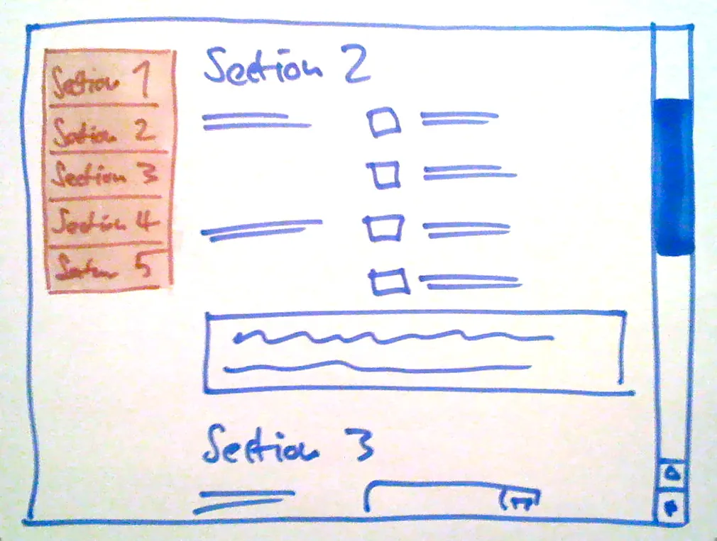
Photo credit: Danny Hope. Creative Commons.
A couple of months into the project, a UX resource was freed up to add fidelity to these screens and polish the visual design.
Surprisingly, this process actually worked very well for the project. By following a bare bones approach for the first two months, the development team was able to focus on first setting up the backend framework correctly. That ensured that information could be retrieved, manipulated and displayed correctly before anyone started feeling attached to pixel-perfect ideas.
Functionally, we were able to achieve a lot in those first two months and then dedicate time later to ensuring that the front end was top notch.
5. Include a front-end gatekeeper in the development team
I have experienced first-hand what happens to a project when there is a front-end dev with a strong design sensibility and when there is one without it.
In terms of the final design, the difference is as stark as night and day.
Every Agile product team needs to invest in a strong front-end dev who will make sure that everything is pixel perfect. Trust me, it will save you a lot of grief during testing. For anyone who has tested screens with misaligned icons, incorrect spacing, wrong font, etc., I think you will agree that correcting these details can sometimes take a surprisingly long time.

A strong front-end dev will not only be the gatekeeper of the UX designer’s work, but they will also end up being the UX designer’s best sanity check on the technical side. This is the person who will not simply implement the design they’ve been given but will suggest a better way of doing it if one is available. Priceless.
When deciding which member of the development team should serve as the front-end gatekeeper, the Product Manager and UX Designer should keep the following in mind:
- If the Product Manager is very familiar with all the developers in the Scrum team, then he or she can let the Scrum Master (the person facilitating the Agile process, e.g. a Project Manager) know who would best serve as gatekeeper.
- During the first sprint planning session, the Product Manager or Scrum Master should inform the entire team that there is a designated front-end gatekeeper.
- Clarify to the team that the gatekeeper will help avoid double work(no one wants that!). The team should understand that the gatekeeper will speed things up, so if they get stuck, they have someone to lean on for help. By presenting it this way, developers can feel that they’re still in an autonomous position, and that they have the freedom to go to the gatekeeper (or to the UX Designer) as needed.
As you’ve noticed above, I indicate working with the Scrum Master every step of the way.
A strong and reliable Scrum Master is the equivalent of the Product Manager for the technical team members. It’s important that the developers don’t get the impression that the Product Manager or UX Designer is imposing a particular work style. And since the Scrum Master has to follow up on the allocation of resources each day, it’s essential that this person also feel that their expertise matters.
Next Steps
Design and development doesn’t have to be a bottleneck for agile teams. Prototyping ideas sooner than later can save you team developing an idea that isn’t worth while.
In our final part, we’ll give you some techniques for testing and validating your ideas. And we’ll also show you why the work doesn’t end when you launch your product.
If you’re a product team looking to accelerate your process, check out the Enterprise edition of UXPin.
