Single-Page vs. Multi-Page Web Design – Pros & Cons
Single-page vs. multi-page website design is one of the first decisions designers weigh for a new website project. Sometimes the answer is obvious–like if the project needs a blog or an eCommerce store with more than one product.
But with many projects, the answer isn’t that simple. Designers must evaluate business goals, and user needs to determine whether a single-page or multi-page design will work better.
Table of contents
Design, prototype, and test your web design ideas with UXPin–the world’s most advanced code-based design tool. Sign up for a free trial to discover how UXPin can revolutionize your design workflows to create better user experiences for your customers.
Single-Page Websites
What is a Single-Page Website?
A single-page website (also called a one-page website) has all its content, including any forms, on a single page (the homepage). If there are navigational links, they jump to different homepage sections rather than loading new pages.
This UX portfolio website from Australian freelance UX designer Petar Ceklic demonstrates a typical single-page design with navigation and a footer contact form. Petar uses a large image carousel to display his portfolio, which includes website and app projects.
Typical Use Cases for a Single-Page Website
Designers commonly use single-page designs for landing pages. Keeping users on a single page eliminates distractions while increasing leads and sales.
Single-page designs are also an excellent option for websites with minimal content like portfolios, small businesses, single-product eCommerce sites, and brick-and-mortar businesses, to name a few.
What are the Benefits of a Single-Page Website?
- Single-page designs allow users to digest the entire website simply by scrolling. This functionality is beneficial for mobile users where the primary navigation is typically hidden.
- Single-page websites are often easier to design because designers don’t have to worry about the information architecture and other characteristics of multi-page sites.
- It’s easier for engineers to program a single-page website without using front-end frameworks and other development tools. They can use basic HTML, CSS, and Javascript, thus reducing the website’s size and increasing performance.
- Single-page websites are excellent for getting users to take a specific action, like contacting a business, newsletter signups, buying a product/service, etc.
- A single entry point (the homepage) allows designers and marketers to control the user experience and present a consistent narrative to visitors.
What are the Disadvantages of a Single-Page Website?
- It’s important to note that single-page websites aren’t easy! It can be challenging for designers to prioritize and structure content to serve users and business goals.
- While single-page websites can deliver better performance, if designers use a lot of media (images and video), it can increase page load times–engineers can fix this issue with lazy loading and other performance-enhancing techniques.
- Single-page websites limit SEO and keyword strategies. While a well-optimized single-page site can rank as high or higher than a multi-page competitor, it’s limited to a primary keyword and a collection of related terms.
- Single-page designs restrict your ability to expand your website or scale your brand without a redesign.
Multi-Page Websites
What is a Multi-Page Website?
Multi-page websites have more than one page with navigation for users to move around the site. Most businesses use multi-page designs because it allows them to separate content, products, topics, etc.
Multiple pages mean users have numerous entry points to discover your website via search engines, social media, and other websites. For example, a news publisher like the BBC has tens, if not hundreds of thousands of pages where users can enter the site.
Use Cases for a Multi-Page Website?
Most websites use a multi-page layout, especially eCommerce stores with multiple products, blogs, and news sites, which use different pages to separate categories and content.
The New York Times is an excellent example of a multi-page layout. The header navigation provides users quick access to popular news topics, with the homepage dedicated to the world’s biggest stories of the day. NY Times’ footer includes additional links to news categories, policies, contacts, and other helpful information.
What are the Benefits of a Multi-Page Website?
- Multi-page sites allow users to navigate to the content they value most rather than scrolling down a single page to find what they need.
- Multi-page websites provide many SEO benefits and opportunities for marketers to target different keywords and topics–especially if the website has a blog.
- Designers can add new pages to scale a multi-page website.
What are the Disadvantages of a Multi-Page Website?
- Large websites require careful consideration for information architecture and making content discoverable. This process increases costs and time-to-market.
- Multi-page websites have bigger file sizes and process more server requests, increasing hosting costs.
- It takes longer to update the design and content for a multi-page website, especially for responsive design.
- With the ability to enter a website from multiple pages, designers and marketers must create CTAs site-wide to funnel users to products and services. For example, UXPin uses CTAs to encourage visitors to try UXPin in all our blog posts.
It’s important to note that there are tools and techniques designers and engineers can use to overcome these multi-page website challenges. Still, they must address them to prevent causing usability issues.
When to use a Single-Page vs. Multi-Page Website

Several factors dictate whether your project needs a single-page vs. multi-page website. We’ve identified three primary factors that influence most projects when deciding:
- Business goals: what do you want to achieve?
- Content: how much content do you want to display?
- SEO: what are your content digital marketing goals?
Business Goals
Most people and businesses create websites with an intent or purpose. Single-page web design is excellent if you have a focused business goal like acquiring leads, promoting app downloads, or selling a single product.
Creating separate pages is best if you have more than one CTA or promote multiple products/services. This separation allows you to create different campaigns for targeted audiences and funnel them to a single call to action. Multiple actions on a single page can cause confusion and impact conversions.
Content
The amount and type of content you need to display can impact your decision significantly. For example, multiple videos increase a page’s file size, adversely affecting performance–even YouTube videos add additional requests when loading a page.
Images also decrease page performance, particularly on mobile devices and users with poor internet connection. Designers must consider how content will impact the user experience and accessibility.
Search Engine Optimization (SEO)
SEO is another crucial deciding factor for single-page vs. multi-page web design. A single-page design is adequate if you only need to target one primary keyword, but a multi-page design is the better option for a diversified SEO strategy.
7 Tips about Deciding Between Single-Page and Multi-Page Design
- Take a content-first approach. Figure out what content users care about, then design your interface accordingly. Include only as many pages (and content) as you need.
- Ensure your site is appropriate for a single-page experience. If you struggle to fit everything into a single page, consider a multi-page design instead.
- If SEO is a priority for your marketing strategy, then a multi-page design is often a better option.
- Single-page sites or landing pages perform better for paid ad campaigns. Eliminating distractions and navigation prevents users from leaving a page, thus increasing conversions.
- Make web pages easy to navigate and digest. Create a definitive visual hierarchy for every web page and plan information architecture to solve user needs for multi-page websites.
- Follow web accessibility guidelines to ensure your website is digestible and navigable for all users.
- Use a single CTA per page to eliminate confusion and provide users with a clear goal. If you need multiple CTAs, consider a multi-page website over a single page.
Web Design With UXPin
UXPin’s code-based design tool enables designers to create fully functioning responsive website prototypes to improve user testing, stakeholder feedback, and design handoffs.
Designers can start by creating multiple layouts for each viewport with UXPin’s ready-to-go mobile, tablet, and desktop frames. UXPin also offers wearable and TV frames for app design.
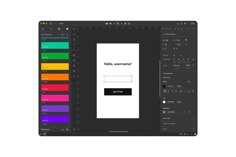
With Content and Data, designers can populate UI elements with real data using JSON, CSV, or Google Sheets. The Match Content by Layer Name lets you populate fields with dummy data in just a few clicks. Designers can also fill media elements with Unsplash images without leaving UXPin’s design canvas.
The result–beautiful-looking user interfaces populated with real data using minimal effort!
Unlike image-based design tools, UXPin allows designers to use a single frame to create interactive prototypes. Designers also enjoy superior functionality, like conditional interactions, form validation, user input validation, and component states, to name a few.
Check out this example website project we created using UXPin’s advanced prototyping features. You can download this project and inspect it in UXPin to see how we built this interactive prototype.
Enhance your web design projects with the world’s most advanced code-based design tool. Sign up for a free trial to discover how UXPin revolutionizes UX workflows to deliver better user experiences for your customers.

