As you know, UX is not a new discipline. But given the rise of responsive design, mobile design, and adaptive design in past years, the question of compromising between performance and experience still seeks a clear answer.
In this piece, we’ll dive into some of the important criteria for responsive performance and the overall mobile experience.
A mobile-only site renders faster but costs more to develop and maintain. On the other hand, responsive design is simpler to create upfront but must be implemented carefully since a smartphone and laptop receives the same amount of code (which can obviously slow down performance).
To further complicate things, a fast site that renders correctly and creates a good experience will be the one that’s ranked better. In fact, Google itself even recommends responsive design.
So what are some important considerations to keep in mind when designing for mobile? Let’s take a look.
Performance
Performance is one of the biggest problems that many sites experience.
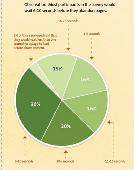
Not only does it affect SEO, but it also impacts traffic, usability and ultimately, conversions. Since the latter is the one that most businesses care about, it’s worth noting that a Kissmetrics study found that most mobile users (30%) wait between 6 and 10 seconds before abandoning a site. That’s a fairly long load time and not very difficult to achieve – but every second that you can shave offload times counts and you should aim for much less than that.
After all, like we stated in Interaction Design Best Practices, digital time and real time are not the same.

Photo credit: KISSMetrics
The study found that there was a strong correlation between page load times and customer behavior. 79% of shoppers said that they would be less likely to buy from a site with poor performance again, whilst a 1-second delay was found to decrease customer satisfaction by 16%.
So, this shows that site performance is an important factor to UX, SEO and to customer behavior and conversions.

Photo credits: KISSMetrics
Performance issues can be caused by all kinds of things, including:
- Bloated, untidy code
- Plugins
- Themes
- Under-optimized images
- Poorly constructed responsive design
- Render-blocking JavaScript and CSS
- Lack of GZIP compression
- Poor server setup
Of the above, poor server setup is likely to be the one that most businesses have the least control over. Cheap or free hosting tends to come with its own issues and should be avoided for business sites.
In the past, I moved two of my responsive sites across to a managed WordPress service and this fixed a lot of the performance issues overnight. It wasn’t a cheap or free host that I was using previously, but it was affecting site speed. It’s not always simple to diagnose server issues though. The first step would to run a speed test using Google Page Speed Insights and/or GT Metrix to see if it picks up a poor server response time. If this is the case, then you can perform a Trace Route test and then use an online service to help you to understand the results if necessary.
This should help you to pick up server errors but bear in mind that they can be tricky to pin down.
Responsive Web Design
Issues only arise from responsive sites that haven’t been correctly built in the first place. For example, broken layouts may be caused by things such as dropping in a viewport meta tag without using media queries to make it properly responsive. This results in a chunk of the page being cut off and other elements – such as navigation – being displayed incorrectly.
Responsive web design is sometimes blamed for offering poor performance, yet it’s not the fault of the technique, but its implementation, as set out by Tim Kadlec.
Photo credit: UXPin
Responsive web projects – and any web project that you begin – should always take a mobile-first approach. The problem that many have with RWD sites is in conditional or lazy loading, or rather in the fact that they don’t use it. This results in a full desktop model being delivered to mobile devices, which of course slows down the site.
This issue was made somewhat famous a few years ago in a study carried out by Guy Podjarny. He found that the majority of the responsive sites that he tested for speed performed poorly due to the loading of full desktop sites, as opposed to a pared-down version.
The problem remains now that it’s fairly complex to build a responsive site that performs well. Not only do you have to reduce the large HTML file that’s initially called for a mobile site, you also must ensure that you avoid running certain scripts, load certain CSS and download specific images. A responsive site is never going to be as fast as a dedicated mobile site, the latter of which usually has small HTML and very few scripts.

Photo credit: Search Engine Land
However, from a business standpoint, supporting mobile and the main site means twice the maintenance, and therefore twice the cost. It’s no wonder that many people want the convenience and lower cost of responsive design.
If you’d like to learn more about improving the performance (and therefore the UX) of responsive sites, check out these tips from CrazyEgg. For a quick reference guide on breakpoints, check out our free Responsive Design Cheatsheet.
Mobile UX
The basic principles of mobile UX are not really very different from desktop UX. However, mobile is still a rapidly developing medium and as such, this means that best practices are still emerging. As Steve Krug points out in the 2014 edition of his UX classic Don’t Make Me Think: A Common Sense Approach to Web and Mobile Usability, “Web and app design for mobile devices is still in its formative “Wild West” days in many ways.”
Mobile UX is all about trade-offs. Once you’ve decided what belongs on the home page, you then have to decide how to prioritize the rest of the content. It’s also necessary when designing for mobile to ensure that you provide strong visual cues that show the user how to use the site.
For example, clickable areas in purely flat designs can create usability issues since the signifier (what visually defines a button) may not be as clear. Without clearly defined buttons, the design will require other distinguishing elements.
Color is a great choice for this, as you can see in the image below for SitePoint. The navigation is clearly sectioned using strong colors to ensure that on mobile, these areas are obvious and more importantly, large enough so that a user won’t accidentally click on a link next to the one that they want (unless they have exceptionally large hands).

Photo credit: Sitepoint
Best practice for mobile UX dictates that you should then pay attention to the following:
- Clarity – How can you ensure that the user knows how to use the site? Consider the use of strong visual cues such as the use of color and drop shadows on buttons to prompt the desired user action.
- Navigation – Again, you consider if flat design adds anything or if it creates confusion in the user and how you can overcome this. You should also consider if it’s worth having a dropdown menu or a standard, traditional top menu.
- Gestures – As designer Thomas Joos suggests, you must think in terms of time, dimension, and animation. How will your interface respond when it’s swiped or pulled from the top? Interactions and animations require even more care with regards to visual refinement and response times.
- Forms – Input forms need to be short and concise, not ask the user to enter all kinds of details from their age to the name of their dog. Limit forms to one or two fields and ensure that they are big enough to click into. Also, take care with form labels as these can easily be thrown off on mobile devices.
- Touch – As discussed earlier, clickable areas should follow the fat finger rule and not encroach on surrounding areas.
When it comes to designing for a smaller screen, prototyping and wireframing tools are also helpful once you outgrow the low fidelity of sketching by hand. The sooner you can get your design onto real-world devices the better, but it’s incredibly helpful to have tools at your disposal that can effectively help with layouts.
Final Thoughts
Mobile UX is a sum of its parts.
It’s not just about performance, nor is it all about how the site and its content are presented. For the designer, it’s become necessary to look at a web project much more holistically than we’ve seen in the past.
On the small screen, good UX is essential to the success of every site. Consider every navigation element alongside your design choices and how these will work on real-world devices. As championed by Steve Krug, the user should not have to think about what they have to do next, it should be immediately clear to them.
If you’d like to learn more about mobile design, check out our free ebook Mobile UI Patterns. We include over 46 of some of the best UI patterns for mobile UX and performance.


