Discoverability in UX and UI Design — 9 Techniques to Try

Discoverability is crucial in effective UX design as it ensures users can effortlessly find and access features and content within an interface. A well-executed discoverability strategy helps users explore and interact with the interface more efficiently while increasing user engagement and retention, contributing to the overall success of a website, application, or product.
We explore the topic of discoverability in UX, its importance, how to test discoverability, techniques to improve, and real-world examples from Google Maps, Airbnb, Spotify, and Slack.
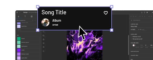
Get meaningful feedback about your product’s discoverability with immersive, interactive prototyping experiences from UXPin’s advanced features. Build your first interactive prototype with UXPin. Sign up for a free trial.
What is Discoverability in User Experience Design?
Discoverability in UX describes how easily users can understand, find, identify, and access a design product’s features, functions, or content. The user may not know these elements exist or the product’s full capability, so it’s essential for design teams to create discoverability and awareness.
For example, many mobile apps offer the option to swipe content for options like archive or delete–a typical feature in task apps and even Gmail. Without making this swipe feature discoverable, users may never use it and not enjoy the product’s full capability for streamlining tasks.
Optimizing discoverability creates more intuitive and enjoyable user experiences where users can complete tasks and actions effortlessly.
The importance of discoverability
Discoverability directly impacts user experience and how users interact with digital products. Good discoverability enables users to quickly and easily find, understand, and use the features and content they need.
This satisfying user experience results in more engagement and longer retention while increasing the likelihood that people share their positive experiences with others.
Here are several reasons why designers must pay attention to discoverability:
- Intuitive interactions: Discoverability ensures that users can navigate and operate an interface with minimal effort with minimal guidance or instructions. This intuitive experience reduces user frustration and cognitive load.
- User satisfaction: When users can effortlessly locate and use features or content, they are more likely to have a positive experience and be satisfied with the product. This satisfaction can lead to increased engagement, retention, and brand loyalty.
- Faster learning curve: Improved discoverability helps users learn products and interfaces faster, allowing them to complete tasks more efficiently.
- Accessibility: Good discoverability ensures that users with different abilities, including visual, auditory, or cognitive impairments, can also easily find and interact with elements in the interface.
- Increased conversions and retention: When users can find content and complete tasks efficiently, they are more likely to continue using the product or service, make purchases, and recommend it to others.
- Reducing support demand: When users can quickly discover and understand features, they are less likely to contact customer support, reducing costs and the need for support services.
- Competitive advantage: Well-optimized discoverability results in better user experiences and satisfaction, resulting in a competitive advantage and stronger brand reputation.
Discoverability vs. findability – what’s the difference?
Discoverability refers to a user’s ability to understand a product and its capabilities and locate content and features they may not be aware of. Findability is more focused on specific features within a product, like finding a piece of blog content or a particular setting in the account preferences menu.
Check out this 3-minute video from the Nielsen Norman Group for a brief explanation of discoverability vs. findability.
Measuring and Testing Discoverability
Designers continually evaluate discoverability to identify issues and areas for improvement. Here are some methods UX teams use to measure and test discoverability.
Usability testing
Usability tests allow designers to observe how to complete specific tasks within a product or user interface. These insights enable design teams to understand people’s actions and decisions–for example, did they use the navigation or search? Could they find the easiest route to complete tasks?
Designers can use these observations to redesign user interfaces to meet user needs and behavior–like moving the search functionality to the header of a mobile app instead of the navigational drawer where users couldn’t find it.
Heatmaps and clickmaps
Heatmaps and clickmaps allow designers to analyze users’ behavior within a product, including interactions, scrolling, clicks, mouse movements, and more. Design teams can use this data to determine which areas get the most attention and which elements remain undiscovered or underutilized.
Analytics and metrics
Analytics from products, tools, social media, and integrations provide design teams with behavioral insights such as page views, time on page, bounce rates, click-through rates, etc. These metrics allow designers to monitor discoverability implementations and identify areas for improvement.
A/B testing
A/B tests enable design teams to compare two interfaces and determine which version performs better for discoverability. This data-driven testing technique delivers the best results when testing the impact of minor adjustments, like element positioning, colors, language, comparing different assets (image or video), etc. If you A/B test multiple changes simultaneously, it’s difficult to tell which one was responsible for achieving the desired outcome.
First-click testing
First-click testing measures which element or task users interact with first, most often. This user research methodology is essential for discoverability as it tells designers whether a desired action or path is obvious.
For example, you may have a CTA on the home screen to initiate a feature, but the user’s first click is the hamburger menu because they expect to find it there rather than realizing the shortcut. Designers can conduct further tests, such as interviews, to learn why users aren’t using the shortcut and make necessary adjustments.
User surveys and interviews
Surveys and interviews provide UX research teams with direct feedback to learn how easily people find features or content and the challenges they may encounter.
Techniques to Improve Discoverability
Here are some UX design techniques for improving a product’s discoverability.
Progressive disclosure
Progressive disclosure is a design technique that gradually reveals features and content. This progressive approach prevents users from feeling overwhelmed, allowing them to learn and discover a product’s full features and capabilities in “manageable chunks.”
Tooltips and hints
Designers use tooltips and hints to draw attention and explain content or features. The hint catches the user’s eye by jiggling, enlarging, or changing the color of an element, and the tooltip popups up to provide information and context. This technique is a standard and highly effective onboarding strategy for introducing users to a product.
Contextual onboarding
Contextual onboarding is a dynamic onboarding methodology that adapts to user behavior rather than presenting someone with knowledge about the entire product. This technique is more relevant and meaningful to users because it doesn’t overload them with information until required.
Clear visual cues
Designers use icons, colors, typography, sizing, whitespace, and contrast to make important features and content stand out, making them more discoverable.
Visual hierarchy
Arrange content and features in a logical and intuitive visual hierarchy so that it’s easy to discover. Visual hierarchy also helps users understand related content and features, which can enhance the product experience.
Consistent design language
Design consistency, such as color schemes, icons, and typography, helps users develop a mental model of your product’s interfaces, making it easy to discover and interact with content and features.
Effective navigation and information architecture
A clear, consistent, and easy-to-use navigation system, including menus, breadcrumbs, and sitemaps, help users discover and explore content and features.
Promote and recommend content
Many products use personalized algorithms that help users discover relevant information, features, and content based on their interests, browsing history, and other factors.
Accessibility
Designers must pay attention to accessibility, ensuring that users with diverse abilities and assistive technologies can discover and interact with content. A product may be fully discoverable for someone using their hands, but users using a keyboard or screen reader may have trouble finding or accessing the same content or features.
Real-world Examples of Discoverability

Here are some real-world examples where design teams have successfully applied discoverability.
Airbnb
In 2022, Airbnb redesigned its home screen to make its stays and types of properties more discoverable. The redesign uses a horizontal tab menu listing different property types above the search results. This feature allows users to find stays they might not have considered–for example, a historical building or tree house.
Google Maps
Google Maps uses multiple UI elements to help users discover features and content. A scrollable horizontal menu below the search field lets users quickly search restaurants, hotels, grocery stores, and other places of interest. The map also highlights points of interest and tourist attractions, so locating them without searching is easy.
Spotify
Spotify is the master of discoverability, suggesting hidden gems you never knew existed, from podcasts and artists to songs and entire playlists. The app is also in tune with your schedule and will often recommend playlists relevant to your environment or time of day, like mood music on Sunday or a focus playlist during work hours.
Slack
Discoverability is also crucial for SaaS and enterprise product design. Slack’s sidebar highlights the product’s key features and allows users to find communication channels and workspaces. The “Threads” feature is particularly helpful as users can scroll through multiple replies rather than clicking in and out of changes and message threads, reducing time-in-app and making them more productive–a crucial feature to discover!
Enhance Discoverability With UXPin
Interactive prototyping enables design teams to visualize and test discoverability with end users. UXPin’s advanced features allow designers to experiment with different layouts, navigation systems, and other UI design elements to find the most effective discoverability solutions.
UXPin’s interactive prototypes enable designers to get meaningful, actionable feedback from usability testing and stakeholders to iterate and improve.
By leveraging UXPin’s powerful features and capabilities, designers can create interfaces prioritizing discoverability, enhancing the overall user experience and the product’s success. Sign up for a free trial.


