Good App Design – Top 8 Best Practices to Follow
We spend a lot of time on mobile devices, and it’s hard for us to imagine our lives without our favorite apps. However, the number of applications for Iphones or Android smartphones we can choose from is huge, and it’s safe to say that people won’t tolerate bad mobile design.
In the following article we’re going to take a look at a few best practices, which you can use to make sure your app design interface is flawless! It’s not a step-by-step tutorial, but an easy walk-through of successful app design.
Good App Design TL;TR
- Before you even begin working on the design, be sure to understand the app’s purpose – whom you’re serving, why, how, and what value you’ll be adding to their lives.
- Avoid web-like experiences. These are hardly optimized for mobile devices and are now a big ‘no’ in terms of UX design and UI design.
- Prioritize app consistency and remember to constantly collect feedback from users.
Jump to Section
Do you need to design a good app? Sign up for UXPin’s trial and see how easy it is to build an app prototype in this code-based design tool.
With UXPin you don’t need to draw multiple art boards to simulate your product. It allows you to add interactions, expressions, and variables that make your design feel like a finished product that is ready to be tested.
Sign up for a UXPin trial and start prototyping!
The Consequences of Bad App Design
Great app design is effortless. Intuitive. Everything works, just as it should, without users even thinking about how to do what they want to do. Bad app design is like placing a boulder in the middle of the road. It forces users to deviate from their path, changes the flow, or – the worst case scenario – has them backing off in search of another app that does what you don’t.

Bad app design, i.e., the kind that confuses people, causes friction during the experience, or simply overwhelms them. Simply put, it has serious impacts on your app’s success.
1. User drop-outs
You don’t just want to attract new users – you need to retain and keep them coming back to your application, thus increase metrics such as DAU or MAU (see other UX metrics). Poorly designed apps can’t deliver on that. As the user-base crumbles, it harms your business.
2. Low or no engagement
Every app designer wants users to engage with their product – and the less user-friendly the app’s user interface is, the less likely it is that those that stick around actually engage with it. It affects game apps, productivity apps, ecommerce apps and other kinds of apps. With so much choice in the digital marketplace, users will go elsewhere.
3. Lack of referrals
Word-of-mouth is a powerful tool. The majority of users aren’t willing to spread a good word about an app or leave a great review of a mobile app that’s not user-friendly.
Even die-hard fans of your startup or previous products will find it difficult to endorse an app, meaning potential ‘evangelists’ won’t tell others ‘You gotta try this iOS app’. And if they do, users don’t want to hear, ‘But if you do, remember you need to X, Y, and Z, before it works.’ Today’s users just don’t want to use an app if the learning curve is steep.
8 App User Interface Practices for Good App Design
Follow these mobile app design guidelines to build a product users will love.
1. Prioritize mobile users
User-centric design is paramount. Because if an app isn’t built for the people that actually use it, then it’s little more than a vanity project. Users are used to everything being crafted for them. Whether it’s an easy ecommerce experience, like the kind provided by Amazon, or simple actions, like swiping right on a dating app, each component of the design needs to be designed with the user (and the device) in mind.

Apps that don’t take a user-centric approach are destined to fall out of favor with users drifting to rival apps and sites.
Testing can help you figure out how they use your site, letting you tweak the design until you find something that totally meets their needs.
Read more about mobile-first responsive design.
2. Make it easy to navigate
Make it as simple as possible to get around – that’s just good mobile app design guidelines. If a user wants to reach their account information, or take a key action (like, ‘Play game’ or ‘Buy now’) then it should be obvious exactly how to do that. Remove the awkward moment when users think, ‘Is this right…?’, because it destroys usability of the app.
A simple app design interface isn’t the same as an underpowered one. It’s about removing what isn’t important and focusing attention on one or two core actions per screen.
Take Facebook app as an example. It’s one most of us are familiar with, and it’s a masterclass in intuitive navigation. No one has to pause and think how to post an update or find the messenger icon. Familiarity and consistency are key to creating easy navigation.
So, the search button is found in the top-right corner, just as it is on countless other apps and sites. The menu button, also in the top-right, is shown as a three-line button. So, users know what it is, where it is, and how it works. Users aren’t overloaded with information and input options. Plus, their onboarding process goes way smoother this way.
3. Use the right app design tools
When following tried-and-tested mobile app design guidelines, think about how you’re going to craft your product.
If you’re keen to get your app to market quickly without compromising on quality, choose the right app design tools. You wouldn’t build a skyscraper with wood shavings. And, even if you did, just how close to your initial idea would it be?
You and your team won’t want to fiddle with clunky workarounds. Forcing design tools to do what they were never meant to do. It harms product development and risks shattering that original vision.
The tools you use are absolutely critical to bringing your app to life in a way that chimes with your original vision and what your users crave. So, look for good app design tools that are specifically made for product designers in the website & app design and development space – like UXPin.
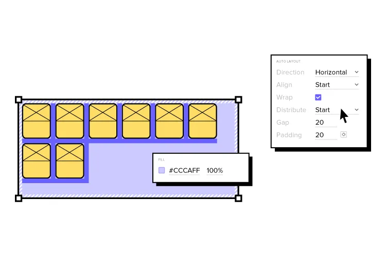
UXPin helps designers and developers stay efficient, consistent, and creative every step of the product design process – from prototyping to simplifying those sometimes tricky design hand-offs.
UXPin has multiple features that will make you design user interfaces fast and efficiently. It also helps you adhere to accessibility standards, easily test your prototype with the simulate mode, and it aims to make front-end developers build products according to your vision by giving them access to code.
4. Remember about feedback
Feedback is, of course, a really important part of product design – it helps you refine your product, turning a good app design into a great one.
Users love feedback just as much. There’s nothing more frustrating, as a user, than tapping a button. And nothing happens.
That lingering sense of dread as they wonder, ‘Did it work? Is it doing what I want?’
That’s bad app design, pure and simple. Because it leaves the user adrift, even if just for a second or three. Users aren’t just used to ‘instant gratification’ here. They positively demand it (there’s a reason good website design dictates load times of no more than about three seconds). Without feedback, they can’t tap back fast enough, even if the action is still processing. The result is a lost user, and potentially a win for your competitors.
One of the best examples of this is the Domino’s pizza tracker. It offers users feedback at every stage of the order. They’re not worrying whether their order went through – they can just open the app and see where it’s at and when it’ll be delivered.
In your own app, use animations and transitions, audio and physical signals, like a vibration, to tell users that their action has been a success.
5. Understand the app purpose
The why is just as important as the what and the who and the how.
Take time to really understand why you’re building your app. It’s all about finding your purpose in the digital space.
Let’s say you’re making a user-generated video social network. If your reasoning is, ‘I have an app idea for a social media mobile application because TikTok is popular’, that’s not a good enough why. TikTok already addresses a particular user pain point. In order to succeed, your app needs to do more than that. It needs to fill a niche, achieve new results in new ways.
Understanding the why at an early stage of mobile app development – ideally, right at the beginning – informs the direction of the project for everyone involved.
6. Avoid web-like experiences for mobile apps
Dare to be more than a website on mobile. Apps, especially the ones made for smartphones like Android or Apple, have some things in common with web design. Yet, there are things you should consider when designing mobile app UI.
Creating web-like experiences in an app should be avoided. – for two main reasons:
- Technological limitations
- User-centric design
If you’re essentially ‘porting’ a website to an app, the tech limitations will impact your final product. Your app won’t work in the same way that a native app can. It’s true to say that HTML-powered apps that work across operating systems are easier to update. But it also means they’re prone to lag and are generally less capable than apps designed specifically for the iOS and Android platforms.
The result is a bad user experience – a cardinal sin when building apps made with the user in mind. Web-style apps lack interactivity. That fundamentally changes what users can do and how they do it.
If it doesn’t do what users want, in the manner they expect, they’re sure to find native apps (those built for specific platforms) that do.
7. Don’t include too many notifications
Notifications are a necessary part of making an app – whether you want to highlight an important message or want users to perform a particular action. But they also disrupt the user flow, which means it’s important you strike the right balance. How quickly do you press ‘No thanks’ a website asks if they can view your location? And how frustrating is it to X an annoying pop-up? The same is true in an app and the notifications that pile up in the home screen.
Bad app design throws real-time notifications at a user with reckless abandon. At that point, the focus is on the app’s functionality, not what the user wants (and the user, frankly, wants as few notifications as possible).
Frequency is important. But so is the content of those notifications. If you’re disrupting the user journey just to tell them how to do something they’ve done a million times before, then it only serves to frustrate them.
Make your notifications useful or necessary (or both). A reminder to redeem their points or an item is still in their cart, for instance, is great; a reminder that pressing ‘Buy’ lets them buy an item isn’t.
8. Prioritize design consistency
Have you ever tapped onto a new screen and thought – just for a second – that you’re in the wrong app? Gone is the familiar, replaced by a whole new style. It’s a pretty jarring experience (and one that might even see you closing the app, your mind filled with well-earned distrust). Consistency is more than using one color scheme or typography.

When creating a consistent design, make sure you align:
- Font type
- Spacing
- Images and icons
- Navigational elements
Consistency is important in great app design. Avoid changing UI elements up too much, at a screen-to-screen level, or introducing too many different concepts all at once. It risks overwhelming and confusing users.
Best App Design is Within Your Reach
Given how most of us interact with services and products on mobile devices, no business can afford offering a bad mobile app design experience. Luckily, as we’ve shared in this piece, there are a set of best practices you can follow as you work on your application.
Sign up for UXPin trial and use those tips above to design a powerful prototype that follows good app design principles.

