Choosing the Right UI Design Software – Top Features to Look For in UI Design Tools

I bet most of us have at some point in our careers heard a UI designer complaining about the final product being very different from the one they designed. There are at least two potential culprits here – a lack of proper designer-developer communication and the use of the wrong UI design tools. Luckily, both of these challenges can be tackled by using the right design software.
In this piece, we mention the top 8 features you should look for in your design software – from the ability to set and re-use UI design templates, all the way through to seamless design handoffs and automatic layout resizing.
Top 8 Features to Look For in UI Design Tools
Here are the most important features you should consider when choosing a tool that will help you build user interfaces. Beginners may find it useful to know that UI design is created on top of UX design that consists of many stages, including the discovery phase in which you build user flows and other things and usability testing in which you see if your digital product is intuitive for the users.
1. Image-based vs. code-based prototyping tools
Designers for many years used Photoshop to create digital designs. Yet, even though Adobe has an excellent tools for creating illustrations and animations, it’s not perfect for creating complex UI designs that need to communicate transitions between pages and user flows.
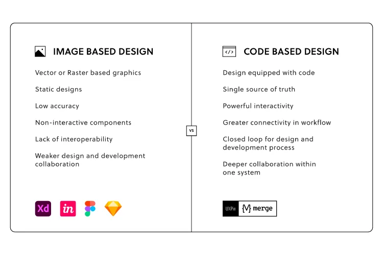
That’s why a suite of different tools were created to fill that gap. Adobe came up with Adobe XD, but also there emerged tools like Figma, Axure, InVision that are what we call image-based tools for building user interfaces.
While that’s great for getting across a concept at creation point, these tools are limited when taking a product design further. Because no matter how close a UI designer gets to the real deal, image-based tools can’t give UX/UI designers the feel and opportunity to build a fully-functional prototype.
When a developer gets the design during the handoff phase, and begins to code micro-interactions, animations and the rest of the elements, there’s no true consistency. The tools can’t communicate, so designs can’t ever be precisely replicated in full and testing is all but impossible.
Instead of mashing square pegs into round holes, move to code-based user interface design tools. This delivers:
- More accurate, highly interactive prototypes
- Products that work as designer envisioned them to work
- Faster deployment and easier collaboration
Part of the problem here is cultural mindset. Designers create static images, and it’s up to developers to turn them into something more tangible (and functional). Some tools, such as Framer, Zeplin or Sketch, act as intermediaries between design and development, and aim at making the handoff process easier. Yet, it means that UI designers and developers need to employ another design tool.
It’s been this way for so long, it can be hard to break the mindset – the dangerous cry of ‘it’s always been done this way’ can stop creativity in its tracks, killing much-needed innovation across design and development teams alike.

Nevertheless, there are design tools on the market that can handle the jobs of many plugins and design tools and help designers create wireframes, low-fidelity prototypes, high-fidelity prototypes, and help with the handoff process. They are code-based design tools and one of them is UXPin.
2. Level of functional fidelity
A prototype that looks like the finished product is good. A prototype that acts like it is great. And that means using tools like UXPin Merge, which let teams create designs using ready code components – the same interactive components developers use to bring creations to life.
Raising the level of functional fidelity brings real benefits to your teams. First, by cutting down on morale-sapping back and forths between design and development, and the endless tread of iterations that eventually do what’s needed.
Second, when developers receive UI design templates, they can immediately work them up, since the prototype functions as it should. The prototype already features interactions and states coded by the dev team. Which leads to the third major benefit: consistency. From interactive prototype to end-product, the vision is maintained (well, until it comes to user testing, when all bets are off).
3. Collaboration (working on the same document at the same time)
The theme of modern life is this: communication.
We’re messaging, and posting, and texting, and sharing – and that’s as true in business as it is at home.
Or the bar. Or wherever else you last checked in on Facebook.

Making it simpler for teams to work together, to discuss projects, and share updates is essential. Especially when overseeing design and dev teams.
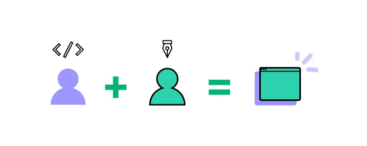
The relationship between design and development teams is a lot like that of a movie director and producer. The dreamer dreams, before being brought crashing down when told, ‘That’s just not how it works’. Rising frustrations have, on one or two occasions, been known to occur.
Using cloud-based design tools like UXPin helps bring team members closer together – working on the same designs at the same time, in real-time. This is especially important in the age of remote work, where online collaboration is fast becoming the norm. Teams cannot meet in front of a whiteboard anymore, but the need for real-time collaboration is still here. So is the need to share libraries, feedback, and conduct efficient remote brainstorming sessions is essential to delivering a final digital product that matches the original vision.
Are you facilitating a collaborative design process?
4. Easy developer handoff (Spec mode in UXPin)
The handoff is one of the most important moments in your design process. The finished prototype is complete, and it’s time for the devs to work their magic.
It’s essential, then, that UI/UX designers can communicate their expectations of the final product, and developers can ask burning questions about the project. The idea, refined. Remember, the most successful handoffs begin long before they happen. Don’t include any nasty surprises in the developer handoff. Your solutions should have already been agreed upon by all teams.
Achieving that level of consistency usually demands pages and pages of dry documentation, created by designers and read, cover to cover, by the development team.
A woeful use of oh-so-precious time when you can save hours with automated design handoff tools that put everyone on the same page.
5. Saving time – Auto layout
When looking for features in your UI design software, anything that saves time is a must. One of the most common bottlenecks in the design process is the designs themselves. A designer sits down, creates an impressive mock-up of an app screen, and then…
Well, at least it looks good.
The team can visualize the concept.
But it doesn’t do anything.
It’s just a static design.
Which means, at some point, that work is going to be repeated. Or constantly tweaked to accommodate fresh thinking – different text on your call-to-action button, for example, or additional options on the menu. And don’t forget to keep the changes consistent across all on-screen elements.
If this bottleneck sounds familiar, streamline the design process with UXPin’s intuitive Auto Layout tool.
So, let’s say you’re changing that call-to-action text. It’s longer now. But instead of having to go in and alter the size of the button to accommodate the new length text, the element (and every other affected element), automatically resizes on your UI design template.
See how easy that was?
6. Using real data inside the project
‘Why are we using that foreign language?’
Ever heard that before after lobbing a few lines of Lorem Ipsum into your design?
Ideally, your prototype should test the idea for the finished product. Thus, it should mimic real interactions as closely as possible. But many prototypes and mockups look exactly what they are – and that can really harm stakeholder buy-in for any proposed solution or even take people out of the moment. They can’t ‘see’ how the finished article should (or would) really look because what’s presented to them feels inauthentic.
Great UI design tools let you import real-world content – from avatars to high-quality stock images – to help make concepts feel real.
For example, UXPin offers the ability to import data from CSV, JSON, and Google Sheets docs in a single click. Fields can be instantly filled with the names and addresses of people in your database, immediately displaying a concept closer to the end-product.
7. Possibility of creating a design system
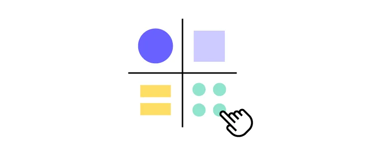
Think of a Design System as a constantly evolving product and web design bible. It’s your company’s ‘design truth’. A communication tool that informs designers and developments of the tools to use, the assets to deploy, the patterns to adhere to, even the values and beliefs of your brand. Anything, in fact, that offers clear, unambiguous direction and guarantees consistency between teams.

It’s critical to keep everyone on the same page throughout the creation of any product. It helps maintain consistency between design and development. But a Design System isn’t a static document. You’ll find that it’s built to adapt, to change, sometimes unexpectedly, as you take on new user interface design projects, or as fresh challenges or opportunities present themselves.
Your chosen UI design software tool must let you build a dynamic Design System that meets the brief of each individual project, so your brand always shines through.
8. Availability
The best UI design tools offer extended availability – i.e., the number of different device types the platform is available on. Design and development teams will all have their own preferred ways of accessing the tool, depending on how they use it and how it fits into their workflow.
That means factoring in availability from the outset. Your UI design software will need to be accessible on Windows and macOS, at the least. You should also consider a mobile app, so you can preview prototypes built for phone screens. If your teams are working remotely, the option to access the tool via a web browser should also be high on your list of requirements.
Choosing a tool with the right availability isn’t strictly about making it accessible to your entire team – although it’s incredibly important. It also means you can see how your prototype correctly behaves across different systems that your users are using. Let’s say, in preview, you notice that smaller screen sizes are cutting out elements or otherwise functioning as you, and the user, expect.
With a tool like UXPin, featuring availability across Windows, Mac, iOS, and Android platforms, you can quickly identify and rectify these errors – no matter what device you use, and before you roll out your product to the wider public.
What’s Your Choice?
Choosing the right UI design software is more than just what program to install. It’s about finding a tool that brings designers and developers closer together than ever before. Help your teams communicate ambitious ideas and create complex, consistent concepts that can be brought to market at lightning speed. If you are looking for a tool that will make working on your user interface design projects more effective and faster, then try out UXPin.

