First, you must understand the current state of your design and development ecosystem.
If you think the experience provided by your product is internally inconsistent and confusing, or the maintenance of code takes too much time - you must prove it to get your team and stakeholders on board.
The best way to start is by building an inventory of all the different patterns, colors, text styles and assets used in the product. The inventory clearly shows all the inconsistencies and hopefully lets you build the case for a design system. Creating a complete inventory, as described below, takes time. You might want to select only a few activities to get the team and stakeholders on board and continue when you’ll have the full team focused on the task.
1. Create the Patterns Inventory
-
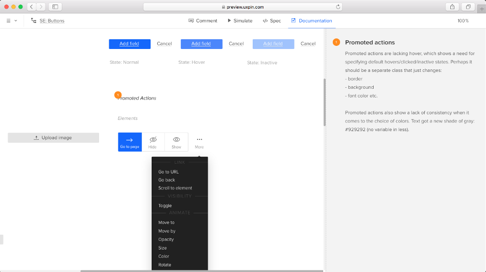
Take screenshots of design patterns or collect design patterns from design projects, to form an inventory of all the different versions of patterns.
Start by collecting different examples of patterns from your product(s). Either take screenshots and paste them into one place - for example your presentation tool, or your prototyping tool or collect project files and take patterns directly from there. You can read more about the inventory here
-
Check the frontend code and/or talk to developers about the architectural approach used across the codebase. Try to identify if the frontend architecture is modular and if you can use it to categorize patterns in the inventory.
Quite often frontend developers work using modular architecture that can be used to organize patterns in the design system. Approach with care and a critical mindset, but definitely do not ignore what already exists. For example, at UXPin, our frontend developers divided CSS into: elements, modules and components. That modularity existing in the LESS files helped us build a strong foundation for the system and make the inventory more actionable as our reference document for the future sprints.
-
If modular frontend architecture exists, categorize your patterns in the inventory using categories from the architecture.
Take patterns collected from products and group them into categories. For example, if the lowest level of the frontend architecture is an element then collect all the buttons and place them under a category ‘element button’. You might also want to document links to all the styling files associated with a given element. Not only will you communicate with frontend developers in the same language, you’re also showing the full scope of the inconsistencies.
-
if modular frontend architecture, categorize patterns in the inventory
Even if there’s no modular fronted architecture in your ecosystem, you have to categorize all the patterns collected in the inventory. You don’t have to make the decision about the overall architecture of your design system just yet. Simply find the common categories for elements (buttons, form fields, sign-up forms…), so the team and stakeholders can quickly notice where the inconsistencies exist.
2. Create the Colors Inventory
A typical source of design inconsistency is the set of colors used across the product portfolio. For example, the inventorization of colors at UXPin showed a massive redundancy slowing down the development process. 116 colors variables with 62 shades of gray were used at UXPin before the emergence of our design system.
-
Traverse the code files and list all the color variables and/or all the colors used in CSS files
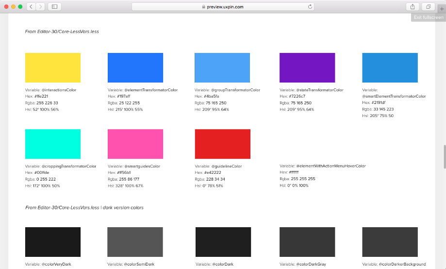
The result of our Interface Inventory sprint — list of 116 color variables -
Take note of the number of places where a particular color appears
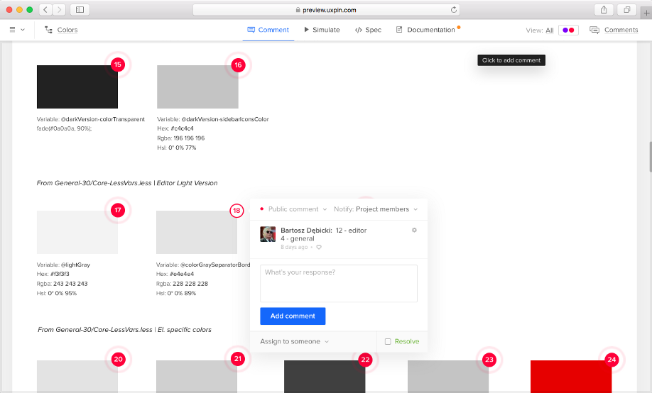
Statistics of color usage across our UI.
3. Create the Typography Inventory
In a complex project, typography can quickly get out of hand. Lack of consistent typographic scale used across the project makes the information architecture convoluted and hard to understand for users, while it also increases the cost of product maintenance due to fragmentation of code. By inventorying text styles, you show your team and stakeholders where styles become inconsistent.
-
Walk through the UI and check all the text styles through a browser console.
-
Take notes of any inconsistencies of text styles in one project.
-
Form a typographic scale by ordering text styles in the order of the informational importance (from h1 to small text). Create multiple scales if necessary.
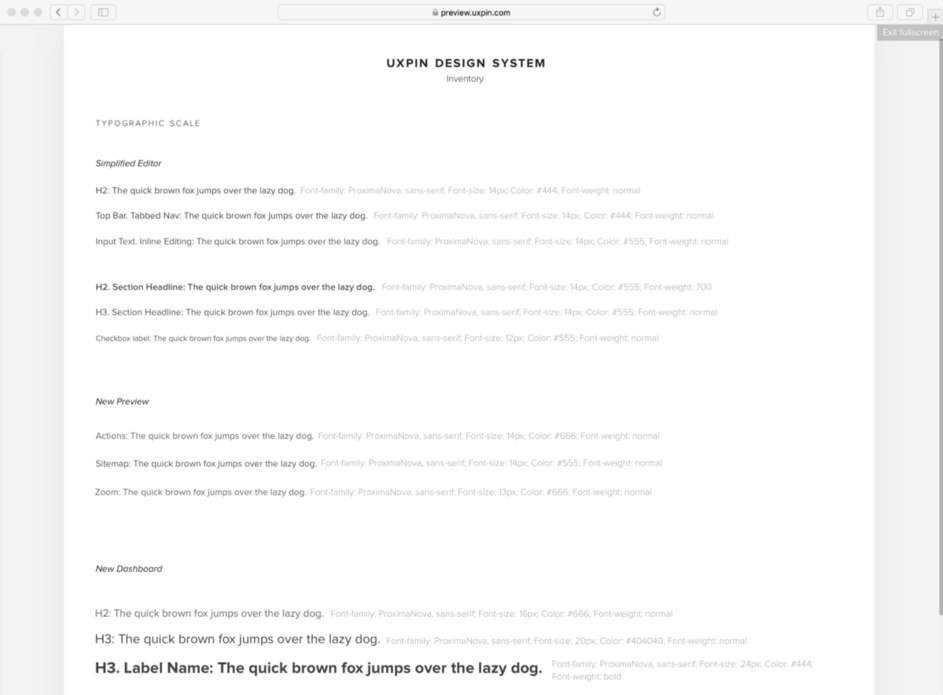
Our typographic scale. -
if CSS preprocessors are being used - take note of mixins and variables used to generate text styles and try to match them with styles in the inventory
In modern front end development CSS preprocessors are often used to generate ready text styles through the usage of mixins (e.g Sass mixins). Referring these simple functions in the inventory helps you communicate with developers and becomes very handy for implementation of a new typographic scale.
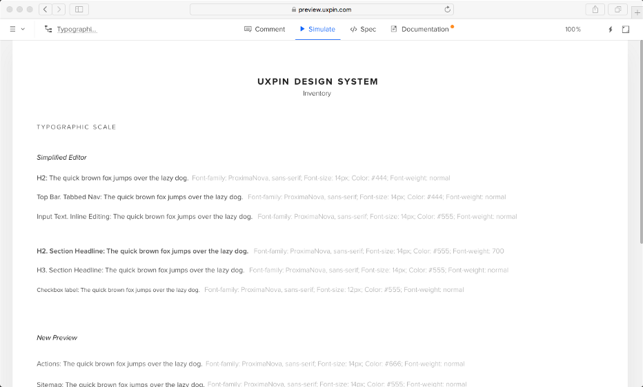
Here’s a list of all the text styles in our internal design system.
4. Create the Icons Inventory
Icons provide the necessary context for user experience and speed up the recognition of key actions in most of the interfaces. Inconsistent usage of icons can lead to extreme confusion of users and increase the maintenance cost. By creating an inventory of icons, you can help your team and stakeholders understand the pain of not having a design system in place.
-
Identify all the icon libraries used across the product
-
Mark inconsistencies across the icons (e.g. two icons from different families used in one UI, two similar icons assigned to different actions, two different icons assigned to the same action etc.)
-
Check if there are different ways of implementing icons across the product portfolio
There are multiple ways to use icons. Inline SVGs, SVGs as data-urls, icon fonts - talk to the development team, or browse through the code to understand which methods are used in your design and development ecosystem. If different methods are in use, it’s worth taking a note since this is likely to increase inconsistencies and further slow down the software development process. You can learn about different methods of implementing icons and their efficiency, here.
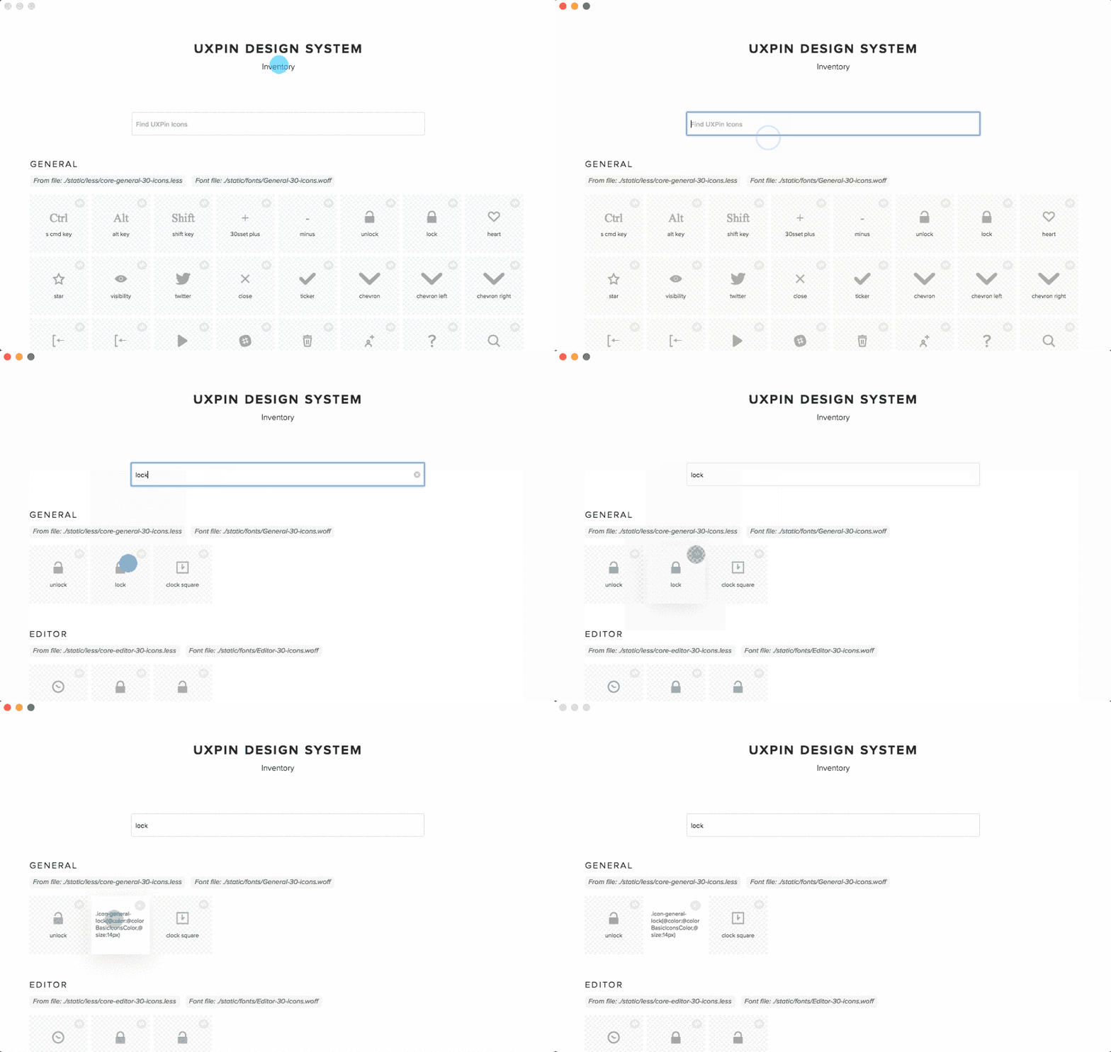
An in-house app we created that generates a list of icons from an icon font and shows mixin declaration from Less files.
5. Create the Space Inventory
Space is the key ingredient of any UI and designers and developers have to manage it efficiently. Add to your inventory different kinds of grids used across the products and perhaps also dive deep into paddings in the containers to understand any inconsistencies. Learn more about space in design systems: here
-
List and document grid systems used across the product portfolio (if there are any)
