Kick off your design system process with sprints devoted to unifying and implementing the color palette. Colors affect all the parts of the system, so you have to organize them first.
-
Use the color inventory to identify the primary/base colors
To identify base colors, check which colors are associated with the brand and which colors are the most prevalent in the UI. Aim at forming the full palette in which there is no accent colors not associated with a primary color and there’s no color in the UI not represented in the palette.
For example, we identified all our primary colors as:
- #006CFF Blue (main brand color)
- #666666 Gray
- #FF003C Red (error & danger color)
- #63ad0e Green (success color)
- #ffc000 Orange (warning color)
- #7800ff Violet
- #ff56b1 Pink
- #00ffde Mint
-
Decide on the naming convention
There are different approaches to naming colors in a design system. You can name colors using abstract names (e.g. #b9b9b9 - pigeon), actual names (e.g. #b9b9b9 - silver), numbers (e.g. #b9b9b9 - silver-1) or functional names (e.g. #b9b9b9 - silver-base). At UXPin, we’ve decided to go with the functional approach. Names are also used as variables in preprocessor files.
For example, our primary colors became:
- @base-blue: #006CFF
- @base-gray: #666666
- @base-red: #FF003C
- @base-green: #63ad0e
- @base-orange: #ffc000
- @base-violet: #7800ff
- @base-pink: #ff56b1
- @base-mint: #00ffde
-
Decide on the system of building accent palette colors
You can build the palette of accent (secondary) colors by making a series of arbitrary decisions (which in some cases might be very time consuming and difficult) or use some sort of a functional approach. At UXPin, we’ve used LESS functions (darken and lighten) to derive accent colors from base colors. For example a 15% darker color than our base-silver (#f3f3f3), would be called @silver-darken-15 (#CDCDCD). This approach let us build an extensive palette with human readable, clean, naming.

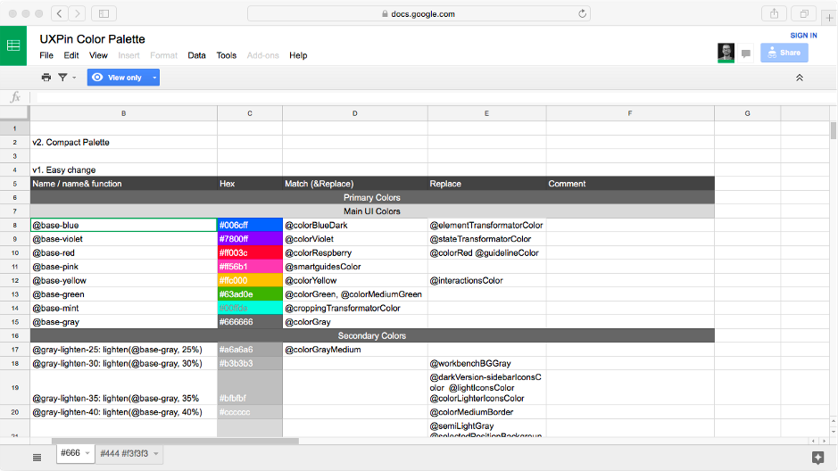
Spreadsheet listing all the new and old color variables. -
Test the color palette against the colors in the inventory
To assure your new palette will serve the entire design team well, make sure you either match, replace or merge all the colors used in the current version of the UI. There should be no color in the UI outside of the color palette as stated in the design system.
-
Implement new color palette in CSS (consider using a preprocessor and build a list of variables) on a test server
-
Test how the new palette affects the interface
Plan extensive QA to check how the new palette affected the UI.
-
Check the contrast between colors in the new UI. Make sure you comply with WCAG guidelines
Make sure that after the introduction of the new palette all the elements of the UI still have sufficient contrast as regulated by the Web Content Accessibility Guidelines. Use this color contrast checker.

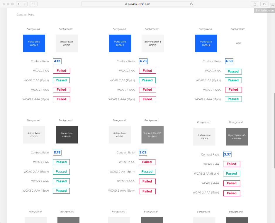
To help spread this knowledge, I created ‘contrast pairs’, which clearly shows which pairs pass WCAG tests. -
Present the new palette and the UI affected by the palette to all the product designers
-
Invite product designers to test the interface and suggest changes to the palette
Let the product designers participate in the process by testing the new palette and suggesting changes. You need them onboard to assure them that the new palette is actually going to be implemented and used in the future projects. Remember - design system not used by the product team is dead and useless.
-
Finalize the palette
After tests and gathering feedback, finalize the palette and communicate it to the company. Add the palette to your design system documentation.
-
if you’re using variables in a CSS preprocessor, make sure that names of variables are documented in the documentation of the design system.
-
Deliver the new color palette to the tools used by product designers
Make sure that the new palette is going to be implemented in design tools used by your team ( UXPin, Sketch, etc). For example, you can use the UXPin design systems library to assure and manage consistency.

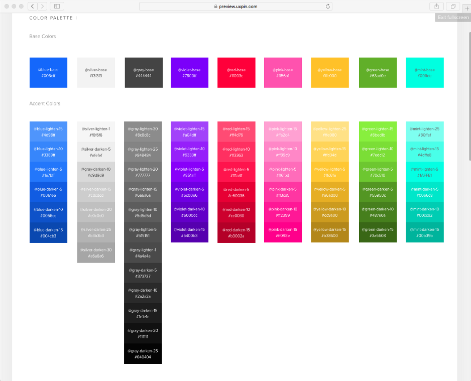
The final version of our color palette.
All these colors are used in multiple places in the UI and typically play an important role.
While we could further divide them into, for example, brand colors, messaging colors, marketing colors — we struggled to create a common nomenclature. Any attempt at sub-categories just resulted in confusion.
To simplify things, we decided to keep our colors in one bucket and refer to them as our primary colors. Not ideal, but it’s a pragmatic step since many more colors still need to make it to the final version of our palette.
