Allard van Helbergen, Senior UX Designer at Atlassian, speaks from Sydney about what he and his team learned from 16 years of design system evolution.
Why do you build a design system? The popular answer is to maintain consistency across different products and different teams, but a well-made design system also reduces cognitive load and increases the speed of development overall. There is one reason, though, that stands over the others, the ultimate reason. Design systems help users.
Atlassian has known the value of design systems for quite some time, but it took years of practice before they realized just how powerful design systems are — and how to best utilize them.
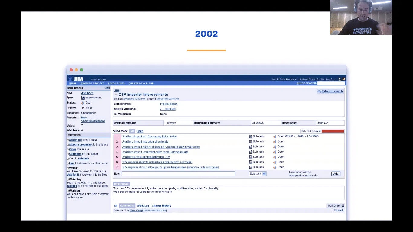
Jira UI 2002
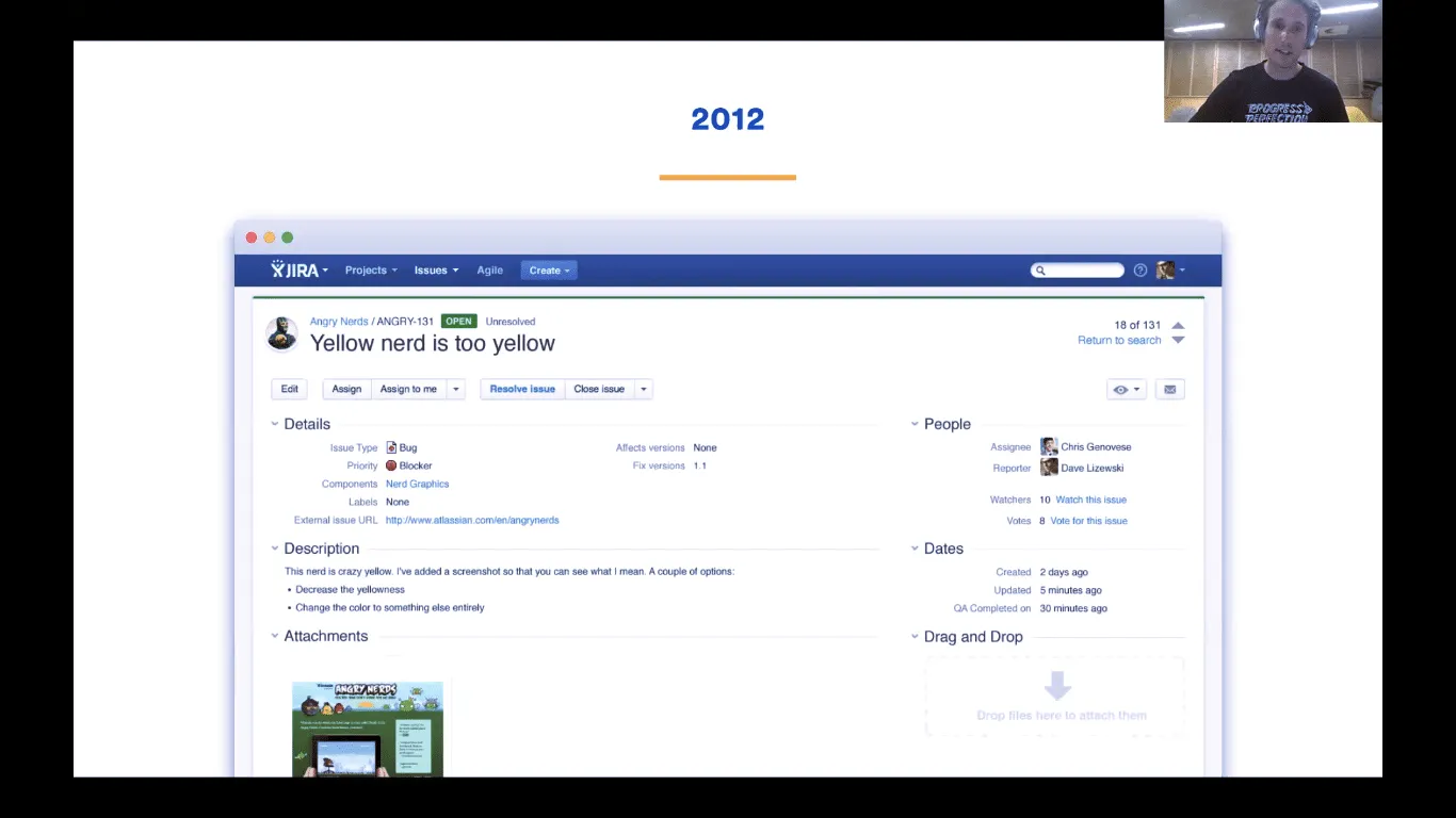
Jira UI 2002
Through gradually refining and improving their designs over ten years, Atlassian created its first official design system in 2012. Back then, the goal was primarily to ensure consistency across all of Atlassian’s products, and their first “design system” was actually closer to a traditional style guide.
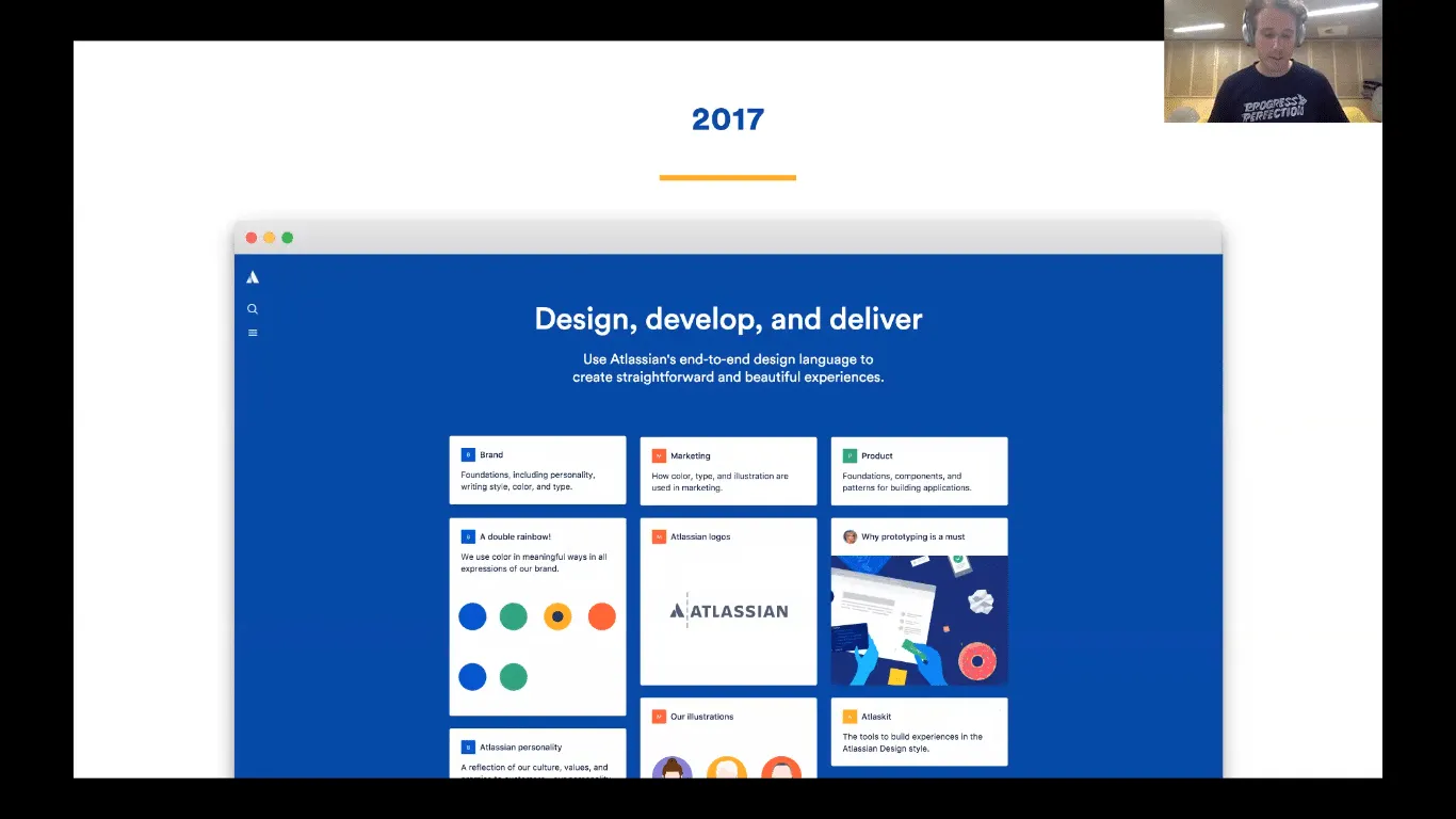
Jira UI 2017
For the next 5 years, Atlassian developed and fine-tuned their design system, learning some valuable lessons along the way — namely that it could be do more than just maintain consistency. By 2017, their latest version placed more emphasis on reducing friction in product interfaces, and to this end they added the complementary Atlaskit, a move that defined the capabilities of design systems.
The Atlaskit comes equipped with standard UI components that not only help designers maintain consistency by using the similar parts, but also offer the best ready-made UI options for better performance. The kit’s components are built around actual user preferences, so standardizing them saved time for each product.
But, as our speaker explains, “there’s a lot more to it than just delivering UI components.”
Over the years, the process of refining the design system taught Atlassian a lot. Senior UX Designer Allard van Helbergen was kind enough to share some of these Learnings during UXPin’s Design Systems Virtual Summit 2018, which presented case studies from companies like Salesforce, IBM, Airbnb, GE, Linkedin, Fjord, Zendesk, and more.
Focusing on two specific UI components, inline and modal dialog windows, Allard takes us through the four most important pieces of advice for design systems, and how to apply them. Take a look at the recap of his presentation below.
Learning 1: Tension between product and design systems is healthy.
One of the hardest parts to grasp about design systems is that their components never quite fit perfectly out-of-the-box. The design system and the product work together, but do different things. “At some point your product will be leading [the design]. At another point, your design system will be leading.”
Rather than fight this tension, Atlassian learned the smarter solution was to use it to their advantage. There is no “one size fits all” component that would work perfectly with every product, so they needed to add a degree of customization. They found that, by leaving some room for growth in their design system, the components could be slightly modified to suit whatever the product’s needs are.
“What happened was,” Allard explains, “the component that was taken from the design system had a shortcoming and didn’t allow the product to do what they needed to do. So products reached out further and made their own decisions.”
To illustrate his point, Allard shared a real-life example. Compare the design systems entry for inline and modal dialogs…
… to some of the final variations that ended up in the products…
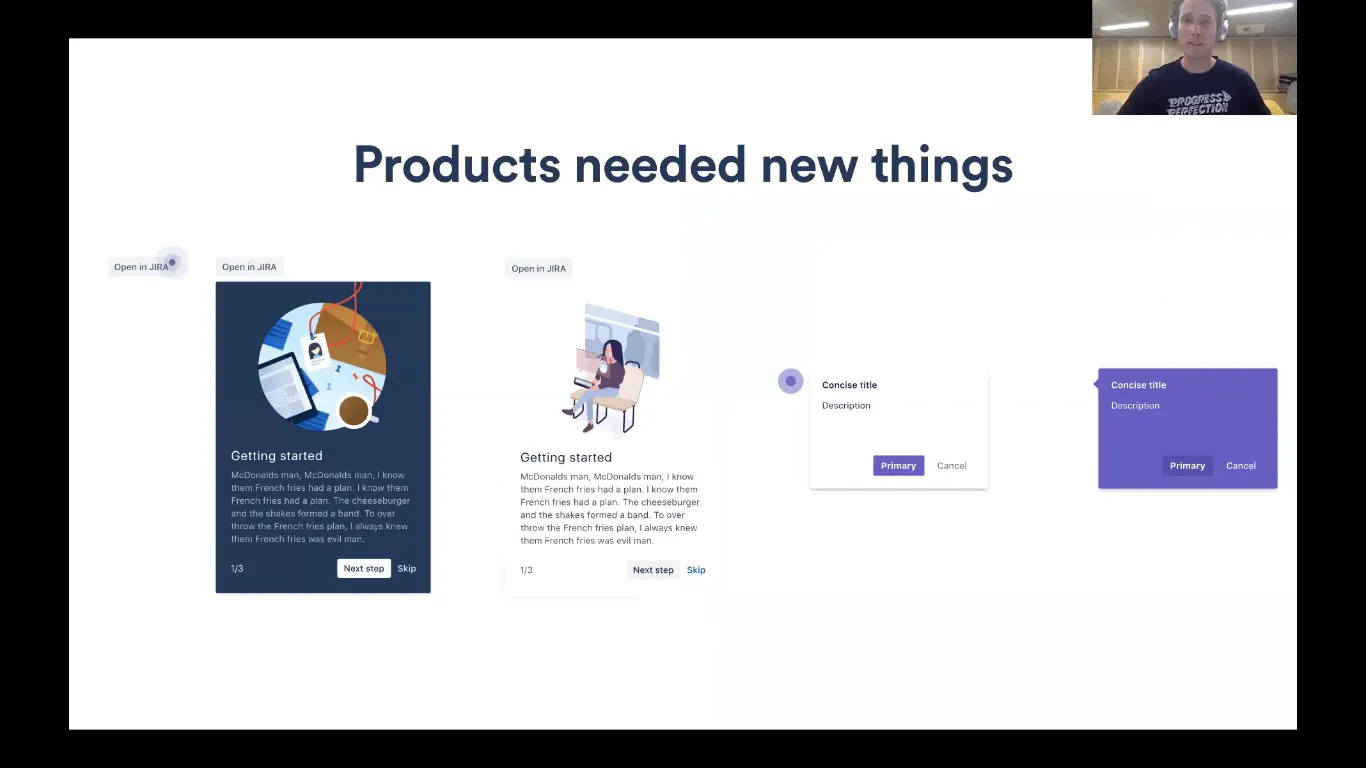
The modifications are minor, not nearly drastic enough to threaten consistency across products. At the same time, the small changes add some new life to the design. Tweaks like color changes, illustrations, or adding a pulsing dot can be just what the product calls for, so it’s crucial to leave that possibility open.
Atlassian gives product design enough freedom to build and change components based on their own individual use cases. This gives designers room to experiment and create variations, which opens up the possibility of improving on the original designs, especially considering individual product needs.
Design systems simply can’t account for every need for every product. You wouldn’t want them to, either; that kind of cross-product uniformity would limit all your products, not to mention appear repetitive for multi-product users. So to get the best of both worlds, Atlassian provided the foundation for UI components in their design system, but gave enough flexibility that individual products could modify them as needed.
Learning 2: Look at what’s in product, synthesise, and build forward.
To perfect each component, Atlassian relies on feedback, whether user research, usability testing, or comments straight from the users themselves. Normally, each individual product would iterate the feedback into progressive prototypes and move forward on its own. Atlassian, though, encourages synthesising the feedback from all products first.
For one thing, accounting for feedback from all products adds enough diversity to balance everything out. As Allard explains, “Some products might have made some bad decisions or some products might have taken shortcuts along the way. So this is a moment when you can fill those stop-gaps and help them get that extra kick.”
The other major advantage of synthesising feedback is that the individual components are stress-tested in multiple scenarios, providing a more accurate understanding of how they should be treated. This provides extensive data and opens up improvements that a single product’s feedback wouldn’t reach on its own.
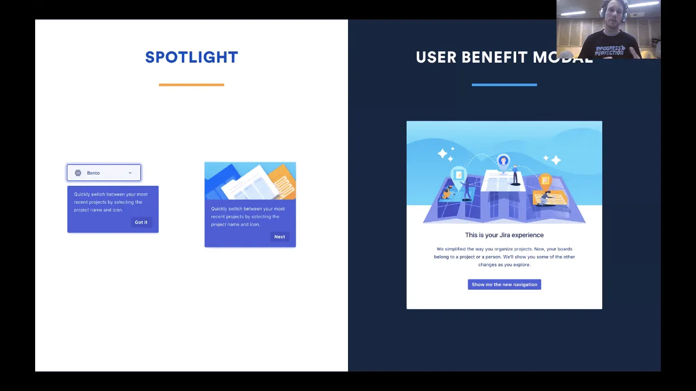
This is the method that helped Atlassian develop two new components, both born from the feedback of previous iterations. The Spotlight is “essentially a type of chaperon that will show you around the interface,” while the User Benefit Modal can “help you kick-start your new experience, telling you some highlights and why this experience is good for you.”
By looking at the entire forest instead of the individual trees, Atlassian was able to identity some UI elements that were missing across the board, and subsequently add them.
Learnings 3 & 4
We don’t want to give too much away in the recap. To learn more about how Atlassian handles design systems — straight from the mouth of a senior designer — watch the video below.
The hour-long video covers all 4 learning points, plus an informative Q&A after the presentation with questions from designers all around the world. You’ll discover a lot of professional insights straight from the mouth of an expert, such as:
- How to incorporate user experience into component design.
- How to build a cohesive user flow by combining chains of components.
- How to synthesise experiences the same way as components, including a case study of Atlassian’s process.
- Why you should build your design system as if it were a product
- A personal account of how Atlassian evaluated their product line for a “roadmap alignment” to see which design system components to prioritize.
- More trade details about how Atlassian devised their “First Impression” framework for onboarding.
- Realistic time frames for building and implementing design systems.
- The best ways to introduce design systems to other departments internally, and how to get them on board.
- Recommendations for follow-up resources on how to start building a design system.
To see Allard’s presentation in its entirety, click the video below now.

