Creating Engaging Mobile App Design – All You Need to Know
It’s predicted that by 2023, the mobile apps market will reach $935 billion in sales. Pretty impressive, right? However, to get a piece of that cake, you need to make sure that your app design is not only pleasing to the eye but also easy to use. Only then you’ll be able to generate high user engagement.
Let us walk you through a few things that your entire team, and especially your mobile app designer should keep in mind while building the best app.
Go to section:
- 3 Steps of an effective design process
- How to create the best app design strategy?
- Creating great user experiences
- 3 great practices for great app design
- 3 great app design examples
- How to avoid common app design mistakes
- Choosing the right app design tool
- App design trends to watch out for in 2022 and beyond
- Build App Design in UXPin
Ready to create an app prototype? Use UXPin and simplify hi-fi prototyping. Build an interface that looks and behaves like a real app, even though it’s yet to be developed by your software engineers. Get better feedback from tests, show stakeholders what the app will be like, and make it easy for developers to see what you want them to build. Try UXPin for free.
3 Steps of an effective design process
There are three app design steps you’ll need to map out and follow to launch a successful product. This is your design process. It’s how you and your team ‘keep your eye on the prize.’:
- Plan and research
- Design and development
- Launch and test
Let’s look at them below.
Step one: Plan & research
During the initial phase, you’re going to define exactly what your product is, how it helps, who it helps, and what your app does that rivals don’t. These are the foundations for building a popular app with a clear user base.

Start by clearly outlining what you want to achieve – in broad strokes. Detail the problems users face, how you think you’ve solved those issues. This is mobile designing at its most innovative and creative.
Focus on your users. The most successful app designs are centred around the user – from who they are to what they want. Call on focus groups, surveys, and phone & face-to-face interviews to uncover what users really want from your app design. They will challenge your assumptions. This is a good thing.
At the same time, analyze your competitors. Even the smallest playing fields have big players. What do they do well (and not so well)? How can you best them?
With all this data, you can then assess, pare back, and refine your goal into a single, shareable vision.
Step two: Design & development
The next step in the process sees you visualize your app design. You’ll start with wireframes – basic mockups that are just useful enough to gather reflexive feedback from users, stakeholders, and your team.

As you progress, you can start building up a consistent design system for color, typography, sizing, and other visual elements. These UI and UX designs will follow through to your high-fidelity prototypes. Such functional mobile designing mock-ups let you continue testing and optimizing the app throughout the design process.
You can then hand over designs to the development team who will build the app. It’s important to prevent bottlenecks during this stage. Designs can so easily tumble back and forth between design and development teams, threatening to derail entire projects as one side asks for X and the other side delivers Y.
When developing your app, you can speed up interactive prototyping and harmonize the design-development hand-off by using software like UXPin. It’s a design tool that lets designers create a prototype that looks, feels, and behaves like the final product. Try it for free.
Step three: Launch & test
Ok, one final test and it’s all systems go. Finally, all your app designing experience comes together for the product launch. That might strike the end of the design process, but the journey is only just beginning.

As you follow the design process, you’ll be assessing the product at various stages. And it doesn’t stop there. To ensure your app remains relevant, popular, usable, and used, continue to collect user feedback that offers new directions for refining.
To find out more, read our guide on How to create an effective app design process.
How to create the best app design strategy?
1. Define the idea
As a mobile app designer, you need to keep everything aligned to the same objective. It’s all too easy for team members to lose focus, not understand their role, or give in the mission or project creep. Your communication matters.
Offer clarity with a well-defined concept. Before you start app design work, you should be able to articulate:
- The purpose – what is your app for?
- The audience – who is it for?
- The use-case – how will it be used?
- The benefits – why choose you over a competitor?
- Required resources – what’s needed to develop the app?
- Success metrics – how will you measure success?
2. Calculate the budget
Calculate a realistic budget as part of your strategy. It’s crucial for keeping the project on track, as it’ll help prevent mission creep – which sees design and development teams add extra features, leading to spiraling costs and hours of wasted time.

In other words, it actively harms the product design and development (and it’s even more costly if users turn off from these untested features).
This will also help you allocate resources most effectively. A budget should help detail what’s being designed in terms of UI design and UX design, as well as how it’s being developed.
3. Establish the KPIs
What does success look like? As you build a detailed app design strategy, focus on the metrics that really matter to you. There’s no single yardstick against which success should be measured. It’s up to the mobile app designing team to determine a few of the most relevant metrics to your app and your objective.

Common product and design KPIs include:
- Number of downloads. Download figures show you whether users like your product enough to install it. If the figure’s too low, you know you’ll need to test ways to increase installs.
- Churn rate. Churn shows how many users are uninstalling your app, or not opening it. Use this data to explore what it is that’s driving away users.
- Session counts. Session counts and times show the number of users who open your app and how long they stay active within it. It’s a good base to start if you want to figure out why people stay (or go).
These three stages form the basis for a successful 7-step app design strategy. Explore the other four in our dedicated article How to create an app design strategy.
Creating great user experiences
The 5 principles for outstanding user experiences are:
1. Usability
Mobile device screens are small – and that limited space means adjusting your designs accordingly. Actions should be easy to tap, swipe, scroll, and hold with one hand. Avoid forcing users into performing fiddly actions (think of those annoying pop-ups with minuscule X buttons that are difficult to press). It should be obvious to users what to do and how to do it.
2. Familiarity
Familiarity of user interface creates a more engaging and intuitive user experience. There’s no need to reinvent the wheel (or redesign the app). Search bars go at the top, options lurk behind hamburger menus, settings are under the cog icon.
When you use familiar mobile design patterns in your mobile app UI, the onboarding process of new users won’t be difficult.
3. Consistency
You don’t really want users to even think about their actions – it should ‘just work.’ Consistent design principles are really important for making it happen. A good example is always using the same button that indicates adding an item to a shopping cart in your eCommerce app, so users act on instinct.
Another great one is sticking to one or two fonts, so that you increase readability, as well as make your design consistent. At a broader level, every screen in your app should be consistently you to better brand yourselves and immerse the user.
Use UI kit or even better, a component library with a pre-made interactive UI elements such as Material Design, to stay consistent.
4. Accessibility
App designing for accessibility means considering the broad range of mobile devices on the market – and an even broader range of users. Does your app demand a high-speed internet connection? Can users with physical limitations still use your app?

5. Appeal
At the end of the day, a mobile app designer wants users to love their product. When building your own app, factor in audience appeal. Focus on how you can design experiences that are
Interested in learning more? Explore all the secrets behind memorable app design UX.
3 great practices for great app design
1. Simple navigation
Simplicity is about making key actions easy to find on-screen. The best way to do this is to limit each screen to one or two core actions. Through an engaging design hierarchy, you can then focus a user’s attention to the right places.
Look at the Amazon app as an example. It offers a masterclass in simple app navigation. Users aren’t overwhelmed with choices. The interface is clean, clear, consistent, leaving users in no doubt what steps to take, whether it’s searching for products or hitting the buy button.
2. Built for mobile
Design your app for mobile devices. It might sound obvious, but all too often mobile app designers effectively ‘port’ a website. While HTML-based apps give you a bit more freedom to update across platforms, the experience is less desirable. You’ll typically find web-like Android and iOS apps laggy, underpowered, and poorly optimized for mobile devices.

Great app design means respecting the user (and how they engage with your product). Ultimately, app designing in this way, in a highly competitive, user-focused marketplace, is a major risk.
3. True design tools
To create truly seamless experiences for all your users, you need the right tools for the job. This gives you the flexibility to build app designs in an efficient workflow, with tools dedicated to your craft.
Design and prototyping tools like UXPin help you realize your ideas precisely as envisioned. The mobile app designing software helps designers and developers build creative, consistent products from wireframes to ready-to-launch apps. And by giving designers access to the same real-world code components used by your developers, you can ensure expectations match reality, no coding skills required. To find out the must-have features in your software, see the section Choosing the right app design tool.
Explore more top tips on creating good app design in our dedicated article: How to choose app design software.
3 great app design examples
So much for theory – let’s now look at some examples of great app design below.
Example One: Google Maps
Google Maps is a prime example of the app design mantra ‘form follows function.’ It’s perfectly built to fulfill its objective – helping users navigate the entire world from their desktop or mobile device.
The map app makes it simple for users to find specific locations, search by category, and get directions to just about any destination. Better still, it delivers incredible value to its users through imagery, reviews, street views, business information, and sat-nav capabilities.
Despite being loaded with functionality (and stuffed with the whole world), the Google Maps interface is delightfully subtle, never threatening to overwhelm the user. Even if you’ve never used an app before, you’ll know how to get around Google Maps, and how to get around using it.
Example Two: Pocket
Pocket is a clever app that lets you save articles and media to read or watch later.
The app’s interface is fresh and modern. Navigation is smart and intuitive. The experience centers the user, from easy-to-use actions to distraction-free options for concentrated reading. It even works without an internet connection, so you’ll always have something to read on-the-go.
In keeping with all successful apps, user testing was critical to improving today’s iteration of Pocket. Thanks to Google Ventures, developers were able to gather feedback from five users unfamiliar with the app. That feedback was used to create its classically simple interface.
Little wonder Pocket recently won a Webby award for its UX design. But what else would you expect from developers Mozilla, the firm behind the Firefox browser?
Example Three: Etsy
Etsy is the beating ‘art’ of the ecommerce apps, where creators and shoppers meet. The Etsy app is a notable example of simple, effective web and mobile app design – but perhaps that’s to be expected from the arts and crafts supremo.
Crack open Etsy and, unlike so many eCommerce apps, you’re not immediately bombarded with sales messages, deals, star products, and other irritations that clutter user interface. All users need to do is search for what they want or try Etsy’s suggestions.
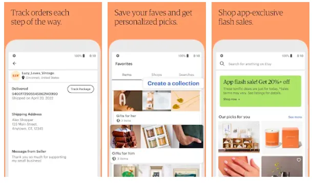
It’s a strongly visual experience. Images take center-stage, alongside simple product headings. No prices or product names to distract you as you browse. It makes the user experience much more gentle and serene no matter if you use Etsy on Apple or Android devices.
Discover more real-world examples like Airbnb, TripAdvisor, and Uber in our dedicated article on great app designs.
How to avoid common app design mistakes
Don’t add too many features at once
There’s nothing wrong with a feature-rich mobile app. But one of the most common mistakes is when mobile app designers throw all those features into the app at once. Even the most highly functional apps add features over time. This allows them to see what works, what doesn’t, what users want, what they don’t. And it means the app delivers on its singular objective first.
When you begin the app designing process, start off with the core purpose of your mobile application. Make it guide your mobile app development process. You can then add additional features as your app grows in popularity. Be sure to test these features individually. Otherwise, the risk is that you’ll overwhelm users, clutter up your app, and waste precious resources on something that has no real viability.
Maintain a regular updates schedule
The development process starts when your product launches – and it doesn’t stop. Don’t let your app fester after launch. Maintain a regular schedule for updates. It’s a great way to attract and retain users, keeping your app feeling fresh and innovative.
After each update, check out reviews (or, better yet, conduct in-depth testing) to understand where improvements can be made in future.
Test with diverse user personas
User testing offers insights into how your app performs. And the best way to get the most valuable feedback is by drawing on the broadest possible range of users. When building a test group, choose different types of users – think gender, age, and background. All of them will be attracted to your app for varied reasons, and those reasons may surprise you.
By calling on a broad range of user personas, you’re better placed to identify specific and general behaviors that help improve the product. Without a diverse user group, you risk getting locked in a feedback loop, appealing only to a selected few. This can lead to poor app design, which can be expensive to fix post-launch. It’s better to get it right during the design-development phase, and lots of different user types will help.
Read more about the mistakes you should avoid in new app design in our article about bad app design.
Choosing the right app design tool
What should you be looking for when selecting the best design tool for your job? Here are a few characteristics you should keep an eye out for.
1. Simple design-dev handoffs
The moment the design team passes over their concept to development is one fraught with anticipation. It’s a stage in the process where bottlenecks are common, and projects have been known to come to a total standstill as some team members might debate over what the app needs to do versus what’s actually possible.
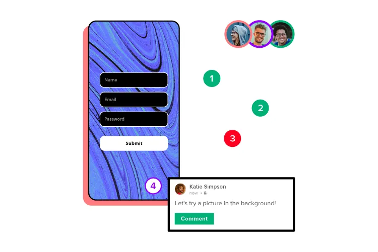
For this reason, you’ll want to choose a mobile app designing tool that simplifies the passing of design to development. UXPin gives designers the opportunity to design highly realistic prototypes. When devs see the prototype, they can use UXPin to generate CSS automatically.
This leads to easier design handoffs, since user experience and interface design as well as app development processes are connected. They all can meet in one tool. Try it for free.
2. Real-world data
One of the biggest issues with prototypes is just how artificial they feel. All that lorem ipsum and knocked-up design elements break immersion in test groups and fails to showcase the true flavor of your concept. It simply doesn’t look believable, or even look how it should at all.
The best design tools let you populate your prototypes with real-world data. Names, locations, text, and images can all be inserted into designs to better reflect what users will actually see when the product launches. Real-life data like this also gives your team and other key stakeholders a greater impression of what’s being built long before you invest resources into design and development.
3. Collaboration and sharing features
Collaboration is an essential part of the design process – from chewing over product concepts and strategizing your next steps to communicating core functions to other teams. With so many ideas bouncing around, it’s sometimes difficult to log everything and keep everyone fully informed. And that harms the perfecting of your app.
So, choose an app design tool that makes it simple and easy to share ideas and collect & collate feedback. UXPin features support for PDF, PNG, and HTML exports so everyone on your team can check out the latest designs.
To further enhance collaboration and sharing between teams, the UXPin Mirror app offers authorized users the ability to live-preview mock-ups on mobile devices. It’s the ideal way to understand how your app design looks, feels, and acts on other devices, be it Android or iOs. And with edits displayed in real-time, you’ll be able to compare before-and-after shots.
Be sure to discover more characteristics of great app design software in our dedicated article on choosing the right tool to design your app in.
App design trends to watch out for in 2022 and beyond
1. Multidirectional navigation
Scrolling remains the primary way users experience apps today. Up and down and the occasional tap or input. It’s a functional means of navigation, but it’s not fulfilling – even if everything else on the screen is.
Multidirectional navigation introduces a more engaging experience than traditional and limited scrolling. Modern apps are deploying horizontal and vertical sliders that let users swipe and scroll through the app, to evoke more instinctive, natural interactions.
You’ll find this type of design heavily featured in multimedia and dating apps that let you swipe left and right to find everything from stunning shots and radio stations to potential life-partners.
2. Inclusive designs
Mobile devices are for everyone – and your app should be, too. They’re in the pockets and hands of youngsters, pensioners, and everyone in between. Unless you’re targeting a very niche market, a modern app needs to feature inclusive design.
You’re not just appealing to a broad user-base. You’re designing an app that’s accessible and usable by that audience. Whether they’re on a phone or a tablet, have physical disabilities or other accessibility issues.
Subtitles are one of the most common trends in inclusive design. Other examples include using buttons that are big and bold, reaching younger children and those with visual impairments. The same goes for sizing options and adding alt text to images for users with screen readers.
Color blind mode is another accessible feature worth including for those who need it. To make sure you’re creating fully inclusive app designs, UXPin hosts a ton of accessibility features, including a color-blind simulator and contrast checker, making it simple to build experiences for all.
3. Dark mode
Dark mode isn’t a new trend in app design. But it is an ongoing one. Users today want apps to be easy on the eye – even, or especially, when we roll over at 3 in the morning to check our inbox. Generally speaking, good UX is not blinding users with a bright white screen if dark mode is available.

Dark mode fits comfortably in mobile app design, as both an accessibility feature, and a user-focused enhancement. A classic case of ‘If they don’t need it, they want it.’ By switching to darker colors, users experience less eye strain, so they’re more comfortable using your app at all hours of the day.
For bonus UX points, let users set a dark mode schedule that turns on at specific times.
Lead the way by looking at all the top app design trends we’ve gathered for you.
Build App Design in UXPin
The road towards creating a successful, user-friendly mobile app can be lengthy and
time-consuming. The good news is, however, it does not have to be an arduous one!
If you follow a well-thought-out strategy, you’ll be boosting your chances of market success. For starters, it’s important that you divide your app design process into three phases – planning & research, design & development, and launch & continuous testing. Make sure to have a clear understanding of your budget and KPIs. It’s also equally important to use the right mobile app design tools.
If you’re just about to embark on your mobile app designing journey, we recommend taking UXPin for a spin. You’ll be using the absolute-best solution for team collaboration, leverage real data in your prototypes, and make design handoffs as easy as can be.

