Every time the occasion arises, my team jumps at the chance to give workshops and presentations.
We know what it’s like to step out of our comfort zone, whether that means executing basic design tasks (like wireframing) or doing more strategic work like defining, planning, and validating UX processes. These sessions target both the curious and the advanced, focusing on exploration and experimentation, never requiring they know a certain design tool (we think paper and markers do just fine).
Here’s what you need in order to organize your own workshop for sketching a mobile product experience:
1. Select a theme
We’ve learned that an idea for a workshop should be easy to pitch, and something your team can work through from start to finish. It’s highly effective at keeping attendees’ attention engaged during the entire session.
Let’s take look at the idea we selected for our workshop during a local design event.
Illustro is the platform where writers and illustrators get together and create comics that are sold through its internal market.
You see? Elegant and straight to the point.
Here’s a very important disclaimer: before trying this workshop with your product team, make sure your theme is informed by user research. For instance, you can run a few 1-hour user interviews to reveal pain points and current behavior patterns.
This way, you won’t jump into a solution before first exploring the problem. Otherwise, you might end up sketching a mobile product that nobody truly needs.
2. Present a brief
The brief should include (at minimum):
- a general product definition
- a list of possible competitors
- a set of personas (based on user research)
- a list of features/functionalities
- technical limitations.
Here, I recommend a little workshop tip: don’t fill in the entire brief.
You’ll want to leave a section or two blank so that attendees have something to complete on their own (like some extra new features or a persona’s fears and restraints). This is a very good exercise to understand the project, its scope, and its users.
3. Draw the main flows
The purpose of all workshop steps is to gain practice with experimenting and iterating as rapidly as possible. So, how can we draw flows faster and communicate what needs to happen on the screen? Thanks to Ryan Singer and his great article, A shorthand for designing UI flows, we switched to his format.
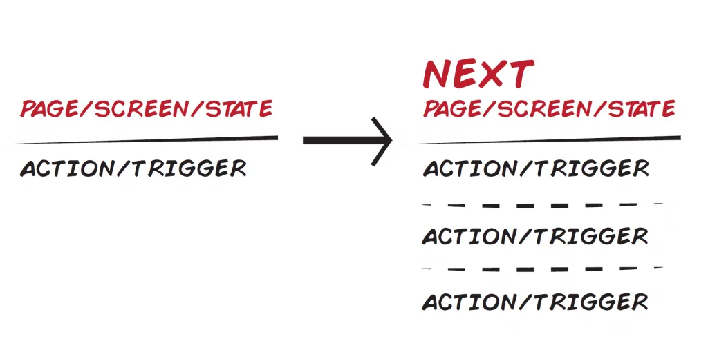
The diagrams have two major components: the screen we’re currently on (what we see on the interface) and the actions or triggers required to advance to the next screens. This way, we challenge participants to devise their own flows while also considering the number of steps and actions users would have to make to achieve their goal.
4. Sketch, sketch, sketch
Here, at Grapefruit, we’ve been trained by Marius Ursache to use more than a pencil. Everyone on the team has their own toolbox, complete with black and red fine tip markers, a black and grey marker, and a highlighter.
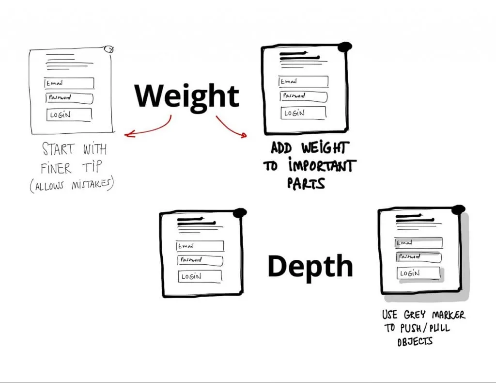
How we use our toolbox
- When participants draw their own screens, have them start with the black fine tip marker. They’ll use this to create their major components.
- Next, the black marker is used to add a layer of weight to features worth mentioning (for example marking the main call-to-action button or the fact that the component is a pop-up window).
- Attendees will then add a new layer of depth using grey markers to push/pull objects (drawing drop shadows for buttons or inner shadows for input fields).
- Finally, use the highlighter to mark active and/or important elements, labeling with the red fine tip marker where necessary.
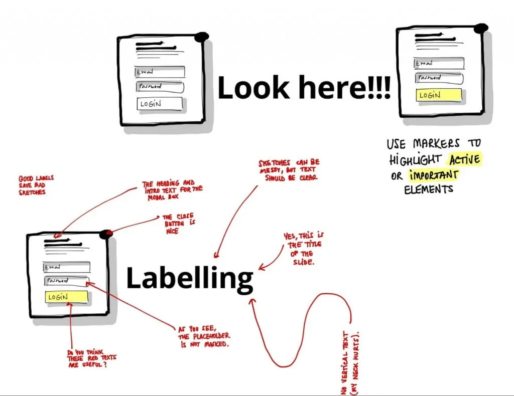
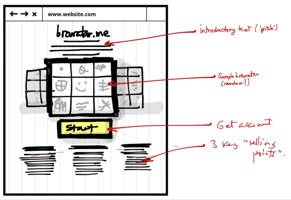
For this exercise we let the participants explore their ideas by starting with a desktop/web experience. I’ll explain an example of how we used the tools when sketching our own product.
Back in 2014, we were working on a recommendation engine based on the brands we love (we named it Bravatar). For selecting the brands, we went with a 3×3 grid with the profile picture in the middle. We used the black marker to direct the attention towards the grid, while graying out the background elements. We ended with highlighting the call-to-action and labeling the sections. The rest of the page was drawn using simple lines.
5. Prioritizing mobile user flows
Not all features or flows end up on mobile.
This might be influenced by budget constraints, usability priorities, or the simple truth that something just doesn’t fit. Luke Wroblewski graciously presents in his book, Mobile First, how we can align mobile web behaviors with the user’s needs.
Luke Wroblewski highlighted four major mobile use cases in his book: lookup/find, explore/play, checkin/status, and edit/create. They’re then arranged in a matrix, as well as the product’s flows.
Using his matrix, we invited participants to mark all its entries with 1 or 0 if they think there’s a match between the flow and the use case. If the flows have a total of 1 or 2 (maximum) going through all uses cases horizontally, then your flow is a keeper.

This is a great exercise that helps you choose and prioritize when switching from desktop to responsive or designing mobile apps.
6. Sketch, sketch, sketch some more
Now that we’ve organized the mobile flows and practiced our doodling skills, we move on to our last exercise.
We’ll be sketching again, but strictly for mobile this time. Using device paper templates, attendees begin sketching their vision for the mobile app.
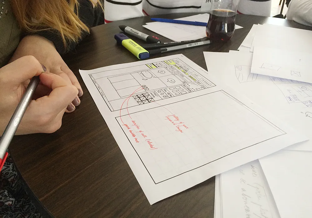
To make things even more interesting, we recommend practicing paper prototyping with the attendees.
For example, In Illustro’s case, some of the attendees cut the sketches, glued them and made low fidelity prototypes out of them, while others used POP to create tappable interactions. After the session, you can even take photos of the paper prototype and upload into UXPin for a quick digital prototype (and early documentation).
That’s the beauty of an audience, you may never know how they might surprise you with their process.
Recommendations
If you’re eager to run a similar workshop, here are a few pointers we’ve learned along the way:
- Before you plan the workshop, decide, how you’ll schedule the time. Will it last a full day, or should it be split into two? The level of information in a workshop can become overwhelming.
- If you go with an idea, also present your own approach (solving the exercises yourself). It adds great value to your feedback.
- If you split your attendees into teams, make a point to still provide feedback on each member’s contribution.
- Balance the time needed for you to present and for attendees to do the practical exercises.
- Prior to the sketching exercises, showcase patterns and best practices in order for the attendees to get accommodated and warm up their drawing skills.
I invite you to try and experiment yourselves. It’s a fun and rewarding experience to embark on a workshop like this.
Participants will surprise you with witty ideas and challenge your thinking when you least expect it. Moreover, it’s a great exercise for the entire design team to practice their presentation skills, to share their knowledge or to give constructive feedback.
I, for one, will continue to refine this workshop formula and adapt it towards wearables, virtual reality or Internet of Things. So what’s stopping you?
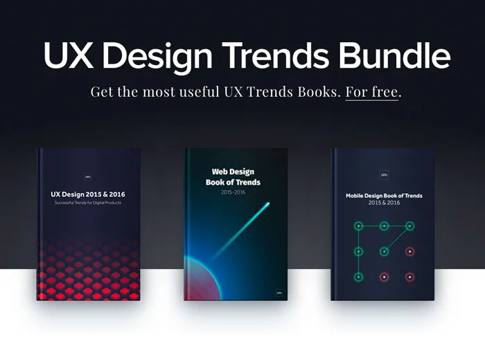
For inspiration and a refresher on UX best practices for your workshop, check out the free Definitive 2016 UX Trends Bundle. The bundle includes 340+ pages of advice with hundreds of examples.

