Should User Experience Designers Be Aware of Psychology?

Products are built by people for people. To do it right, UX designers must have a genuine interest in human psychology – to understand the emotions and motivations behind users’ actions. Only then you are able to create products, which perfectly resonate with the target audience. Without this knowledge, it’s like shooting in the dark – high chances are, you’ll miss your target.
In this piece, we’re going to focus on the question – should user experience designers be aware of human psychology? We’ll discuss the psychology principles you should be aware of and how you can apply them to your design process.
Implement all UX psychology principles that we’re about to outline right away. Create advanced prototypes using UXPin, an end-to-end prototyping tool that supports product design and development teams on their journey to build the best apps, websites, and other digital products for their users. Try UXPin for free.
Is UX design related to psychology?
Psychology and user experience are inseparable. You cannot design products that will appeal to your target audience without diving into human psychology – at least on a basic level. Otherwise, how will you know how to influence their decisions and resolve their problems?
If you’re a designer, then high chances are you’ve heard the term “design psychology”. It’s a combination of the following:
- Neuroscience
- Cognitive psychology
- Social psychology
- And human-computer interaction.
By wrapping your head around these branches of psychology dedicated to human thinking, you’ll be able to view the design process through a more human lens.
In other words, you’ll be capable of implementing mechanisms that will drive specific responses and actions from your users into your products.
4 UX Psychology Factors Designers Need to Know

At UXPin, we’ve noticed that plenty of sources online reduce the role of psychology in design to ‘studying behavior’. However, it’s far beyond that. It’s a complex process, which circles around analyzing the user’s emotions, attention, cognition, and perception levels. Of these four criteria, the last two should be studied particularly well by designers.
In this section, we’re going to discuss all four UX psychology factors and how you can make them play out in your digital product’s favor.
Cognition
Have you ever stepped into a store to buy yogurt, only to stare blankly at the fridge, overwhelmed with the choice? This is a prime example of Miller’s law. In a nutshell, people struggle to compare multiple options against one another due to cognitive limitations.
The average person can simultaneously process anywhere between five to nine options. Anything above this threshold either makes us pause our actions or withdraw from them altogether. The same is likely to happen to your users if you clutter too much information on your website or app.
To tackle this UX psychology challenge, it’s best to distribute information over multiple, progressive screens. For example, if you operate an online store, show no more than nine products per page. If it isn’t possible, then try to group them into categories to ease navigation.
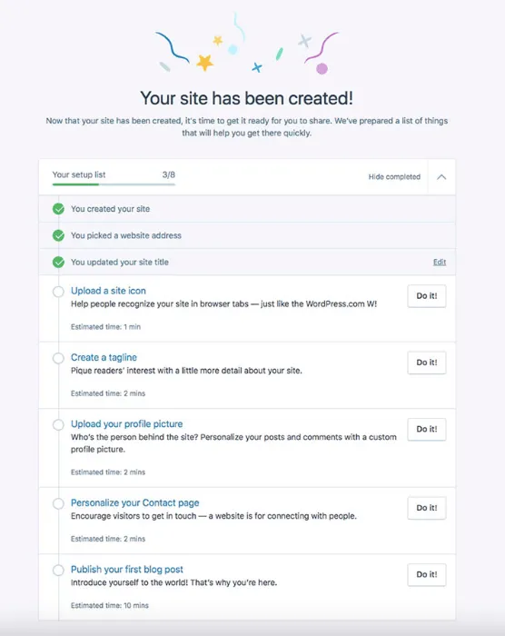
The same rules apply when designing entire user journeys. If you’re creating, say, an in-app onboarding sequence, break it down into smaller chunks, and show a progress bar at the top.
Here’s a great example from WordPress:

Perception
Perception kicks in as soon as a person comes across your brand name or logo for the first time, and stays with them in all interactions with your website and services. It’s a mixture of opinions and emotions that your product triggers in them, and is subject to change over time.
So, what contributes to how users perceive digital products? The Interaction Design Foundation points to several Gestalt principles. While discussing all of them in depth would be beyond the scope of this piece, designers should particularly consider the following:
- Proximity – users tend to think that elements placed close to one another in an interface are part of a group, i.e., there’s a relation among them.
- Similarity – people believe that similar elements are related to one another, even if they’re dispersed on a screen miscellaneously. What we see as ‘similar’ can be based on shape, color, or size.
- Closure – the human brain tends to imagine lines and links between shapes if it helps us see a pattern. Look at the famous Champions League logo below. Even though the stars aren’t linked on the outer edges, we clearly see a star-shaped football.
To learn more about the role of perception in design, grab our free eBook on Web UI design for the Human eye.
Attention
There is a statistic circling the internet that the average human’s attention span is just 8.25 seconds, which would put us behind goldfish (9 seconds). This number has rung alarm bells among psychology scholars. While the goldfish analogy has luckily been debunked, it’s true that our attention has worsened when compared to the pre-personal tech era.
There are two things that can disrupt your user’s journey. Firstly, they can get distracted by their own thoughts or physical surroundings. Secondly, they can be deliberately interrupted by other apps competing for their time – for example, via push notifications.
Here’s how to tackle this while designing your website or product:
- Refrain from any strong stimuli that could interfere with the user’s goals. For example, if they visited your product page, showing them random pop-up surveys or colorful banners could keep them from converting (i.e., draw their attention away from the “Buy now” button).
- Inform your users about where they are in the process. Imagine they were setting up your tool, but were interrupted by a phone call. Will they know where they’ve left off once they return to your app or site? A good idea is to create breadcrumbs or even a progress bar, so they can see how many steps are left in the process.
- Finally, try to make your product stand out. People are attracted to and interested in new experiences. That being said, don’t break any UX design conventions. Simple actions like moving between categories or finalizing a purchase need to be easy to complete.
Emotion
The age-old rule says that you become who you surround yourself with. But it’s also strongly about what we surround ourselves with. If we dedicate, say, 80% of our leisure time to watching sad movies, it will be easy for us to pick up the gloomy mood. This is a subconscious reaction, which can luckily also be used to evoke positive feelings.
How does this relate to digital product design? Don Norman, UX design guru and co-founder of the NN Group, says that aesthetics play a key role. One of his research papers circles around the claim that “attractive things work better”.
What Norman has noticed throughout decades of UX design work is that people tend to forgive usability glitches if they like the design. They will also feel that aesthetically pleasing interfaces are more functional. So, when it comes to emotion in UX, it’s not only about your company’s message. It’s also about how you present it through visual and functional design.
Is a Psychology Degree Necessary for UX Designer?

Both psychology and UX revolve around people. So while a user experience designer should be aware of human psychology, they don’t necessarily need to be a psychologist.
Most psychology principles are easy to understand but can have a tremendous impact on your design process if applied correctly. Let’s take a look at what UX design and psychology have in common:
Research – humans are complicated creatures, and figuring out their motivations and needs can be hard, especially when they can’t verbalize them. Having basic psychological knowledge will help you apply specific techniques to gather information and derive insights from them.
Empathy – a lot of us think that empathy is something we’re born with. However, the truth is that it can be trained, and psychologists spend years trying to become more empathetic. Being able to step into your users’ shoes, which is what empathy is about, will become handy in UX design.
Emotional design – successful products and services are built around users’ emotional journeys. When you run user interviews and usability testing, you’ll be able to apply your basic psychological knowledge to figure out how people feel while using your product.
Check out: UX Design Degrees and Courses that Are Worth it
Psychology in Design – How Can it Help You?

Applying psychology to your designs will help you make better design decisions.
Here is how:
Decision making – giving users more options to choose from isn’t always the right thing to do as it can lead to a paradox of choice. The more choice they have, the harder it is to make a decision. Offering your users guidance, and simplifying their entire journey will improve their experience.
Motivation – UX designers have to understand their target audience’s pain points and needs. In short, they have to know what motivates them to use a product. Without this knowledge, they won’t be able to retain a user for long.
Influence – as humans we’re often indecisive; we don’t know what action to take until we actually take it. This is a very important piece of information, as it shows that people need guidance. Psychologists are aware of mechanisms that can be applied to “push” individuals towards a certain action. The same principles can be used while designing products. However, there is a thin line between manipulation and influence. Trust and credibility are the basis for building a lasting relationship with customers.
Interactions – the more complex the product the harder it is to interact with it. And this is worth taking into consideration as people have different levels of tech savviness. If you want people to use your product or service then you have to adapt it to your users, not the other way around.
Use Psychology Principles in UX Design
An understanding of psychology principles is a must-have in any UX designer’s skill set. Humans are complex beings, and our reactions aren’t always the most ‘rational’ ones on the table. Knowing how people create visual connections and what triggers their positive and negative emotions will help you do more than just build more enjoyable experiences. It will also support your business goals and have users return for more.
The best part is that, since we’re all humans, you can test your concepts well before you put out a design. By using UXPin, you can create interactive prototypes, from start to finish. Have an idea for a functionality or an assumption you’d like to build and test out? Get started with UXPin.


