The humble box element doesn’t get much credit. While they make terrific gray placeholders, in UXPin boxes can be more than just dull rectangles.
Border
The edge of a box can have a certain thickness, measured in pixels. You can color this border, which technically sits inside of the box element.
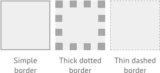
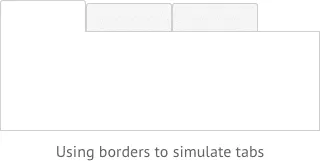
Click the chain icon to give each side a different thickness. That’s useful when simulating a bottom shadow, or making a small box appear to join a larger one as when making tabs. You can also change a box’s corners from sharp points to gentle curves with the corner radius settings.
These options are available to you in the Style menu.
Fill
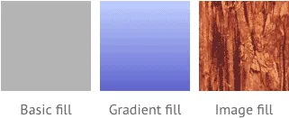
You can fill the space that a box occupies with a color, gradient, pattern or image.
When using color, box backgrounds use RGBa — which includes opacity. That means you can make its background translucent without affecting its border or content.
Unlike image elements you can import with click-and-drag, images in box backgrounds do not stretch or shrink as you resize the box. If the image is smaller than the box, you can use it as a repeating pattern by selecting “repeat x-axis” and “repeat y-axis.”
Like borders, you can edit a box’s fill in the Style menu.

Content
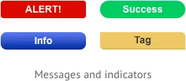
Boxes can contain text. Double-click a box to start entering words or numbers. This is most useful when creating sitemaps — though you can also use it to create simple alert and success messages.
To keep text content from bumping into the border, look in General Settings for “padding.”
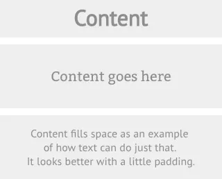
Coupled with fills and interactions, you can create give users some useful messages
Fixed position
Like any element, boxes don’t have to move as a user scrolls through long prototypes. Look in General Settings for the “fixed position” checkbox to keep them in place. This is useful when creating headers and footers, especially on mobile apps.


