The UXPin editor lets you build prototypes with elements, from simple shapes to icons to pre-built components. Here’s how to find and organize elements in your design.
Everything is a layer
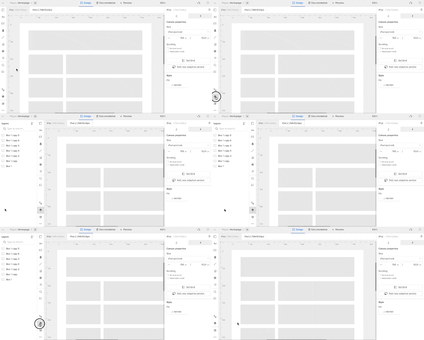
As in Illustrator or Sketch, every element is a unique “layer,” or object. That means you can place elements above or below other elements, like navigation buttons above a background. To see your layers, click the stack-like icon near the bottom left corner of the editor.

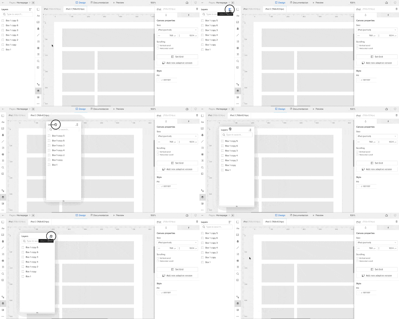
The layers menu is detachable so you can move it to a convenient place above the canvas as you work, if you need the space. Look for the three-bar “pop out” icon in the upper right corner of the layers menu itself.

Adding elements to the canvas
Building both quick wireframes and advanced prototypes with basic parts is a snap. On the left side of the editor you’ll find a collection of design elements like buttons, text fields and icons. Drag one into the canvas to add it to your prototype.

Searching for elements
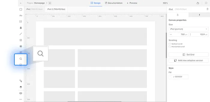
Although UXPin organizes its elements into libraries, sometimes you need to find one by name. To that end, the element search feature (cmd/ctrl-F or that icon in the top bar) lets you type a name, then drag and drop your choice into place.

Groups
A “group” is a collection of elements that act as one. Re-positioning one element in a group moves them all, and hiding the group hides its elements.
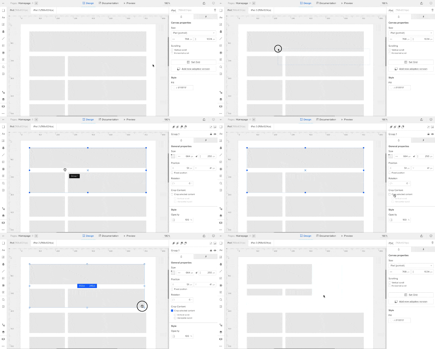
Groups can be cropped to hide certain elements they contain, making them partially or completely hidden. Turn on grouping in General Properties. To reveal a group’s cropped elements, activate the group’s horizontal or vertical scrolling options, also in General Properties. Cropping is useful when you want to simulate smaller viewports or iframes.

Above, creating a group with a crop.
Align elements with the layout grid
The horizontal layout grid (opt/alt-G) helps you create orderly designs, especially with wider apps and sites.

Resources
- Article: Pre-built elements
- Ebook: The Guide to Mockups
- Get a free trial


