Best Signup Page Examples That Will Make You Want to Redesign Your Own
Many people underestimate the importance of a signup page and use a generic template to onboard new users. Signup pages are your organization’s first point of contact with a new customer, so designers should focus on the user experience just as carefully as they do with any other user interface.
We’re going to explore some of the internet’s best signup forms and why they matter. We’ll also show you how to build and test your signup forms using our code-based design tool.
Can your image-based design tool capture user inputs and validate that data? The problem with image-based design tools is they lack fidelity and functionality. With UXPin’s code-based prototypes, designers can capture user inputs, validate emails and passwords, create conditional formatting, and more! Sign up for a 14-day free trial and discover the endless possibilities with code-based design from UXPin.
Why Your Signup Page Matters?
Signup pages are a way for organizations to attract new leads or sales. It’s usually the first time a potential customer will interact with your brand, so it’s critical that you impress and delight new signups.
Signup forms are probably the least complicated UI element to design but the most challenging to entice people to take action. Designers must understand their target audience and UX psychology to overcome hesitancy and increase conversions.
There are no rules to creating the perfect landing page. A/B testing is crucial for registration form optimization.
Top 10 Signup Page Examples
Here are 10 excellent signup form examples to inspire your next landing page.
1) GetResponse
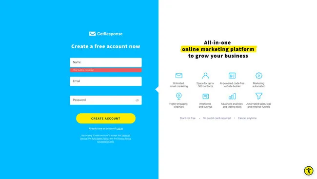
GetResponse is an industry-leading email marketing and lead generation software with landing pages, forms, and other tools. You would expect such a company to have an excellent registration page, and they do!
GetResponse ticks all the boxes when it comes to UX design principles; it is consistent, accessible, easy to digest, uses simple language, and provides feedback, to name a few. The page only has three form fields:
- Full Name
- Password
Think of each form field as another reason why someone won’t sign up for your product or service. By reducing form fields, you increase conversion rates.
GetResponse also highlights its benefits on the signup page, reminding customers why they need this product and the problems it’ll solve.
One feature you won’t often find on a signup page is an accessibility button to change the form’s background color marketing it more accessible for visually impaired users to read. GetResponse must know that their brand’s blue didn’t contrast well for people with visual impairments, so they added an accessibility button to fix it.
2) Flux
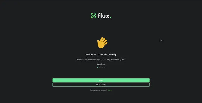
Flux uses a full-screen signup form to onboard new customers. This strategy allows the user to focus on completing a single task without distractions. Even though Flux only requires users to complete three form fields, they break these up into steps, with a separate page for name, email, and password.
Flux also includes a list of requirements below the password field, so users know what length and characters they must use. As they complete each condition, it turns from red to green with a checkmark, so the user knows they have fulfilled it correctly.
3) Leadinfo
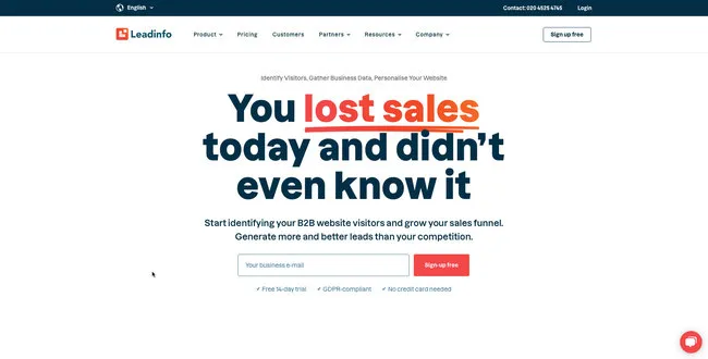
The quickest way to get signups is to make it easy, which is precisely what Leadinfo does on its home page signup form. All Leadinfo require to onboard a new customer is an email address. While there is a risk that they might not complete the signup process right away, you have an email address to nurture the lead into a customer.
Leadinfo’s UI design uses typography and color to highlight a problem and how the product can solve it. The clever use of color draws a visitor’s attention to the effortless signup form or the live chat to engage with a sales representative–giving users options and making them feel in control.
4) Cleo
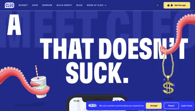
Cleo is an app-based product, so users can only signup via the iOS or Android apps. If a potential customer finds Cleo’s website using a desktop, they need to funnel that customer to download the app.
Cleo makes this easy with a dropdown animation revealing a QR code redirecting users to their preferred app store. They also provide links to Apple’s App Store or Google Play.
While Cleo’s example isn’t a signup page, it’s a great example of creating an immersive, on-brand experience for users to find your product and sign up.
5) Designmodo
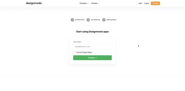
Managing users’ expectations and providing context are crucial for good UX design. Designmodo does this well with a three-step signup sequence that displays a progress bar above the form.
Users know what each step requires and approximately how long it will take them to complete the process. Another intelligent strategy about Designmodo’s signup page is to first ask for the user’s email. If the user abandons the signup sequence, they can try to win them back through an email sequence.
6) Salesforce
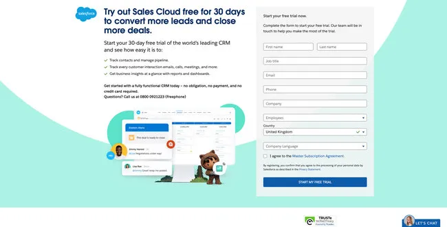
Salesforce is the world’s leading CRM platform with an extensive suite of tools and products. The company requires a lot of information during signup, including company name, email, phone number, to name a few. Still, they offer a 30-day trial in return–with no credit card or obligation.
Salesforce uses compelling copy to highlight the product’s primary benefits and remind customers that they’re getting 30 days free. The CTA button even says START MY FREE TRIAL, so users know there is a reward for completing Salesforce’s lengthy form.
If you’re asking customers for a lot of information during signup, use value to incentivize the process. Most free trials last 7 to 14 days, so by offering 30 days, Salesforce creates a lot of value. They’re also an established brand with a lot of prestige, so customers are more willing to spend time completing Salesforce’s signup form.
7) Typeform
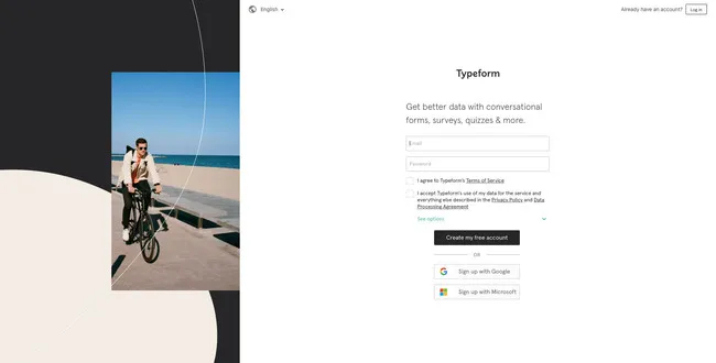
It’s impossible to have an article about signup pages without mentioning the master of the form, Typeform. Typeform’s immersive and intuitive forms make completing signups, or any form, an enjoyable experience.
Typeform only requires two fields to complete its signup sequence; email and password. The company also offers two social media options, Google and Microsoft. As Typeform is a business product, offering corporate-type social signup options makes more sense than Facebook or Twitter.
Typeform also offers users the opportunity to customize their data privacy with three options to opt in or out of specific communications below the newsletter signup. As this would create a busy signup interface, Typeform uses a dropdown menu to hide these until the user clicks “See options.”
8) Transmetrics
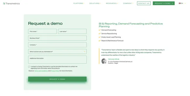
Providing social proof and testimonials on your sign up page is a fantastic way to tell people how the product or service benefits customers. Transmetrics uses a quote from a prominent European customer explaining the company’s excellent customer service and understanding of the logistics industry.
Transmetrics also uses simple language and bullet points to highlight the product’s key benefits. Lastly, the call to action button says “REQUEST A DEMO,” telling the customer exactly why they are filling out this form.
9) Glide
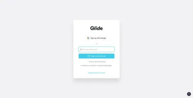
Glide’s email signup form is minimal and effortless. Users can signup using their Google account or email address. The product integrates with Google Sheets, so it makes sense to only offer one social network signup option.
The simple UI design uses a bright blue signup button, immediately drawing users’ attention to the center of the screen. Glide’s signup form can onboard a new customer smoothly and efficiently with two clicks.
10) PayPal
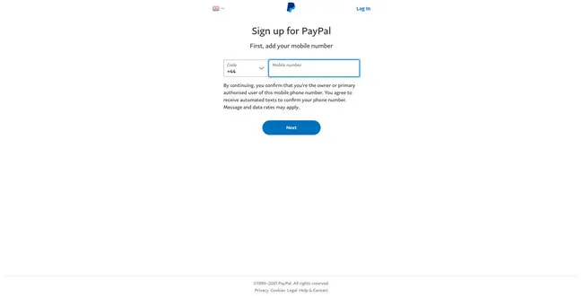
As a financial service, PayPal must collect a lot of personal information during signup. If PayPal had to create a single signup form for its onboarding, it might overwhelm customers, resulting in high dropoffs.
To overcome this problem, PayPal uses a step-by-step process of capturing personal data. The company asks for users’ mobile and email first to follow up if the person drops off.
If you have to collect a lot of information, consider doing it in a step-by-step process and use a progress bar to show customers how many steps they must complete. You should also consider offering the option to save their progress to return later.
Prototyping Signup Pages With UXPin
Prototyping forms in traditional vector-based design tools is impossible. These tools don’t offer the functionality to create working inputs users can interact with.
UXPin is a code-based design tool, which means designers can build prototypes that capture and process data like a website or digital product. Designers can create actual signup forms with inputs that check for conditions and provide error messages.
For example, UXPin lets you create email and password validation. If the user forgets the @ or .com in an email input, designers can program an error message for the user to fix the problem. You can also include password conditions, like character count, letters, numbers, and symbols.
Once a user completes signup, you can welcome them with their name on the next page and include their personal information on a profile page. No image-based design tool offers the fidelity or functionality to prototype signup forms like UXPin!
Ready to give signup form prototyping a try? Here’s how in three easy steps:
- Sign up for a free UXPin trial.
- Download our working example of a signup form prototype.
- Drag and drop the .uxp file into your free UXPin account, and you’re ready to go.
Here is a preview of the signup form prototype you can edit and customize in UXPin.


