Website Structure 101 with Examples

A Website structure helps users to navigate sites and find the information that they are looking for. This article will explain why site structure is important for designers and how designers can create effective site structures.
Key takeaways:
- A website structure is the way a website’s content and pages are organized and interconnected.
- It involves the hierarchical arrangement of web pages and their relationships to one another.
- Website structure helps visitors and search engines navigate and understand the website’s content.
- There are four types of website architectures: hierarchical, sequential, matrix, database.
Designing a new site? Use UXPin and build website architecture and turn it into a workable prototype. It’s an end-to-end solution that simplifies UI and UX design process up to design handoff, so your developers can extract ready HTML and CSS code to kick start website development. Try UXPin right now.
What is Website Structure?
Website structure is how the different pages of the site are linked with each other through internal links and their hierarchy. It is about how the information on a site is organized and presented, so that the users know how to move through the site whilst the algorithm can read its context well.
Good website structure facilitates easy navigation for both users and crawlers. Apart from influencing user experience, it also affects the SEO ranking of a website in search engines.
Why is website structure important for designers?
The role of a UX designer is to create a website that has a great UX that takes care of accessibility and is easy to use. A great website structure improves the usability or user-friendliness of your website by making it easy for users to find what they are looking for.
4 Types of Website Structure
There are different types of web structure that you may use in UX design. They are hierarchical, sequential, matrix, and database model. What are they about?
Hierarchical website structure

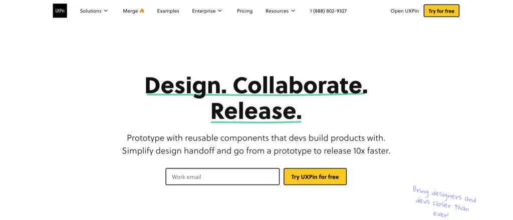
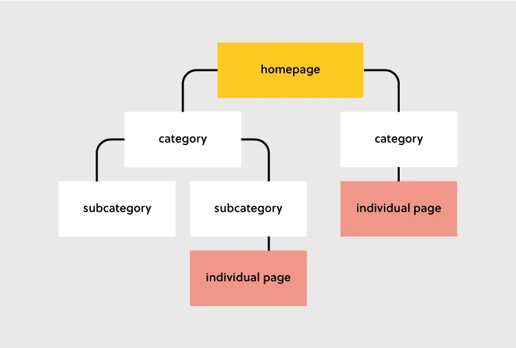
Hierarchical structure is the most common website structure is a hierarchical structure that is based on one parent page (main page) and child pages (categories and sub-categories) that flow from the main page. Think of UXPin’s page (image above).
Sequential website structure

Sequential structure is used when you want your users to go through steps or any other sequence. A good example of that structure is Growth Design‘s UX case study pages that they share in their newsletter.
Matrix web structure

Matrix structure is site structure that’s common for online newspapers, such as New York Times. The site architecture, although present, isn’t as clear as in the hierarchical model.
Database website structure

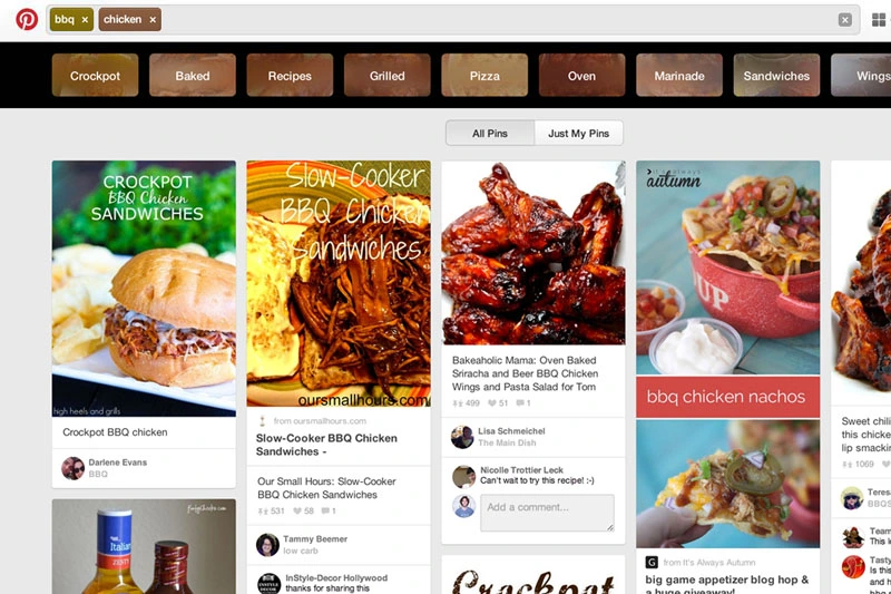
Database model, also called dynamic website structure, is the model prevalent for sites that have a lot user-generated content.
How to Choose the Best Website Structure?
To create a website structure, you need to map out how you will organize the content on your site (homepage, categories, individual page, blog posts). This is why website structuring should be the first step in any web design project.
The underlying principle in great website structure is Information Architecture (IA). IA ensures that content is organized, structured, and labeled effectively and consistently.
Consider the following factors to design an information architecture of your site:
- User journey: Since websites are created to serve users, it is important to consider how they might experience or interact with your site and their expectations of how your website should work. You can determine the journey of your users through interviewing them or doing a card sorting exercise.
- Content: The structure of your website will also be largely determined by the type and volume of content on your site. The structure of an e-commerce site will be different from the structure of an academic site. Read more about UX content: Content Strategy for UX.
- Context: The context of a website is determined by its business goals, the cultural context that it exists in, and the resources available. It is important to consider this fact as you structure your website.
Key Elements of Website Structure
Let’s focus on hierarchical structure of a website. This is a structure which most content websites, such as company website, eCommerce store, common blogs, etc. are based on.

Let’s look at each of these elements and how you can optimize them during your design process.
Homepage web structure
Your homepage is the top page in your website hierarchy and the central place where users navigate your website from. Ensure that all the important pages on your website are linked from this page. The relationship between your homepage and the main category pages is represented by your website’s menu or main navigation.
Here’s how to design a useful navigation/menu for your website.
Navigation or menu web structure
Your site visitors will use the navigation to understand how information is structured on a website and to find what they are looking for. Ensure that all your main category pages are represented on your menu or main navigation. Additionally, use the following rules when creating your navigation:
- Use short phrases or even one word for each element.
- Use simple language that your users can understand.
- Don’t clutter your navigation with sitelinks.
Apple’s main navigation follows these rules to create a simple but super-useful menu.

If your site has some subcategories that are useful for users such as their account information. You can create a secondary vertical menu like Asos has.
Other useful categories such as utility pages (privacy policies, disclaimers and legal information) can be placed on the footer of the website.
Categories and subcategories web structure best practices
Use categories to group website pages that have similar content which makes it easy for users to access the content. Blog posts can be grouped into categories such as ‘marketing’ and then be further subdivided into subcategories such as ‘landing pages’ and ‘email marketing.’
If you are designing an e-commerce website, you can group your products into categories such as ‘men’ and ‘women.’ If your categories are too many you can further subdivide them into subcategories. Continuing with our example of an e-commerce store example, the women category can have subcategories such as ‘clothes’, ‘shoes’, and ‘handbags’.
A great example of this is the Asos Marketplace website where their clothing category has a subcategory that shows the types of clothing available in the marketplace such as swimwear, sweatshirts, tracksuits, and hoodies.

Web structure tips for individual pages
It is important to structure your individual website pages or blog posts in a way that makes it easy for users to find what they are looking for, find similar content and understand where they are on your website. Breadcrumb trails, tags, and contextual sitelinks are used to structure information architecture on individual pages.
Take care of the headers that you put on individual pages. Make sure that they follow the right order, for example, the title of the blog post is H1 and that they all have metadata. Metadata are important part of UX, too. You don’t want to confuse users what your site is about.
Use breadcrumb trails
You can add navigation on your pages or posts in the form of a breadcrumb trail. A breadcrumb trail is made up of clickable sitelinks that show users exactly where they are on your site plus your site structure. Breadcrumb trails like the one used by Mailchimp improve usability and user experience.

Add tags and categories
Tags are another useful way of grouping similar content on a specific page. The difference between tags and categories is that categories have a hierarchy and can be further subdivided into subcategories but tags have no hierarchy. They simply group similar content.
For example, Grammarly’s blog uses categories and tags, such as ‘how to,’ ‘product’ and ‘inspiration’ to group blog content.

The usefulness of these tags is displayed when a user clicks on one of the posts tagged ‘how to’ and they are shown other posts that are also tagged ‘how to’ at the end of the blog post. This is a great example of how website structure makes it easy for users to find information.
Tags can also be used in e-commerce websites to group products according to brand and direct users to similar products.
Here are 3 best practices for creating tags:
- Don’t create too many tags or a new tag for every post.
- Place tags in a place where site visitors can easily see them such as your sidebar or at the end of your blog posts/product pages.
- Make sure that the tags are clickable and users can view similar content if they need to.
Contextual links
These are links on webpages or blog posts that point to other relevant content on other webpages. Contextual links are useful in showing users related content. In the context of a blog post, contextual links can be used to point users to other blog posts that have similar content. Grammarly does this in their blog post as shown below.

Contextual links can also be used in e-commerce pages to link to pages that have related items, what other people have bought, or which products are often bought together.
Easily Incorporate Website Structure In Your Designs
Web structure is how information is organized and interconnected on a website. An effective site structure improves usability and user experience which makes web structuring an important step in the web design process. The UXPin design tool makes it easy for you to design, prototype and structure a website, as you collaborate with other team members and designers. Try UXPin now.


