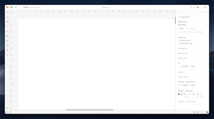
Canvas
The heart of the UXPin Editor is the canvas where your designs come to life. Only elements placed on the canvas are visible in the Preview mode unless you enable vertical or horizontal scrolling (more on that below). You can change the canvas for each Page in the Properties panel. The maximum size of the canvas is 25 000px.

Canvas Properties
In UXPin, there are several canvas properties you can customize:
Size
You can change the size of your Canvas in the Canvas Size section of the Properties Panel. Each Page of your design can have a different size. You can:
- Choose one of the predefined canvas sizes for Web, iOS, and Android devices in the dropdown.
- Choose Custom in the dropdown to set your canvas size to auto. That way, on Preview, the canvas will end right after the last element on your Canvas.
- Set the size manually in the height and width inputs.
Note
If you signed up for UXPin before UXPin 2.5, which was released on May 19, 2020, you can either set a different canvas size for each Page or add Adaptive Versions to your design. Please also note that if your Prototype has or had an Adaptive Version, even if you deleted it – you cannot use different page sizes.
Scrolling
Scrolling lets you scroll to elements that are placed outside the canvas on Preview. Choose horizontal to scroll to elements placed to the right of the canvas, or vertical to scroll to elements below the canvas.
Fill
That’s where you can change the color of the canvas.
Image fill
Adds an image as a background for the entire canvas.
Grid
The grid helps you layout your elements (changing any grid settings activates the grid automatically).
Smart Guides and Snapping
Smart guides are temporary snap-to guides that show as green lines when you move or resize an element on the canvas with the mouse or arrows. You can resize an element with the
Ctrl
key and arrows. You can toggle Smart Guides in the View Settings by checking the Smart Guides checkbox.
Snapping works like a magnet. It helps you precisely place elements by making them snap either to guides as well as smart guides. You can toggle snapping in the View Settings or by holding down
Ctrl
while moving elements.