When designing for users, you need to know their end goals and actions along the way. The two are called content and user flows, respectively, and together they form the heart of any great website.
But how do we go from an information outline to interactive design? In this post, we’ll discuss how to turn a set of content into a prototype, rapidly.
Assembling a content inventory
What are we designing? Many designers start from the outside and work their way in, crafting the containers and framework before examining the information that users spend more time with.
When you start designing from the inside out, you design with the user in mind. What they need to see immediately will gain prominence over what you want them to notice second. Navigation bars deserve less attention than the call to action, for example.
As importantly, a content-first approach is also naturally a mobile-first approach. Mobile devices have more limitations, screen size, and bandwidth to name a few, and so designing within these parameters force you to prioritize content ruthlessly.
A content inventory is an organized list, spreadsheet, or equivalent document containing all the elements relevant to the end-user. A good inventory acts as a hierarchy of information divided into sections.
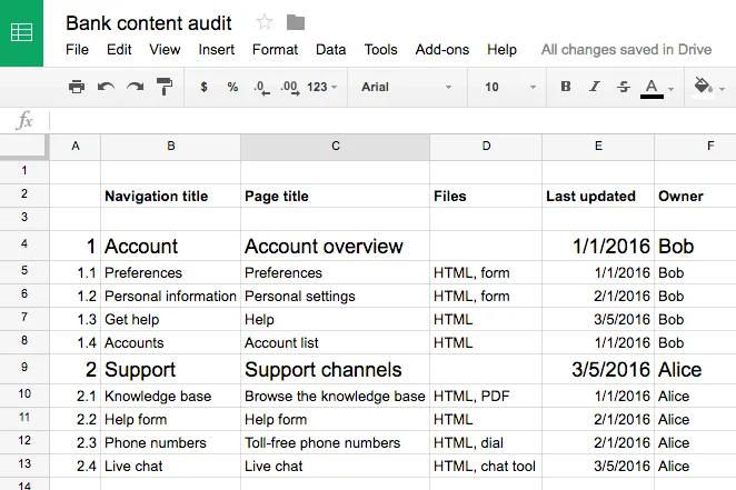
Your completed content inventory lays out all the possibilities for your user flows.
Planning the core flow with informed decisions
A complex project like a banking website will require many flows, such as:
- Changing a password
- Viewing investment options
- Reviewing 401k
- Ordering checks
- Opening a new account, or closing an old one
- Transferring funds to or from a different bank
- Paying the credit card balance
Each flow requires a user to weave through multiple content pages. For the sake of this tutorial, we’ll focus just on the credit card payment process, one of the most crucial flows. When you prototype, focus first on the riskiest or most fundamental user flows.
Let’s write it out this user flow:
- The user lands on the homepage.
- The user completes their login information and redirects to their dashboard.
- The user clicks into their credit card balance.
- The user chooses an account from which to pay the balance. Then submits the request and confirms their balance is paid off.
That sounds like a lot of steps, but there are only three decisions involved: deciding whether or not to pay, choosing an account from which to do so, and choosing to confirm the transaction. Each step must be clear and effortless in our prototype.
Building the prototype
In this case, we’ll build a user flow that lets people pay off their credit card balance at a fictional bank.
Given real content, our goal is to build a mid-fi. Unlike lo-fi designs, which act like boxy wireframes, or hi-fis, which show branding in place, mid-fis demonstrate the flow of decisions users take to accomplish a task. If you’re limited on iterations, mid-fi prototypes are the perfect choice since you don’t waste time on visual design but still provide enough detail for user testing.
In a mid-fi prototype, you’ll want to show:
- Correct layout of UI elements (navigation, primary content, etc.)
- Basic colors
- Basic interactions (no advanced animations or states yet)
- Correct typography
- Images in the correct dimensions
Here’s how we’d make it work for our bank website. You can start with Photoshop or Sketch and import into your prototyping tool or just start in the tool.
Login
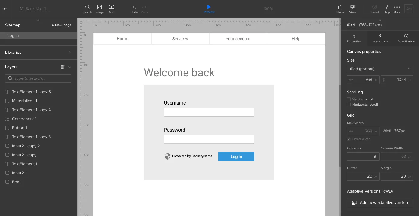
Logging in is easy: a simple form on the bank’s home page lets users securely enter their account. But we don’t neglect this obligatory step because it’s the user’s first interaction with the bank and its brand. Everything from the color scheme to the microcopy must fit with the friendly-yet-professional tone.
Account overview
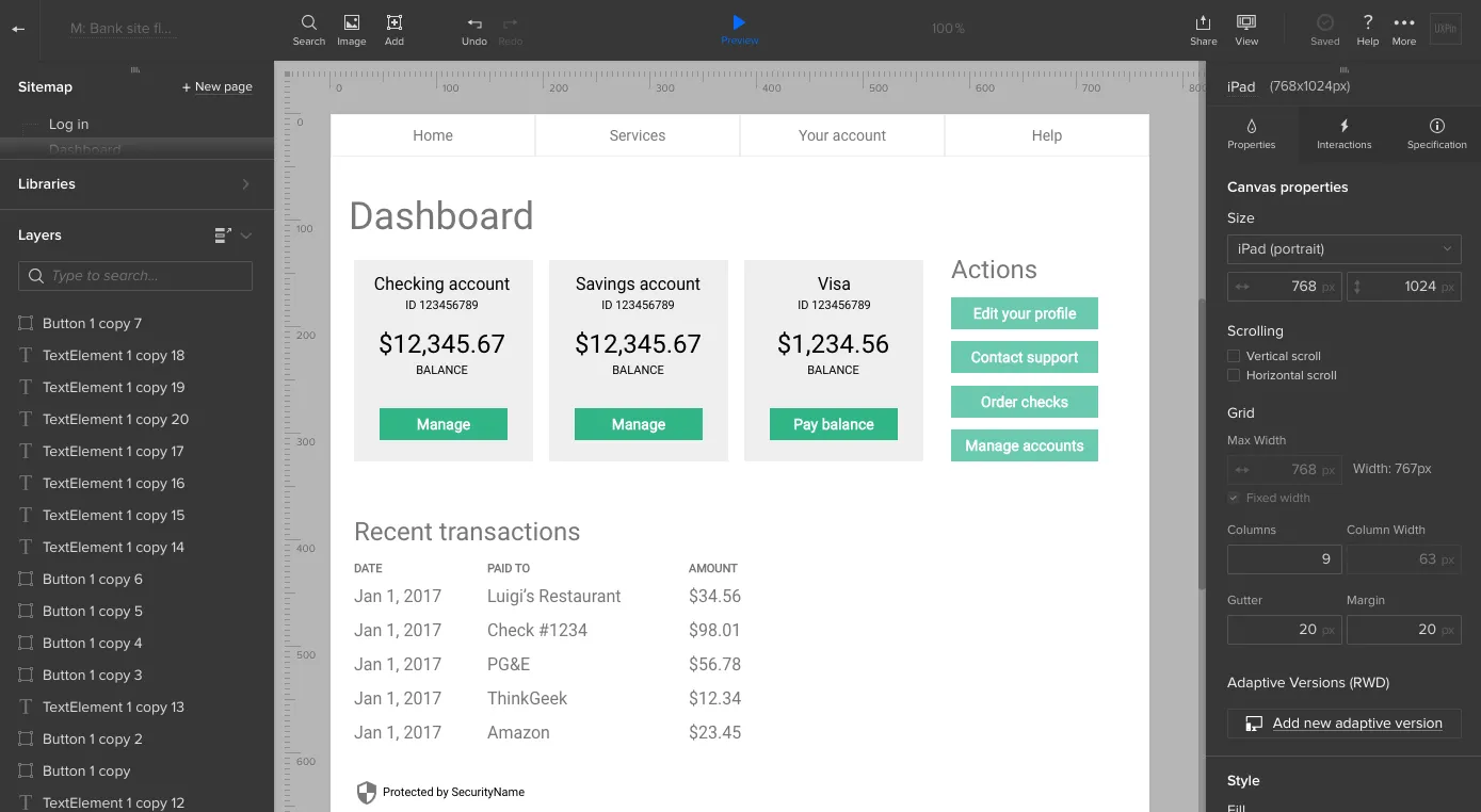
Upon entering their username and password, they see a dashboard that includes their account information. The purpose of this screen is to give the person an overview of their accounts. There are no ads, no upsells, and secondary information is pushed to one side. It’s all about their money.
To help them decide if it’s time to pay, we’ll include their credit card balance on this screen.
Payment process
According to the user flow, we know that the person’s next move is to choose to pay the card balance. That’s an easy click — and presents a second decision. At this point, he or she must choose the account to withdraw money from.
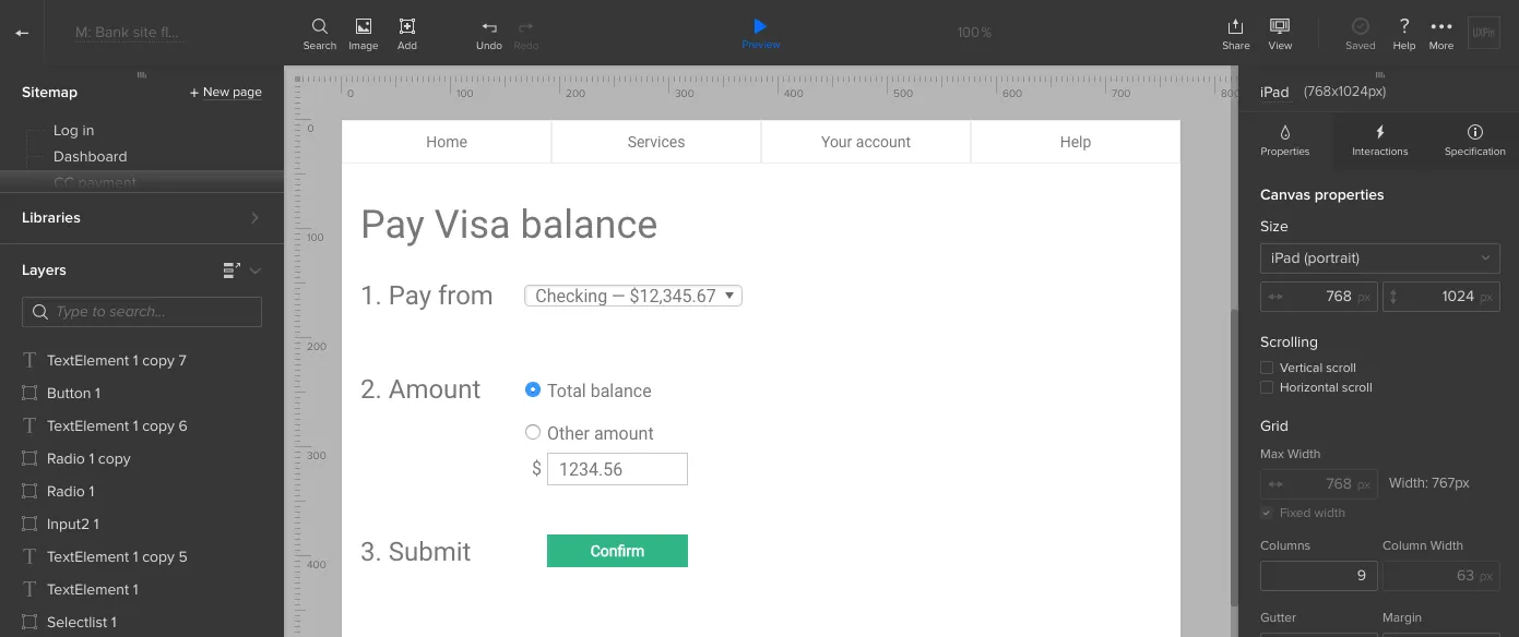
Decisions take time and cognitive power, so we should make choosing an account dead simple. Each account is listed with as little information as necessary (the account name and balance).
Next, the person reaches their third decision: whether or not to commit the transaction. At this point, all they need to know is what the transaction’s about. That means we can eliminate the previous decision’s options.
A new screen, or even a simple modal window, will present the information they need to make that decision. Specifically, the account name, the amount to pay, and the approve and disapprove buttons.
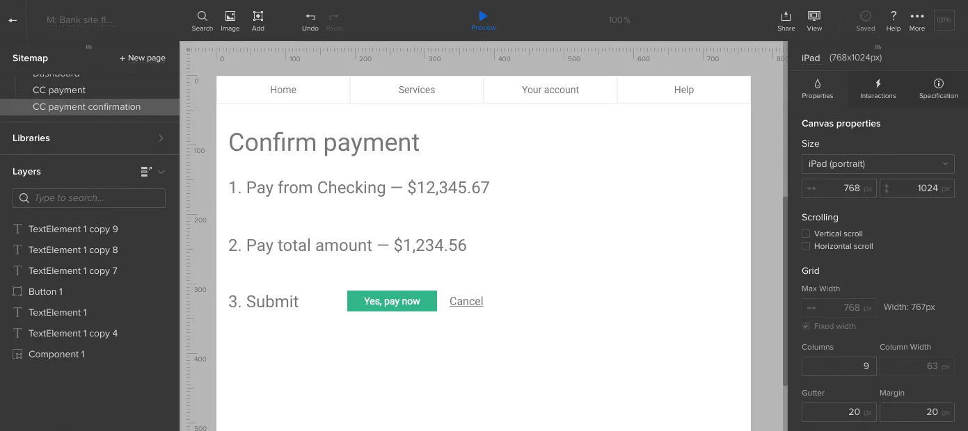
Success! Clicking the right button confirms that the balance is now cleared.
Getting close to reality makes it work
Notice that each screen in this design uses both realistic colors, typography, and layout — in addition to real microcopy. It’s not fully polished, but enough to start testing.
At this point, we just need to add some basic interactions so people can click through the screens. Once that’s finished, it’s time to collect feedback, iterate as needed, and then test with our users.
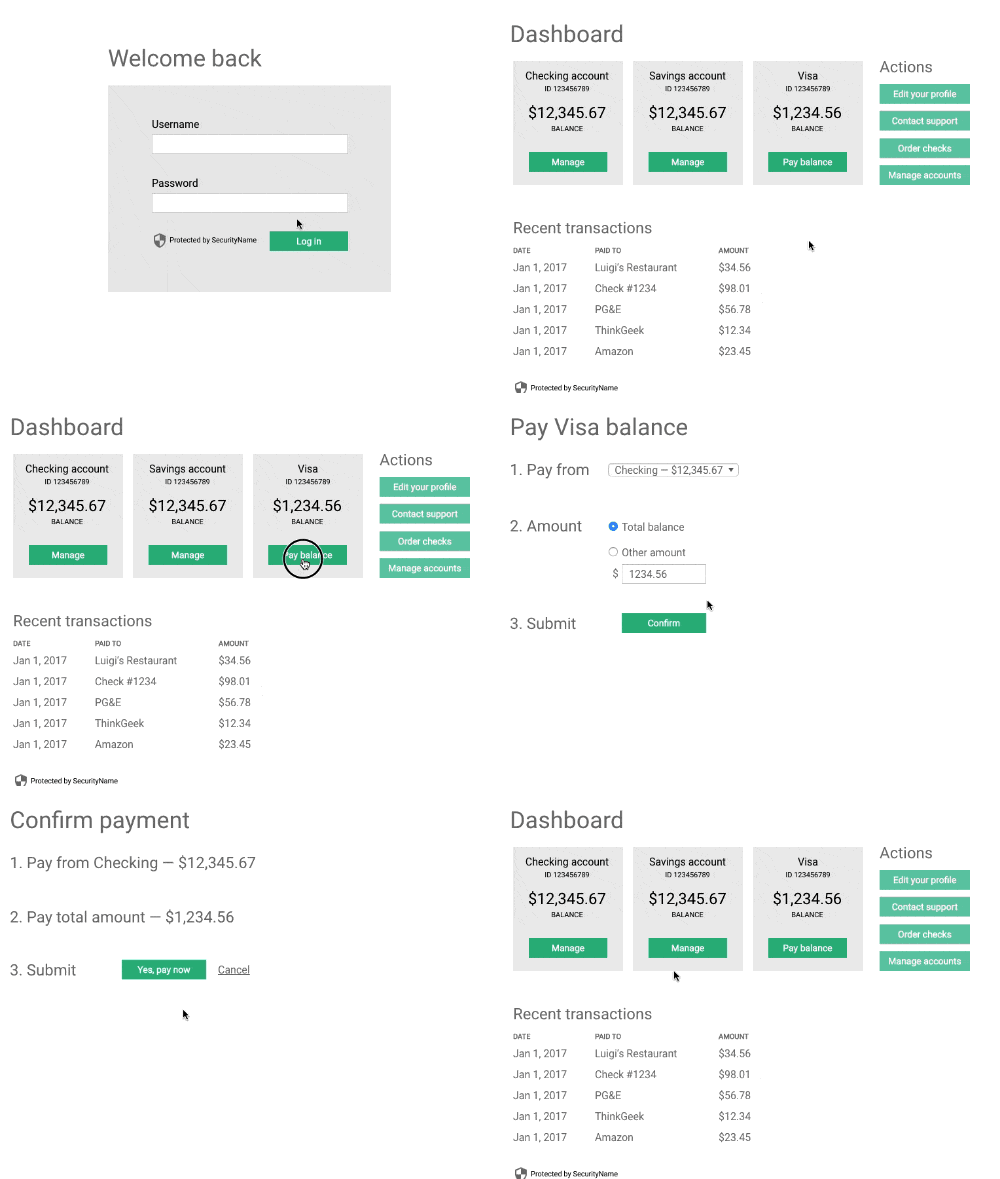
To complete your prototype, just repeat all the above steps with each user flow.
Conclusion
People visit an interactive website to accomplish a task, not use a widget or admire its graphics. That makes the flow along with real content as important as developing a prototype’s UI.
Content-centric design helps find their way along that path. If you’d like to try what you learned in this guide, go ahead and start your free trial in UXPin.


