Hero Image Banners – 4 Effective Ways to Catch User’s Attention Before They Scroll
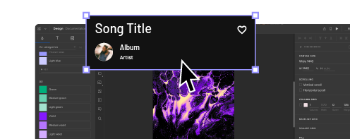
Hero image banners, also called “hero headers” dominate the top of your website or application. Typically, they spread out over the entire horizontal space. Ideally, they have high-resolution images and calls-to-action that get attention from visitors.
Creative designers have made a variety of hero image formats over the years. A hero section may include navigation buttons that rest on top of the hero image. Other hero sections force users to open navigation bars.
A hero image website design may also change depending on the type of device people use. When you use a desktop computer with a large screen to access a website, the hero section may stay at the top of your screen even when you scroll down. On a mobile device with a smaller screen, though, the hero section may shrink – or even disappear – as you scroll down.
You have plenty of options when making hero image banners that effectively catch a user’s attention before they scroll. Start with these four tips, but feel free to explore unique ideas that fit your product’s brand.
Build a prototype of your website with UXPin, an advanced prototyping tool that will increase design efficiency in your team. Create prototypes that stakeholders and users can interact with. Try it for free.
Use Bold Colors to Grab the User’s Attention
You & Sundry, a wellness center and barbershop made especially for LGBTQ+ individuals, offers an excellent example of using bold colors that grab a visitor’s attention.
The bright yellow letters in the background provide an anchor for the visitor’s eyes. After the eyes linger there for a bit, though, visitors can’t help but look at the colorful clothing worn by the hero section’s models.
The diversity of color plays into the company’s brand. It also contributes to a hero image website design that holds a person’s attention and encourages them to explore more.
Write CTAs That Tell Visitors How to Respond
Placing a CTA button inside a hero section can drive tasks completions by encouraging people to follow instructions. Depending on your page’s goals, you may want to generate leads, get people to sign up for a newsletter, or educate them about upcoming products from your company.
Apple’s page for the iPhone X includes two clickable CTA buttons. One tells visitors to learn more about the product. The other button simply says, “Buy.”
These are the kinds of instructions that visitors need from CTAs. Keep messages short and to the point. Eager, impulsive shoppers will immediately head to the Buy section. Consumers who want to explore their options can follow the Learn more button. Either way, the CTAs provide clear instructions without any ambiguity.
Typically, you should think about how your button’s design will influence visitors. In this case, Apple wants its product to dominate the page, so it makes sense to put the CTAs inside invisible buttons.
If you don’t know what text to put on a button, consult content designer. Or, learn about content strategy.
Use Strong Contrasts to Make CTAs Stand Out
CTAs can only accomplish their goals when they stand out to visitors. A hero image website design with too many colors could make the CTA difficult to read. Some visitors might skip the button completely.
Using strong color contrasts will help your CTAs get noticed. The example above takes contrast to the extreme with bold, white text on a black background. The message tells the visitors, “let’s build something amazing together.” Next, your eye gets drawn to the bright white button that says, “Watch Video.”
Interestingly, the designer chooses to make the “Learn How” button a little more subdued. It doesn’t grab your attention as quickly as the white button, but it does create a pleasant balance within the hero banner’s composition. Without the “Learn How” button, the composition would feel lopsided. With the current approach, the hero banner has nice, satisfying proportions.
A/B Test Your Hero Section to Determine What Works
You can make educated guesses about what hero image features will drive results before users scroll down. You cannot know whether your design gets the best results, though, until you perform testing.
In A/B testing, you create two versions of your hero section. The control version consists of your original design. The variation can have one or more changes. For example, you might put the CTA button elsewhere, change the CTA’s wording, or choose a different color scheme.
Over time, you track the performance of each design to see which one drives the most results. If the control version gets more conversions or leads, then you keep using it. If the variation performs better, then you use it to replace the original.
You can keep fine-tuning your hero design until you reach a ceiling and your results will not improve.
Make Effective Hero Section Banners With UXPin’s Design Tool
UXPin makes it easier than ever to design effective hero section banners. UXPin has a design tool that lets you build every aspect of your web page or application. You can use interactive elements like clickable buttons and forms that let users enter real information.
Once you have a hero section you believe in, you can use UXPin’s prototyping tool and share your work with others. Feedback can play an incredible role in improving your original design. You don’t even have to restrict your collaboration to other people’s UXPin accounts. You can send a link to anyone for feedback.
Are you ready to see what UXPin can do for your hero image designs? Start your free 14-day trial now so you can explore all of the features that make UXPin such an amazing tool for designing and prototyping!


