As described in the free e-book Web Design for the Human Eye, landing pages are essentially your ‘shop window’ and you have one chance to impress the user. Do this, and it’s likely that they will go on to browse the rest of the site, perhaps even making a purchase and reading through your carefully crafted content along the way.
In this post, we’ll deconstruct a few visual examples and explain UX best practices for every landing page.
When considering the design of the page, there’s no doubt a lot to think about.
The amount of content, your headlines, images, forms and that all-important call-to-action. Your first step should be to fully understand what the aim of the page will be. It’s almost always the case that some kind of sales objective will be the focus of the page, so what’s the best approach to designing with that in mind?
#1: Become the User
The first thing to do when thinking about your landing page is to put yourself firmly in the shoes of the visitor.
Ask yourself:
- What information needs to be present to quickly and effectively convey the key message?
- How can you immediately communicate the product or service to the user?
- What are the key questions in the user’s mind?
- Who is the user?
By firstly understanding who the user is based on the buyer personas that have (hopefully) been developed by your marketing team, you can gain a better understanding of how they might arrive at the page and what they, as a group, prefer.

Photo Credit: “Sketchy Empathy Map Template”. Zak Greant. Creative Commons 2.0.
You can also use Google Analytics or KISSMetrics to gain a further understanding of user profiles and behavior. A/B testing will help you further understand them and craft a page that gets results, but we’ll get to that a little later on.
#2: Borrow from Other Disciplines
Growth hacking is a term that encompasses several disciplines to successfully grow a business at scale. It’s seen a lot of movement in the past few years, even becoming a buzzword of sorts (especially for anyone in Silicon Valley).
In this context, we’ll look at Dropbox to see how they applied a few growth hacks to acquire an astronomical number of users in an unbelievably short amount of time.
Dropbox began using AdWords to market its services but soon found that this was very expensive and provided little return. The page below is an older one from when the service launched and which illustrates very well how the simplest of landing pages can be the most effective.
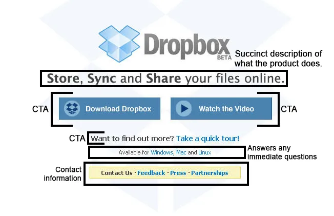
Photo credit: Dropbox (annotated from original).
Taking a look at the above, we can see that the page was specifically designed to encourage signups and downloads.
- Title – conveys very simply and effectively what the product does and how it’s useful to the user.
- Sub-header – encourages the user to delve further if they’re still not convinced that this is the product for them.
- Header 3 – gives the answer to the immediate question of compatibility that would be on the mind of many users.
- Header 4 – contact information for feedback, press and investors for further promotion and to collect user-reported errors/bugs.
- CTA x 2 – further calls-to-action allow users to either dive straight in and download Dropbox or gain further information.
When a user lands on this page, it’s immediately obvious what’s required of them. The page was specifically constructed to attract signups and that’s exactly what it did. A year after the service launched, Dropbox also created a second video for Digg which gained the company 70,000 new users overnight.
If we take a look at the latest version of the page, we can see that not much has changed – why mess with something that works?
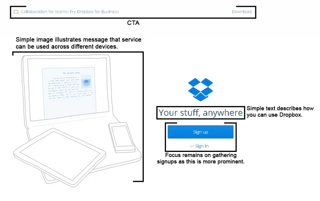
Photo credit: Dropbox (annotated from original).
The top CTAs draw attention to the fact that there’s a version which is suitable for the business. The imagery, while simple, effectively conveys that the software is compatible with any device. The most prominent CTA though – the signup button – tells us that Dropbox is still focused on gathering new users.
Once you delve a little deeper and sign up for the service, the process is again simple with not too many form fields to complete. Just like we described in the free e-book Interaction Design Best Practices, the user input process feels more effortless because the design dangles a clear incentive in front of you: if you finish your registration and invite other users, you’ll get more storage space.
In the Dropbox landing page, everything above the fold invites users to sign up through the use of strong, clear CTAs, simple language and imagery.
The most important thing to take away from Dropbox is that the user must know what is expected of them by the use of clear signifiers, language and imagery.
- Type size should be large enough so that users can read it quickly. We’d recommend your call-to-action type size is at least 25% larger than body copy, with appropriate microcopy as needed to reassure users (Jared Spool actually helped one company earn $300 million more through smart microcopy).
- Less is more: try to limit your H1 headlines to less than six words.
- Sub-headers (H2, H3) should be used when it’s necessary to give more information
- Speak to benefits rather than features.
- Choose relevant images and optimize them.
- CTAs should clearly direct the user into taking the desired action.
If you need to provide a lot of information on the page, you should save this for beneath the fold and present it in snippets of text, rather than large unbroken paragraphs.
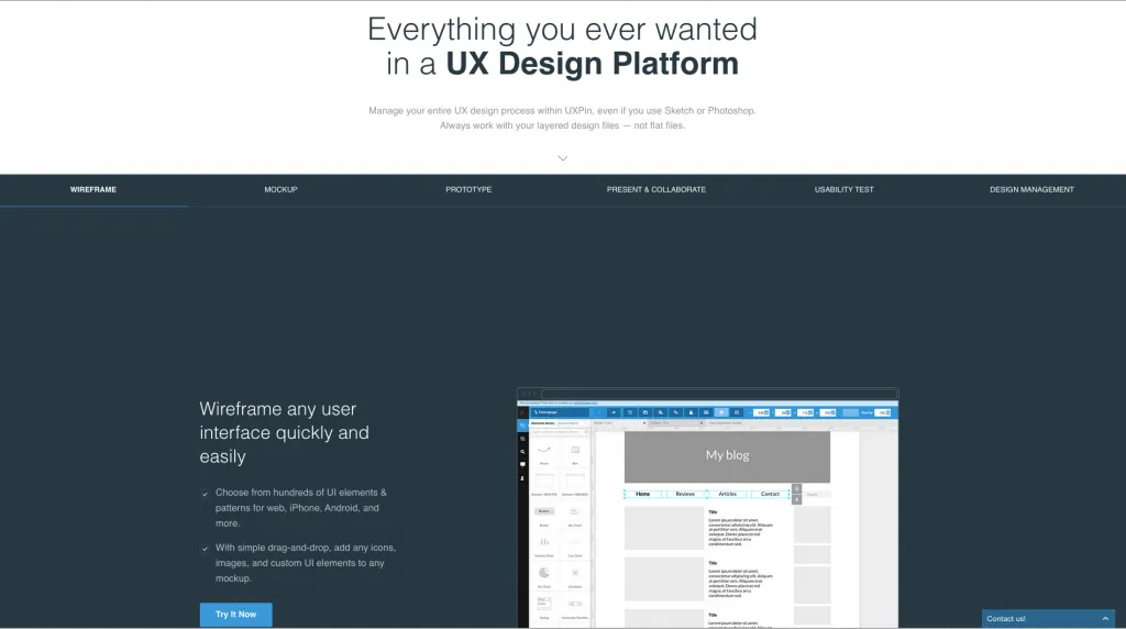
Photo credit: UXPin
Performance-wise, you want the landing page to be as lightweight as possible and to be mobile-friendly. In fact, as KISSMetrics reports, slow load time dramatically reduces conversions since nearly half of all web users expect sites to load in 2 seconds or less.
In days gone by, we were told that it was best to use one CTA on a landing page. As you can see in the above examples, Dropbox use several. This is fine as long as you craft each element carefully and it has a clear reason for being there.
#3: Create Trust Through Transparency
As stated in the free e-book Web UI Design for the Human Eye, a landing page should immediately start building trust with the user.
With this in mind, your landing page should try to include the following elements.
- Social proof – Now is not the time to be humble or shy. If you have a good social following (or prominent customers) then brag about it by name-dropping and listing the number of users (if they’re impressive).

Photo credit: Dropbox
- Privacy – Always a concern for users, so ensure that you include a link to the privacy policy in the footer – it doesn’t have to be prominent. You could just as easily include microcopy reassuring users that their data is safe (which is what we also do).
Photo credit: UXPin

- Contact information – Either place this in the footer or provide a clear link.
- Testimonials and case study links – Always useful for some businesses to improve trust, especially when paired with plenty of images of the person or companies involved. These are especially powerful when used in conjunction with social proof indicators (like logos of companies who use your product).
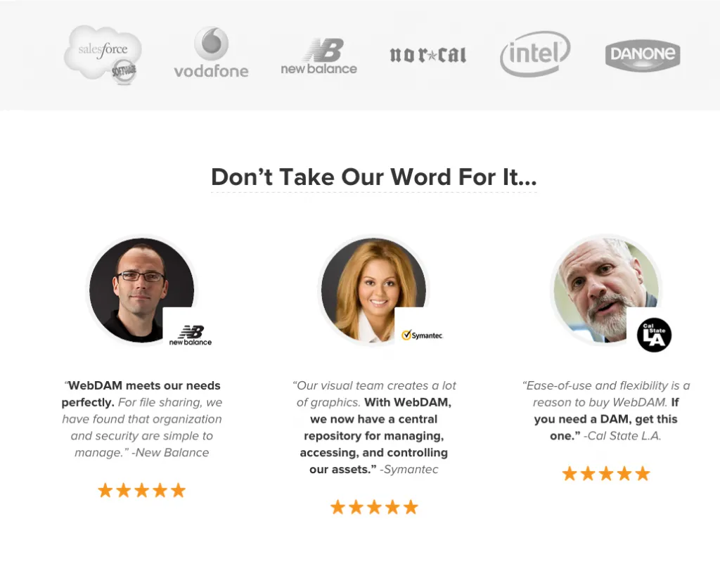
Photo credit: Webdam via Hubspot
As a broader note, make sure your copywriter and designer work closely together to ensure that all content on the page (written and visual) is as clear as possible with no factual inaccuracies or potential for misinterpretation.
#4: Create Forms Based on Audience
On a landing page, a form should ask for only information that’s relevant.
If the value of filling in the form exceeds the inconvenience of doing so, then the user will always proceed.
Consider the following:
- Is there an offer that can be redeemed by filling in the form? Never underestimate the power of the carrot in form design.
- What kind of information are you asking for? Often, a visitor is turned off by the insistence that they have to enter their phone number, for example.
- How trusted is the site? If the site has been around for a while and is credible, then the user is more likely to input more information. Again, this is why you should always try and include testimonials, social proof, and case study links.
As always, design the right form for the right user. If the target audience is in the younger age bracket, then they may be filling in the form on a smartphone and will become frustrated by too many fields. For mobile users, try to limit your form fields to 2-3.
Try to use social logins as well. Not only can they provide social proof as they often display the number of followers for each connectable network, but they provide a quick and easy way to avoid having the user input a lot of information.
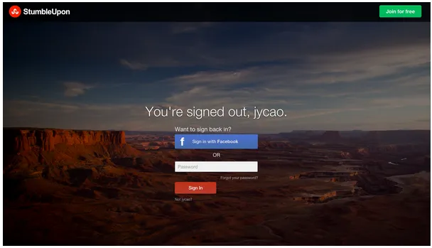
Photo credit: StumbleUpon
If, however, you know your user input process requires multiple steps (like for e-commerce, airline sites, car rentals, etc.), chunk out the steps and include a completeness meter to incentivize users.
To learn more about form design, we highly recommend this hand-picked list of 15 resources from Smashing Magazine. If you’d like to see visual examples (with analysis) of some of the best form designs we’ve come across, check out our free e-books Web UI Patterns and Mobile UI Patterns.
Creating Landing Pages that Work
When it comes to an enjoyable and valuable landing page experience, simplicity is key. Know your users and their preferred device (verify with site analytics), then design accordingly.
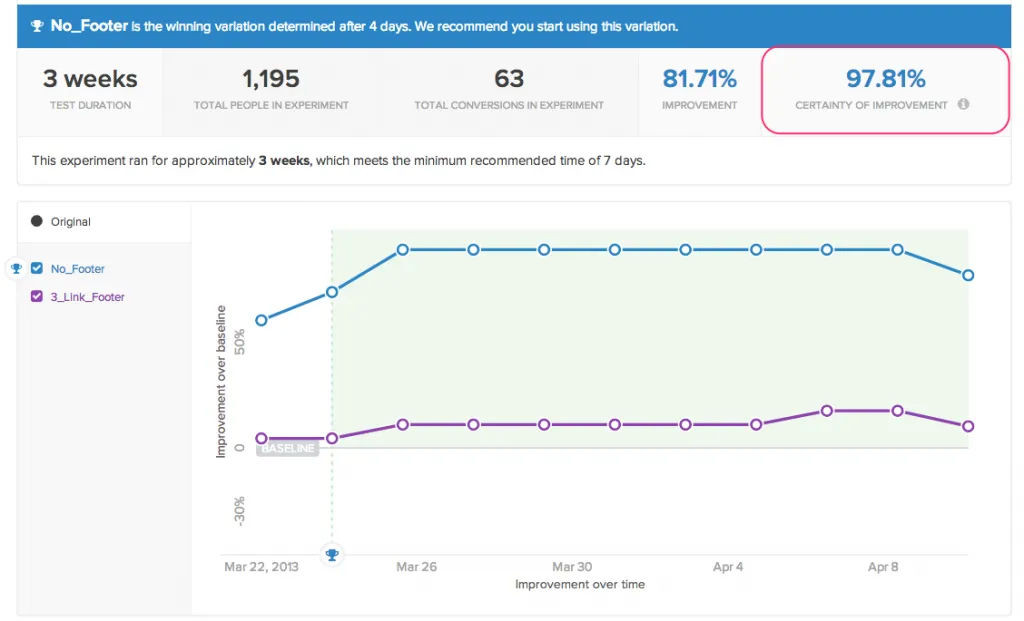
Photo credit: KISSMetrics
We strongly recommend that you A/B test your landing page designs. You should only test one (two at a push) element at a time for best results, ensure that you have a good-sized sample, and allow the test to fully run its course. Many A/B tests return false results purely because they aren’t set up correctly or because the designer/marketer jumps to premature conclusions.
The UX of landing pages is an art which relies on understanding the user and their needs. This understanding allows you to create design elements and copy that really speak to the user and immediately convey what’s in it for them.
For more tips on designing web pages that create the right first impression on users, check out the free e-book Web UI Design for the Human Eye. We’ve included visual case studies from 33 companies including Google, Twitter, Medium, Intercom, Bose, and others.

