Without a doubt, touches of Material Design are the must-have aesthetic of the year.
Google’s Android-based design scheme may have started as a mobile device interface, but has exploded in popularity and usage, regardless of device or platform.
It’s a natural continuation of the biggest trend in design during the past few years: flat design. Yet, Material does something flat never could, it adds just enough embellishment to enhance usability. Instead of stripping everything away to favor visual appeal, at the root of Material Design is usability.
What’s Material Design Lite?
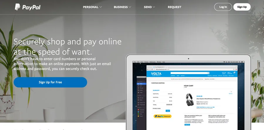
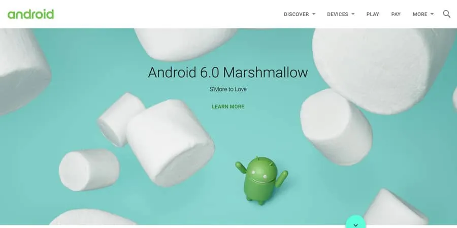
Photo credit: Android
Material Design Lite, or MDL, is the next phase of Material Design. It takes the ideas and optimizes them for all devices. MDL has been crafted to include guidelines, components, and an overall framework with templates and tools that help nearly every designer craft an MDL website with minimal prior knowledge up front.
MDL essentially makes the concept accessible to everyone in a quick and easy way.
While MDL may be a variant of “classic” Material Design, it is in no way a lesser version. Most sites designed with MDL are robust, easy to use, and visually pleasing.
The idea of MDL goes back to the mission of Material Design as a whole: “Develop a single underlying system that allows for a unified experience across platforms and device sizes. Mobile precepts are fundamental, but touch, voice, mouse, and keyboard are all first-class input methods.”
If that weren’t enough, every part of MDL is open source. Rules, templates, best practices, and code snippets are available on the MDL website or GitHub.
The Principles of Physics
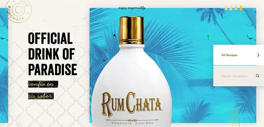
Photo credit: Rumchata
The foundations of this style’s aesthetic come from physics. The designer should aim to create something that looks and functions like it would (or could) in the physical world.
This simple concept is what supports the innate usability of Material. Consider all of the design tools that rely on this idea—layering, cards, motion, color.
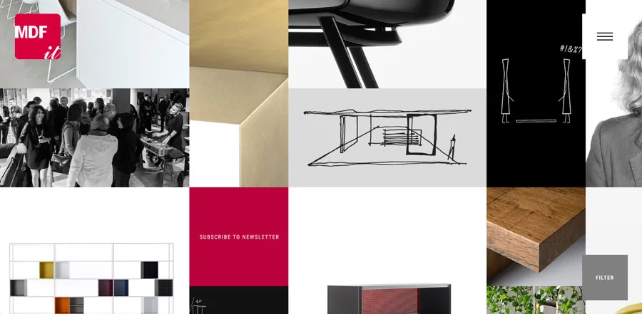
Photo credit: MDF
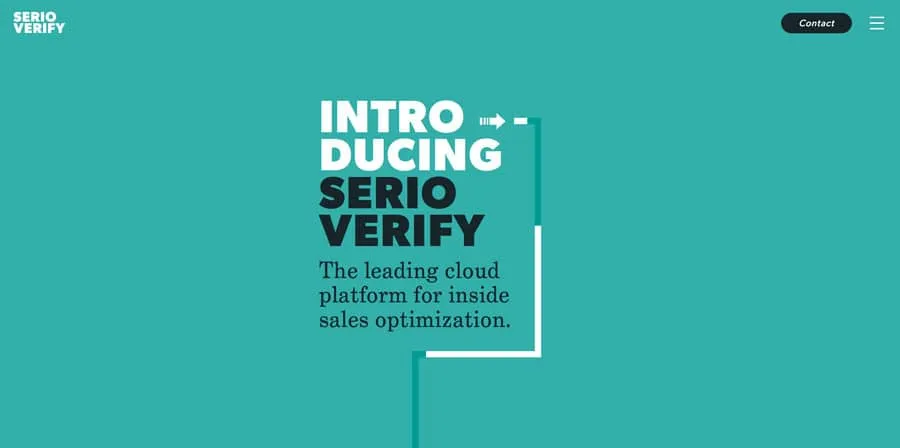
Photo credit: Serio Verify
To understand how to create these elements in a way that looks truly Material, let’s think back to physics class, for a moment.
- Varying x and y dimensions are recommended, but all elements should have a uniform thickness.
- Shadows should fall naturally on the z-axis, seemingly from a natural light source.
- Content can appear on any plane, in any color or shape.
- Material components are solid and have no transparencies.
- Each space is limited to a single component; they can’t overlap. Layering is only acceptable with backgrounds and photo elements, not singular components.
- Components can shrink and expand, but not bend or break. They have a fluidity to their movements.
- Components can split or be combined.
- Motion can occur on any axis and should be dictated by user interaction.
Mix and Match Components
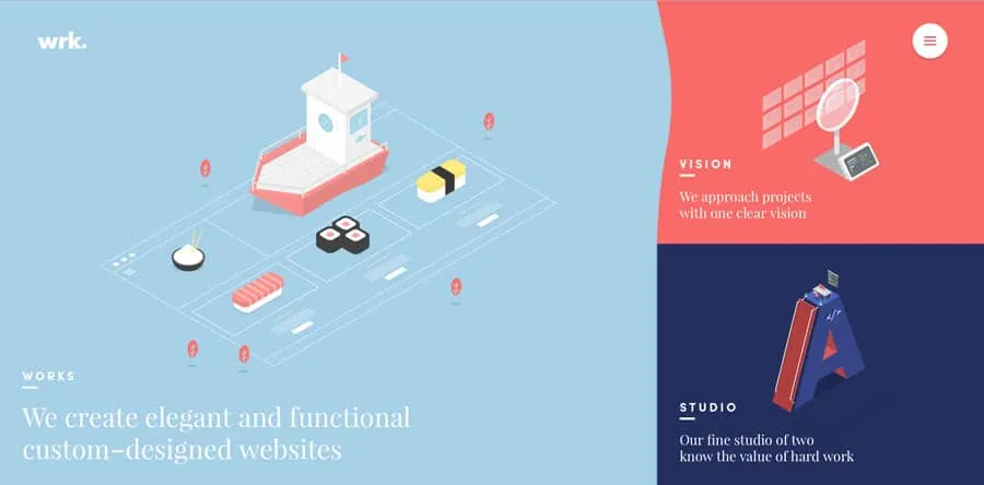
Photo credit: wrk.
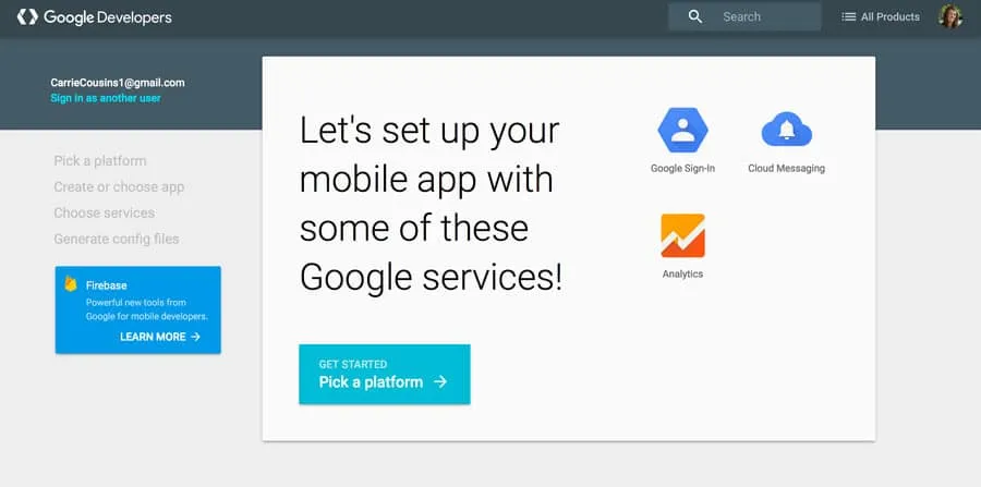
Photo credit: Google Developers
MDL is packed with user-friendly tools to help start the design process. While the visual design is primarily what you see, what makes Material Design Lite different is in the backbone.
MDL is not JavaScript-based; it is designed to work on all devices, degrade in older browsers, and provide cross-platform accessibility. You don’t necessarily need to know how it works, but there is one vital takeaway you should remember: MDL will work pretty much everywhere. And that’s by design.
The easiest way to start with MDL is to pick a template. Each template (there are six to choose from) comes with everything you need for the design, including the components and color palettes. But the beauty of MDL is that you can customize as much as you like. The templates are merely a starting point.
In addition to templates, MDL has a massive component library that lets you mix and match pieces to create something uniquely yours. (You can grab just code snippets for only the components you like to keep your website lightweight.)
While these parts are a lighter, easier to manage version of Material, all of the basic elements are the same, including typefaces (Roboto), layer styles and elements, and color palettes. Almost any element can be added to a design or removed. You can even include elements of MDL in a site that’s not fully Material if you want to experiment.
Material Color Palettes
One of the most visual aspects of MDL are the associated color palettes. Material projects are often bright and bold in color. Hues are deeply saturated and color combinations can be a little unexpected.
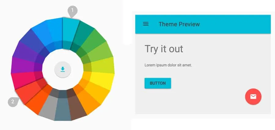
Photo credit: Get MDL Custom CSS Theme Builder
Material color is often based on a palette that consists of a primary color and one accent. (You’ll want to choose wisely.)
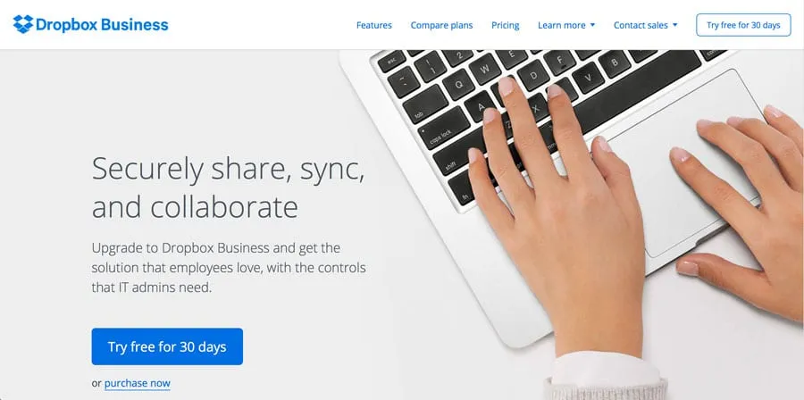
Photo credit: Dropbox Business
Dropbox Business is a classic example of a website that adopts design concepts early, yet maintains brand identity. Luckily, their branded blue is perfect for Material. Here, the site uses a single color palette with black and white to communicate. (This is quite common with MDL, as brands work to maintain an identity while using the style.)
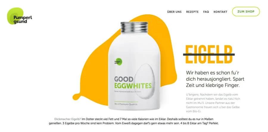
Photo credit: Pumperl gsund
The site for Pumperl gsund takes the opposite approach and goes all-in with two bright colors. Note again how color is used against a mostly minimal background, with black and white for everything else.
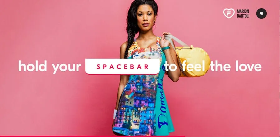
Photo credit: Fila
While MDL projects can feature big, bold color throughout (such as Fila, above), this can be tricky to pull off with finesse. You need just the right content to make it work well. In this case, Fila had the perfect combination of elements to go big with color thanks to a colorful athletic clothing line.
Conclusion
Material Design Lite is a more usable, more flexible version of Material Design and one that you can implement in whole or in part for almost any website design. It offers overall functionality, focus on usability, and design known for clean lines and organization.
For more UI advice from analyzing 61 examples, download the free e-book Web Design Trends 2017.


