Engaging, interactive websites and what you can learn from them

Some sites look good and some sites function well, but there are some interactive websites that do both with an extra sense of magic.
These websites engage us on a deeper level, command our attention, and take root in our imagination. They draw us into their world and make us forget our own — if only for a moment.
In this post, we’ll analyze 16 interactive websites with brilliant design. We’ll explain how you can learn from them to be a better designer.
Interactivity and enjoyment feed one another. In his book The Social Animal, psychologist Eliot Aronson explains that when performing a task, a person is likely to justify the action in their head. This can easily lead into a self-fulfilling prophecy of the user enjoying any given site that they invest even a small amount of time into.
But interactivity does not always need to be about interactions. Emotionally engaging content like videos or poignant visuals can achieve the same results. In this case, simply watching and/or reflecting on the content is the user’s role in the interaction. This experience is just as immersive — as anyone who’s ever seen a movie can tell you — and forms the same connection.

For a more detailed analysis of how to design interactivity and its best practices, as well as the techniques behind 9 other modern design trends, check out the free e-book Design Trends 2020. But don’t stop there. We’re also keeping an eye on emerging design trends in the coming years.
1. Nike Reactor
Source: Nike
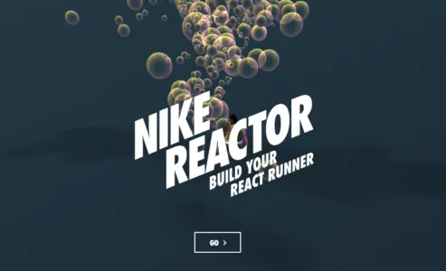
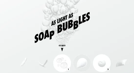
We’ll start with a familiar name, Nike. This interactive website lets you build your own React running shoes using fun, seamless animation and eye-catching visuals. But you’re not building shoes in the strictest sense of the word. Instead of choosing stitches and fabrics, you’re given the option of using bubbles, stress balls, springs, and more. The use of these fun visuals boosts user engagement while selling the idea that Nike’s React footwear is extra comfortable.
Source: Nike
2. AirBnB Online Experiences
Source: AirBnB Online Experiences
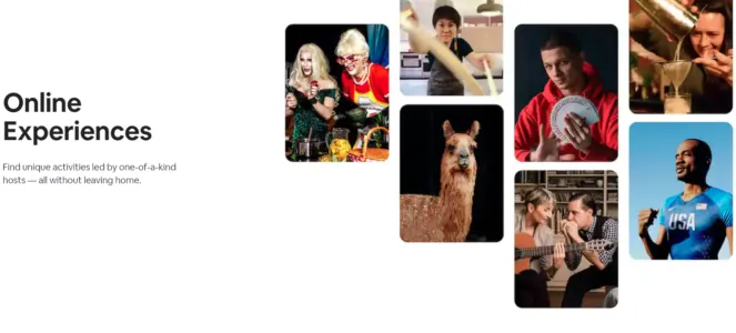
The popular travel site is a perfect example of interactivity without many real interactions. AirBnB depicts the magic in the everyday moments experienced when traveling through a variety of attention-grabbing photos.
But AirBnB’s interactive website goes beyond the traditional travel site to give you unique online interactions hosted by others. Take tours of exotic locations, learn how to cook from other chefs, or even solve an escape room with these online experiences.
3. An Interesting Day

Source: An Interesting Day
This interactive website shows you don’t need to have cutting-edge graphics to create an engaging design. An Interesting Day documents a 2018 conference held by digital product studio Bakken & Bæck in Amsterdam. All of the animations are hand-drawn and simple, giving the site a handmade feel.

Source: An Interesting Day
The entire website exists on a single page, giving the user all the information they need without navigating.
4. Chanel: Spring-Summer 2021 Haute Couture Show
Source: Chanel: Spring-Summer 2021 Haute Couture Show
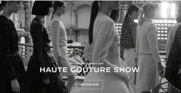
Chanel certainly knows how to create an atmosphere. They combine video, still images, and poetically written product descriptions — all united with an interactive scrolling navigation — to immerse the user in an environment rich with the elegance and fashionability the brand is known for.
5. Space Needle

Source: Space Needle
Scrolling in general is an excellent strategy for immersive interactions. The Seattle-centric site for the Space Needle shows off stunning visuals and displays content with scroll-activated, animated boxes — a far more entertaining method than simply listing facts about the city. Users aren’t normally accustomed to scrolling upwards on a site to learn more, but the navigation pattern works for this specific context because it matches the on-screen journey.
6. APPS

Source: APPS
Among the most interactive websites on this list, APPS first takes you through a guided tour of the cider making process. It prompts you to continue the journey with a few button presses. The animation is lifelike and fun, and the interactive elements keep the user engaged.
7. Aquatic Macroinvertebrate Collection

Source: Aquatic Macroinvertebrate Collection
Education facilities also understand the value of engaging the learner in increasing both memorability and enjoyment. In the case of the Aquatic Macroinvertebrate Collection, users can examine lesser-known species by zooming in and out of various body parts and reading the descriptions.
The effects themselves aren’t groundbreaking, but they definitely create the wonder of exploring something new and exciting. Never forget that when making interactive websites, it’s not about the best design but the right design.
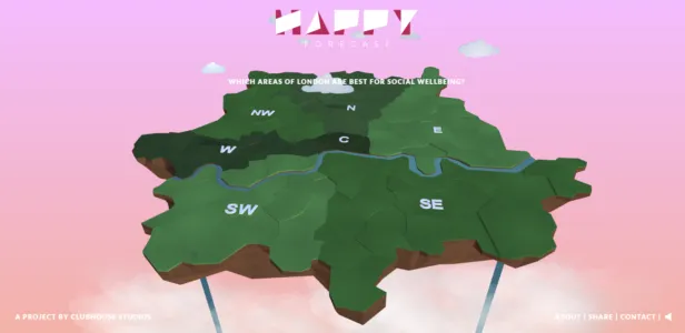
8. The Happy Forecast
Source: The Happy Forecast
Our favorite interactive website elements include a hover state that leads to a color change and some motion indicating interactivity. Beautiful music and animations create an emotionally immersive and engaging experience.
9. Make Your Money Matter

Source: Make Your Money Matter
Our favorite interactive website elements are scrolling interactions that tell a story and take the user through an educational journey. Each scroll reveals a new part of the story. Stunning illustrations and animations are done on a muted and earthy color palette.
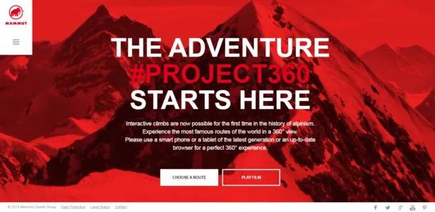
10. Mammut
Source: Mammut
Climb mountains without climbing mountains. Our favorite interactive website elements are a rotating 360-degree animation of Mt. Everest on the homepage. This draws users in by creating depth. A scrolling interaction takes users through an interactive and customizable climbing experience.
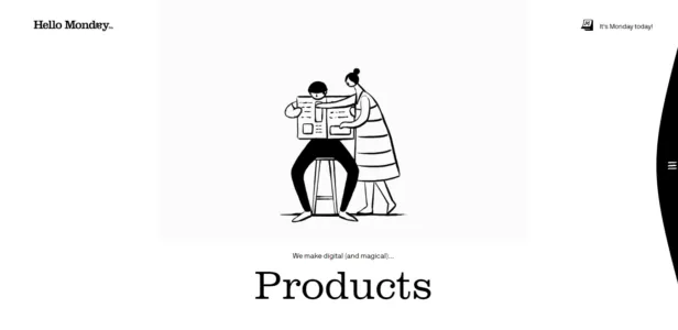
11. Hello Monday
Source: Hello Monday
Our favorite interactive elements include a horizontal parallax effect when the user clicks on the menu bar. Movement on the menu items when hovered over and quirky animated 2D illustrations are unexpected elements that grab attention.
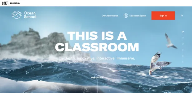
12. Ocean School
Source: Ocean School
Our favorite interactive website elements include scrolling interaction that takes users deep into the ocean. A blue and white color palette and 3D animations create an immersive experience, along with animated and color changing hover states.
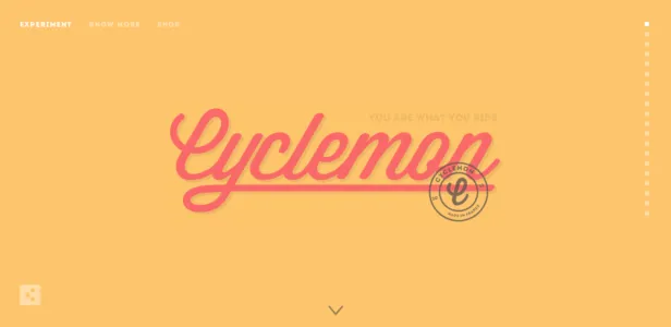
13. Cyclemon
Source: Cyclemon
Our favorite interactive website elements include a vertical parallax effect on scrolling interactions that tells users who they are by their bike type. A bold and fun color palette is customized for each bike type.
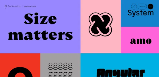
14. Fontsmith
Source: Fontsmith
Our favorite interactive website elements include a fun hover state that changes color and the size of the text. A bold and funky color palette grabs the user’s attention from the beginning.
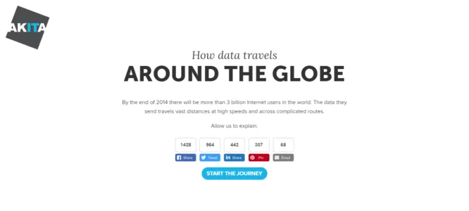
15. Akita
Source: Akita
Our favorite interactive website elements include a scrolling interaction that defies the traditional top-down direction and charts the movement of data across the internet. Hover states reveal more information with popups.
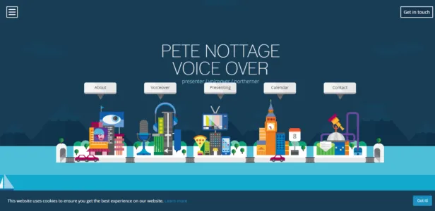
16. Pete Nottage
Source: Pete Nottage
This voice actor’s interactive website makes use of hover states and fun animations for a memorable impression.
What We Learned from the Best Interactive Websites
The most common interactive feature we saw from these interactive websites is hover states. The reason for this? They’re easy to implement across a wide range of industries and don’t create too much distraction. You can try the simple hover states like Ocean School or go for a more animated one like Pete Nottage.
Scrolling interactions are another popular element because they’re also easy to implement and they create motion without using animation. You can use the parallax effect like Cyclemon or tell a story like Akita. To improve user experience, these interactive websites used more than interactive features and micro-interactions. They used fun color schemes like Make Your Money Matter or like Fontsmith to evoke emotions and create an immersive effect. The videos and animations used by Mammut and Happy Forecast can also create a very deep movie-like experience that captures the attention of users.
To drive interactions and increase engagement, the best interactive websites used a consistent design and combination of storytelling and excellent copywriting to create curiosity and get engagement. Interactive elements should not be used just for the sake of it, their role is to enhance the experience of users and pass on a message.
Need more help with your winning design? UXPin is a platform used by some of the best designers on the planet. You can manage your entire UX/UI project with a single tool. This is the design process simplified. Try UXPin today, completely risk-free.

