When someone mentions style guides, people usually think of typography, grid layouts, color palette, and enough numbers to give you a headache. That’s because style guides’ primary purpose is to consolidate and even officialize the tiny details of a web project that can lead to confusion and inconsistency if not pinned down.
But style guides can be much more than a data sheet. As a company-wide reference guide, they provide the chance to communicate the brand’s personality to all employees, or tackle the data that not as memorable but still as useful.
That’s why we’ve compiled these 7 style guide sections — with real examples — that might have slipped your mind. Pick and choose which would make a useful addition your style guide.
1. Overview
Every important work needs an introduction.
Before diving into the facts and figures, the first section(s) of a web design style guide are a great place to summarize your goals and design direction. Remember that style guides must unify the team, so try presenting your philosophy right from the onset.
Some topics to discuss here might include the site/app/company’s:
- Personality
- Content strategy
- Design language and philosophy
Furthermore, if you choose to bypass the later branding section, this would be a good place to at least mention your target audience, the style of the design, or the tone of the copy.
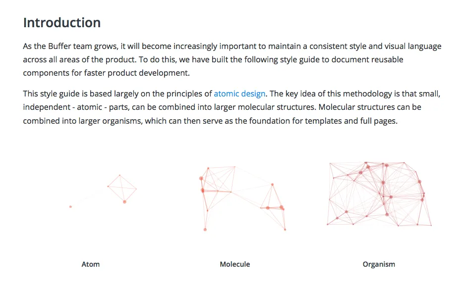
Source: Buffer
The style guide for Buffer introduces and explains the thinking behind the style guide itself. They describe their style guide through the lens of an atomic analogy – the organism is made up of tinier atoms. In this way, atomic design systems encourage each individual component of a site to work intuitively with one another throughout the site.
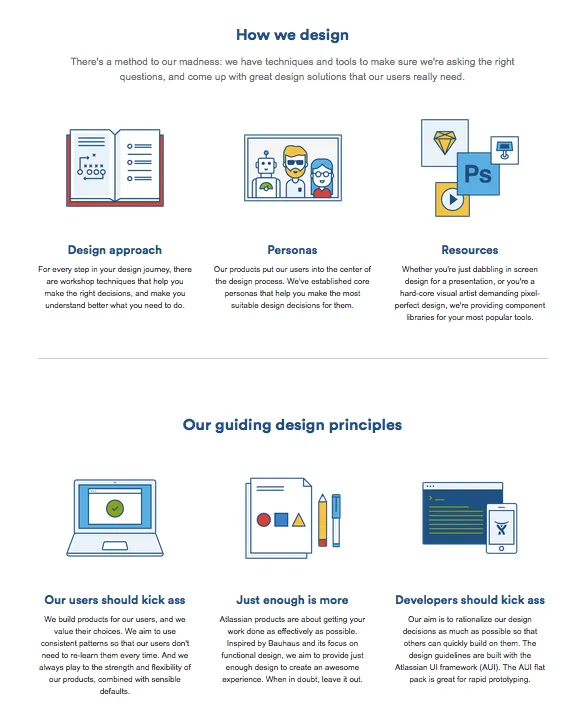
Source: Atlassian Design
Atlassian Design goes deeper into their philosophy and personalities at the start of their style guide. The three “guiding design principles” at the bottom infuse the style guide with the brand’s personality and maybe even inspire some of its workers.
2. Media Treatments
Each company and site will want to deal with their images and videos a certain way. The most common topic in this section is the proportions and ratios for your media, divided based on type (such as graphics within banners instead of those within content).
You could get further detailed and include specific practices, such as alignment, the surrounding spacing (if not discussed in the layout section), notes on captions, and the use of icons if necessary (such as a play button for video or an enlarge button for images). If your concerns are more technical, you could even outline the specific cache settings, in case your CMS might make this confusing.
Sometimes it might be necessary to discuss the kind of content used in media. Is it important that your content is children-friendly? How children-friendly?
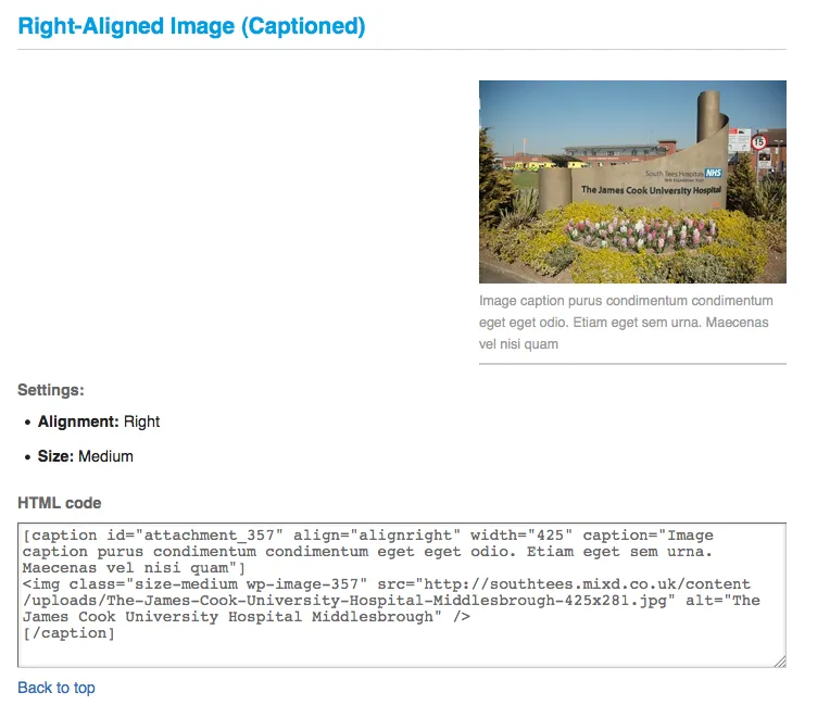
Source: South Tees Hospital
In the above screenshot from the style guide for the South Tees Hospital NHS Foundation Trust, you can see they list the proper procedure for captioned images, plus basic information, ending with the HTML code for direct implementation.
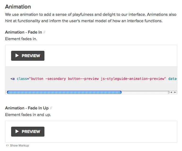
Source: Neue
The style guide for Neue explains the logic behind their animations, and lists examples. For something like animation that can’t be captured in a document, they include playable previews.
3. Navigation
This section covers all rules related to navigation, such as the use of search boxes, sidebars, links, and menus and drop-downs (for example, a minimum/maximum items per list).
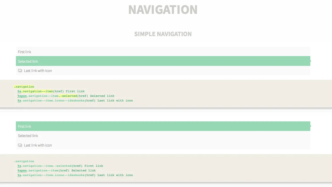
Source: Homify Living
Rather than wasting time describing their practices with words, the Homify Living Style Guide features a visual example and the corresponding code. Developers need look no further when building their navigation guidelines.
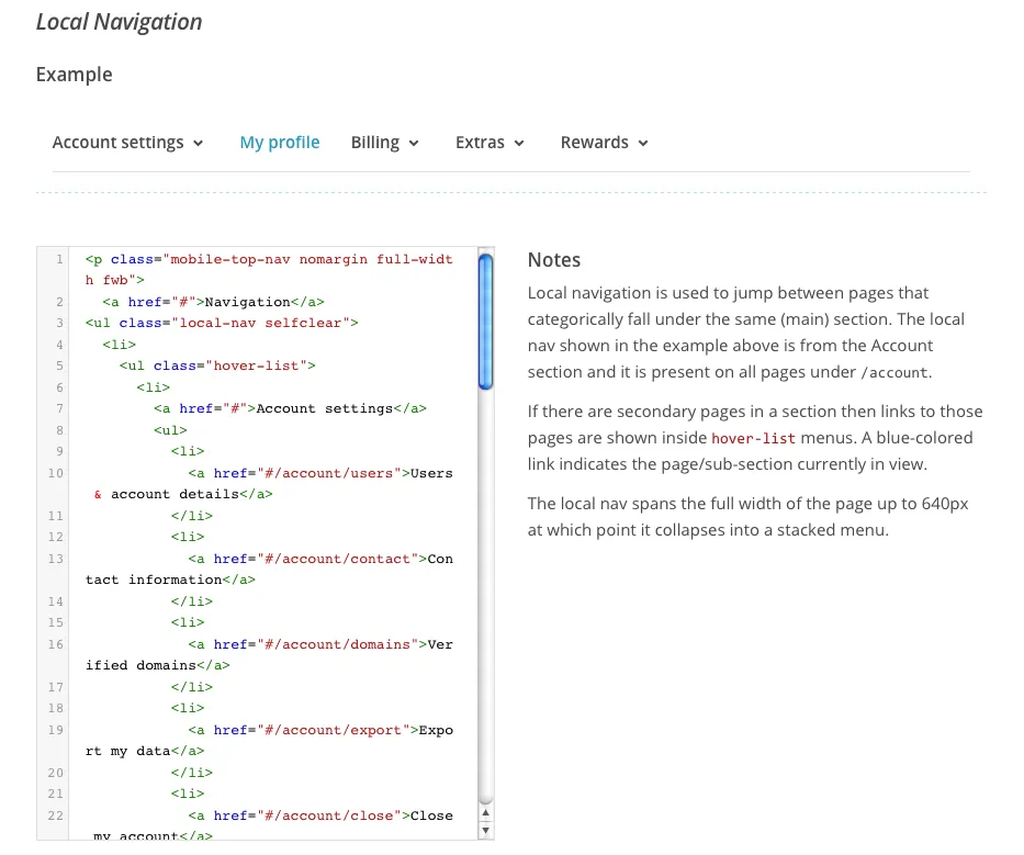
Source: MailChimp
On the other hand, the style guide for MailChimp goes into a little more detail. In addition to the visual example and coding, they give a few notes on how the navigation system operates, and clarifies some key points, such as the procedure for linking to secondary pages.
4. Iconography
Even if you don’t feature a wide variety of icons, you still want to clearly define them since they are a recurring design element. To avoid inconsistency, the iconography section can show all available icons for easy selection, the rules governing them (i.e., size, placement, etc.), and even include the markup for quick reference.
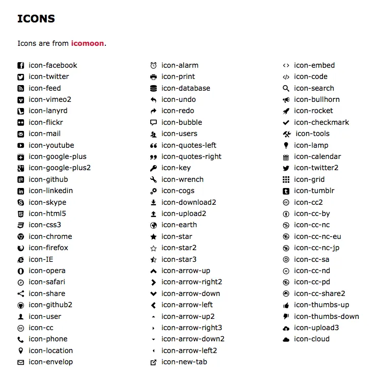
Source: Code for America
The Code for America style guide displays all their icons in an alphabetized list.
5. Naming Conventions & File Directories
In this section you can outline the proper directory structure for your files and folders, as well as a standardized naming convention (especially for versioning).

The Code for America style guide goes a step further and explains how they name their layout classes: they use musical notes to avoid listing the number of columns in a grid.
6. UI Patterns
Show your chosen UI patterns and mention any customized variations for each. This can also help you determine if any patterns overlap or contradict.

Source: Lonely Planet
In many ways, style guides are detailed lists of the brand’s UI patterns. You can tell by the above navigation menu for the Lonely Planet style guide: each entry is an existing UI pattern, where the style guide acts as a manual for defining how each one is modified specifically for the site.
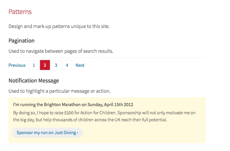
Source: Paul Robert Lloyd
Sometimes there’s more to mention about patterns. Paul Robert Lloyd concludes the style guide for his website with a small section describing the patterns he created. This is a great way to set the standard: since these patterns are original to him, there would be no where else to look except this site.
This level of specificity demonstrates how you should not assume your reader has any existing knowledge. You might know that certain patterns are unique to the design, but a new designer (or a non-designer) probably wouldn’t.
To learn more about how to create pattern libraries for your style guide, check out this practical piece by designer Paul Boag. In fact, if you include enough detail in your pattern library, it will usually suffice as a standalone lightweight style guide. The pattern library for DoSomething.Org is a great example – it provides the design reasoning, implementation notes, and markup code for UI patterns.
7. UX Writing Guidelines
This section deals with the content of the writing, not the typography. In essence, there are a few fields to this section, though you could choose any or all, depending on your needs:
- Subjective Guidelines – These cover the tone and voice (casual versus professional), as well as the target audience.
- Objective Guidelines – These cover specific language and grammar choices (such as the inclusion of the oxford comma, or customized spellings of words), when to write out numbers, or the preferred system for writing dates.
- Suggested/Prohibited Language – Some brands choose to either identify themselves with or avoid particular words or phrases. We’ve found it especially helpful to highlight prohibited words (e.g. “myriad”, “plethora”, and any empty buzzwords).
- Appropriate Language – These guidelines state what is and is not an appropriate language, including writing levels and even profanity.
In circumstances where copy must be added or revised in a pinch, it’s helpful to have these formalized guidelines, especially for non-writers.
Source: MailChimp
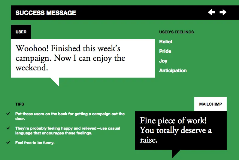
Both beautiful and practical, MailChimp’s editorial style guide is the best example we’ve found of the perfect editorial guidelines. Separated from the main style guide as its own microsite, the highly interactive guide feels immersive and fluid. Most importantly, the guide forces marketers to think about the user experience, outlining the emotions users feel upon encountering each design pattern.
Creating Effective Web Design Style Guides
Web design style guides are most effective when they’re succinct since shoveling in extra sections just makes it harder to find the essential ones.
To find out what your style guide needs and what it doesn’t, don’t guess. Ask around the entire team to see which sections could make their lives easier. Don’t forget that the real power of documentation are the insights gained in the collaborative creation process, not in the documents themselves.
For more best practices on writing style guides, including more sections and examples, download the free ebook, the Critical Component of Web UI Style Guides. Practical lessons are included based on analyzing style guides from 22 of today’s top companies.

