Even today in 2016, you’ll find plenty of popular yet ugly websites — they’ve hardly changed since the 90’s:
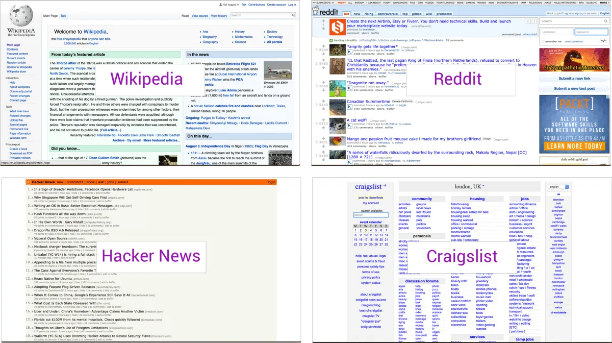
Wikipedia, Reddit, Hacker News, Craigslist
All of the above sites are massively popular despite their ugliness because of one key factor — they do exactly what people need. For example:
- Reddit has 234 million unique users, 8.19 billion monthly pageviews, 25 million daily votes (stats as of 2016) — and still loads really fast!
- Hacker News simply shows the latest start up news, “emphasizing content above all else”, as that’s what their users have always valued most.
- Wikipedia organizes information really well, making it easy and consistent for users to find what they need.
When an app ‘just works’, it matters less what it looks like, but how it helps solve a problem. A great example of this that I recently encountered was in a less well-known app called ‘My Tabata’.
Let’s explore the app as a case study for how usability can be more important than visual design.
My Tabata: Useful UX with An Ugly UI
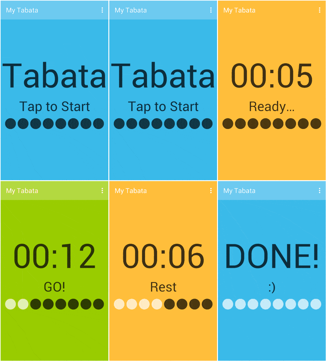
Without knowing what the app does (assuming no prior knowledge of Tabata), it seems pretty bad because of the visual design. However, it impresses when used within the context for which it was designed because it solves one problem really well. This is reflected in the 4.4/5 average review from 4200+ users:
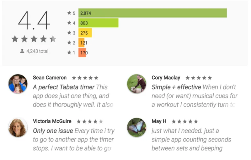
My Tabata overview
So, What problem Is It Solving?
Tabata involves doing simple exercises at high intensity, in 20 second bursts, with just 10 seconds of rest between each interval:
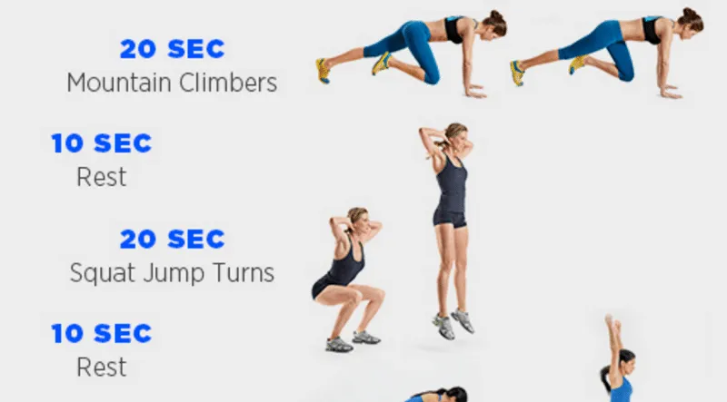
Tabata training example from Women’s Health Mag
It’s not easy for users to time the intervals and rest periods using a watch or timer, which is the problem ‘My Tabata’ solves very intuitively, despite the ugly user interface. As a result, it actually enhances the exercising experience through a set of good usability principles, which are set out below.
4 Usability Lessons from My Tabata
1. Use interactions that make sense in the context
When jumping into the air doing ‘super squats’, users will probably need to pause the Tabata session to get a drink. There’s no ‘stop’ and ‘start’ button on the app, it’s done in an even simpler way by tapping anywhere on the screen — tap to start, tap to stop:
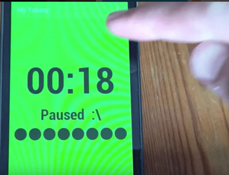
Tap to pause
This helps the user stay focused on the exercise, rather than fumbling about with their phone.
2. Use just enough navigation
When starting the app, users are faced with the ‘Tap to Start” screen — and practically zero navigation.
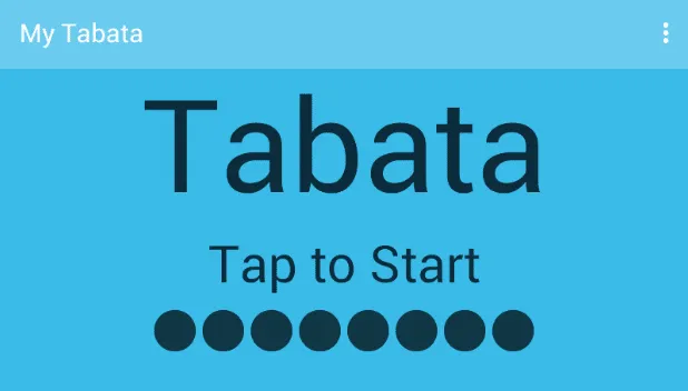
Tap the screen, and it’s straight into the fitness session — the experience becomes Tabata — not the UI, and not the phone. The result of this minimal navigation is that the user can achieve their goal on very first contact with the app.
“Your job is to help the user achieve their goal. Navigating an interface is never the user’s goal. If you’d done your job right, the app would only do one thing, and would do it very well, and would do it all on one screen.” ~ Antoine Valot
While users can tap the kebab menu in the top right of the screen to access the settings,the action doesn’t interrupt the Tabata experience — the settings are changed before or after each session, and the app saves those preferences for the following session.
3. Use audio only when necessary
When pushing through the last few seconds of an interval, a user’s eyes can close in the strain of the exercise.
My Tabata uses audio cues to count down the last three seconds of each interval, so users don’t have to change focus away from the exercise to their phone.
4. Enable users to track their progress
As the app goes through the different activities, it’s easy for users to forget their place in the overall exercise. While not the best visual implementation, users can quickly assess progress with a useful status bar on the bottom of the minimal UI:
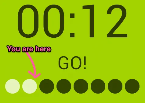
Combined with the timer, this tactic further improves the experience of the exercise.
You’ll actually notice that many of the lessons from ‘My Tabata’ cross over with Jakob Nielson’s 10 usability heuristics for UI design, which is a great set of broad guidelines to help ensure apps are usable, as well as looking great.
Learn more: UX Design Process Best Practices
Next Steps
Don’t fall into the trap of sacrificing context for visual finesse.
In closing, always remember the UX hierarchy of needs:
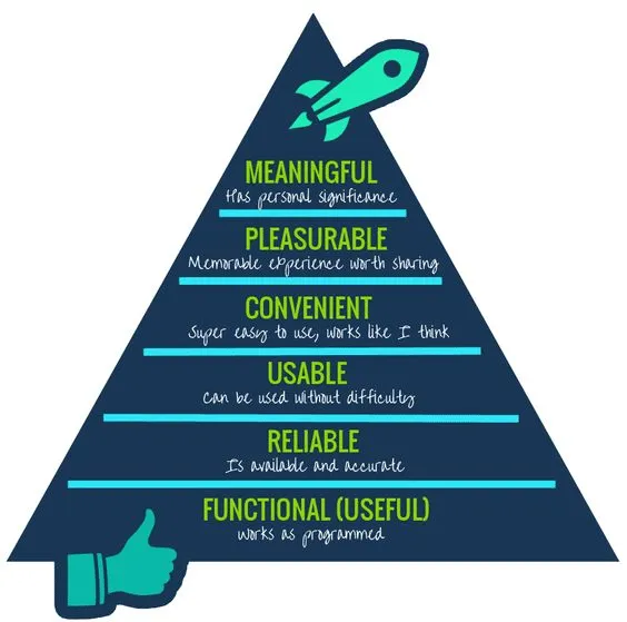
Photo credit: Growth Engineering
Yes, delightful design can certainly make good products great, but that only matters if the product is actually useful, usable, and reliable in the first place. Otherwise, you’re just building on a shaky foundation.
To see how successful companies design their products, check out the free e-book Real-Life UX Processes. The guide peeks inside design processes at Slack, Autodesk, 3M, and Sumo Logic.

