You’re a project manager, not a designer. But you have ideas and, more importantly, responsibilities that involve your organization’s website.
Listing out ideas in prose might not work for designers, who can be more visually oriented. Also, a list might feel like a requirements dictum coming down from the mountain. That’s where mocking up your ideas in a visual way can ease communication. You need to provide visuals that don’t dictate to the folks actually doing the work. It’s a delicate balance that you can maintain with a few simple tools.
For Stakeholders, Design is a Conversation, Not a Finished Plan
The trick to working with problem-solving designers is to give direction, not directives.
Especially at the beginning of a project, stakeholders like clients, project managers and art directors understand the project’s goals and requirements better than the average designer. It’s their job to know what problems the site or app should solve for end users.
Meanwhile, UX and UI designers only know what they’re given. If stakeholders provide full comps, then designers will return mockups. But if they understand why something’s important then they can propose solutions that improve the bottom line.
Saying “this button needs to be orange,” for example, is superficial. Instead:
- State the goal, such as “we need people to sign up for our service.”
- State the problem as you see it: “analytics says people aren’t tapping the call-to-action button. It gets lost on this page.”
- Ask designers a question: “how can we make the button stand out without looking like an annoying sales pitch?”
Sure, the solution might involve making the button orange. But designers might think of something else, like giving the button more space (and therefore more contrast), or changing the layout to make the button more prominent.
Copywriters and marketers might realize the button’s text doesn’t inspire people to tap. Developers can double-check that its code works. The whole team can contribute when they understand what’s at stake. Even better, they’ll come to appreciate that you respect their opinions.
This is a powerful technique that gets creative designers to work with you on making a stronger site, leaving you free to work on the big picture. But there’s a catch.
Questions may not be enough, especially if you already have an idea of how to proceed. Remember that designers (and many developers) are visually-oriented. They’ll respond well to prototypes that provide direction, not directives. And you can make it happen.
The Power to Communicate Visually
Let’s get down to brass tacks: how you can start doing this in a hurry.
1. Start with a plan
Based on your goals, list the content that will motivate people to act.
If you’re selling products, for example, then people may want to see photos, features and prices. If you’re offering a service, then determine which features people crave most. If you’re publishing a blog, and want more newsletter signups, you might pique interest with a sample post or list of upcoming topics. Whatever you think will persuade people to buy, sign up, read, or otherwise take action — you need a list.
And that list must be organized based on users’ time. People only spend so much time on a website, so the order in which you present your information is critical. For example, which do you want them to see first: a stylish stock photo or a screenshot of your app? And if your product’s features are its selling points, for example, then list them before testimonials.
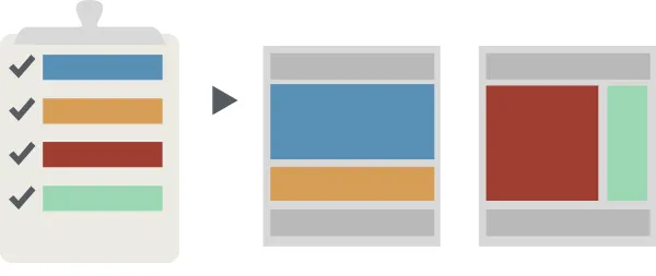
Next, organize it all into groups based on relevance. Only so much will fit onto a screen, especially on mobile devices. If you’re promoting an app, then its features and screenshots might work well together — but features and testimonials, not so much. These groups are your site’s pages.
Share the list — and your goals — with the team to explain what you’re trying to accomplish, be it increased sales, signups, or other actions people should take.

Above: organize disparate chunks of information into pages. What does this have to do with prototyping? Everything.
2. Boxes are your friends
Now you have a plan — more than that, a vision. It’s time to get visual.
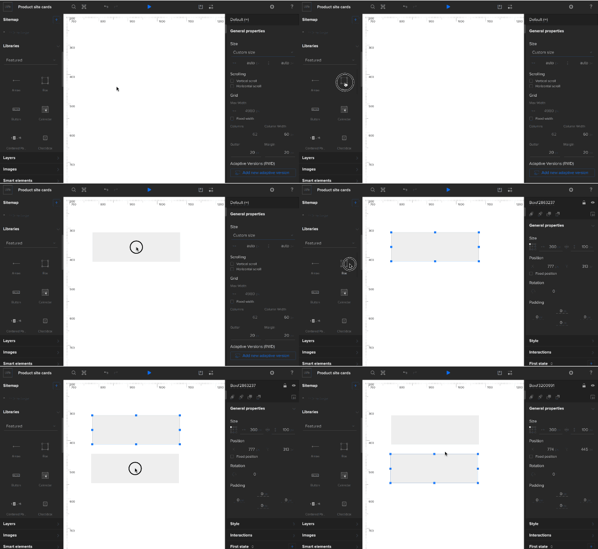
UX prototypes don’t need much to get the broad strokes. In fact, the less time you spend, the better, because it’s likely to change as the design progresses. Use simple gray boxes to block out the major sections of content.
Luckily, they’re super simple to create: just drag and drop for the side toolbar (shown below if you’re using a tool like UXPin).

One important point: you should use the same shade of gray everywhere except where you want people to go next.
In the case of shopping websites, “buy now” and “add to cart” buttons should take the form of darker boxes that stand out. This communicates to designers how you think users should venture through the site.
3. Make pages by duplicating the first
Handy tip: Once you have the basics of one page together, you can duplicate it rather than making new, blank pages. That ensures that every page has the same common elements, like headers, footers and navigation bars. Then change blocks that represent content as you need.
Don’t worry if they look redundant. When you communicate the problems and your proposed solutions, designers and content producers can take it from there.
The goal of fast mockups and prototypes is communicating ideas, not perfecting them. Clear communication is always the first step to perfect refinement.
Going Forward
You don’t have to be a designer to have design ideas, but remember that’s just the beginning.
The best way to work with designers is to hash out ideas together without saying “just make this.” Working with UI and UX designers will go smoother if you use rough mockups to start conversations.
