There’s lots of ways to create a mockup. It’s true there is no “best” way, but depending on certain UI and UX designer’s styles and preferences (and the design process), some will work better than others.
In this piece, we’ll look at the pros and cons of mockup tools, graphic design tools, as well as coded mockups that start to blur the lines with prototyping.
1. Use bespoke tools
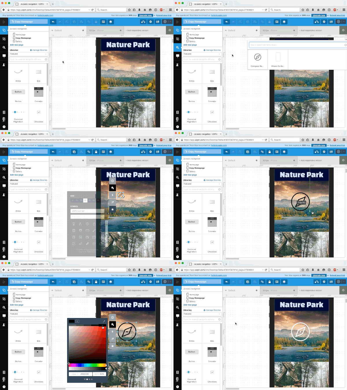
Using a tool like our own UXPin, or other solutions like Moqups or Balsamiq, will provide you everything you need to build your mockup and facilitate the entire process. These tools are designed to make the creation process as easy as possible, so you can focus more on stylistic decisions and less on how to manipulate the program.

Both experts and beginners feel most comfortable with mockup tools, as beginners prefer their ease of use, while experts appreciate the designs specifically tailored to their advanced needs.
Moqups and Balsamiq provide more functionality than non-design tools that are sometimes used for wireframes and mockups (such as Keynote), but they are limited to only low fidelity designs. They can, however, be quite useful if the goal is to create low-fidelity wireframes very quickly.
When it comes to mockup tools, many are targeted for wireframing than true mockups. With built-in collaboration, UXPin offers dozens of element libraries to save time, and its a simple matter of dragging, dropping, and customizing to create your mockup. Our 20+ element libraries cover both web and mobile.
2. Using graphic design software
Some designers swear by software like Photoshop, Sketch, orIllustrator, especially those particularly skilled or familiar with tools that offer control down to the pixel. As Nick Pettit of Treehouse points out in a piece explaining mockup types, graphic design platforms work best if you’re aiming for the highest level of realism and visual fidelity.
Working in graphic design software gives you access to an almost endless selection of highly defined colours, so if you’re working within the restrictions of a rigid and preset colour scheme — for example, under particular branding rules — then these programs may be your best option. More than colour options, these programs offer far more visual tools, allowing you to tackle the minutiae of detail.
However, the drawback to using this type of software is that it can be difficult to translate when it comes time to start coding the design. What worked in Photoshop may not always work in code (elements like fonts, shadows, gradient effects, etc.), which can waste time in figuring out solutions for the prototyping phase.
As described in The Guide to Mockups, graphic design software is only recommended if high fidelity visuals are the top priority. If you have a style-heavy page, it might help to hammer out the specific visual details in the mockup process (in which case Photoshop or Sketch will give you the most options).
Just take a look at Hubspot’s list of the 53 Most Beautiful Homepages, and it’s easy to understand why it sometimes helps to sort out all the visual details sooner rather than later. Similarly, if you’re dealing with a nitpicky or hard-to-please client, presenting them with a gorgeous and impressive mockup might win them over more easily.
It’s also worth mentioning that mockups created in Photoshop or Sketch can be dragged and dropped into the prototyping phase with UXPin. This lets you easily animate all layers (no flattening) with a few clicks, and ensures you don’t need to start from scratch when it’s time to prototype. For more details, take a look at the tutorials for Photoshop integration and Sketch integration.
If visuals are not your only priority, you might be more efficient using a tool that allows you to do the wireframing, mockups, and prototyping all in one place. Graphic design software can be more trouble than its worth for mockups unless you’re looking for optimum visualization — you’ll definitely need to communicate regularly with your developer since these tools aren’t designed for collaboration.
3. Coding your mockups
For starters, if you’re mainly a designer and not comfortable with coding, then this obviously isn’t even an option. As discussed in The Guide to Mockups, coded mockups are not the default choice.
Most coding can be postponed until prototyping (if you’re creating an HTML/Javascript prototype) or even later (if you use a prototyping tool). But despite the complexity and potential obstacles, there are many respectable designers who advocate introducing coding into the mockup phase.
As Joel Falconer shows us on TNW, building a structure in HTML and then moving to CSS for the basic layout can streamline the entire development process — in theory at least; many would argue that focusing only on visuals during the mockup phase saves time in decision-making and organization down the road. But those who prefer coding early understand that more mathematical changes such as sizing can be implemented more easily when the code is already written.
One of the biggest proponents of coded mockups is Ash Maurya, Founder/CEO of Spark59 and speaker on development. When describing how he prefers to create mockups, Maurya defends the HTML/CSS route, and makes some solid points:
- Feasibility — “Flashy” mockups (sometimes literally if they’re done in Flash) designed only to look good can be difficult to translate into code, resulting in wasted time and effort. Elements like gradients, fonts, and effects — while easy to create in other tools — can be cumbersome or even impossible to recreate when coding. Starting in code lets you know right away what you can and cannot do.
- Quick Iteration — According to Maurya, coding actually saves time by simplifying the iteration process, although others disagree in that it adds time in dragging out design decisions.
- Minimizes Waste — “Creating a mockup in anything other than the final technology in which the product is delivered creates waste.” Because the mockup is going to end up in HTML/CSS anyway, Maurya suggests adding fidelity there.
But as we mentioned before, mockups with coding are not a popular strategy, for more reasons than the difficulty of coding. Tony Thomas, Lead Designer at Medialoot explains why in a compelling post on the subject. Among the reasons designers prefer to leave coding out of mockups, these three are the most common:
- Limits Creativity — The strength of building with code can also be its weakness: knowing concretely what you can and cannot do will cut off many avenues before they’re fully explored, while designing openly might inspire new ideas you wouldn’t have had otherwise. Sometimes when you like an idea enough, you try harder to figure out how to recreate it with code, whereas the idea never would have even surfaced if you started in code.
- Limits Experimenting — It is a lot harder to try out new and different ideas in CSS/HTML than in other simplified programs. Just as with the above point, the freedom to create will often inspire new, more, and better ideas. Just ask yourself how many UI designs and iterations can you create in 30 minutes of Photoshop or Sketch versus CSS/HTML?
- Dilutes Design Process — Not everyone is great at multitasking. The mockup phase is all about iterating on the appearance of the site, and worrying about coding at the same time can get distracting. Some people prefer leaving things for the right place and time: visual design during the mockup phase, coding during the prototyping or development phase.
Again, it’s up to you when to introduce coding. Just make sure you know your design priorities and keep the developers updated on how you’re prioritizing features.
Conclusion
Don’t make the mistake of thinking all mockups are the same. Simple decisions about platforms, fidelity, and coding will all produce significantly different results.
Know what you want and what your goals are before you even begin the design process — if you want a tool that supports all three phases, it’s best to start out using it than to begin halfway through. Likewise, if you need a stellar, fully realistic mockup, keep in mind that you’ll be using a graphic design editor at some point.
If you found this post helpful, feel free to check out our tool. With a free trial, you get full access to the highest Pro+ plan which contains thousands of pre-built elements, integration with Photoshop & Sketch, customizable UI libraries, and more.
This post was originally published on CreativeBloq.


