If there’s a pattern to using patterns, it lies in the tools designers use to create them.
Having a standard library of reusable, easy-to-access elements is vital because the faster we build prototypes, the faster we can iterate through them. Quick iterations in the beginning lead to more time for development. Development time translates to beating deadlines. And that means happier clients, stakeholders, and users.
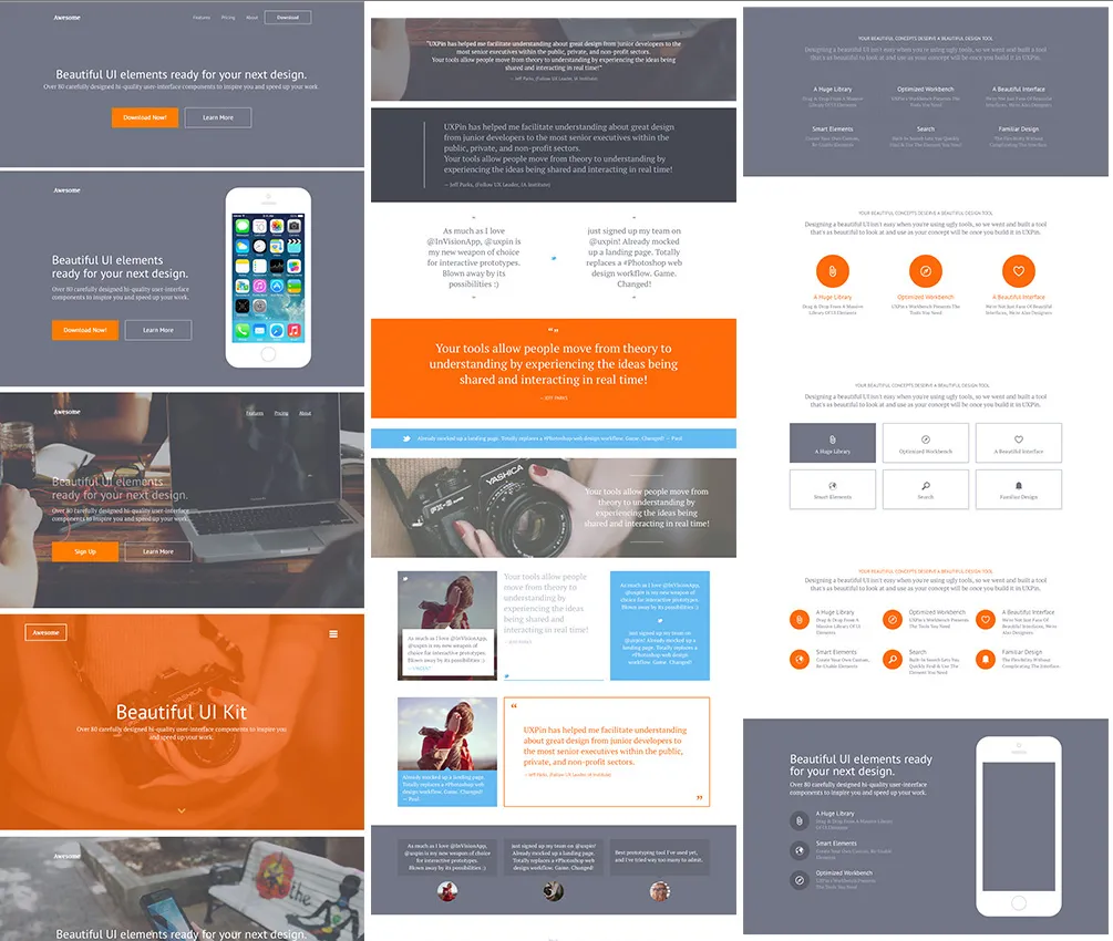
Photo credit: Free UI Kit
So it’s not surprising that designers take full advantage of pre-made elements for low-fidelity and high-fidelity prototypes.
But pre-made patterns have their drawbacks, and overcoming their shortcomings takes effort and awareness of what is going on — and how ignorance of that process is actually strength.
Explaining the Gray Box
Those who use prototyping tools face a difficult challenge.
Elements in their designs must represent specific components like input form fields, text blocks, and images. They also need variety: not just “form fields” but text areas, radio buttons and single-line input fields; not just “text” but paragraph text boxes of any size and shape; placeholder images, imported photos and plain ol’ “pic goes here” boxes.
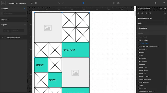
The challenge is creating elements that clients and team members understand without dictating the final look-and-feel in a prototype. It’s not about using the best fidelity – it’s about using the right fidelity.
Start with a lo-fi prototype so you can explore user flows and basic usability (with feedback from users and your team), then iterate into a hi-fi prototype after testing. Don’t dive immediately into high fidelity, no matter how tempting the idea of visual finesse.
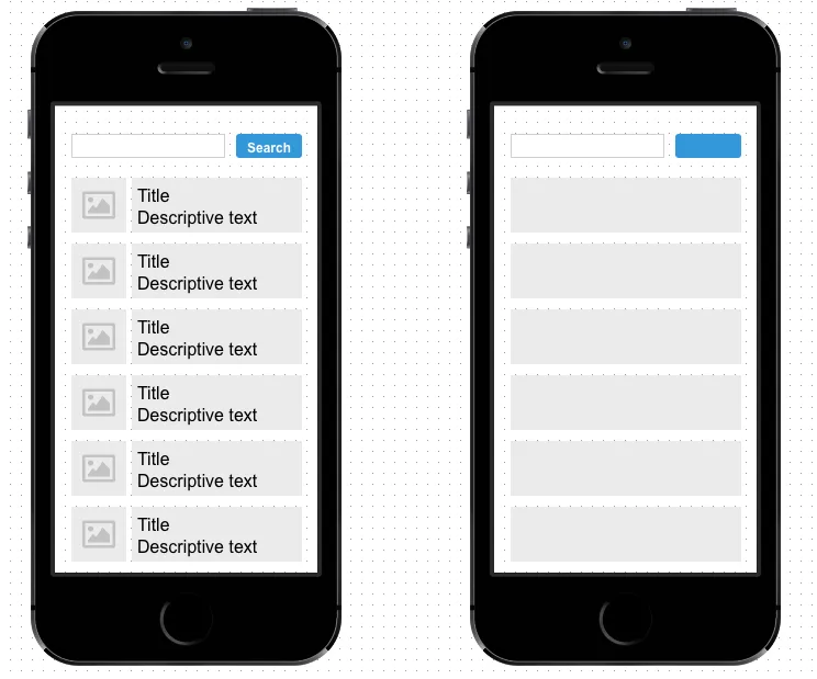
Above: A pattern in a lo-fi prototype with just enough detail (left) and somewhat lacking in detail (right) to indicate what’s going on.
The easiest — and most common — solution is to start with grayscale boxes that may (or may not) get filled in later. Gray boxes are design-agnostic, meaning they could apply to anything. Boxes say “something will go here, we just don’t know what yet” or “pay attention to the big picture, don’t get bogged down in the details.”
Thus most prototyping tools, including UXPin, come with many pre-made elements that could mean many things. Unadorned boxes, for example, can stand in for images or header backgrounds. Buttons can let testers submit forms or signify calls to action. But sometimes gray rectangles are a little too vague. Even those responsible for the design can forget what every abstract shape means.
The opposite approach is to create more recognizable, less generic objects. Radio buttons and checkboxes don’t have to resemble each other. Browser windows can have round corners on the outside, and sharp corners inside their frames. Text of varying sizes sets headings apart from paragraphs, and paragraphs apart from calls to action. The more specific an element is, though, the less likely it will get used. Not every every project will need, say, a calendar or video window.
The best prototypes bridge the gap that includes generic and specific objects. These objects become patterns as people learn to recognize them for what they are. Patterns emerge from understanding what, exactly, each element is without spelling it out. The prototype is therefore fast to create and provides just enough detail for users to focus on accomplishing tasks.
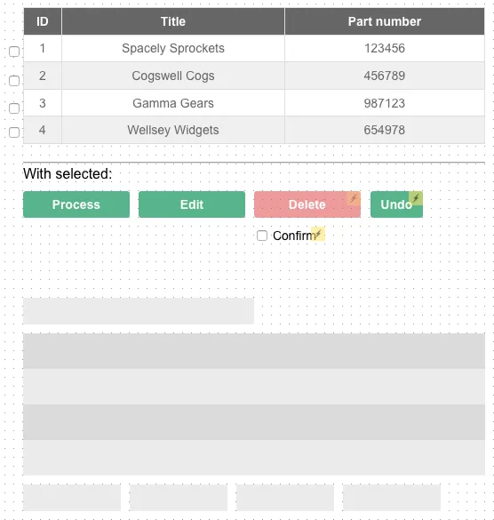
Above, a more-specific object (top) communicates its purpose better than an abstract set of unlabeled shapes (bottom).
Pattern Libraries Are Prototyping Shortcuts
Prototypes are built with a set of patterns, often called libraries, that contain elements designers don’t have to invent. At the time of this writing, UXPin has more than 900 of them.
It’s easy to drag a pattern into a design and discard it later. This allows designers to focus on solving problems without gnashing their teeth over visual design details. Instead they can design for user actions like whether or not to let travelers give hotels a star rating, or if that’s overkill.
Designers should make decisions, not patterns.
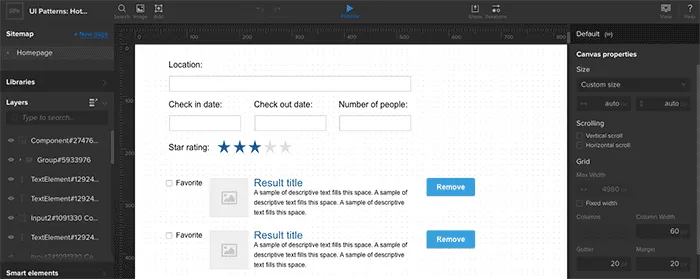
In programming terms, patterns are instances of a class; in practical terms, they’re shapes in a sidebar you drag into your design. Make as many as you need of the same thing. “What if we have a calendar here?” designers ask, and drag-n-drop one into place. Patterns are disposable. Prototyping tools make them inexpensive.
Let’s look how UI pattern libraries help you prototype faster while making the design easy to understand.
Reusable elements
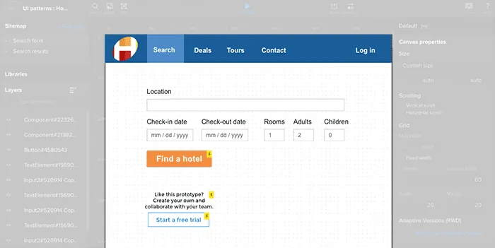
The mockup above recreates a standard search pattern with a twist: This one’s geared for finding a hotel. It includes some technical (and practical) requirements like check/out dates, number of people and location.
Notice that the whole design uses only three kinds of elements: Text, input fields, and a single button. They’re instantly recognizable for what they are. Not only that, but they’re arranged almost identically. A text label is set atop each input field, making them easy to copy/paste throughout the prototype.
In the beginning stages of design, visual details don’t matter as much, so it’s more important that the design structure makes sense (which UI patterns help).
Custom libraries
One-off elements are quick to create and customize. Whenever you need to repeat yourself precisely, though, you need some smarts.
Certain parts of a project tend to remain the same on every screen but, like anything in development, change over the course of the project. For example:
- Site-wide headers
- Primary navigation bars
- Tappable logos
- A standard copyright statement
Look sharp and you’ll notice a pattern in these elements. Each is part of the overall website design and branding. In addition, some parts — particularly the navigation — may change on multiple wireframes throughout a project.
Patterns and Prototypes Work Together
Patterns and prototypes complete each other. You can’t have one without the other … unless you don’t mind creating everything from scratch. But even then you’ll find yourself recreating what’s come before.
Prototypes must communicate the solutions that designs bring. Their patterns must be recognizable as distinct elements — for example, that calendar widget — without declaring that its final look will be a particular style, color or typeface.
As you work, find a good tool that becomes an extension of yourself. The quicker you forget that you’re using it, the quicker you’ll iterate through the design process.
If you want to bring UI patterns to life, give UXPin a try with our free trial and explore our UI templates and patterns.

