Validated learning is a helpful way to think about the UX design process conceptually, with insight into different techniques and methods you can use during each step of the way.
Read on to learn how this lean framework can make you a better UX designer.
Why Use a Framework?
First of all, why do you need a “framework” to think about design?
Ultimately, UX design is about creating solutions that respond to the needs and desires of your target consumers, in a way that is usable, pleasing, and memorable.
Source: Five Whys
Think about the number of variables involved in that last sentence:
- Understanding the problems, needs, and desires of consumers
- Actually solving those problems
- Doing so in a way that is usable
- Making sure your solution is pleasing and memorable
UX designers are constantly balancing all of these priorities, and trying to come up with a product that satisfies all of the above. Trying to do this without any sort of process is like trying to summit a mountain in a forest without a map (still possible, but your odds are much lower).
By treating design as a structured process where you’re making sure that you’re solving the right problems at each step, you can ensure consistently better outcomes while preserving your resources of time and money.
An Overview of the Validated Learning Process
So, here’s the challenge. You start with an idea — a hypothesis on a problem customers have, that you can solve. But how do you turn that into an end product that people love?
Follow the validated learning framework, which we’ll explain below.
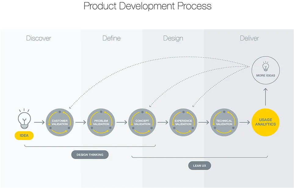
There are five “gates” which we go through on our way through the product development process. While each step is iterative, and driven by hypotheses that we have to test and validate, it’s advisable to move on to the next “gate” only after really nailing that step.
Step 1: Customer Validation
As described in the Guide to UX Design Process & Documentation, our idea starts with a hypothesis on a problem that a hypothetical customer audience has — for example, mid-size startups have difficulty with inter-team communications.

Source: Techni-Asia
In order to solve that problem, we first must be confident that the target audience exists and is addressable. Can you find people to research? If not, maybe that customer segment doesn’t exist, and you need to rethink the problem you’re trying to address.
Step 2: Problem Validation
Once you’ve validated that customers exist, it’s time to figure out the extent of their problem, and what other products they currently use to solve it. This is the phase that’s covered during the User Research process. Some popular techniques used here as described in the Guide to Usability Testing:
- Field observation – Field studies are when we observe users in their natural environment, and get to understand user behavior in its proper context. We observe users performing tasks within the problem space, and probe them about their behaviors, in order to better understand their mindset, problems, and opportunities.=
- Diary studies – Diary Studies are a technique to gain better understanding of users’ behavior remotely. Participants are provided a diary (either physical or virtual) and given reminders to enter their activities and moods (or other measurements deemed as important by the researcher) into the diary.
- Customer interviews – Customer interviews are 1:1 interviews conducted with the people that operate within the problem space we wish to explore. If budget permits, a second researcher may be included to take notes. This is often a good idea, as it allows the interviewer to maintain rapport with the participant.
These allow you to hear from customers, ask questions, and get a feel for what’s going on in their lives.
Source: Agile Syndicate
After conducting these inquiries, you’ll often have enough insight to create the following deliverables that help you and your team deeply empathize with your customers:
- Storyboards – Storyboards are simple drawings joined by a narrative, that show our users experiencing the problem space that we are interested in. Storyboards are a great tool to show our users in context. They allow us to show not just what our users are doing, but where they are when they’re doing it
- Personas – A persona is a fictional character used to represent a particular type of user of your product. Good personas include the behavior patterns, goals, skills, attitudes, and environment of your users, and help you empathize with specific types of users throughout the design process.
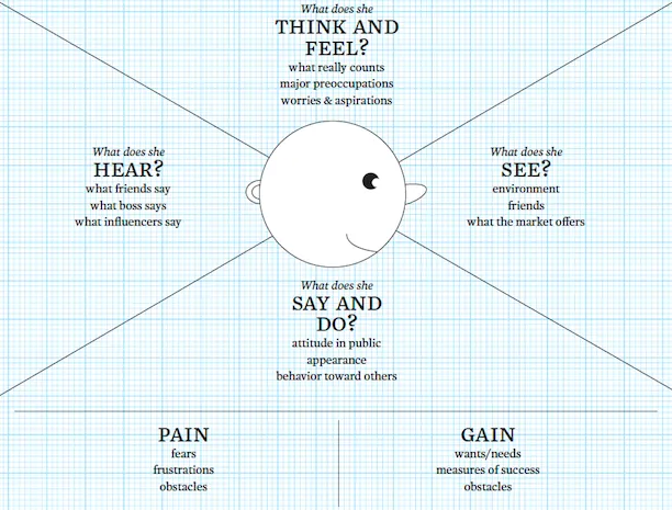
- Empathy maps – An empathy map is a tool used to help you put yourself in the shoes of your hypothetical customer. You literally map out what the user is seeing, thinking, and feeling, in an attempt to understand the “why” behind users’ actions.
- Customer journey maps – A Customer Journey Map is a diagram that we create that shows the key stages on our user’s journey, and how our user behaves during each of these stages as they move towards completing their task. It shows how they are feeling, what their influences are, and what channels they are using at each stage of the journey.
- Feature comparison diagrams with competitors – As part of our research process, we must investigate other products customers are currently using to solve their problems. After this competitive analysis, we create a “feature matrix” where we review the features offered by other products in the space.
By the end of this stage, you’ll hopefully have deep insight into who your target customers are, what their problems are, and whether solving the problem is valuable.
Step 3: Concept Validation
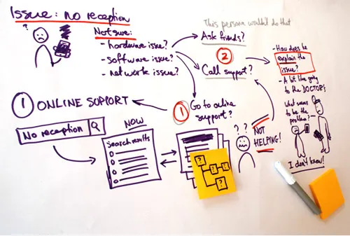
At this stage, with a more nuanced understanding of your target users and their problems, we jump into generating solutions. Before actually building products, though, it’s helpful to create conceptual solutions describing the product.
Source: Johnny Holland
Here are some techniques we can use for this:
- Storyboards – You’ll notice that storyboards are also referenced in Stage 2. Indeed, storyboards are a valuable tool that can be used throughout the design process — they’re a way to map out the entire customer experience in order to identify gaps. You can often show hypothetical storyboards to your target users, in order to hear them explain the issues they see.
- Landing pages – This is exactly what Buffer did for their minimum viable product. Explain your value proposition, let interested people sign up, then follow up with them in email to collect feedback for building your solution.
- Paid ads – Create a paid campaign targeting relevant keywords, then drive that traffic to the landing page you created. Do some A/B testing to see what messaging resonates most.
Without actually showing them any detailed screens, we can show users how we intend to solve their problems. By testing them and validating our concepts, we’ll know if our solution hypotheses are correct, or if we need to iterate some more.
Step 4: Experience Validation
Now comes the stage most typically associated with “design”. We know our problem-solution fit, and now it’s time to start designing the solution. The level of fidelity (visual detail/functionality) depends on what type of questions we’re trying to answer.
Source: UXPin
At various stages of experience validation, we’ll create these artifacts that users can interact with:
- Sketching – A universal language for exploring and sharing broad ideas. Sketches should be quick and rough, and done in layers.
- Wireframing – If sketches explore concepts, then wireframes explore structure. Don’t worry about visual finesse, just focus on content and layout.
- Interactive prototypes – The most powerful way of gathering feedback, prototypes demonstrate your product’s functionality. Low fidelity prototypes are rougher and can encourage more feedback, but higher fidelity prototypes help you refine visuals and interactions. If you’re strapped for time, focus on creating a mid-fidelity prototype.
Through any of these methods, we can observe whether our solutions present any problems to our users that might affect task completion, and gain qualitative and quantitative feedback on the experience as we test our designs on users.
Step 5: Technical Validation
Finally, after we have built our product, we need to test the code to see if it has any bugs or security holes in it. We accomplish this by conducting alpha testing, user acceptance testing and QA testing.
Conclusion
So that’s an overview of the validated learning framework.
It’s just one example of a structured approach to problem-solving through design. Hopefully this provides a nice guideline for your UX design process. Next time you’re building a product, observe for yourself: are you jumping into generating a solution before properly identifying the target customer and their needs? If so, refer back to this post for guidance on techniques you can use.
You can learn more about these techniques, while working on hands-on projects and getting 1-on-1 feedback from expert design mentors, through online courses on Designlab (enroll with a 20% discount here).
To learn more about the product design process at companies like Apple, Spotify, ZURB, and many others, check out the free Guide to UX Design Process & Documentation.
Questions or comments? We’re all ears!

