There are three recurring problems on web design projects that affect your interest and ability to complete them: time, invention, and novelty. I’d like to help you solve all three.
The time problem is one of deadlines. Even when you have months to work out the details of the product, the deadline invariably comes sooner than you’d like it to. Most are far tighter than that. When you have so little, you’d like to spend it on the right things. The important things.
That leads you to the invention problem. Whoever it is you work for, your team’s biggest challenge is to build the cool stuff the world has never seen before — the things that’ll make your product awesome and exciting. This should be your biggest time-suck.
Unfortunately, what is actually your biggest time-suck is all the boring stuff you’ve done a million times before and can’t stand to think about. Like search systems. Registration forms. Homepage layouts that communicate the same few things they always do (value proposition, major features and benefits, pricing, how to sign up, etc). These things take up a ton of your time, and are nowhere near as exciting as inventing and dominating a niche industry.
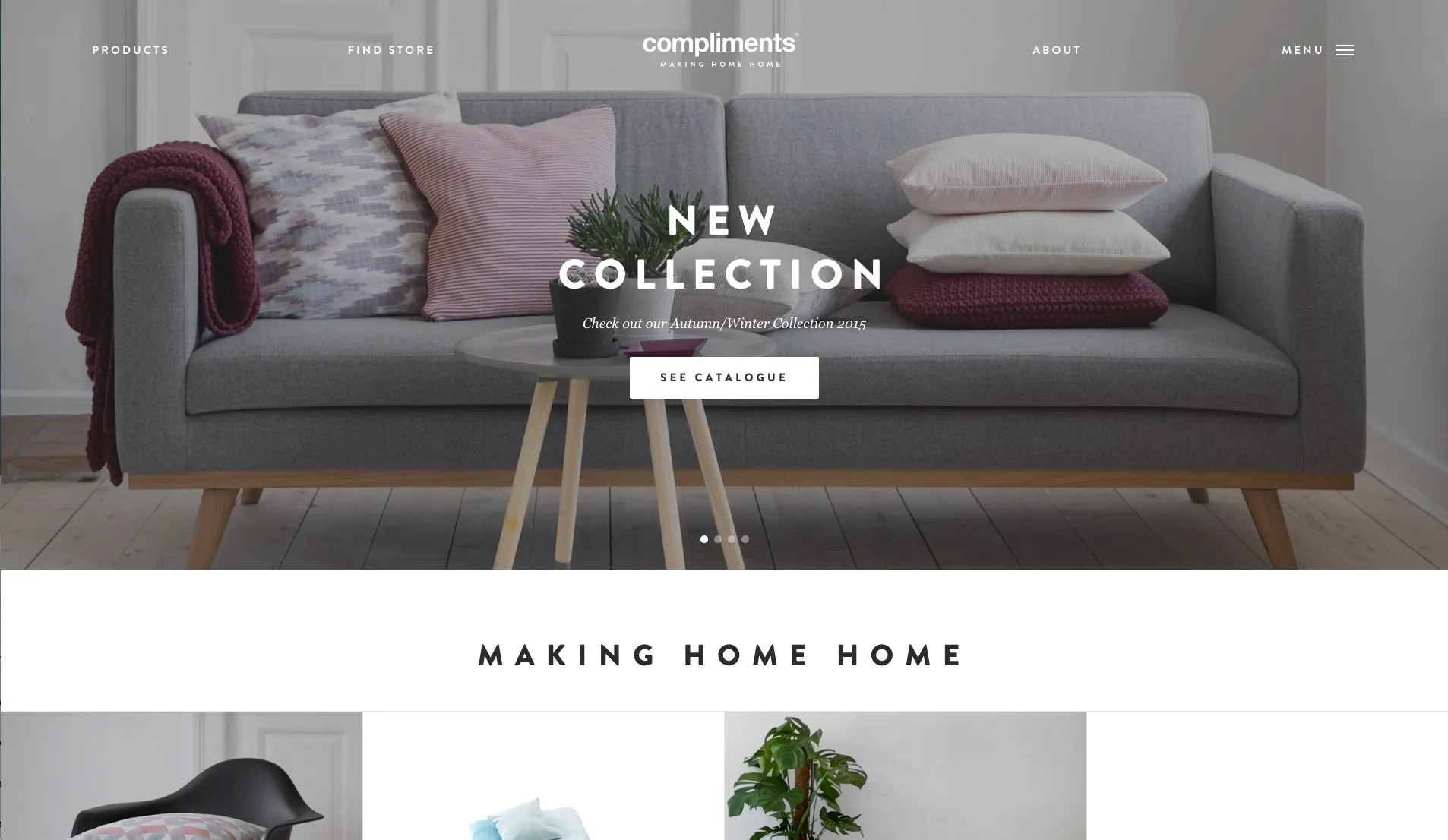
Photo credit:Compliments DK
And that leaves us at the wrong end of the novelty problem. What you hoped you’d spend your time on when you started your job is the cool stuff, but what you actually spend your time on is the boring stuff. It’s not challenging. It’s not interesting. It’s barely worth sticking around for. You want to work on something new and interesting for a change.
Dealing with all of these things requires a reuse strategy.
Adopting a Reuse Strategy
A reuse strategy is a plan for how and when to reuse existing elements from your product or suite of products for any new design. By doing so, you can better focus your time on the tougher and more exciting aspects of the project.
There are three types of reusable elements to know about: design patterns, components, and interaction design frameworks. Back in 2009, I coauthored a book with Jared Spool on the subject called Web Anatomy (New Riders), wherein we called these three elements the “Reuse Trinity.” Each type can be collected into a library. A pattern library, for example, is a collection of documented design patterns.
After that, it’s a matter of putting it all together into a library of solved problems. Below, I’ll describe the 3 levels of the reuse strategy in order of complexity.
Documenting UI Design Patterns
As explained in Web UI Best Practices, design patterns are recurring solutions to common problems. They are the most atomic level in the Reuse Strategy.
A search box, for example, usually looks pretty similar to all the others. It’s a basic input field with some sort of trigger for submitting the query. It’s on your phone. It’s part of your desktop browser. It’s on every content-based website.
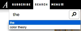
Photo credit: The Atlantic
It’s a pattern because of exactly that: a bunch of sites with the same problem solving it in roughly the same way. Patterns make websites and apps more learnable for users. Since they’ve already used the pattern on other sites, users can easily learn how to interact with them on yours.
When developing a pattern library, make sure you document your patterns with the following details:
- Name – The name of the pattern so you can all recognize it and find it within your patterns
- Description – A short summary of its purpose
- Context of use – Where and when you’re most likely to find the pattern put to use (a search box would appear on most pages of a content site, for example, perhaps at the top of the page)
- Where used – This is a list of links to examples of it in action on a live website or app
- How it works – A description of the actions a user takes and what happens as a result
It’s pretty common these days for designers to have collections of stencils for Keynote, Photoshop, Illustrator, and other apps that are full of little wireframe versions of these patterns. If you’re using UXPin, you can actually use customizable libraries and smart elements to create your own reusable pattern library.
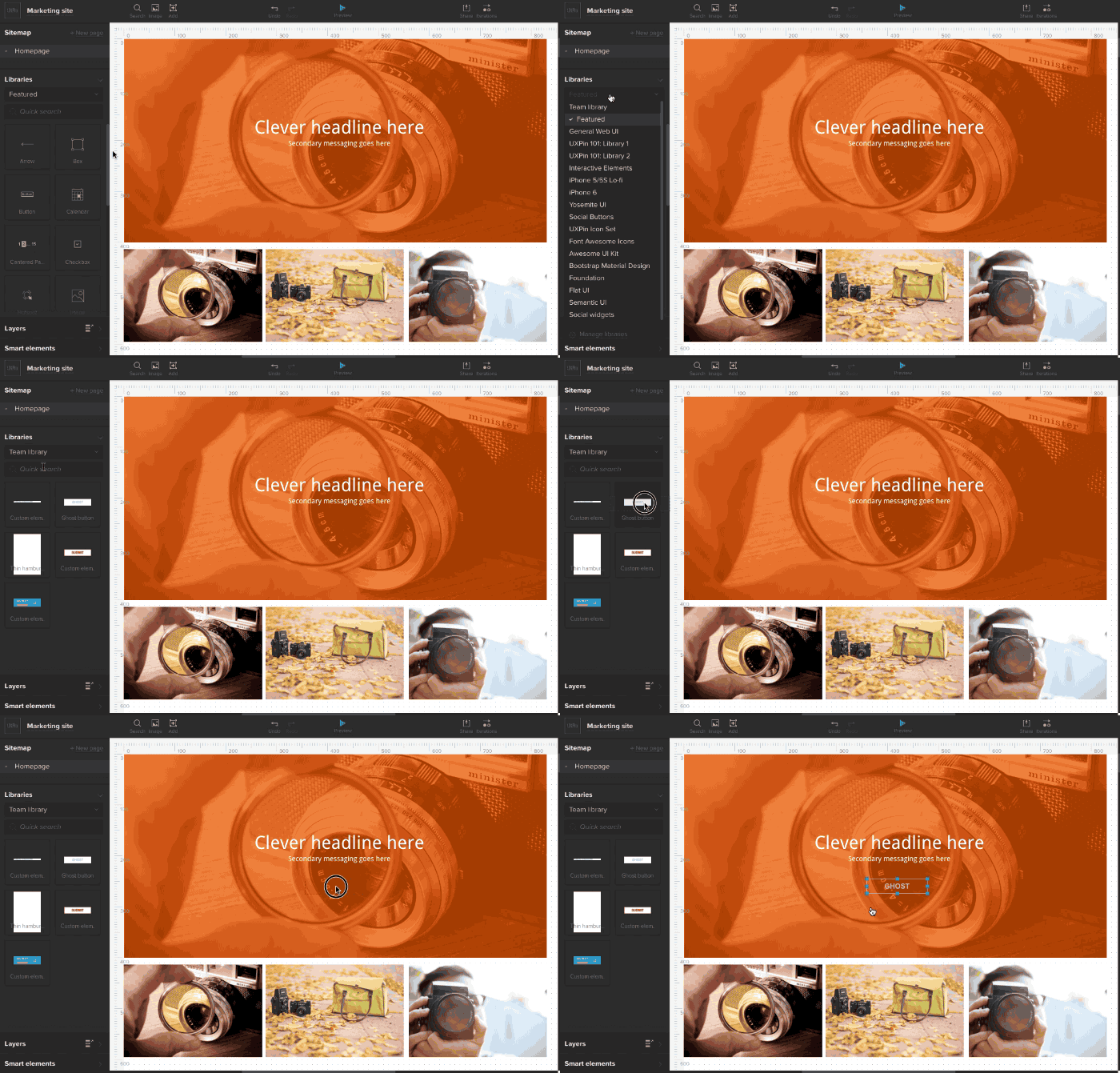
Photo credit: Created by UXPin designers
Design Components
Components are the fully-developed versions of patterns, specific to a company. As in, an insurance company with a lot of forms on its website might build out all of its typical form elements and compile them into a library where they can document how and when they should be used.

Photo credit: Progressive Insurance
Component documentation typically contains the following pieces of information:
- Name: Again, just a recognizable name for the element
- Version number: Used so everyone knows which version is most current and whether or not an instance of one on a website is current
- Definition/description: A short summary of its purpose
- Usage: User actions and outcomes
- Sample: Links to an instance of the pattern in use, or the actual component itself
- Code snippets: The code for implementing the component in your new design (this is the most important part)
Interaction Design Frameworks
The third type of reusable element is the most robust. An interaction design framework is, basically, a collection of patterns that come together to solve a larger problem.
For example, an entire search system. Rather than apply just the search field pattern, you’d apply the search field, the search results, maybe a type-ahead pattern (to speed up searching and to let users know what exists to be searched), pagination at the bottom of the search results pages, and an Advanced Search option with its accompanying page.
IxD Framework Documentation for Site Search:
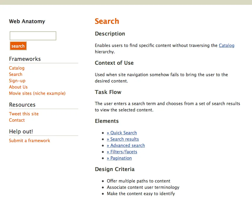
Documenting a framework like this is similar in concept to white-labeling a website template. Rather than design any of this boring stuff from scratch, you drop the entire set of IxD framework wireframes into your design and just tweak as needed. If you have each element built out as a component, you can just plug the code for every piece of it into the entire site and move onto the cool stuff.
IxD frameworks typically include:
- Name: Need I say more?
- Description: You know what this is by now
- Context of use: When and why the user would encounter this collection of elements
- Task flow: What steps the user will take and what will happen as a result
- Elements: This is a list of the design patterns or components used in the framework (as described a moment ago in the search example)
- Related frameworks: A list of any other frameworks that go along with this one (an eCommerce catalog framework, for example, should accompany a shopping cart framework for purchasing)
- Design criteria: A list of design principles you should consider when tweaking the framework for your own use (these should be specific to your company and help you achieve the overarching strategic goals, like decreasing abandoned shopping carts by making the order cost more visible or something else)
Building the Library
Developing these reusable elements into a library can be a slow process, but over time, it gets faster, and with every bit of progress, it pays off more.
Here’s how you do it:
- Look around: Take some time to audit your entire product catalog or website and put together a list of commonalities. Do you always use the same header layouts? Do you always have an About Us section with basically the same things inside? Are all your search processes designed in a similar way? Anytime you spot something used more than twice, make a note of where you found it. It’s a potential candidate for the library.
- Note the exceptions: Also keep your eye out for the exceptions to the norm. Add links to those instances to your list so you can document when and why and how to apply the reusable element differently in future designs.
- Add it up: Anytime a new recurring design element is established, add it to the list as well.
Take a closer look at common UI patterns. To get started, UXPin offers several useful free eBooks on the subject, including Tactical UI Patterns, Web UI Patterns, and Mobile UI Patterns.

