Although wireframing and prototyping are two different tasks, they both represent a web or mobile interface in its most fundamental stages.
Meant as an explorative exercise and an early visual specs document, wireframes are a natural part of the design process. And as we described in the Ultimate Guide to Prototyping, you can then turn a wireframe into a low-fi prototype by adding interactions or jump directly into a paper prototype.
Photo credits: UXPin
Just because the design team creates the wireframes and prototypes doesn’t mean that developers have nothing to offer. In fact, developers can share early opinions while the wireframes are still rough, which helps catch small nuisances and even offer potential improvements for rough layout concepts.
In this piece, we’ll explore some guidelines for wireframing and prototyping so that they communicate the experience as clearly as possible to other designers, developers, and stakeholders.
Wireframing for Developers
The best way to approach a wireframe is as a blueprint for the product team.
Before adding any details, you must first lay out the headers, footers, content areas, and the relationships between these page sections. In our experience, we prefer to first wireframe the homepage (so we can start to think about content flow at the broadest level), then dive into landing pages and finally secondary pages (like About Us or Contact).
If developers are expected to code an HTML prototype straight from wireframes, then it’s important to give them as much information as possible. In this case, you’ll want to lean towards higher fidelity with crisp typography, richer colors, and high-resolution images since the wireframe will serve as the primary visual reference. If you prefer wireframing on paper, we recommend the “sketching in layers” technique since it provides more structure and detail than standard freehand sketching.
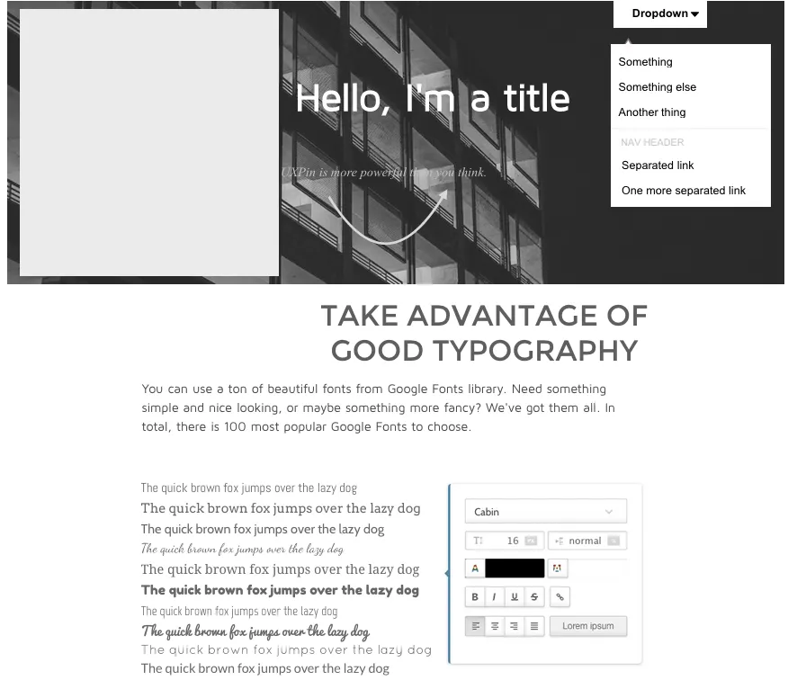
Photo credits: UXPin
On the other hand, if you’re going to iterate the wireframe into a rapid prototype using a specialized tool, then the wireframe doesn’t need to be as formal (although annotations are still helpful for later reference). In this situation, your prototype instead serves as a living representation of your technical specs.
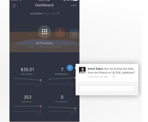
Photo credit: UXPin
When wireframing, clear explanations are vital because designers, developers, and non-technical stakeholders should able to review your designs and quickly understand how they work. The best wireframes incorporate notes in the margins expressing which elements should be clickable, animated, or dynamic in any way.
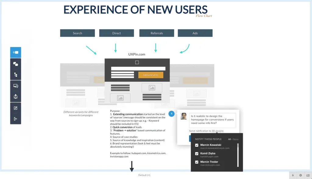
But you can also create similar documents for telegraphing the intent of pages or page elements to developers. Here are a few common supplementary documents (which we first described in The Guide to UX Design Process):
Storyboards – Storyboards focus on the movement of elements and which links direct to which pages, creating a visual narrative for the entire team. Some links may not even load pages, but instead trigger effects like dropdown menus or modal windows. Created through sketchboarding or digital mediums, storyboards give developers a snapshot of the entire experience so they understand why some complex interactions might be necessary.
Flow charts – Flow charts are similar to storyboards except they focus more on content itself. A website flowchart usually resembles a visual sitemap, except in a more multi-directional format that is more descriptive than the traditional tree structure. Detailed flow charts can be extremely helpful for developers since you could annotate how content is served (e.g. whether a lightbox is triggered via Javascript event or AJAX). If you lack the technical knowledge, map out the site pages in the flowchart, then collaborate on the technical notes with the developer.
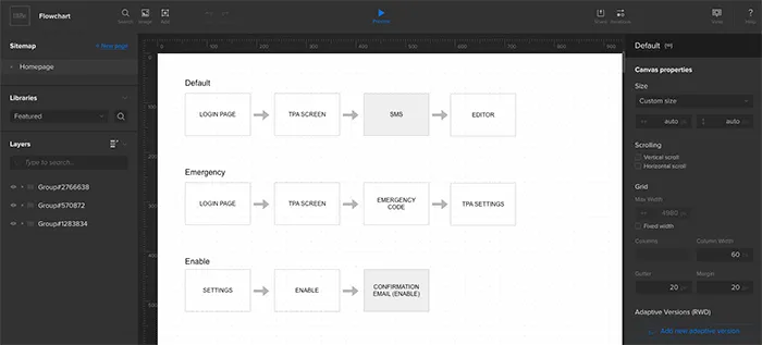
Photo credit: UXPin
Personas – Like we previously discussed, the strongest way to align design and development is to focus everyone on user needs. Don’t just include job titles and demographics. Dive into fears, ambitions, behaviors, goals, and habits. Create lightweight personas, print them out for the product team, and let them become everyone’s best imaginary friend.
While you want to keep documentation as light as possible, don’t underestimate it’s power for updating developers as fidelity increases.
In our experience, developers tend to be highly logical people who enjoy the security of tangible visual requirements. When you treat design documentation as a collaborative tool rather than a “hand-off-and-pray-for-the-best” document, you’ll find that developers will know what to build and designers will have a quick reference for popular and unpopular ideas.
Whatever your documentation methods, make sure they complement rather than supplement your design process.
Prototyping for Interaction
When putting together digital interfaces, look at all the design features as a set of jobs. Each element on the page must help advance users toward completing their goal(s).
As described in Interaction Design Best Practices, think in terms of components rather than page elements. Which components on the page require action? What task does this action perform?
An interesting point to note is that developers speak the language of interaction. Developers review a wireframe/prototype and mentally formulate how it should be built. In some instances, developers might even mirror a rapid UX prototype with their own quick HTML/CSS/Javascript prototype to test the interactions.
This is the beauty of designing for interaction: it helps everybody in the creative pipeline.
When designing for interaction, you’ll spend most of your time in prototypes. It’s harder to wireframe interactions since you’ll need plenty of annotations, but it is certainly possible (and especially helpful for mobile interactions where you want to quickly show gestures).
Regardless of your process, the most important thing to remember is that you design just the right level of fidelity. Otherwise, you might jump headfirst into a hi-fi prototype (dragging your developer with you on complex discussions around animations/interactions), when all you need is a low-fi prototype to explore structure and page flow.
Be proactive and set the right expectations around the design, because stakeholder feedback also indirectly affects developers.
When possible, work with the product manager or project manager to outline a project map so everyone knows what to expect regarding the number of drafts, possible revisions, and levels of fidelity for prototypes & wireframes.
Testing, Gathering Feedback & Revising
Make sure you invite developers to all feedback sessions, whether it’s a simple user interview a moderated usability test, or an internal feedback session.
Conducting usability testing with developers
Not only can you both synthesize feedback in real-time, collaborative user research creates a stronger sense of joint ownership and creation. Interestingly enough, Xerox actually sends their designers with service engineers during on-site visits to deepen their understanding of how customers use the products.

Photo credit: “Wikimedia User Testing”. Blue Oxen Associates. Creative Commons.
Of course, collaborative usability testing isn’t just about sending pairs of people into the field to observe users.
As we described in the Guide to Usability Testing, it can be as simple as drafting up the core tasks together, then presenting the tasks to 5-7 users and asking them to think aloud as they interact with the prototype. Study which features draw the most attention right off the bat and which receive negative reactions. Then after the test is over, ask follow up questions with your developer about where they felt most confused and experienced greatest difficulty.
Team Feedback & Fixes
Usability tests are meant to pinpoint issues or potential problem areas, but they don’t always generate solutions. This is why teamwork and further discussion is required to flesh out the best solutions for individual problems.
Here are five UI/UX ideas to keep in mind regarding usability 101:
- Learnability – Can people learn & adapt quickly?
- Efficiency – Are specific tasks easy to accomplish
- Memorability – Does the interface leave a lasting impression?
- Errors – How are mistakes or inadvertent actions handled?
- Satisfaction – Does the interface provide a pleasant experience?
You can apply these questions to both the interface as a whole and to smaller features. For example, how learnable is your dropdown menu? Would it be more efficient to speed up the animation? Do users recognize that navigation bar links have dropdown menus?
Rather than scrounging up ideas on your own, it’s quicker to devise solutions as a team. Designers should always look toward developers for pragmatic suggestions. For example, if you’re on a tight timeline, the developer may have an elegant technical solution that needs some visual massaging.
Wrap-Up
Early design stages like prototyping and wireframing provide fertile ground for collaboration. These methods of visualization are meant to convey how the final product looks and behaves.
Ideas flow much easier when incorporating suggestions from both designers and developers. Developers can learn a lot about design and what makes the interface work. Developers who sit in on usability meetings will also absorb new ideas that later improve their ideas in the development stage.
When it comes to the UX design process, everyone is responsible for keeping the team involved and moving forward.
For more advice, check out these useful UX guides below. If you find them helpful, you can practice what you learned with a free UXPin trial.


