As this becomes more common knowledge, user research practices like prototyping also evolve. This thinking yielded the extremely helpful technique of rapid prototyping, which increased the amount of testing and therefore the amount of feedback and user data.
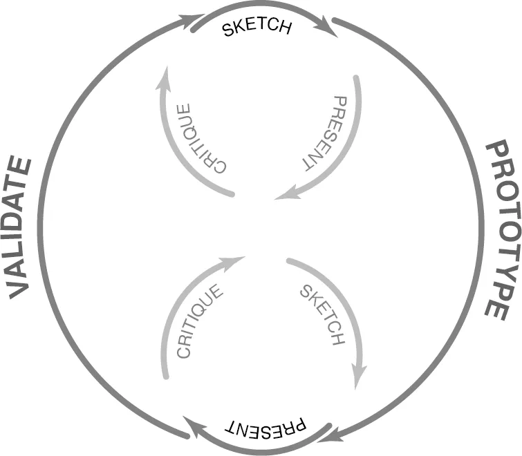
Photo credit: “PT001: Figure 2.1.” Rosenfeld Media. Creative Commons.
But as time goes on, even this practice can, itself evolve. We’re now at a cusp of a more efficient form of rapid prototyping, where prototypes can be made even faster, and with less waste.
The reason is interactive wireframes, and they’re making an already good method of design even better.
The Overall Process
The practice of rapid prototyping was championed greatly by the Lean UX movement, which recognized early on the importance of talking directly with customers, solving problems through user research, and creating faster cycles between iterations.
Rapid prototyping garnered a large and devoted following, thanks to its effectiveness. The main benefit, which justifies doing it alone, is that designs decisions are based on continual, quantifiable data instead of guesswork. This is a concept familiar in Design Thinking; designers have the ability to test multiple options (divergence) and select the best based on analysis and data (convergence).
In addition, some secondary benefits include:
- Safeguard against poor choices — The frequent validation of decision choices checks for problem areas regularly, ensuring you stay on the right track.
- Earlier testing — Testing prototypes early lets you fix big-picture problems like information architecture before they become too difficult to change. The process can even be modified to test product concepts in the earliest brainstorming meetings.
- Justifications for stakeholders — Collecting data more frequently gives the designer firmer ground to stand on if their decisions are challenged by stakeholders.
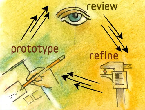
Photo credit: “Design Better and Faster with Rapid Prototyping.” Lyndon Cerejo. Smashing Magazine.
The rapid prototyping process, as outlined by Lyndon Cerejo in his 2010 article for Smashing Magazine, can be reduced to a cycle of three repeating steps:
- Prototype — Build a prototype that incorporates previous data and educated projections.
- Review — Test the prototype with users and evaluate its performance.
- Refine — Isolate problematic areas and design solutions.
… and then start the cycle over. This is repeated until all the faults are hammered away and the testing yields the desirable results.
If this process seems vague, it’s for good reason. Rapid prototyping is highly flexible, and prototypes can be anything from pixel-perfect, fully interactive demos, to paper prototypes sketched on napkins.
Interactive Wireframes: Beyond a Dead-End Document
Another consequence of the popularity of Agile and Lean ideologies is calling into question the worth of wireframes. As processes are looking to trim the fat anywhere they can, wireframes seem more like just another unnecessary, throwaway deliverable.
The thing is, in a way they’re right. Static wireframe critics make some good points, namely that wireframes slow down the rapid prototyping process with an extra step before designers create a functioning system.
When you create an interactive wireframe, however, you connect two stages of the design process together.
How Interactive Wireframes Improve Rapid Prototyping
So what we have now are the ability to create lo-fi prototypes quickly, easily, and with few resources.
Interactive wireframes allow testing early, almost right from the start. Whereas later stage prototypes tested more complete, near-final product versions, interactive wireframes open up testing to crucial early elements.
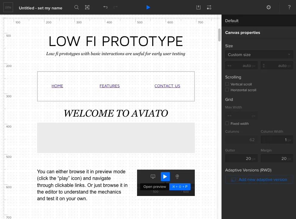
Photo credit: UXPin
Aspects like navigation, information architecture, and general layouts can be tested almost immediately, with the feedback integrated before moving on to higher fidelities. Making base-level IA modifications are easy at the beginning, but sometimes require entire upheavals at the end, not to mention wasted work on graphics.
True, lo-fi prototypes don’t examine the details like visuals, gut responses, call-to-action success, or advanced usability. But in the early stages, these factors aren’t as important as the fundamentals. Besides these elements aren’t neglected; they are still tested with later, hi-fi prototypes.
With the addition of interactive wireframes, the rapid prototyping process looks something like this:
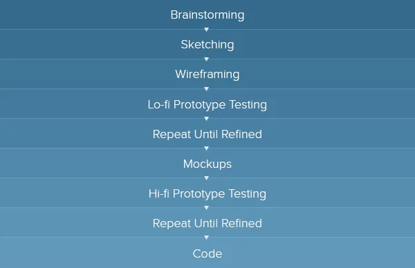
So, in short, the advantage of interactive wireframe is that they enhance the same benefits of rapid prototyping, opening up user feedback earlier, and the capacity to hone early stage elements before they become more difficult to change later.
Best Practices for Interactive Wireframes
Because interactive wireframes are relatively new on the scene, keep these best practices in mind:
- Test multiple lo-fi prototypes at once — Use their simplicity to your advantage. Because they’re so easy to make, you can build and test prototypes for different ideas if you’re undecided about a direction. This also provides more room to experiment with new ideas.
- Know when to stop — You could, conceivably, test interactive wireframes endlessly, continually refining until every last piece is perfect. This would be a waste of time, though — lo-fi prototypes are only a portion of the entire process. Test until the major concerns are satisfied, and then move on to higher-fidelity testing for the fine points.
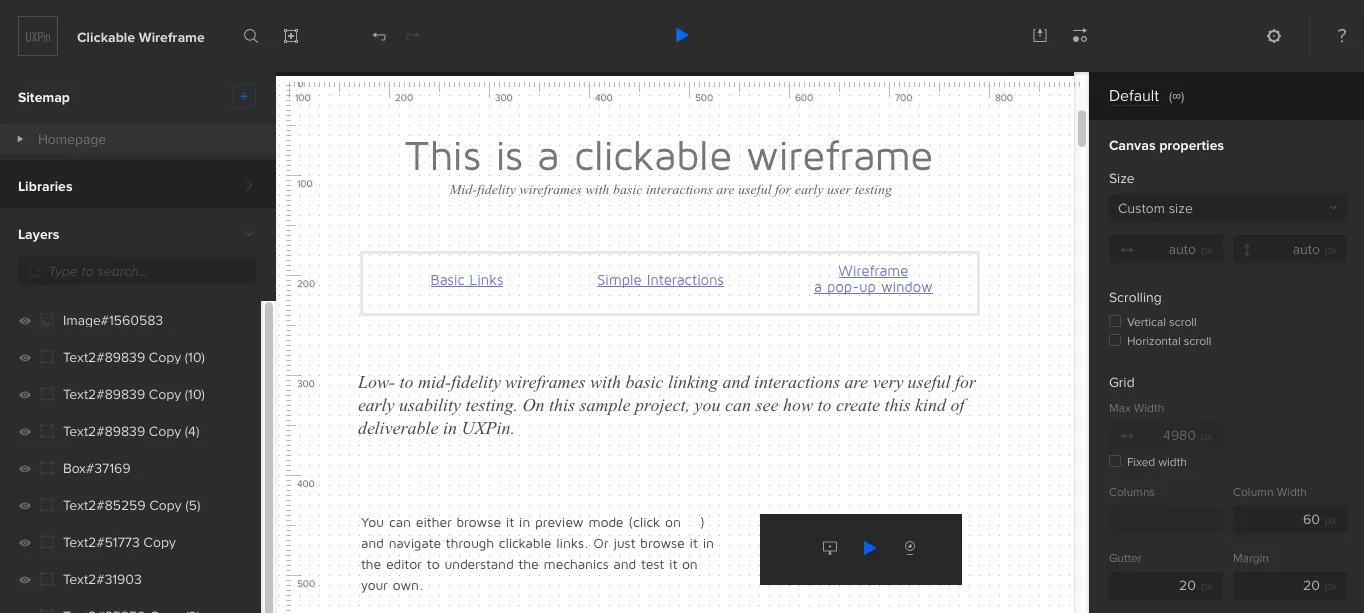
Photo credit: UXPin
- Collaborate before testing — As with all user testing, involve other departments in the process. Take the time beforehand to ask their input — answering their questions in the testing as well as your own will make the product fuller and more capable of fulfilling all its goals.
Takeaway
The concepts this article touches on are explored more thoroughly in our free ebook The Guide to Interactive Wireframes.
Written by Professor Tom Green of the Humber Institute of Technology and Advanced Learning, this guide runs through the process of creating interactive wireframes step-by-step, illustrating concepts through screenshots and explaining how they can fit into design processes.

