Knowing your user is one thing. Knowing about their culture is another. Creating a UX persona becomes quite a different thing when you consider someone’s culture.
Persona evolves based on imagery, language, color and audience. It’s important that you take all of these cultural factors into consideration when designing your interfaces.
In this post, we’ll take a look at how you can take culture into consideration with your personas.
What is a Persona?
As outlined in the e-book The Guide to UX Design Process and Documentation, a user persona is a tool to help create an ideal, reliable and realistic representation of a specific audience. The persona is an important part of understanding potential visitors (and customers) by adding a real-world element.

Photo credit: UXPin
A persona does not, though, represent every potential user. Personas are designed to create stronger relationships with the most important (and largest) part of that base.
Kevan Lee, content crafter at Buffer, recommends a maximum of three to five personas to cover your user base. These UX personas should include three things:
- A name to make the persona feel real
- A description of responsibilities and what the persona does
- Vivid visual information so that users can see and relate to the persona
Why Culture is Important to Consider
Cultural differences can impact how you approach the design of your interface. One country may not share a lot of the same metaphors for actions that yours does. There are a lot of cross-cultural considerations, as outlined in a Human Factors’ article by Nehal Shah. Let’s take a look at a few of those:
- Language — The most obvious cultural difference may be language. Some concepts and ideas may translate well, while others will just be lost in translation.
- Metaphors — As we said already, some cultures might have different iconography that is vastly different from the ones you’re used to.
- Color — Red is passion in one culture, but means danger and caution in another. Your color choices can significantly impact how the entire experience. For more on how color choices affect culture, check out this Web Designer Depot article.
When it comes to culture, you can boil down audience needs based on four elements that make the culture system, according to Lex Sisney of Organizational Physics. These elements are values, rituals, stories and consequences. Here’s a summary of Sisney’s outline:
- Values are the biggest single factor. That’s because people are particularly unwilling to change the way they feel about something. These are the things that are most important to a culture and guide both individual and collective behavior and purpose.
- Rituals are the embodiment of values. This is done through formal and informal actions, such as celebrating a milestone.
- Stories help reinforce ideal values and purpose of associated rituals. The goal of these stories is to share and strengthen values.
- Consequences happen to those who don’t follow values. This is combined with a message that straying from the cultural core will not be tolerated.

Photo credit: Google Image Search
A culture and its values factor into how you create a persona. You first need to understand what the values of the audience are and how they support that value system. Then design a story that fits this structure through text and visuals with a persona or characters that fit the model.
For example, look at the change in the McDonald’s “Hamburgler” character, which changed from a cartoon to a cartoonish guy to a more manly hipster persona. This change is rooted in a cultural change of the McDonald’s audience and cultural vision of what they want to see.
Now let’s dive deeper into creating a user person taking culture into consideration.
Questions to Ask
So how do you get to know the user? Using data, analytics and anecdotal information you can start to create a picture of the current or desired audience.

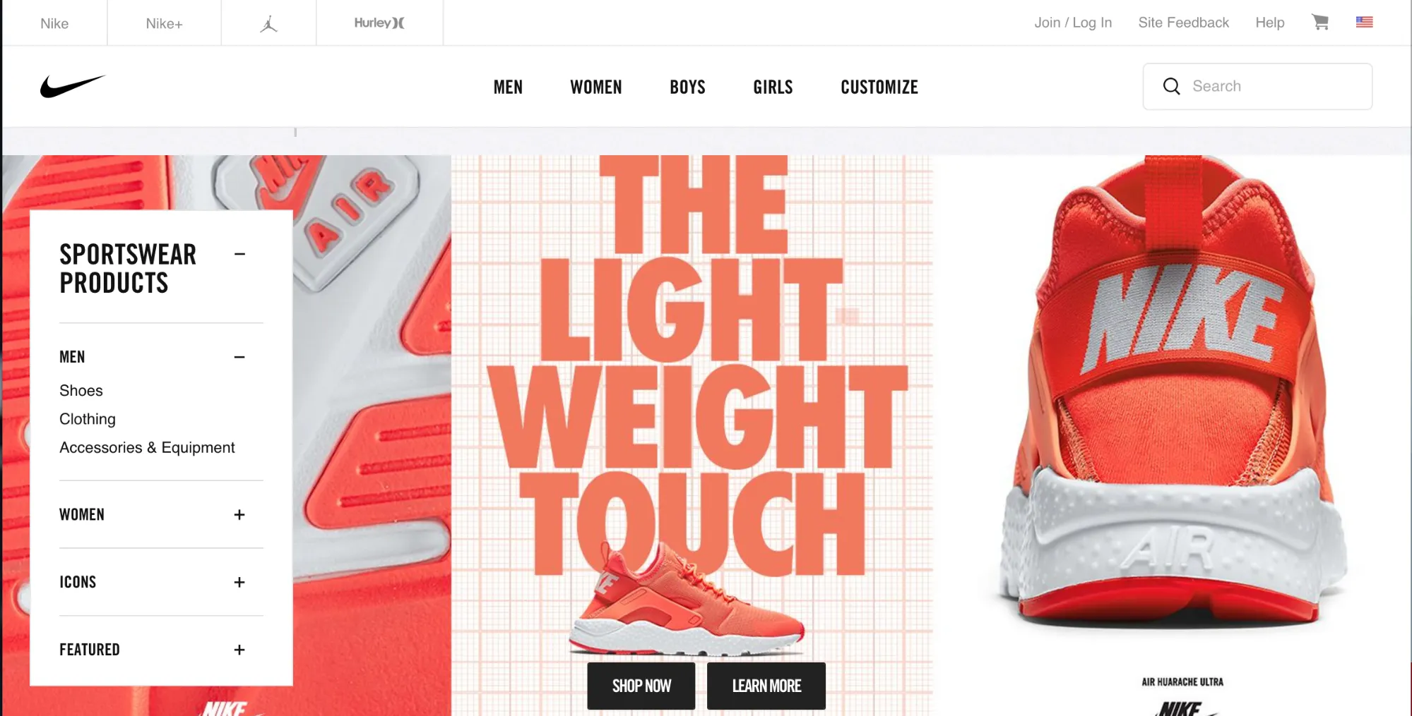
Photo credit: Nike Sportswear
Take a look at the site for Nike Sportswear, above and think about how the design came together. It took a lot of questioning for the development team to come up with this set of visuals.
Key questions to think about while developing a user persona:
- What does your persona look like (male or female, age, personal style, education)?
- Where do they live? (And what language do they speak?)
- What is the job or the persona and what work experience do they have? (This could also equate to life experience.)
- What interests bring this persona to your website?
- What peer group does this persona belong to? Can the persona influence them?
- What is the persona looking for and how are they motivated?
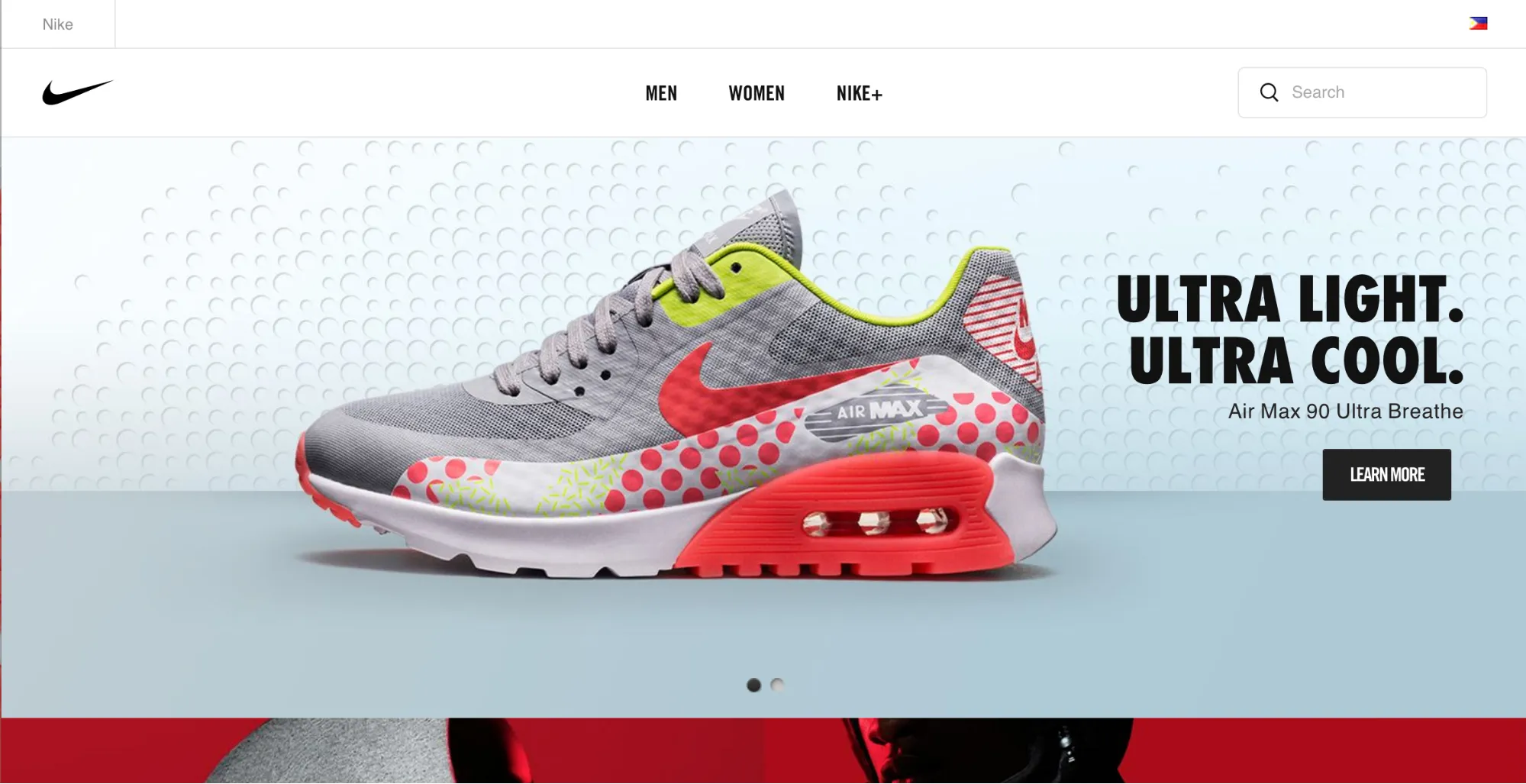
Now consider how those questions might have impacted the designers’ decisions when creating the same sportswear site for the Philippines.

Photo Credit: Nike Sportswear Philippines
Both sites are selling the same type of merchandise but have a different featured product, as well as some minor layout changes. An audience in the Philippines may not share the same exact interest as that in the United States. And all that is dependent to those other questions on where they live, who are their peers. So asking those questions up front and researching their answers can help guide you as you adapt to different cultures.
Visualize the UX Persona
Culture can be one of the biggest drivers of persona because it is at the root of your audience’s values. Everything from religion to gender roles to power and celebrity to how people dress or behave factor into what makes a culture.
Using visual cues properly can help you connect – or will force disconnect – with the audience. Elements that require careful consideration include:
- Color. As we said previously, different colors can have strong connections in different cultures.
- Symbols. Be careful when it comes to gestures and make sure they are audience appropriate.
- Dress and style. Clothing in particular is important and should match the styles of the desired audience.
- Environment. In what surroundings will the persona be placed?
- Language. How does your audience actually speak? As we said previously, some things may not translate well. Use the same type of linguistic context.
- Typefaces. Typography should fit the proper tone as well. Think carefully about meanings of specific text styles, particularly in terms of feeling masculine or feminine.
- Character representation. The actual visual persona can be based on a person (photo), illustration or just in words.
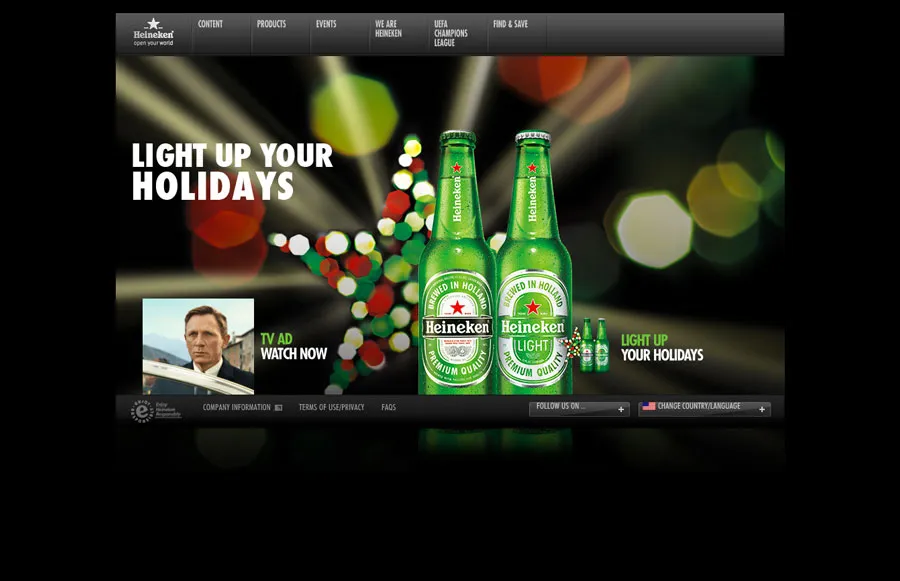
Look at the three homepages for Heineken, below. Each is notably different based on the country of origin and the things that are important to that culture. This is an easy example of creating personas that connect with a user base.

Photo credit: Heineken
The American version of the site has a fun persona. The imagery connects to the holidays with bright color and forward thinking messages. The user can almost feel himself inside a great little bar with friends looking at the bottles across the room. While not distinctly male or female, a masculine vibe is emphasized with the use of the movie tie-in promotion featuring James Bond. And certainly this site is appealing to that persona that wants to be like James Bond. All it takes is a Heineken.

Photo credit: Heineken
In Australia, the Heineken persona is much more sporty. A tie-in with the Australian Open has a male feel (thanks to the small icon for the Open) and the gritty background. The persona is someone you want to be with — one of the cool kids — who hangs out in the beer garden at sporting events. And users will want to join him.

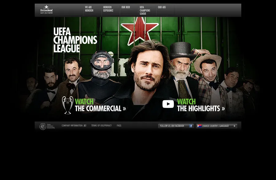
Photo credit: Heineken
The South American Heineken persona is again distinctly male with a fun depiction of the country’s soccer ties (not only can you watch the beet commercial, but you can also view soccer highlights). The imagery is interesting because there are actually multiple images for a single persona, so that every user can actually picture himself — at any age or life experience level — as one of the sports champions who drinks Heineken.
Looking at all three Heineken visuals, it’s easy to see that the brand is creating a more male persona that’s tough, beer drinking and athletic. But each persona is linked through “celebrity” imagery to elements that have a distinct cultural connection.
Takeaways
Crafting a persona is a painstaking process that can result in better relationships with your user base. Remember that culture is a key part of this process.
This is just the starting point to building a great user experience. Learn more about personas and documentation in our free ebook, The Guide to UX Design Process and Documentation.


