How much detail do you really need in a persona?
If you Google “user personas”, the results page is filled with dozens of different personas, both in style and scope. Of course, many examples aren’t even based on any research and may be misleading about their real-world effectiveness.
What works for one project might not work for yours. Personas are not one size fits all.
To counteract that trend, the following four personas were used on actual projects with specific goals in mind. They range from simple sketch personas to detailed stories. Each serve their purpose.
We spoke with a couple of UX mentors from Springboard– Danny Luber (UX Designer at Fake Crow) and Christine Lee (UX Designer at TheRightMargin) to deconstruct why these personas are effective for their specific contexts.
1. BabyBin
Why is it effective?
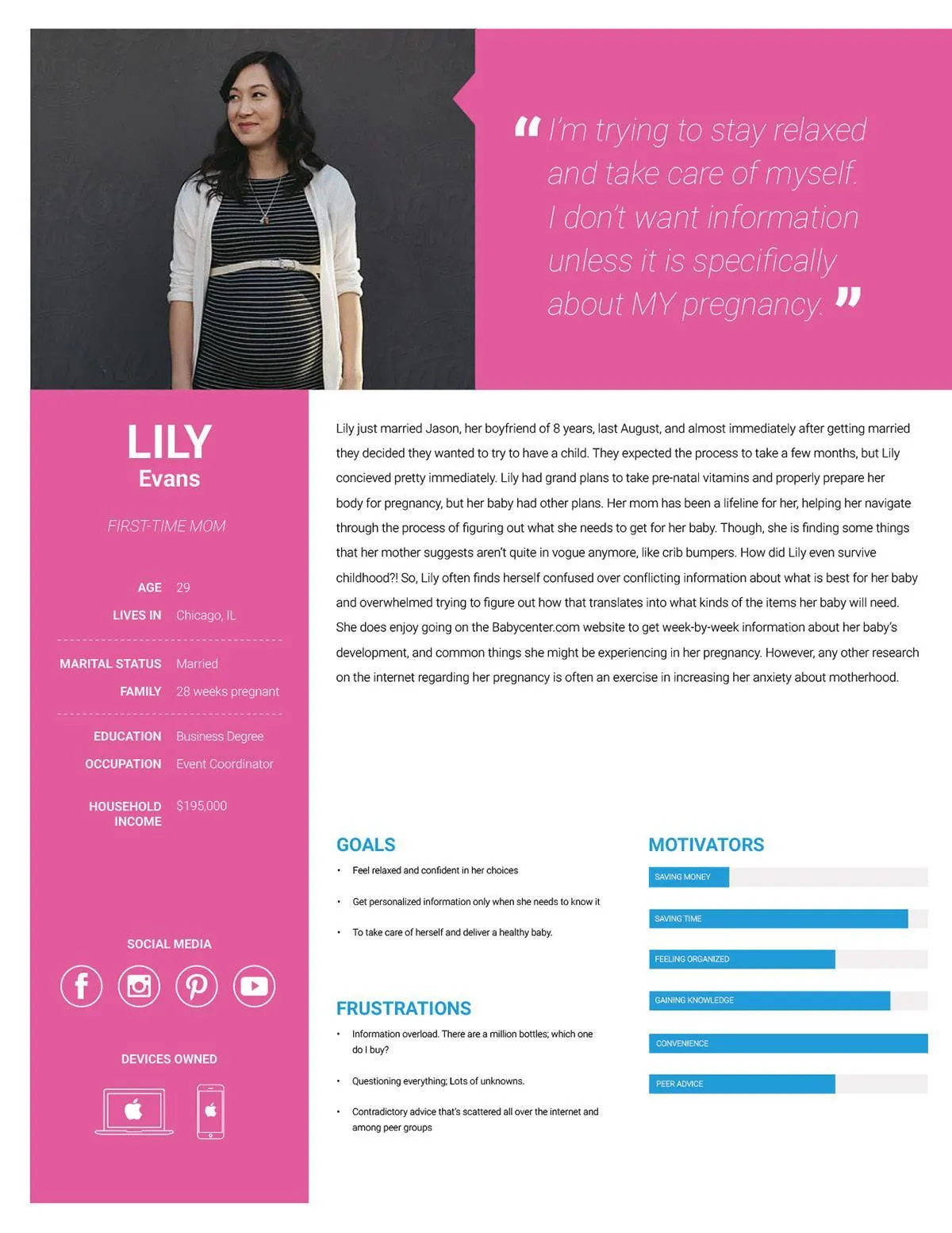
Danny Luber: This persona is great because it takes the angle of the business — (finding the right/healthy products for your baby) – and humanizes it with Lily Evans.
Providing details like the timeline of marriage to conception might seem like over-sharing, but for a product/business like this, it’s absolutely essential. It clues us into one of the many emotional states our users are enduring when visiting the site — and thus, gives us a direction when designing.
Christine Lee: This is a very thorough and well-rounded persona.
The story portion may fare better at the bottom, so that at-a-glance the team will first see the goals, frustrations and motivators. What’s great about this persona’s story is that it offers plenty of clues about her emotional state (which is extremely useful for journey mapping).
Because there’s a well-rounded background for this user, one could even go as detailed as a mental model (Indi Young’s method for understanding human behavior) if need be. The social media piece is also useful for informing the business’ delivery method of information and value to the user. Two thumbs up.
2.Opera Experience App
Why is it effective?
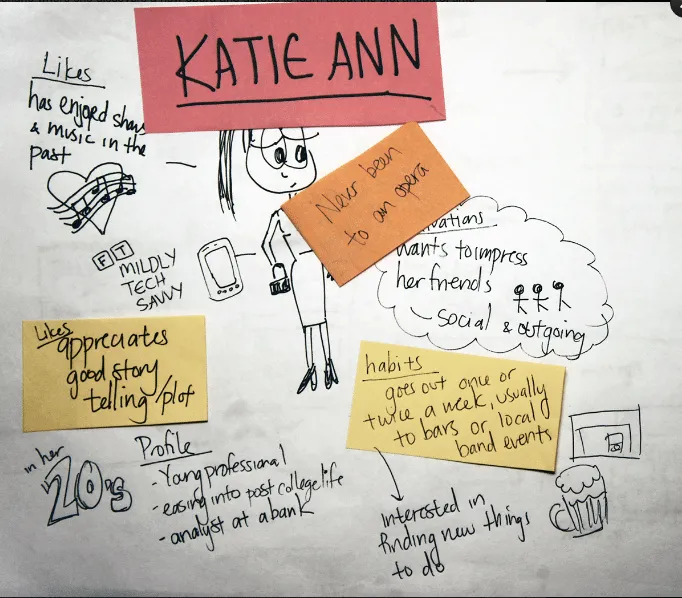
Danny Luber: This is a great example because it showcases someone who we might not expect to be a user of the app. (Katie Ann has never been to an opera.)
When you include details like ‘appreciates good storytelling/plot’, ‘habits: goes out to bars’, ‘interested in finding new things to do’, ‘wants to impress friends’, etc. suddenly we realize that despite Katie Ann never having been to an opera, she is certainly a potential user of the app.
Christine Lee: This hits the main characteristics you need to know to design for this type of user – why would she be interested? What does she already like that the business can offer? Through what way and how often could the app engage with someone like Katie Ann?
I do, however, still find myself wondering about a couple things:
- What is Katie Ann’s price sensitivity? If very sensitive then she may not be a prospective opera app user after all.
- What is Katie Ann’s experience with other tools/apps similar to the opera app? This would tell me if she’s already turning to apps for finding info. If she uses Google most of the time, she may not change her behavior, even if the opera app is a great tool for accomplishing her goals.
3.GM Cardmember Services
Why is it effective?
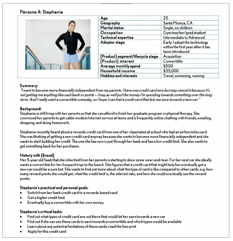
Christine Lee: This is a good persona example because it is very, very specific.
All the information at the top supports the summary below of her goals and desired tasks with GM Cardmember Services. Understanding the foremost, achievable tasks goes a long way in informing the IA and business requirements.
It’s great to know her hobbies as well, because financial services often find their hook via aspirational messaging. Also, Stephanie has such a clear goal (to get a car) that leads to her other goals (getting to travel, go to the beach and swim, run), so the business can show that their card is her ticket for achieving her ultimate goals.
However, my main critique is it’s a bit too text-heavy. I think having keywords highlighted would make it more easily digestible at a glance, upping the likelihood it’ll be used in everyday design. I actually found the summary too lengthy to be a summary. It’s more like a persona quote. I would expect a summary to say “Stephanie wants to find a rewards credit card that will help her buy a car with its rewards.”
4- Genospace Healthcare Data Analytics Platform
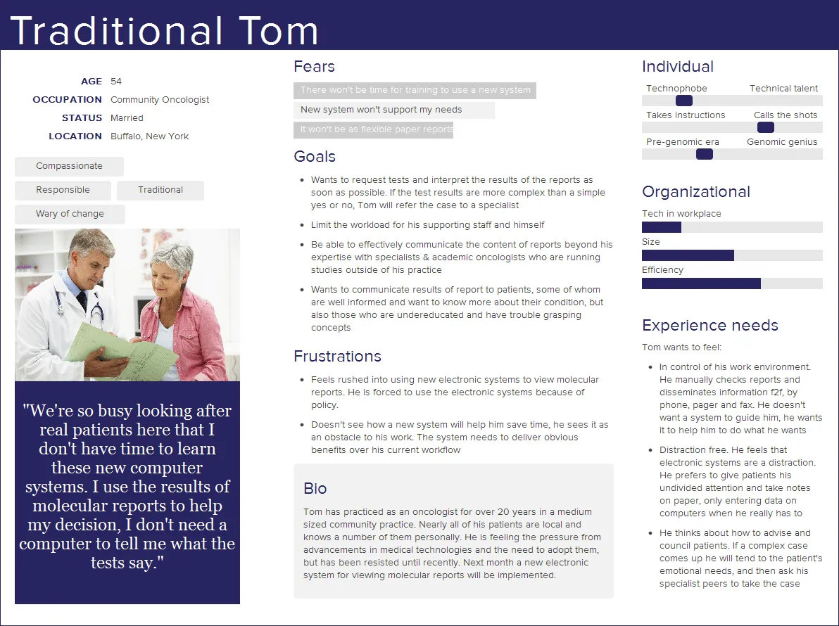
Why is it effective?
Christine Lee: This is a very complete and well-structured persona.
The quote alone tells the reader a lot about the persona’s attitude towards technology (it gets in the way, is overly complicated, there’s a steep learning curve) and some of his current frustrations (he’s busy, and doesn’t want an overly automated process to enter what’s working for him).
The bio is helpful and not overly prioritized visually, and the charts on the right are just enough to provide good visual comparison (if this persona is placed next to others) without distracting from the main point.
I’m also a big fan of the “Experience needs” section: it concretely outlines what it means to design for this persona, and the bulleting and visual hierarchy is easy to grasp and scan. This feels useful, usable and great for high-level and detailed use.
Creating Your Own Personas
Personas unify the understanding of the users for UX team, clients, and stakeholders.
Whenever the team needed to consider the addition or subtraction of a feature, they could say, “Stephanie wouldn’t like that feature because she’s too busy finishing her graduate program” or “Tom loves the increase in efficiency that this feature creates.” The process humanizes the users and gives you a solid defense against scope creep.
To wrap up, personas should contain:
- Information that taps into user interests beyond the product itself, as that will give key insights into the real motivations for which you must design.
- Personal details about the user- pay attention to emotions of users, not just statistics.
- Clear goals for the user (and how those relate to the product), as well as frustrations (opportunities for the product)
- As much real data as possible to support each point.
- Alignment from the whole team. Otherwise, your persona is just another pretty deliverable gathering dust.
Finally, don’t forget that the greatest power of personas is in the process of discovering user insights with your team, not the end document. A lean persona created with your team is far more valuable than a beautifully rich persona created alone.
To learn more about user personas and how they fit into the greater scheme of UX design, check out this curated flow of 131+ hours of free UX resources.
You can also download the free e-book UX Design Process Best Practices.

