At Autodesk, the design teams are as global as the company’s customer base. The $2.5 billion software giant is powered by 7,700 employees across seven continents.
In the Tel Aviv office, Uri Ashano serves as the senior UX manager for AutoCAD 360, the mobile application of the company’s flagship product. Ashano and his team of five (two UX designers, two visual designers, and one researcher) collaborate closely with Autodesk’s San Francisco headquarters to practice user-centered design within an Agile process.
As Ashano explains, the company sees itself as a knowledge house, not just a software provider. All designers train and work with the Luma Innovation Institute, which teaches 36 different methods for user-centered design. The design process Ashano and team follow each time they get new feature requests illuminates the power of collaborative design, especially in the discovery stage.
Research the Problem
The Tel Aviv team’s process begins when they get a request from the larger AutoCAD 360 team for a new feature.
The request usually presents itself as a user scenario such as: “An architect needs an AutoCAD drawing at his job site. He’s bringing along an iPad (or other tablet) and wants to view his drawings, modify, and annotate. Afterwards, he wants to share the updates with colleagues.”
In response, the team first opens a new project in Slack to start investigating the problem the feature aims to solve. This initial research consists of interviewing local architecture firms, reviewing customer support tickets for ideas, and reviewing online data in MixPanel. The team also consults data from the greater Autodesk’s research, mostly around multiplatform use of AutoCAD and the flows related to these products.
“We always examine incoming requests from a user-centric mind-set,” Ashano explains. “We pull out the low-hanging fruit and then focus on the riskier elements that we can go after. These user stories are always our starting point to design.”
Deeper Discovery
Once a vision for the feature(s) emerge, the team moves quickly into the discovery mode. This period of design is one of the most intense and collaborative for the team. As Ashano says, “We don’t want to lose any creative minds in the process.”
Rather than sending designers off with specific projects, Ashano engages all team members together to explore ideas. By exploring these ideas in half- or full-day workshops, the team collectively decides which are worth actually moving forward with. “Working together, we can get 20 great ideas in 20 minutes,” Ashano says. “Our collaborative brainstorming is far more effective than if we sent designers off to think on their own.”
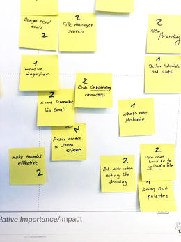
Using bull’s-eye diagrams, pains vs. gains charts, and impact vs. feasibility matrices, the team starts to map out customer needs and prioritize ideas. As the ideas populate the different diagrams and charts, team members (including product managers and developers) also add smiley or sad faces next to the concepts.

Ashano notes that the earlier they can embed developers and product managers in the decision-making process, the better. In fact, this is why the teams are also physically located near each other, sharing meeting spaces and much time together.
From the team’s work with Luma Institute, they also use up to 10 other brainstorming methods, such as affinity maps and eyeball diagrams. At this point in the process, sketching remains minimal with all the focus on idea generation through sticky notes.
Only when there is firm agreement on the overall feature set will a designer start to sketch in greater detail. And, following the Agile UX process, the team will leave the stage of deep discovery with epics, user stories, and a backlog that they can revisit for more ideas.
Designing the Solutions
Once the rough feature sets are decided, the team holds a formal kickoff. From there, long brainstorms are replaced by focused daily stand-ups that involve only people essential to the work being done.
Once the team members divide to conquer their specific tasks, the group starts designing collaboratively with early wireframes and user flows for each user story. To speed up the process for his team, Ashano created templates to easily show the flow between five to six screens at a time.
As the designers start mapping out their flows, the developers will also be wrapping up their technical research. To consolidate their knowledge, the AutoCAD 360 product team now creates a lightweight PRD that focuses on guidelines over prescriptions. The technical details are contained in Dropbox and Zeplin links, while the interactive details are reflected in the links to the user flows.
“Annotating our user flows is very useful because it lets us get great feedback even in the early stages of conceptual design,” he says. “Everyone can go in — including developers and product managers–-and see how things are created in real time. Also, since it is extremely hard to create mockups that show the behavior of an iPad, annotations are very helpful for our multi-device storytelling.”
For feedback on the PRD and early concepts, the Tel Aviv team will also share their user flows with the larger AutoCAD 360 team in the U.S., Singapore, and Germany. As the Tel Aviv team iterates their wireframes into higher fidelity mockups, they will also hold remote design reviews within the platform.
Problem Solving With Prototypes
For most designs, the AutoCAD 360 team iterates wireframes into static hi-fi mockups and then directly to code. In the interest of time, the team only creates prototypes for new interaction models or potentially problematic flows (like ones with multiple transitions).
The fidelity of the prototype depends on the design question. For example, Ashano’s team will create lo-fi prototypes if they’re testing a totally new interaction model. On the other hand, they’ll create a hi-fi prototype if they’re testing branding or different color palettes.
For usability testing, the AutoCAD 360 team generally tests with 5 to 10 people. Since Ashano and his team’s work focuses on specific features within an existing product, the prototyping, testing, and iterating process continues until the system feels refined and complete.
Once a prototype is ready for development, the team will update the PRD again with mentions of any major changes to the interaction models and any links to new prototypes. As the developers build out the feature, the design team revisits the epics, user stories, and backlog for their next sprint.
Conclusion
Autodesk’s Tel Aviv team shows us that enterprise design doesn’t need to be bogged down by poor communication and mountains of documentation. Here are the big takeaways:
- Validate feature requests with early qualitative research (reviewing support tickets and user interviews) and quantitative research in analytics tools and surveys.
- Dedicate time up front for discovery and ideation with half- to full-day workshops aimed at defining the rough feature set.
- Treat documentation as a knowledge portal rather than a paper trail by linking out to further details.
- Prioritize prototyping for the most difficult interaction models.
Learn more about real-life design processes with our free e-book.
Originally posted on FastCo. Design


