Your mileage may vary, but my experience with enterprise organizations dictates there is usually little to no budget for true user research — meaning user interviewing, shadowing and/or direct observation of end-users.
Getting buy-in for these activities is time-consuming and difficult, and on a tight deadline we quickly realize there’s no time to educate management on user research.
So instead of just a “Sprint 0” where we carve out time and personnel for heavy upfront user research, we try a different tack altogether: we research early, and we revisit it often to continually narrow and qualify what we think we know and what we’ve learned along the way.
Here’s how.
For more practical advice based on 25+ years experience, download the 91-page e-book Fixing the Enterprise UX Process by Joe Natoli.
The 1-Page Summary
By the time a project kicks off, you’ve probably already discussed how proposed features and functionality will be used. There’s existing knowledge about user roles and responsibilities, and in most cases, some past use history that allows for educated guessing. This is what we think we know, because it has yet to be qualified.
Because it’s part of the project, our current hypotheses about user needs are worth documenting. But that documentation should be nothing more than a quick, one-page summary. Many organizations love big documents, but the truth is no one reads them. And most executives won’t read past the first page, ever.
Even if your organization mandates gargantuan documentation, create a table-based summary for each section. In terms of user research, my favorite approach is dead simple — a table with four columns:
- Problem/Issue (what problems do we believe users have, that we intend to solve?)
- Proposed solution (how will we alleviate those problems?)
- Expected Result (what do we expect to happen [success metric] both for the users and the organization as a result of doing this?)
- Related Requirements/Tasks/Activities (what do we think is needed in order to do this?)
If any of this takes up more than a single page, your scope is too large. You’re taking on too much with lines of inquiry that simply don’t matter.
In my mind, no matter what the document is or contains, these four components are what clearly delineate everyone’s marching orders. They keep all research related activities focused on value, allowing us to narrow the areas we investigate.
Break everything down to common-sense level, write so anyone can understand it. Dispense with industry jargon and big words.
Skip Traditional Personas and Get to Context Quickly
You’ll find plenty of prescriptions for personas, but – unless you follow Alan Cooper’s one true model – they’re all essentially the same: laundry lists that suggest you can understand a person’s motivation simply by checking boxes and asking questions related to behavior.
We don’t have the luxury of time to start wide and rigorously work to separate fact from fiction. We need to be accurate in our first shot at describing user needs — which means it should be contextual.
The process includes two key steps:
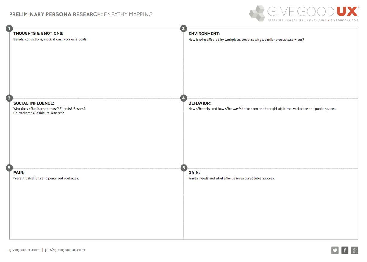
1. First, develop empathy for the person. Empathy goes far beyond demographics, likes, dislikes, job roles and responsibilities. Empathy is about understanding the emotional drivers that affect the user’s behavior, because emotion will trump intellect in almost every user situation. Design for the emotion and you’re truly designing for a person instead of a collection of possible attributes. While that sounds intimidating, the truth is it can be done in 20 minutes — using what we call an Empathy Mapping Worksheet.

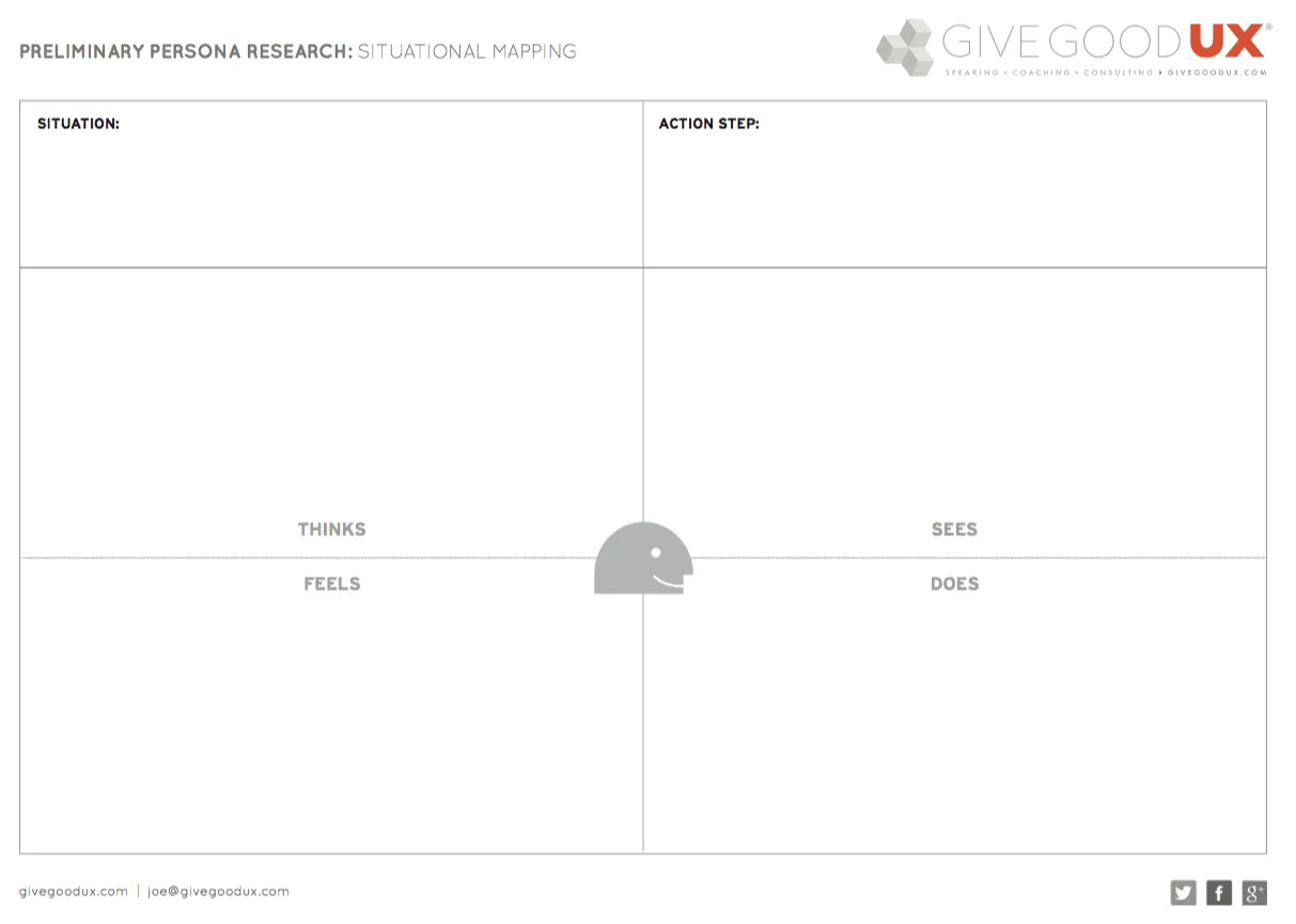
2. Next, uncover behavioral attributes that motivate use, in the context of a situation. What has the person just done or just finished doing when they encounter the product (site, app, tool)? What are they thinking and feeling at that moment, and how does that affect what they need to see or do, or how they act? What stress is present in that situation, and how does it affect the person’s perception and action? Sounds like a lot of work, but again, it typically takes no more than 15-20 minutes. The tool we use is called a Situational Mapping Worksheet.

Both tools are extremely simple and virtually self-explanatory, and you can learn more about them here.
Because we’re focused on context of use in both situations, our hypothesis are almost always more accurate than any traditional persona work. The enterprise teams I’ve worked with have found that combining this work with simplified user interviews (when possible) is a one-two punch that is extremely hard to beat.
Streamline User Interviews
When interviewing users, aim for the largest representative sample possible. The way you do that is by asking fewer, but more poignant and open-ended, questions.
Don’t ask them about the system at hand, or it’s features or functions. Those questions will focus the answers on the tool they’re using — instead of the process they follow. Any number of factors unrelated to the specific tool or even the task at hand may contribute to the current issue or problem. People might use workarounds to avoid using the system altogether. And if you ask a narrow question that’s tactic- or tool-specific, you’ll never hear about any of those things.

Here are the 6 core questions that typically prompt people to tell the kinds of stories that uncover problems and desired outcomes:
- What constitutes a good work day for you?
- How do you go about doing (name a specific process, task or end goal)?
- Can you show me how you do that (if time allows)?
- How does this compare to other organizations you’ve worked for?
- What are the biggest problems, obstacles or inefficiencies you deal with in doing this?
- What other things do you do before, during and after this?
Are there other questions you can ask? Of course.
But these six are worth their weight in gold, because they invite the kind of stories that quickly get to the heart of real obstacles. You want to interview as many users as possible, as quickly as possible, so stick to these six.
Here are some quick guidelines to make the interview process quick, focused and easy to manage:
- Interview at least 3 users, but 5-10 is ideal. If you can’t get to 3, don’t do the interviews. Instead, start gathering a pool of people to test your prototype with. When you have less than 3 people, you won’t have enough data to disqualify the emotions and preconceptions that skew responses. What’s more, you won’t see a wide enough example of the diversity inherent in enterprise users.
- At the same time, you may need more than 10 if you have multiple, specialized user groups. If a portal will be used by both accounting reps and development teams, these two groups have different motivations for use and different paths of use altogether.
- Work to keep answer time for each question within 10 minutes where possible, because in most cases anything after that is repetitive information or ancillary detail.
- Don’t expect to do all interviewing upfront. Your first set of interviews should happen in the first 48 hours, but they don’t end there. Interviews can and should coincide with post-requirements sprints, which often means two-week intervals.
If You Can’t Access End Users…
When you can’t get to the source itself, you need the next best thing — an informed opinion based on experience. Whether it’s an IT Manager or an Account Representative, find out who’s responsible for guiding end-users through the installation and configuration processes. Those people will be your user research champions, for two reasons:
- They have direct face time with the people using the software, so they’re hearing a whole lot about what users like or find useful (along with what they don’t).
- They have a vested interest in making sure the customer gets what they need.
People in these roles can help you connect the dots between the mechanics of product implementation and user needs. At the end of the day, it’s their job to make sure that people get things done efficiently with the software.
Any organization can pitch a product, but if users are unhappy after implementation, or if they create workarounds to avoid using the product, these folks are the first to hear about it. Because when customers are unhappy, contracts don’t get renewed. So in most cases, Account reps or IT Managers will be happy to have your help.
Offer to assist during the install, offer to make yourself available to answer any questions. Introduce yourself and relate that your job — just like theirs — is ensuring that employees are happy.
Validate User Research By Testing Lo-Fi Prototypes
Use cases and user stories should inform your requirements, but further testing/validation of those requirements should come from prototype testing.
A little later on, you’ll read about low-fidelity prototyping for requirements generation. In order to serve this purpose, our prototypes should expose the key screens in core workflows.
They should describe the content (text, images, etc.) and interactive controls (links, buttons, menus, forms, etc.) appearing on each screen. This is a two-step process: (1) iterate quickly and (2) socialize with users. And if you can’t find a minimum of 3 users for testing, dogfooding with 5-10 coworkers is equally valuable. Triangulated against the empathy and situation mapping worksheets, it’s possible to make reasonably accurate judgments about what’s appropriate and what isn’t.
The specifics of prototyping are covered in the coming pages, but we’re aiming for answers about the design’s foundation. In general, we’re asking if the navigation categories and interaction models we’re proposing are easily understood. We want to know if the visual hierarchy, information structure, navigation and workflow we propose:
- Presents information users want and expect
- Presents information in a way where they can easily find what they need
- Uses labels users will readily understand
- Allows users to easily and accurately predict the outcomes of their actions
Invite your stakeholders to attend the usability testing sessions. You’ll gain quicker buy-in for requirements decisions when they see firsthand where users struggle. User Stories (And Requirements) Are Not Created Equal.
If you asked me for the single, best piece of advice I have to offer, it would be this:
Not everything is worth doing.
Startup thinking is all about value—what matters most within the confines of reality.
Compare that to enterprise product development, where the number one problem is wasted effort — on things that don’t matter. We’ve all heard the excuses blaming time to market, customer responsiveness, Lean/Agile practices, or any number of misdirected justifications.
They’re all nonsense, because the simple fact of the matter is this: being first doesn’t matter if you’re delivering something no one wants, needs, or is willing to use.
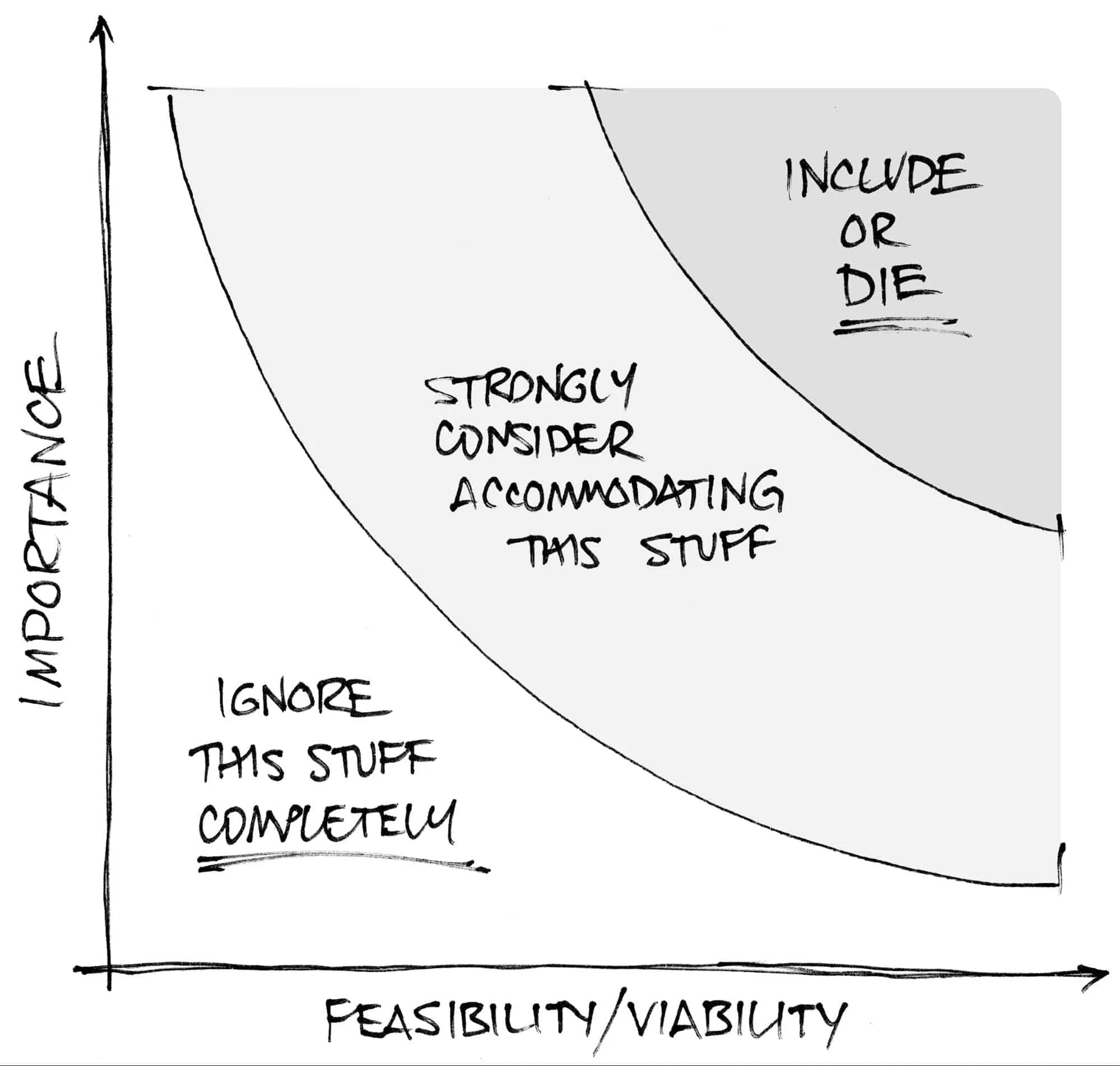
Once you’ve tested your assumptions against users, filter all the ideas through importance and feasibility/viability. Take an hour to figure out what’s actually worth everyone’s time, effort, and the organization’s investment. Seriously, it doesn’t take any longer than that.
With the simple chart below, I’ve seen this exercise take all of 60 minutes in a room with 12 people and a list of 50+ requirements.

On one axis you have importance.
- How important is the product as a whole to the business, to users, and to achieving the end goals?
- To what degree does each individual feature and function fulfill needs and deliver value?
The second axis represents feasibility/viability.
- What can we actually pull off in the time allocated?
- Are the budget and resources (read: people) sufficient?
- How much can we conceivably do? And if we get it done, how will we continue to maintain and improve the product?
Here’s how it works up close.
You poll the room for each user story/possible requirement. You ask about the importance to users and to our stated business goals, and can we do it? You graph the answer and then decide what to do according to its position:
- Anything that lands in the lower left section is out. As in immediately. Otherwise you’re wasting time or money addressing things that (a) aren’t important and (b) probably aren’t possible. If a proposed requirement is of low importance and not feasible within your constraints, either postpone or scrap it.
- Anything that falls in the middle section goes straight to the backlog. You could accommodate these items, but you shouldn’t spend the majority of your effort doing so. It’s unlikely that anything landing here is critical for users and the business. You may even have doubts about feasibility. These items don’t need to be perfect, just done.
- Anything that falls in that top right area is what you commit to doing. That means you’re damn sure it’s important, and you’re equally sure it’s feasible. Design these items extremely well. Features and functionality in this category enable the product to serve as some kind of answer to prayer — and that’s where you’ll get the most return on your effort.
Even if this exercise takes up a full 8-hour workday, the wasted effort and potential disaster avoided makes it worth every minute.
For more practical advice, download the 91-page e-book Fixing the Enterprise UX Process by Joe Natoli.

