One of my favorite things about interaction design is that it’s the perfect partnership between science and art, data and intuition. We imagine our everyday technologies not as they are but as they could be, beautiful but also useful, with nuanced interactions and user-friendly interfaces.
But we have to be careful with what we show, when, and how, to make sure that everyone gets what they need.
In addition to testing our own ideas, we also must balance user goals with business goals. To intertwine these goals, we must build empathy and understanding between stakeholder and user, and offer our customer a hand in the creation of the product.
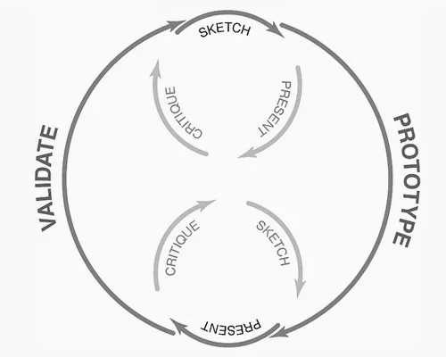
As part of the process described in the Guide to Prototyping, rapid UX prototypes are a great tool for our scientific toolbox. A prototype validates our ideas with clients and users at each stage of the design process, helping us identify where we might’ve gotten lost along the way.
This is the partnership of interaction designer, client, and user, and it is our job to facilitate it.
Focus on practicality over glamour
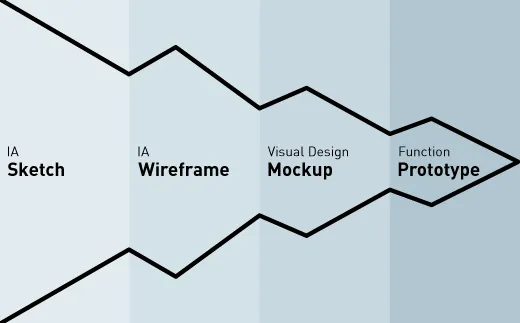
Recently, as part of a client project, I was tasked with creating a prototype for a page that involved some animation. This is a concept that I had recently been looking into from an interaction design perspective, and I was eager to explore its usefulness in client work.
Source: UXBooth
However, in my eagerness to explore, I jumped headlong into creating a high-fidelity prototype. This was a mistake, because I didn’t lay the right groundwork in creating feedback with the client— while we did get the desired feedback, it took far longer than I hoped, and required sifting through lots of irrelevant information.
It was completely my fault.
The client didn’t know what kind of feedback I wanted, because I had forgotten a related-but-less-glamorous predecessor of prototyping— planning and framing the prototype.
Present the right context or risk failure
Chances are, if you’re reading this post, you recognize the value of a good prototype (that, or you’d like to).
The purpose of a prototype is to gather insights on interactions when flat mockups just won’t suffice — when we want feedback on movement, interplay of elements, or changes in an interface. Before a large amount of code is written and time invested, we can see if our brilliant new idea truly has a leg to stand on with stakeholders and users.
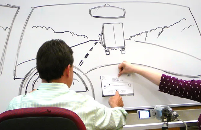
Source: Sharp Suits
If we present stakeholders with a prototype that is unclear in purpose, or perhaps overdone in aesthetics, then the fault is ours. You may present a prototype for feedback on interactions only to hear “I don’t like the colour.” They are only trying to help, so without focus, they’ll simply tell you everything that comes to mind.
After all, if you’re being shown something without context and being asked to comment on it, you won’t know what’s relevant or helpful (or worse, are expected to know but don’t). So you’ll say whatever comes to mind.
As interaction designers, it is our job to guide the client and offer them the tools to give strong feedback. The prototype is just the endgame, the collector of the feedback rather than the enabler. We need to lay the foundations for good feedback ourselves, and these foundations have to be laid before the prototype even makes an appearance.
Otherwise, we run the risk of wasting our time making a prototype which, though beautiful, is as useful to us as a wooden frying pan.
Forge ahead— getting the best out of your prototype
So, what can we do to ensure we’re wielding a cast iron pan instead of a wooden one?
Our preparation begins before the prototype is created, and starts from within.
1. Know what you’re testing
It seems fundamental, but identifying your own (or your team’s) hypothesis and assumptions before the prototype is created will inform its shape.
Ask yourself the following questions:
- Am I testing form, function, interaction, or a mixture of the three?
- What result would I expect, given previous research and the assumptions I’ve made?
- Is there a context to be taken into account?
- What kind of feedback will you need to improve the product, and to inform your next iteration?
Making sure these preliminary questions are answered is key to creating a focused prototype.
2. Choose your fidelity accordingly
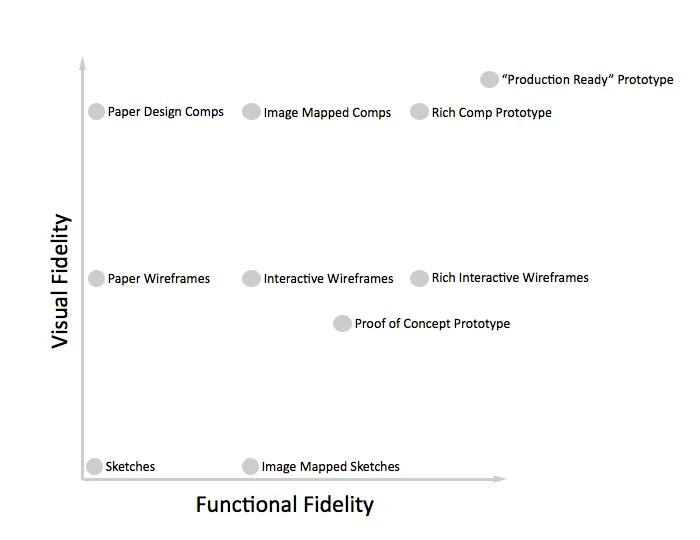
Once you’ve clarified the hypothesis and assumptions to test (and you’re sure that a prototype is the best way to go), make sure you’re aware of the different types of fidelity available to you.
Source: Boxes & Arrows
How refined do the visuals, functions, and content actually need to be? How much value will you stand to gain (that is, how will feedback improve) from turning the fidelity switch to high on all counts? Is this the best way to spend your time?
Maybe it is, but you want to be able to clearly and thoughtfully justify that effort— after all, if all you need is a few sketches to test your hypothesis, there is no need to dive into Photoshop or Sketch.
3. Be ruthless
Make as little as possible, just enough to test what it is you need to test.
If you’re testing a particular interaction, don’t be afraid to just prototype that interaction, be it with a prototyping tool, HTML or CSS, or just with paper and pen. There’s no need to spend time on other parts of the site (unless that context is necessary).
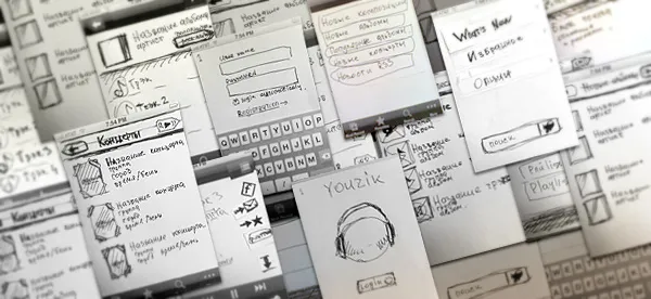
Source: Behance
Don’t be afraid of roughness: the artistic part of us may be afraid of something looking unfinished, and that untidiness reflecting negatively on our skill. But we should remember that at this point, that roughness can actually work to your advantage.
To make this more apparent, you can try creating different parts of the prototype with different fidelities.
4. Get away from the committee
Isolate the person you want to gather feedback from.
The group dynamic is useful in certain UX and interaction design contexts— affinity diagrams or card sort exercises, when a general consensus around a topic is desirable— but when we want frank and honest feedback, a group is the last thing we want.
This may take a bit of time, but will be well worth the effort in the end.
5. Focus the customer— but not too much
Once you’ve created the prototype, be absolutely certain that the customer knows what they’re looking at and why. Give them context and focus.
If you’re testing an interaction, the customer should be made aware (either explicitly by you or implicitly by the fidelity of the prototype) that you aren’t looking for feedback on colour scheme or font choice. This is our responsibility as interaction designers— if we get the wrong feedback, it’s due to a misstep we’ve made somewhere along the line.
Make sure that the customer is just as focused and prepared to give feedback as we are to receive it. The right choice in prototype fidelity will go a long way to achieving this.
6. Adapt and iterate
Once you receive feedback, act on it— good or bad.
Be prepared to go a few rounds, test repeatedly, and slowly increase (or decrease) fidelity in order to direct feedback to test the initial assumptions and hypotheses. At first, the customer may be uncomfortable with seeing something in an unfinished state, but the quicker they understand that this is meant to be iterative, the more likely they are to see the forest for the trees.
Prototyping is a process, after all, not a single act. Involve different people at different stages — developers, visual designers, copywriters— whoever can best help your prototype achieve its goal and desired fidelity.
Conclusion
Prototypes are exciting. They’re innovative and interesting— after all, if the pattern we were testing was established, then we wouldn’t need to test it.
But the prototype is only useful when it’s “just enough,” otherwise work is wasted and focus is lost. I would even say that the hypothesis we choose and assumptions we identify are more important than the prototype itself— without an objective framework, we’re prone to interpret results however we see fit.
Prototype fidelity will help guide the feedback— the more detailed and polished something is, the more detailed the feedback will be. Rapid prototyping is all well and good, but calculated (and sometimes difficult) choices beforehand will make it that much easier and that much more fulfilling for everyone involved.
To learn more about prototyping methods, fidelities, and tools, check out the Ultimate Guide to Prototyping.

