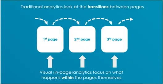
Traditional analytics provide you with an overall look at how your website or mobile application performs. Unfortunately, they fail to explain why certain actions are taking place.
In this post, we’ll explain a more visual approach to analytics for better design decisions.
Most websites rely on Google Analytics. But do they use it effectively? Well, take a guess.
Let’s face it – people do not understand analytics. Most web design decisions are still based on a gut feeling or on the wrong data.
The traditional methods show you the percentage of people who clicked that thing and got to that page, but they don’t tell you why they did or did not do it. If you knew the “why” behind the “how”, you could revise your interface for better usability (and therefore conversions).
Visual (In-page) analytics are different: They differ from traditional web analytics as they focus on users’ movement within the page and not between them. These tools are generally used to understand behavior for optimizing a website’s usability and conversion.
Visual analytics focus on what happens within the pages themselves.
The users of the tools can analyze the data successfully, as it is visualized in an intuitive and clear way.
So what’s the benefit? ? Faster and more accurate decision-making process.
Of Clicks and Men
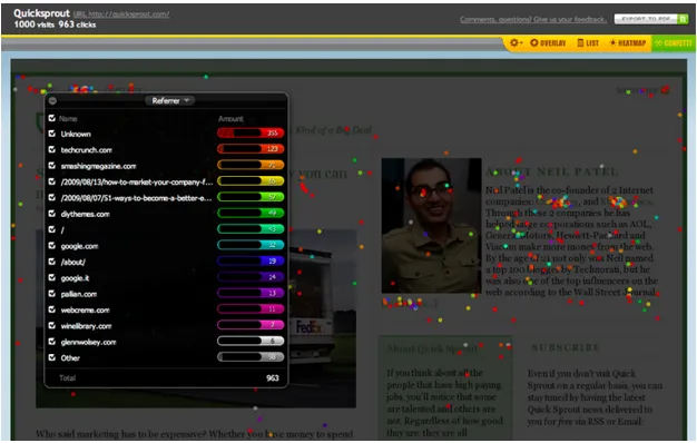
As described in the Guide to Usability Testing, click tracking heatmaps are an incredibly useful tool when it comes to collecting data about your customers or visitors.
They represent all clicks in the form of a heatmap, helping you see areas that receive most attention. With that information, you can judge which areas are attractive for your visitors’ “mouse”.
The biggest advantage is that heatmap studies are very easy study to conduct, and they do not require a lot of investment either in time or in money.
Source: Conversion Scientist
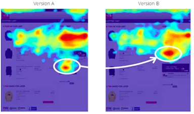
Content Square presents a great case study.
North Face launched an online Gift Guide to help shoppers in the gift-giving season. As that’s a major source of digital revenue they needed to carefully study whether some UX changes could be done to ensure high revenue from this project. After the evaluation, they found out that moving the CTAs above the fold increased their exposure by 50%!
Another case study on conversion optimization published by UsabilityTools shows a perfect example of what you can gain from uncovering ‘the why’.
OptimalEnergy, an online price comparison website, wanted to learn more about the conversion funnel on their website. Their website featured a slider with images, but they none of them were clickable. Data gathered with the Click Tracking tool and heatmaps revealed that 24% of people were actually trying to click these static images. Upon further inspection, they learned that some of the form elements made 81% of users abandon the site.
Heat map analysis revealed that 24 % of the clicks were going to wrong places.
OptimalEnergy made the images clickable and removed the troublesome form elements immediately. As a result, their conversions increased 123%. What can you learn from it?
If elements on a webpage do not meet your and your client’s expectations, then a problem arises. As it was shown before, heatmaps are an incredible way of portraying areas of interest that attract your user’s attention. Every element on a website has its own purpose, and it is crucial that they do their job properly.
However, you can also determine which parts of your web page are the most successful, and you can draw conclusions about your future web design decisions.
1.Learn where people click
Heatmaps mostly show the clicks, so you can gauge effectiveness of CTAs (or even if people click on your logo). Most heatmap tools allow you to switch to a mode that only shows the most popular areas, which helps you quickly see what users actually care about.
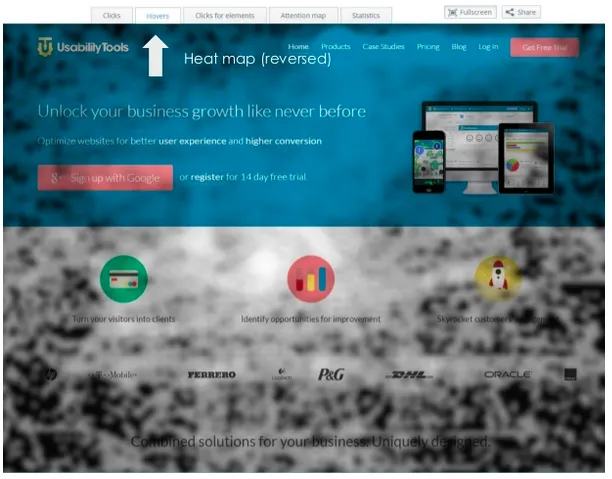
The whiter areas are ‘the most visible’ spots for your users’ clicks.
2. Learn how they react
Sometimes you don’t need a click to achieve your purpose – if your client reads information that you have an ongoing SALE and then proceeds to shop, then the text achieved your goal.
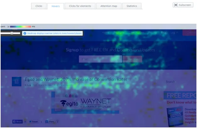
But how do you check what people are actually thinking? By looking at where cursors stopped, we can better deduce which areas were most interesting. Most heatmapping tools come with a “hover maps” feature that show where the curious cursor stopped.
The title of the article and the white space below attracted visitors’ hovers.
3. See how they roll the scroll
The mouse isn’t built of buttons only – the scroll wheel (and the bar for traditionalists) is also a crucial part of the browsing experience.
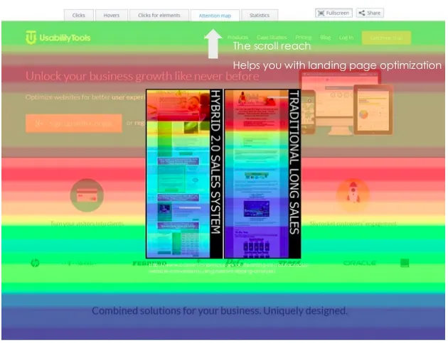
Certain websites began to experiment with long scrolls, but sometimes information gets hidden in the lower parts of a page. A scroll map shows you how far down users actually browse, which gives you a more accurate idea of engagement.
If you find that people aren’t clicking on important content below the fold, you might want to move it higher up (or revise your layout to shorten the scroll entirely).
The warmest colours show the areas that receive the most attention.
4. Filter the best
Heatmaps can be filtered as well, depending on the date or source of traffic. User behavior can vary quite a bit based just on these two factors alone.
For example, imagine a situation that you post an article on another site about “How Cookies and Our Tools Can Increase Your Conversion Rates.” People coming from that article to your website will start clicking and browsing with the idea of using your tools and cookies together – segmenting these users will show what areas were interesting only to them. If you find that particular audience converted very well, it might be worth examining the heatmap to see areas where you can better tailor your site for them.
Photo credit: CrazyEgg via AboutAnalytics
5. Add numbers to analysis
Let’s not devote ourselves to visuals only, though – statistics derived from clicks and movements are an extremely valuable source of data as well.
With stats, you can check how many clicks were placed per view. A large amount of clicks might hint at high engagement. However, a high number of clicks may also signify that people struggle with the website, ( since they cannot get what they expect from a click).
You can filter by clicks per view, then examine the behavior of that segment. If lots of clicks are landing on static areas, that’s a red flag that you need to revise your interaction design. If those clicks are landing on prime content areas, then the results support your design decisions.
Helpful tools for heatmaps & usability testing
You can find many tools that allow you to gather all the information mentioned in the article:
● Gemius Heatmap – Heatmaps in their easiest form. Very basic and perfect for not demanding clients.
● Crazyegg – A well-known classic present on the market for some time (created by a cofounder of KISSMetrics).
● UsabilityTools – Offers a suite of tools supporting card sorting, web testing, click testing, and user surveys.
● Digital360 – Good for optimizing conversion.
Conclusion
Just because analytics provide you with some additional data about your site doesn’t mean it’s actually valuable to your design. You want to find the errors and holes within your website and fill them with additional functionality for your users and customers.
To wrap up, by using visual analytics for your design choices you can:
- Learn where users click
- How they react to content
- How they scroll on the site
- Filter for specific behaviors
- Add numbers to your analysis
To learn more about over 30 different types of usability testing (including click tests), check out the free Guide to Usability Testing.

