Meet UXPin Merge: Quickly Launch a Design System Devs and Designers Will Love
Like Patrick Bateman inspecting Paul Allen’s business card, it’s easy to be envious when inspecting the design systems of GitHub, IBM, and Atlassian.
Responsive? Check.
Patterns? Check.
Vector-based design libraries? Check.
These systems are monuments to work-ethic, discipline, and teamwork. When a design system is launched, it dramatically reduces the time it takes to go from prototype to living app. It also reduces communication friction between designers and devs, and cuts UX bugs by consolidating the experience around well-supported components.

Have you been asked to create a design system at your company? Or are you struggling to keep your existing design system components consistent between deployed code and design libraries? You owe it to yourself to see how Merge can dramatically simplify your workflow. Before I introduce Merge, let’s look at how a classical design system was built and maintained at a forwarding-looking company like GitHub.
Designing a Design System: the Classical Approach
In Design systems at GitHub, Diana Mounter walks through GitHub’s Design System creation story and evolution. Some highlights:
- Planning for GitHub’s design system started in 2016. By the end of the year, there were two full-time employees dedicated to that project. They focused on the documentation and making it easier to prototype without having to write a lot of new CSS code.
- In 2017, GitHub’s design system team added another dedicated team member, bringing the total to three employees. They improved their process for communicating style changes, the status of styles, and the release flow of the design system.

- In 2018, they added another new team member, a front-end engineer increasing the team size to five employees. This helped drive the creation of a React.js component library.
When the article was written in 2018, GitHub’s design system team included five full-time employees. It’s a significant amount of work creating a design system that designers, developers, and product managers will adopt. The work doesn’t stop at launch, UIs don’t stop evolving. Much of this work is tedious. For example, manual translations of vector-drawn components to HTML/CSS-based (and back).

We’ve talked to many folks that are desperate for the benefits of a design system but don’t have the resources for a dedicated design systems team like at GitHub. That’s where UXPin Merge comes in.
Designing a Design System: the UXPin Merge way
A big reason why classical design systems require multiple dedicated team members is the translation between vector-based design tools (Figma, Sketch, etc.) and HTML/CSS.
It’s a manual process that quickly diverges from the source of truth: the UI of the deployed app. Redrawing the symbols in your design tool’s library to keep them consistent with the HTML/CSS version is a tedious, detail-orientated chore. Because this is such a chore, open-source tools like react-sketchapp and html-sketchapp have tried to solve this problem with code-driven transformations. However, I’ve had little success with these: frequent crashes, lack of support for more recent versions, inconsistent translations, and more. This isn’t for the lack of effort by the project maintainers: translating HTML/CSS to vectors is a herculean problem.
What does all this HTML/CSS to vector discussion have to do with UXPin Merge?
Well, on the surface UXPin looks like a vector-based design tool. However, that’s just the surface: it actually codes all the way down. UXPin Merge lets you import and keep in sync coded React.js components from Git repositories to the UXPin Editor. These aren’t flat symbols – imported components are 100% identical to the components used by developers during the development process. It means that components are going to look, feel, and function (interactions, data) just like the real product experienced by the end-users.

There is no HTML/CSS to vector translation with UXPin Merge: it’s the real thing. Let’s walk through the entire prototyping workflow: we’ll design a prototype and use its UI in a React app in minutes.
An example: creating a prototype with Material UI
An easy way to experience Merge is by trying one of the open source React-based design system implementations we already support. I’m going to show just how quickly you can go from idea to React app via Material UI.
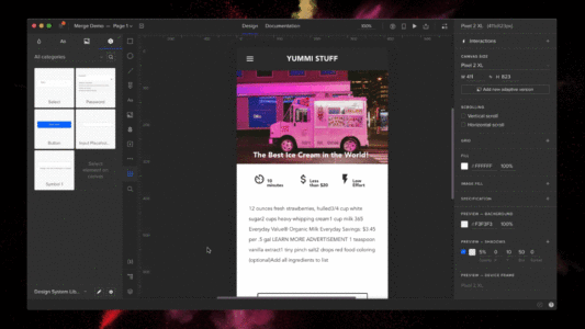
1. Add the Material UI Design System to your account
Start by pushing the Material UI Design System to my UXPin account. Once pushed, anyone on my team will have access to Material UI.
The steps below require git and NodeJS. The total setup time is just a couple of minutes.
Here’s how to push the Material UI library to UXPin Merge:
- Go to your UXPin account
- Enter the UXPin Editor
- Create a new library
- Select the option “import React components”
- Copy the Auth token
- On your computer:
git clone git@github.com:uxpin-merge/material-ui-merge.gitcd material-ui-merge./node_modules/.bin/uxpin-merge push --token [TOKEN FROM STEP 5]
- Back in your browser: reload the project
Everyone on your team can now develop a prototype with fully interactive Material UI components. Let’s do that.
2. Drag-and-drop prototype creation
With the Material UI Design System added, you can now create a fully-interactive prototype. How about a signup form? Start by adding an appbar:
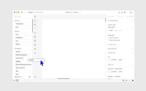
Next add the Signup text, two text fields for name and email, and a button to submit the form:
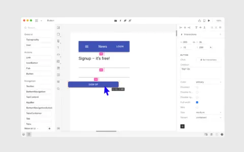
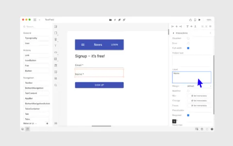
Customize the appearance of these elements via the properties panel within UXPin. These properties are passed through from the component’s propTypes (see the source code for a text field):
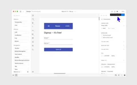
It’s time to preview. Just click the play button in the editor:
Prototypes are great, but how do we go from idea to actual live React.js code?
3. Creating a React app
Remember how UXPin is a code-based (not vector-based) design tool? That means we can go right from prototype to React JSX code. Let’s see how.
Before we can copy over the prototype we need to setup a React app:
- Create a React app via create-react-app
- Install Material UI:
npm install @material-ui/core
Go back to the UXPin Preview of the prototype. Enter Spec mode. Copy the JSX of the parent component into the app:
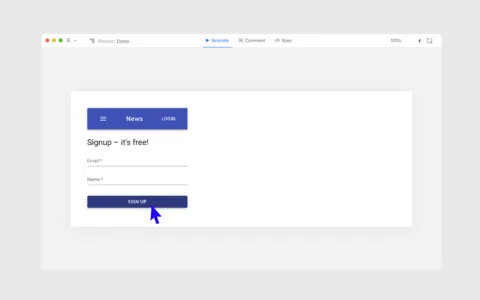
Start the React app with yarn start and then open your browser to http://localhost:3000. Your coded app awaits. We’ve gone from idea to React UI in minutes.
What about your custom themes and components?
The default Material UI theme is fine for a Proof Of Concept, but what about your company-specific theme? How can you add the custom components your dev team has created? Don’t worry – if you can bundle assets with webpack, you can render them within the UXPin editor. As for your custom components, it’s a fairly straight-forward process: wrap the React component and define default property values that are required to render a component.
Can designers push changes to code?
While designers cannot modify the appearance of Merge components and export those changes to code, they have the freedom to make any changes. Designers are free to mix Merge components with native UXPin elements. When viewed in preview mode, Merge components will display their JSX code and native UXPin elements will display their required CSS.
Getting started with UXPin Merge
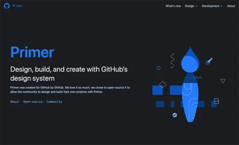
When you look at a design system like GitHub’s Primer you are looking at a several-year effort. With UXPin, we’ll get you there faster but it’s important to pick the right place to start.
Our advice:
- Build on an existing open-source design system – Don’t re-invent the wheel. Start with an open-source React.js design system implementation. Implementations like Material UI have solid documentation already. New team members may already have experience with it, reducing the onboarding time of new employees.
- Internal apps – The default theme for Material UI may not be acceptable for your customer-facing app but it can be totally acceptable for internal tools. Use UXPin to prototype these tools. Let non-designers get in on the action. They are the ultimate consumers of the design system.
- Add a custom component – Now that your designers and devs have seen just how fast it is to from prototype to real code, they are likely itching to use Merge on higher-visibility custom components. Pick a basic component and work up in complexity, thinking about addressing the biggest pain-points first.
Don’t forget: if you don’t have the internal resources to kickoff a design system UXPin’s Merge Concierge service is here to help. Our team can provide extensive one-on-help assistance to help with the initial launch of design systems.
Summary
There are no downsides to having a design system. As Storybook says:
- If a UI pattern is used more than three times, turn it into a reusable UI component.
- If a UI component is used in 3 or more projects/teams, put it in your design system.
We’ve found this baseline is met by many orgs. The challenge is finding the resources to launch and maintain a design system. That’s where Merge comes in: there’s no manual re-drawing of components in your editor or consistency issues between automated HTML/CSS => vector conversions. Merge enables your team to deploy a design system without the need for dedicated team members.
UXPin is the design process tool that helps product teams around the world turn ideas into products faster.
With Merge, UXPin’s revolutionary technology, companies like PayPal can easily solve DesignOps challenges. UXPin Merge allows you to design with React components to achieve full consistency with the final product.
