Create Component-Based Websites with Design Systems
While it’s not necessarily a visual or interactive trend, design systems undoubtedly influence the look and feel of all the properties they govern. They provide the principles, tools, libraries, and code that create the trends we see on the web today.
Design systems are becoming more than a trend—they’re a best practice that will last for a long time because of their usefulness. In the coming years, we can expect improved design consistency across the web.
That doesn’t mean that every website will look the same, but rather that each website will be more consistent with itself and with user expectations of functionality and usability.
Design systems help solve the problems of scale that come with large and remote teams working together. They give everyone standardized principles and components, which leads to benefits including:
- Faster time to market: Design systems create a Lego-like process where everything is reusable, minimizing the time spent rebuilding the same components.
- Consistent UX across platforms and products: Standardized components create a much more coherent “look and feel.”
- Less version control issues: If you update a component in a design system, the changes populate across all instances. The design system is the final record of truth.
- Easier collaboration and communication: Design systems create a shared general knowledge base and components for designers, PMs, and engineers.
That’s why 69% of 3157 designers surveyed said they were currently building their own design system, if they didn’t have one already.
While only large companies had the resources to build design systems before, new tools and processes have now made it much more feasible for companies of all sizes. We’ve seen it firsthand as small companies and agencies have even utilized UXPin’s design systems platform.
Let’s explore the nuts and bolts of a design system, learn how to build one, and showcase a few examples of websites built using a design system.
What exactly is a design system?
First, let’s get the definitions straight.
- Design System: The complete set of design standards, documentation, and principles along with the toolkit (UI patterns and code components) to achieve those standards.
- Pattern Library: A subclass in the design system, this is the set of design patterns for use across a company.
- Style guide: Another subclass in the design system, this static documentation describes the design system itself: how products should look and feel, use cases for UI patterns, correct typographic scales, etc.
Bottom line: A pattern library (e.g. set of symbols and assets in Sketch) and style guide are only parts of the much more robust design system.
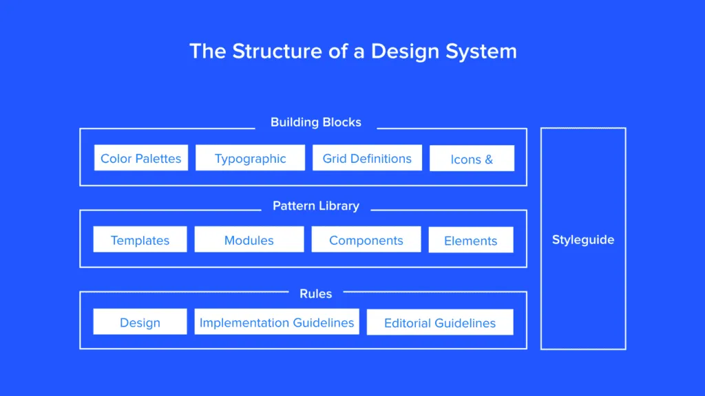
How it all connects
First, keep your focus broad and think about the idea of design systems.
At the broadest level, a design system is a living entity containing the common linguistics, principles, and tools to help teams build products coherently. As Nathan Curtis says, a “design system isn’t a project. It’s a product serving products.”
Shopify’s Polaris Design System is one of the best examples. On the homepage, they’ve already broken down all the core sections:
- Product principles: What is the purpose and soul behind all the products?
- Written content: How should the product’s interface copy look and feel?
- Visual properties: What should the “skin” of the product look and feel like?
- Components: What are the UI patterns and code components needed to build products coherently across devices?
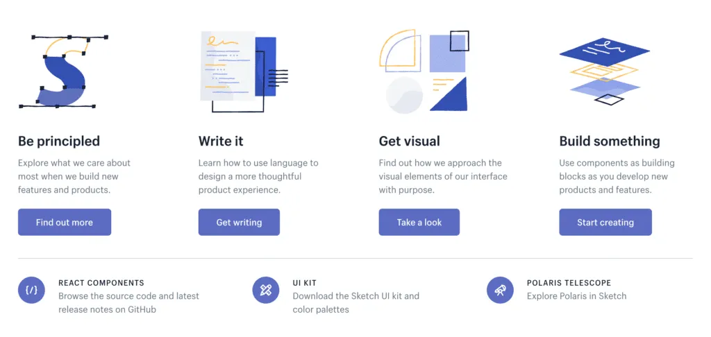
Shopify’s Polaris Design System
In this case, Polaris is the complete design system of principles, written content, visual properties, and components. The style guide is simply the static documentation on the Polaris website which describes how to use the design system. The pattern library is part of the components in the Polaris design system.
The differences are subtle but unmistakably important when it comes to improving product development. A style guide on its own becomes quickly updated since documentation requires maintenance. A pattern library lacks the instructions and principles for coherent implementation.
The design system ties everything together.
How to create a design system
Now that you know what these terms mean and how they work together, let’s quickly review how to build a design system. Here is a quick excerpt from our 50-page ebook Creating a Design System: The 100-Point Process Checklist.
- Create the UI inventory: First list and describe all of the design patterns currently used in your interface and note the inconsistencies therein.
- Get support of the organization: Present your findings and explain the utility of a common design language to everyone. As explained in our Evangelizing Design Systems templates, estimate the number of design and engineering hours wasted on redundant work and how product coherence can improve NPS scores.
- Establish design principles: Codify your practices. You’re now starting to work on the style guide for the design system.
- Build the color palette: When building the UI inventory, we found 116 different shades of grey that needed consolidation. Create the palette and its naming convention.
- Build the typographic scale: You can optimize the scale to serve existing styles, or you might try to build a harmonious scale using the golden ratio or major second. When building the scale, don’t forget that you’re not only setting the size of the font, but also weight, line-height and other properties.
- Implement icons library and other styles: Decide which icons from the UI inventory will become part of the design system, then standardize the implementation.
- Start building your first patterns: This is the task that will never end. Patterns should always either reflect the truth about the product, or reflect the aspirational state of the product in the near future.
Websites built with a design system
You can find plenty of websites that describe each company’s design system.
But what does a website look and feel like when it’s built with a design system? It is much more logical, consistent, and better-performing thanks to less code bloat.
Here are a few websites that were built with the principles and toolkits of some of the best design systems around.

Built according to Predix design system.
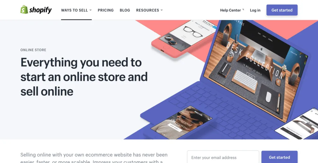
Built according to Polaris design system.

Built according to Atlassian Design Guidelines.
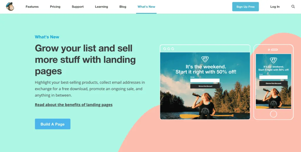
Built according to MailChimp Design System.
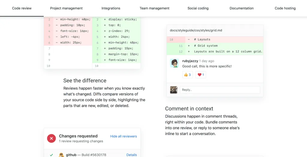
Built according to Github Design System
This is an excerpt from our full-length ebook, an overview of web design trends. You can read the full ebook for free here. If you’re interested in learning more about design systems, click here to view recordings of UXPin’s Design Systems Virtual Summit. Try UXPin’s design systems capabilities for free here.
UXPin is the design process tool that helps product teams around the world turn ideas into products faster.
With Merge, UXPin’s revolutionary technology, companies like PayPal can easily solve DesignOps challenges. UXPin Merge allows you to design with React components to achieve full consistency with the final product.


